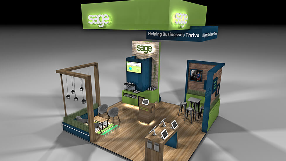
Despite the plot location, this conference stand design drew delegates in time and time again with its open feel and a focus on interaction, tailored content and reward.
Background
Coinciding with the Conservative Party Conference, held at the Manchester Central Convention Complex, Sage was using the forum as an opportunity to generate brand awareness amongst conference attendees.
Challenge
For this particular brief, Sage had a set of very specific requirements; the conference stand design should incorporate:
- Lounge-style seating for meetings
- Demo area with 4 self-service iPad stations
- Phone charging facilities
- Free coffee with barista service
- Wall-mounted screen for looping video content
- Small store area with space for a fridge
The 6x6m space, open on all four sides, would need to offer a relaxed and welcoming feel. The aim of the stand was not to ‘sell’ or rely on in-depth product demos, but to create awareness amongst the audience of how Sage contributes to the UK business landscape.
Solution
While the exhibition stand was accessible from all sides, one of them would be furthest away from the flow of traffic, so we based the orientation of the stand around that, as well as the configuration of elements within it.
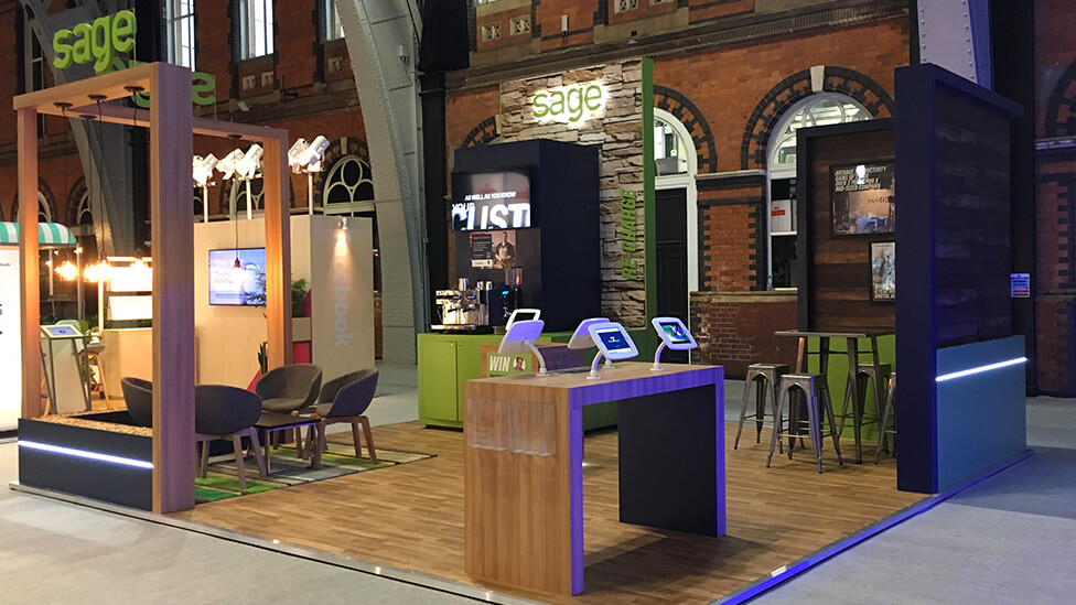
We proposed various conference stand design options to our client, with height being a key element throughout. One of the design options included a suspended rig which, combined with a 4-metre wall at the back of the structure, would give the stand an immediate commanding presence despite the relatively small size of the plot.
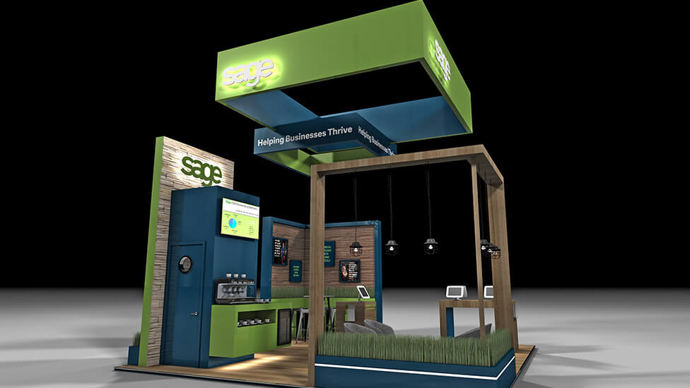
Another option we considered at the concept stage was the inclusion of a trough with plants; its purpose to inject an air of comfort and welcome to a semi private meetings area.
In the final conference stand design, the plants were replaced by pebbles, a more cost-effective alternative that still sits within Sage’s brand guidelines, where a focus on natural materials and textures is key to transmit a relaxed feel to their experiences.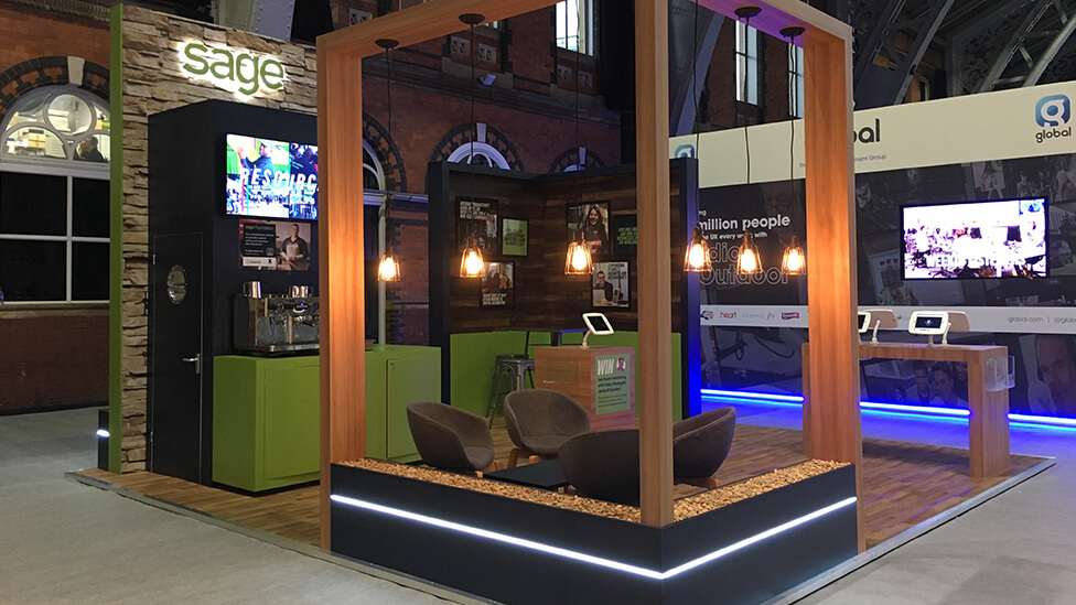
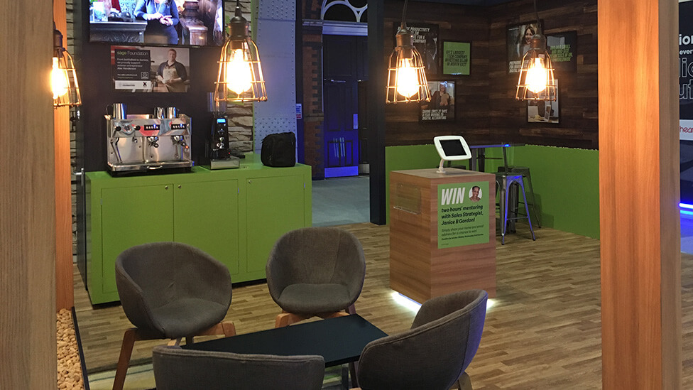
Subtle lighting detail below the trough and an open but clearly defined structure command the attention of delegates, while not obstructing the view of what’s behind – a drinks area with full barista service where coffee made with beans from The Coffee Collective was served.
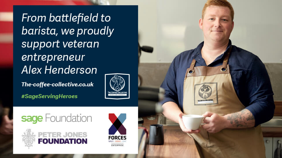
The Coffee Collective is one of Sage Foundation’s ‘entrepreneur heroes’. Its founder, Army Veteran Alex Henderson, joined Sage on the stand during the conference to talk to delegates about the support he receives from the Foundation, and serve his coffee on the stand.
The relatively small space is brimming with hooks for the audience:
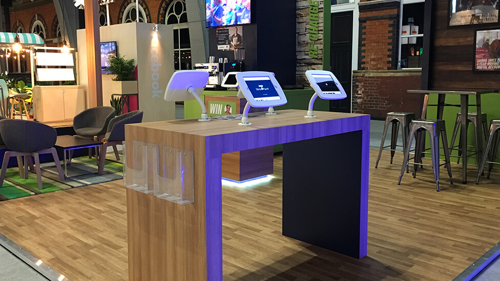
- A central podium with feature floor lighting and an iPad with preloaded content promote a competition where the winner walks away with a one-day mentoring experience with a Sage strategist
- To ensure the Sage brand was the key focus of the stand, other messaging and graphics were displayed on a TV screen mounted above the coffee bar
- A simple demo desk housed 4 iPads with preloaded video content which allowed delegates to choose which Sage product to focus on
- High-level branding adds stature and visual interest to the stand: two Sage logos “float” above the meeting area, an effect we achieved by fixing in sheets of transparent acrylic that supported a fret cut Sage logo
- Contemporary lighting fixtures, industrial feel furniture and a solid wood wall with framed branded messages add to the overall welcoming feel of the stand
Following the breakdown of the show, the stand can be stored ready to be rolled out again for future exhibitions.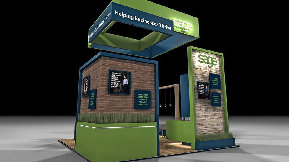
Looking for help with your project?
Feel free to give us a call to start a conversation,
our doors are always open.
Related projects
Capgemini
Corporate exhibition stand
Jacobs
Custom design stand
PTC Therapeutics Inc
Pharmaceutical booth design
