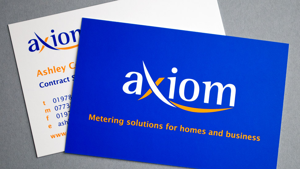
Following a buy-out by British Gas, Axiom required a corporate branding programme in order to differentiate it from its former umbrella company.
Challenge
Axiom (formerly PH Jones) is focused on metering for homes and businesses, and needed a brand that affiliated the company with PH Jones, but which communicated the changes to the business. Having worked alongside the management team at PH Jones for a number of years, we were asked to support the business by developing their new corporate identity.
Solution
Starting with the colour scheme carried over from its previous corporate branding, we developed a range of logos centred around the concept of metering – the chosen logo was a stylised development of these. The new identity is corporate, modern and approachable, and at the same time flexible so that it can grow in line with the business.
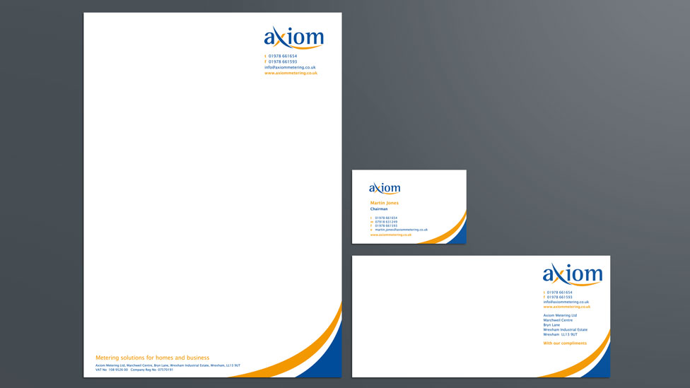
As part of the corporate branding process, we also developed a suite of stationery. Often overlooked, professional and beautiful stationery can help communicate that every detail is taken care of. The designs featured two coloured curves in the lower right corner to echo the logo and reinforce the colour scheme of the brand. Business cards and compliment slips use a full colour blue reverse for impact.
Looking for help with your project?
Feel free to give us a call to start a conversation,
our doors are always open.
Related projects

UK Fuels
Energy brand strategy

UK Fuels
Stationery and branding

Tonic
Logo design
