To help our client keep in touch with their target audience, PH Jones asked us to produce an informative and engaging customer newsletter design that would generate immediate interest.
Background
Founded back in 1963, and now with more than 600 staff, PH Jones prides itself in excellent customer service and care, and a focus on high quality delivery. The company works with local authorities and social housing associations all over England, Scotland and Wales. Our client is also appointed onto a wide range of frameworks for electrical work, installation and service and repair.
Challenge
As a family-run utilities business, our client wanted to reach its audience with a customer newsletter design that had an informative and at the same time friendly and approachable feel to it. The rationale behind this thinking was to ensure that every customer remained interested and engaged issue after issue.
Solution
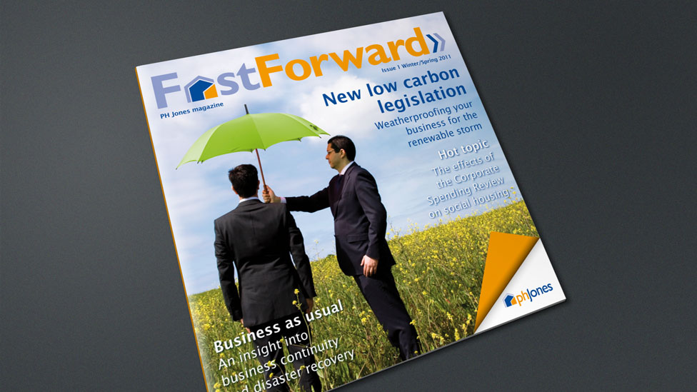
To help break away from the more traditional customer newsletter design approach, our design team proposed a small square format for the newsletter and designed the cover and spreads with the look and feel of a prestigious printed magazine. This effect was further accentuated by printing on an uncoated cartridge style paper, which gave the finished customer newsletter a softer, less corporate feel that makes for a highly attractive piece of literature.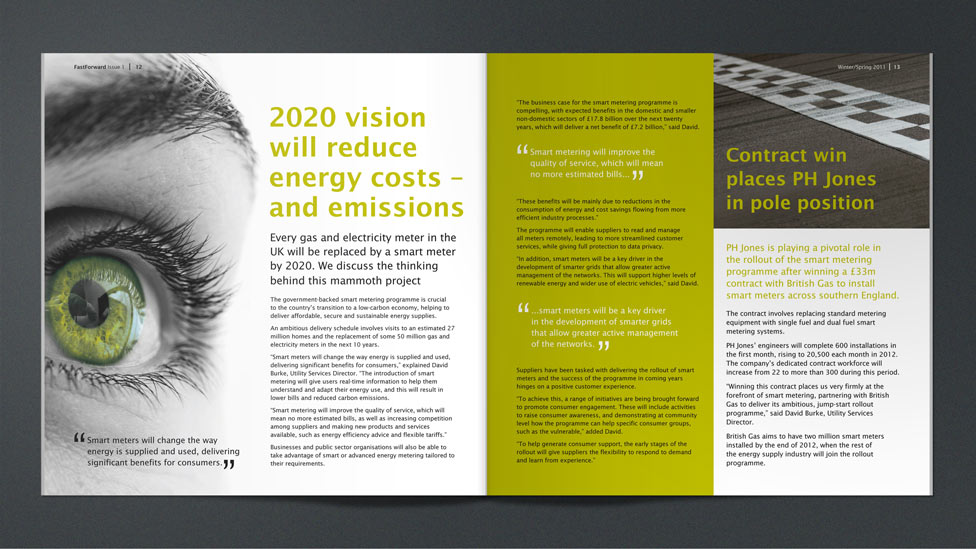
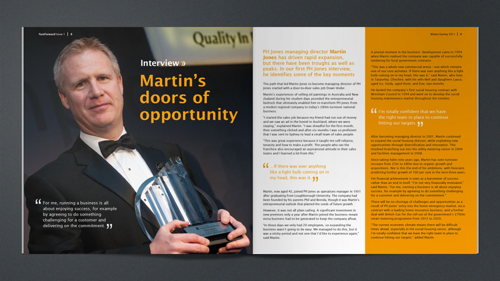
The bright colour palette taken from the PH Jones corporate brand inspired our design, as it lent itself beautifully to the creation of strong and impactful feature pages that stick in the minds of the audience, combining solid blocks of bright colour with striking photographs and illustrations, all held together with modern and elegant typography. The end result was a customer newsletter design that really stood out from the crowd when it landed on customers’ doormats, generating excitement and curiosity for current and future issues.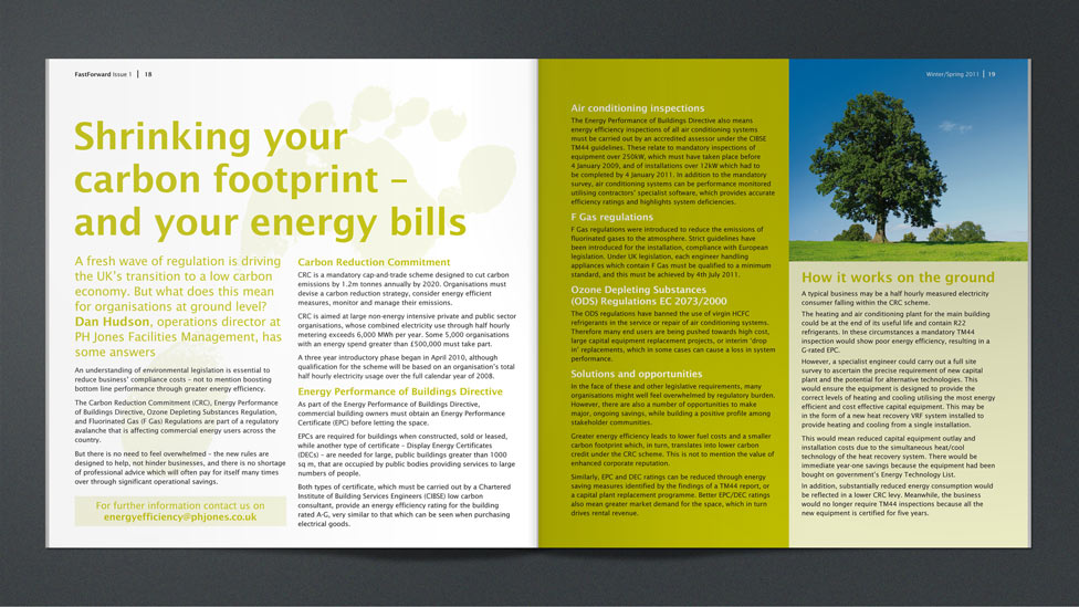
Looking for help with your project?
Feel free to give us a call to start a conversation,
our doors are always open.
Related projects

Alere
Newsletter design

Roberts Bakery
Employee engagement newsletter

AstraZeneca
Email newsletter design
