Inspired by classic packaging, we produced an e-cigarette brand design that contributed to a successful new product launch.
Background
After the ban on smoking in public came into force in the UK a few years ago, first in Scotland, followed by the rest of the UK the following year, sales of electronic cigarettes, or e-cigarettes, boomed.
Challenge
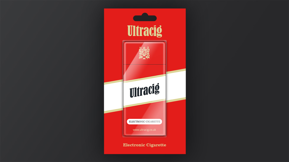
Ultracig asked us to create a new electronic cigarette brand design, including the design of their logo in various formats and contexts, and also various packaging designs, including reusable e-cigarette packs and disposable blister packs.
Solution
We created an e-cigarette brand design that took inspiration from classic cigarettes packaging whilst maintaining a distinctive look and feel that would hold its own among other brands.
The first stages of the design process looked at the cigarette logotype (the text-only part of the logo) – once established, the packaging design would follow. The Ultracig logotype was created and refined after exploring various typographic designs. We knew that the logotype needed to have a classic feel and be instantly associated with a cigarette product. It also needed to work on its own when used in isolation, such as on the side of the cigarette or other media.
Having refined the logotype, the overall brand design began to take shape and a colour palette was developed at the same time as the new e-cigarette packaging designs.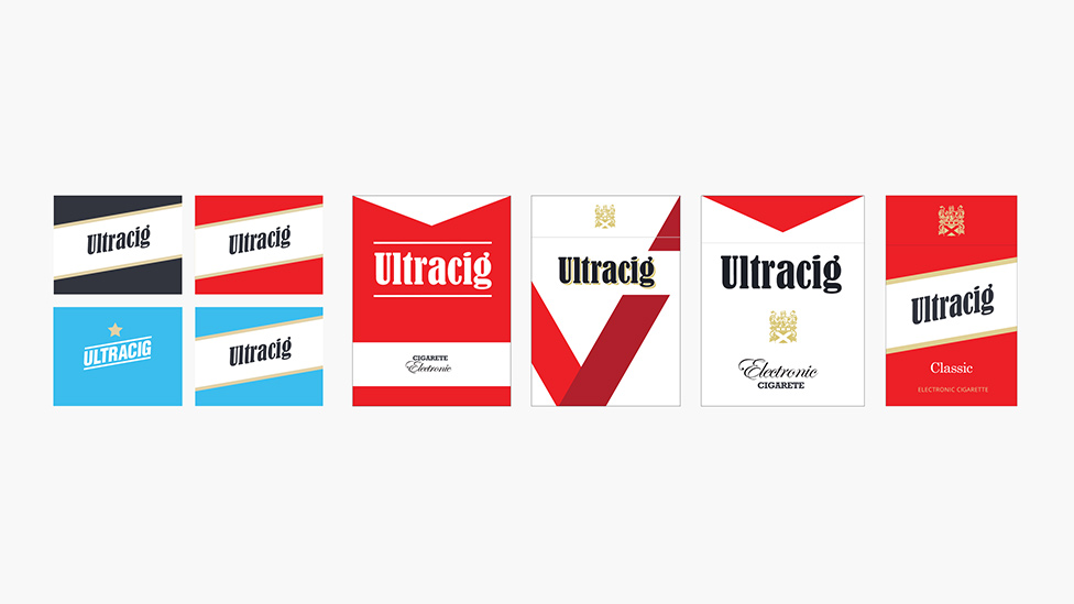
Deep, rich red, white and charcoal black spot colours, plus a metallic gold give the brand a classic feel. This makes the customer feel like they are buying into a brand that has been established for decades and helps to enhance the illusion of smoking a ‘real’ cigarette.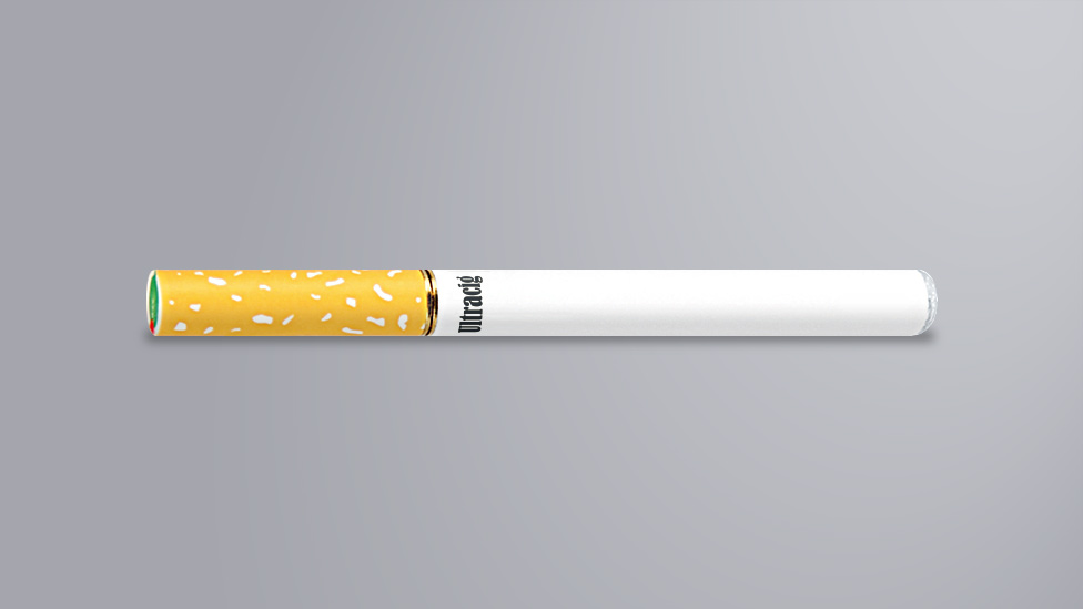
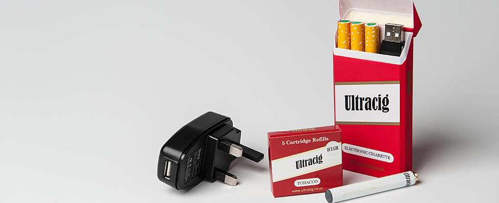
Together with the logo, a gold family crest was added to the packaging designs and other media that makes use of the logo.
A distinctive white diagonal band, with gold edges, was incorporated into the packaging design. This striking band helps to lift the logo from the deep red and also becomes an easily recognisable feature of the overall look and feel of the brand. The diagonal band was also made use of in the blister packs, where it was extended into the backing boards of the blister. The resulting packaging and brand design really stand out on the retailers’ shelves of the retailers.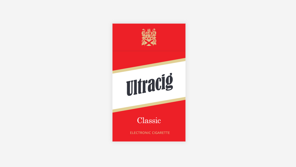
Looking for help with your project?
Feel free to give us a call to start a conversation,
our doors are always open.
Related projects
H&T Presspart
Branding strategy & development

ChargePoint Technology
Brand development

AMBS
Identity development and application
