Sage
Exhibition stand design and build
A fusion of functionality and dynamic, engaging experiences for this exhibition stand design and build.
Innovation and relevance is key to engaging customers and making brand experiences memorable. Interactive elements, immersive displays and creative layouts capture attention and invite active exploration, transforming passive viewing into dynamic participation. When delegates feel connected to an exhibit, they engage more deeply, remember it better and often share their experience, building loyalty and lasting impressions.
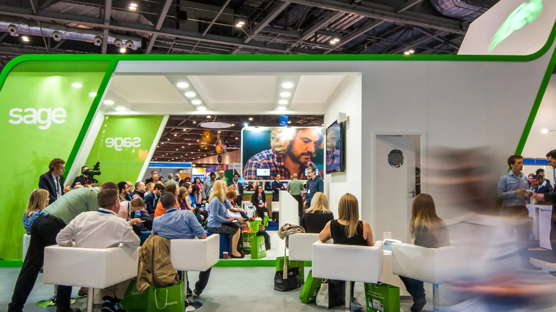
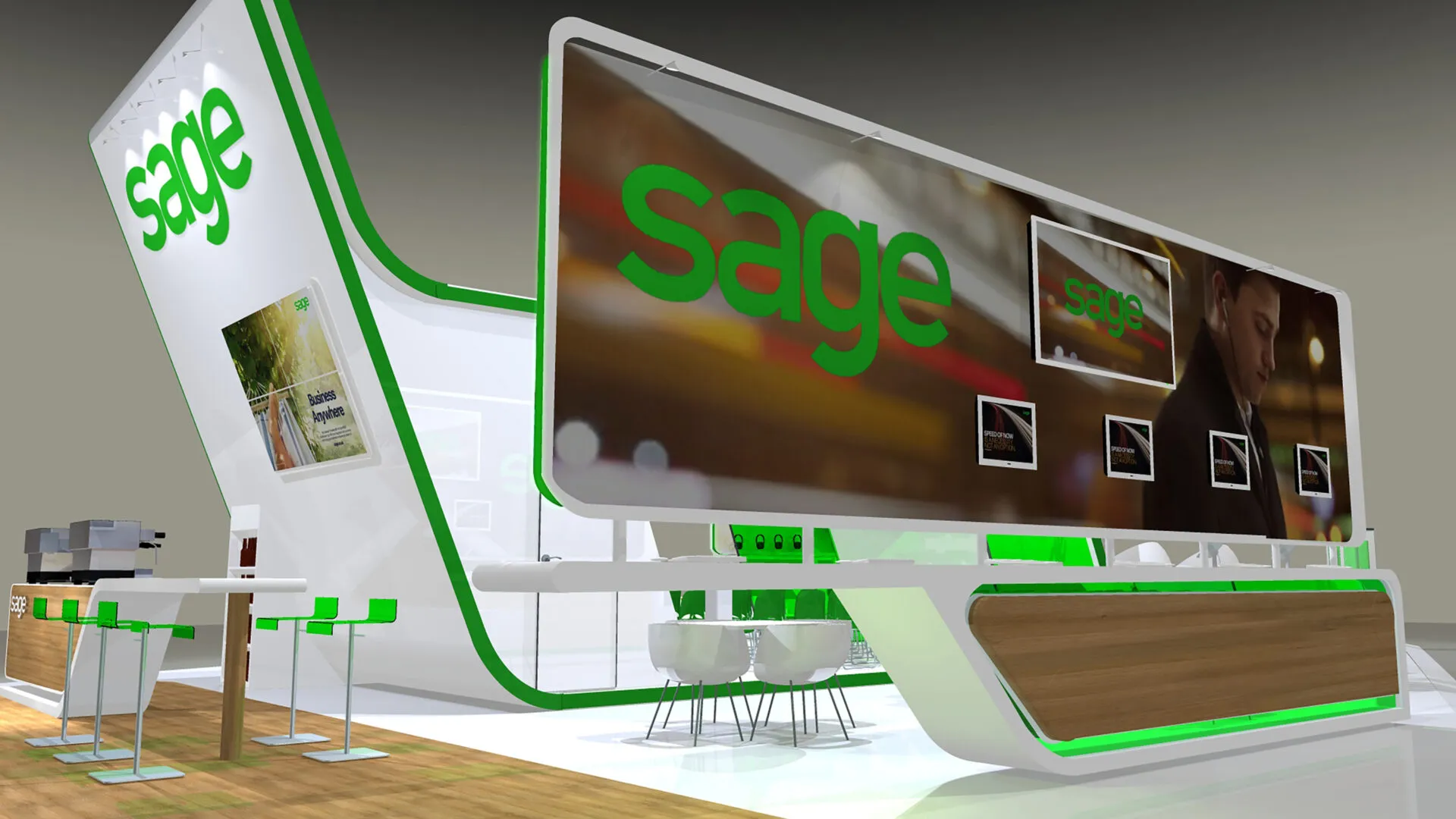
For Sage at Accountex, an event that attracts over 11,000 attendees annually, we designed and delivered an imposing stand that quickly became a landmark in the exhibition hall at a commanding 330sqm.
The challenge
To present our client as thought leaders, offering insightful advice in an innovative and stimulating environment.
Our solution
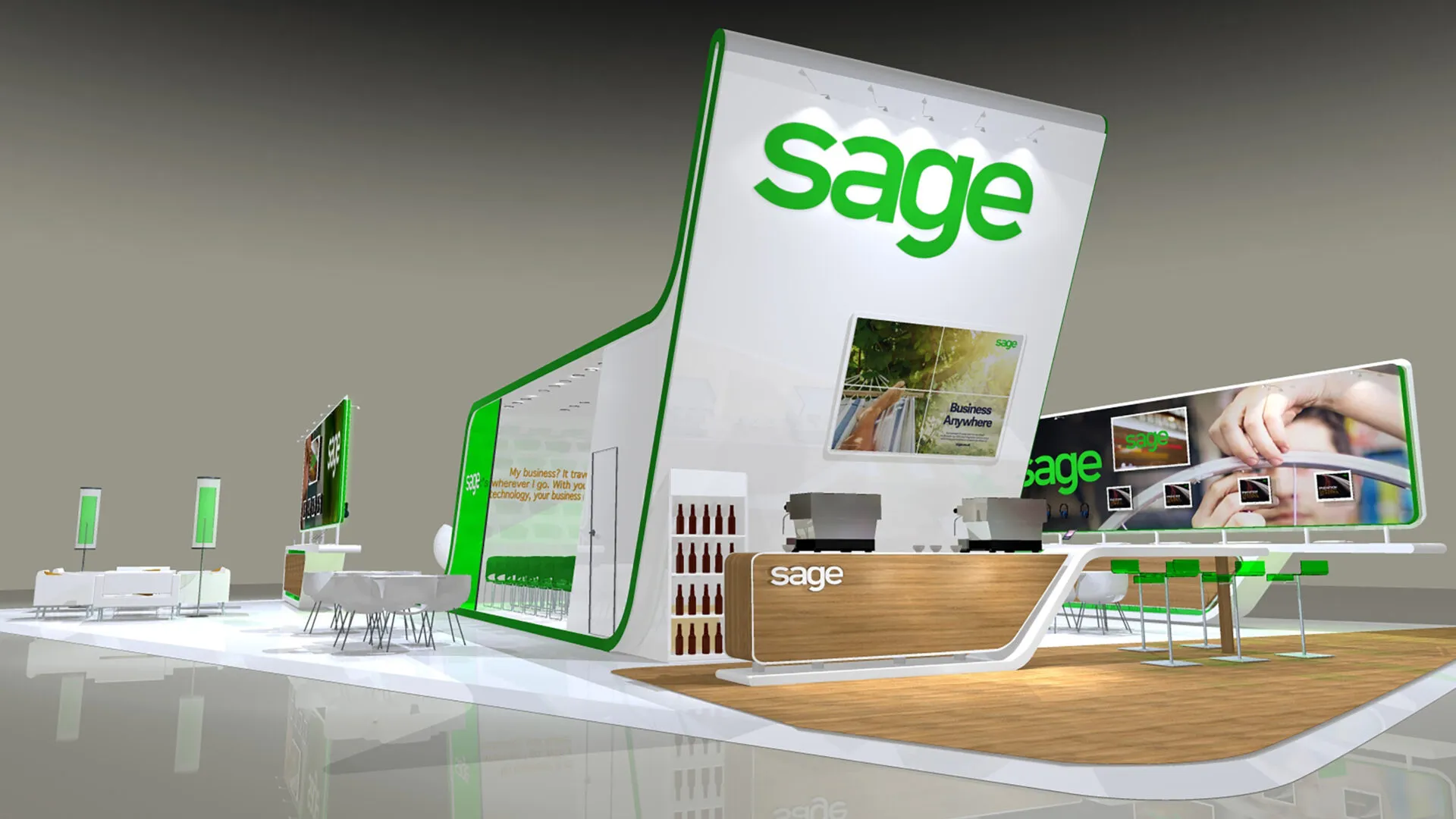
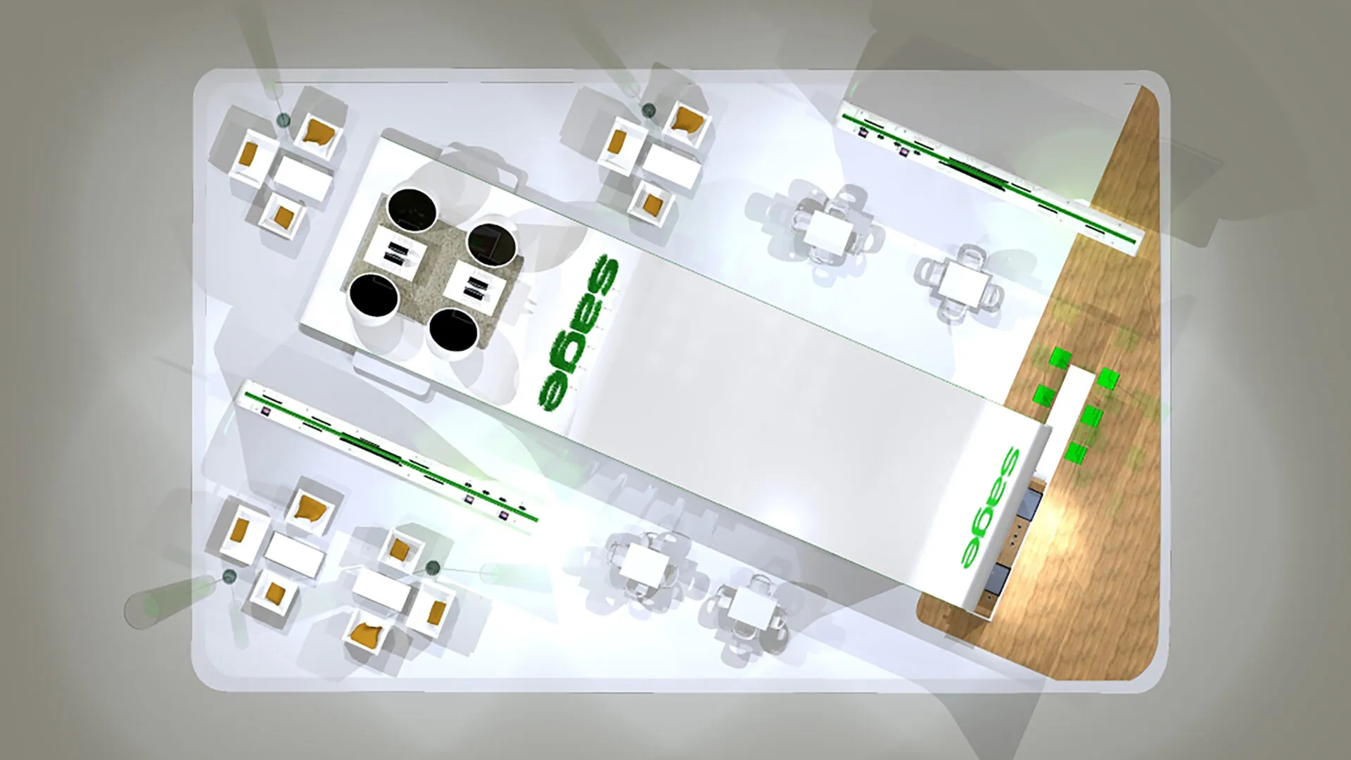
The exhibition stand featured a premium, inclusive design with elements that kept visitors engaged while maintaining a clean, simple atmosphere.
A central 6-metre feature wall incorporating a giant integrated video wall created an eye-catching presence.
The use of natural materials, like timber, and Sage’s brand colours, added a human touch to the stand design.
The stand was literature-free to highlight Sage’s commitment to sustainability, with a custom content kiosk allowing visitors to access tailored digital content and email it to themselves.
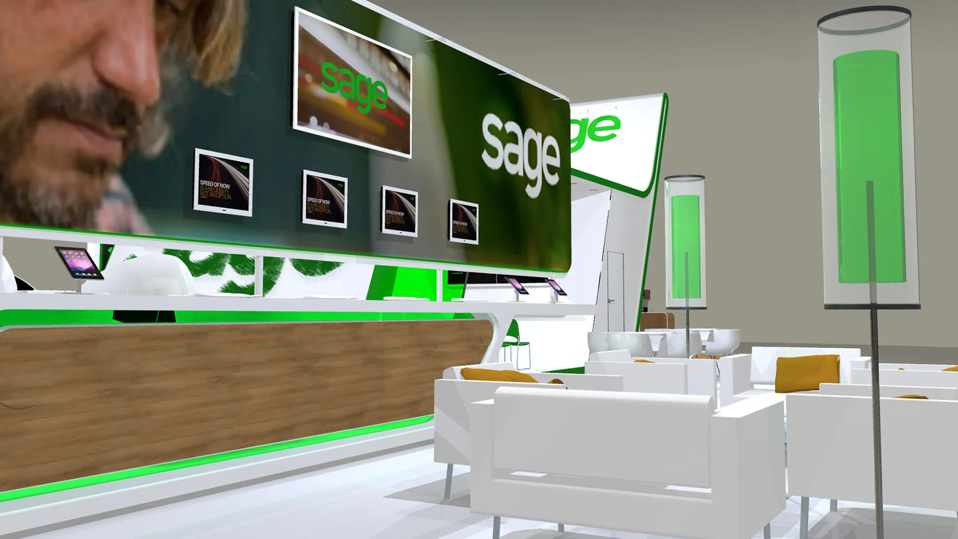
Networking tables with phone chargers and integrated iPads fostered interaction, while precise logistics and AV integration ensured a seamless, functional layout.
Highlights
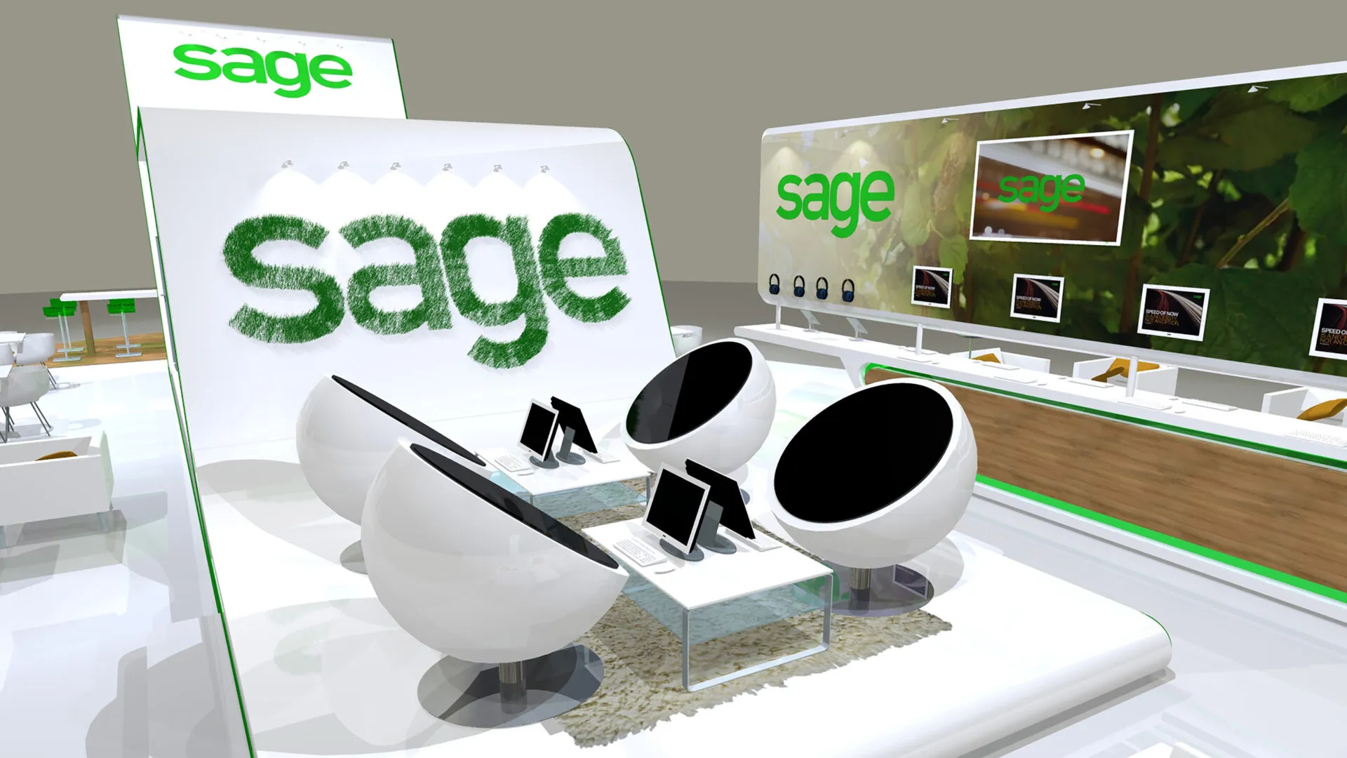
- Demo pods with integrated iPads and laptops.
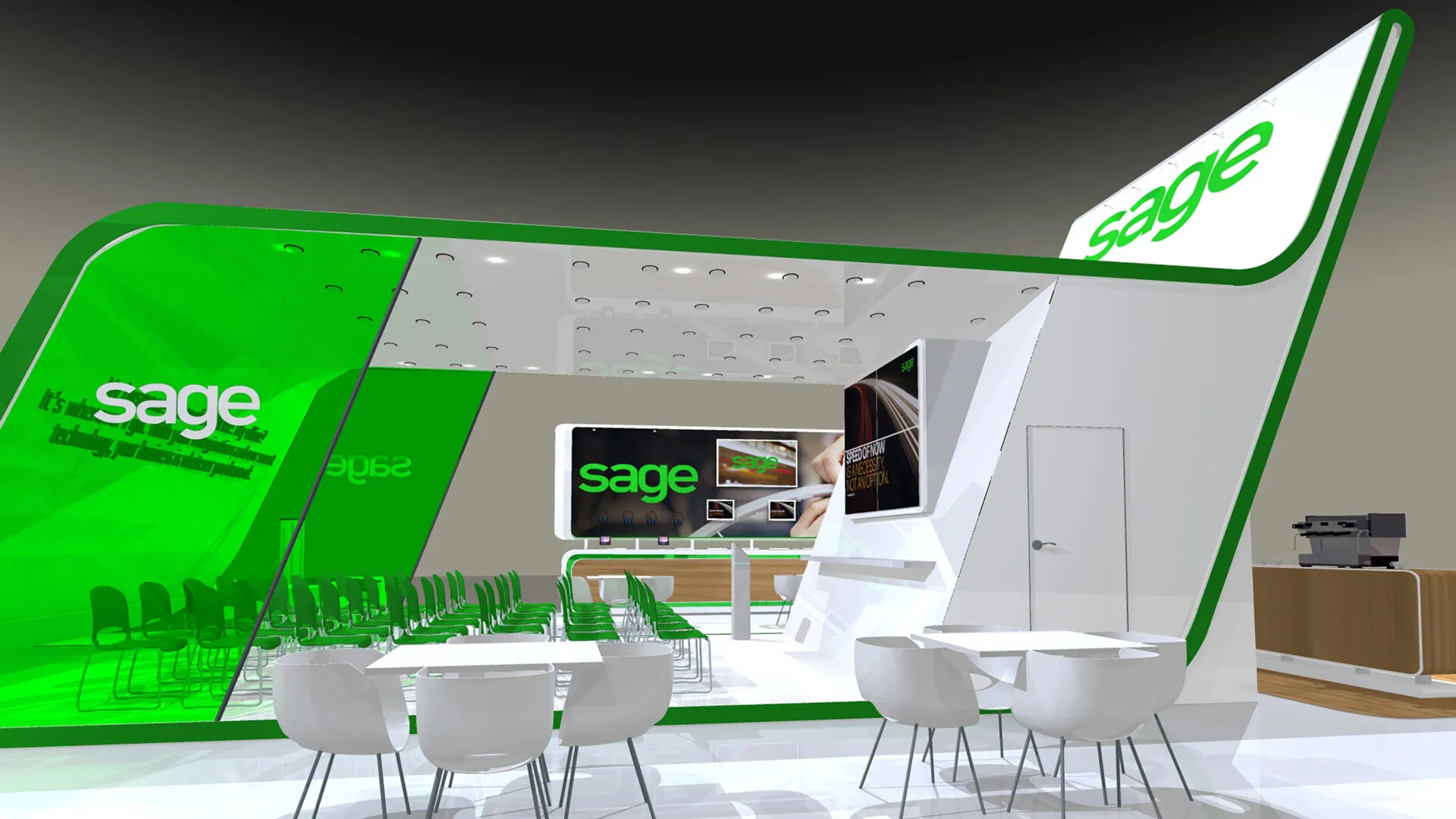
- A raised seminar theatre hub to generate curiosity and flow.
- A 4m x 2m seamless screen and wireless headphones to relay content.
- A live broadcast crew streamed live content to Sage’s YouTube channel.
- Looping animations throughout.
- Coffee and juice bar with professional barista service.
- A “Pic n’ Mix” area allowed visitors to make their own choice on various expert subjects.
- Proximity marketing content.
- Free Wi-Fi.
- Interactive competition, where delegates were offered a scratch card to reveal a code that may or may not open a fully working safe. The safe, positioned in a prominent area of the stand on top of a halo-illuminated podium, contained a pair of tickets to Ladies Day at Ascot.
81%
81% of trade show attendees have buying authority, meaning they are key decision-makers or influencers. (CEIR).
92%
92% of trade show attendees say their primary reason for attending is to see and learn about new products and services. (Statista).
These stats highlight the importance of an exhibition stand design and build that effectively attracts and engages visitors, leading directly to valuable business opportunities.
“Loved both the proximity marketing and content hub. We had lots of feedback from Accountants on the content hub – with one of the visitors saying it was like magic, he “loved it” and it was the “best thing I’ve seen all day”. Parker Design were top notch, what a great can-do team.”
Sage UK’s Marketing Campaign Manager
30 years in exhibition stand
design and build
We’re confident we can help, so why not drop us a message? We’d love to hear from you.
Take a look at other exhibition design projects
H&T Presspart
Bespoke exhibition stand
Capgemini
Corporate exhibition stand
University of Northampton
Fair stand design
