A fresh food brand development exercise that successfully represents Roberts Bakery’s heritage and their forward-thinking ethos.
Challenge
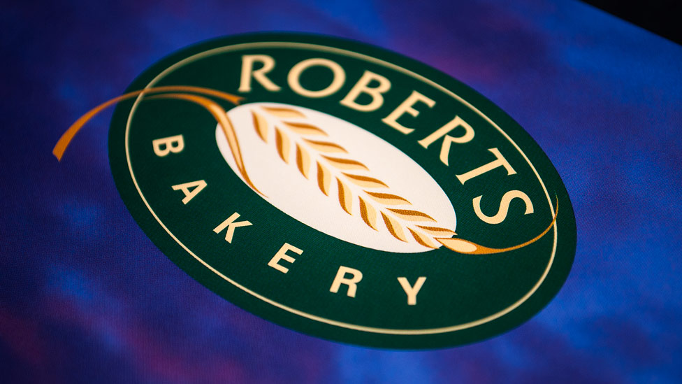
As a traditional family-run bakery, the previous Roberts logo was similarly traditional, containing lots of ornate detailing, strokes and flourishes and dog tooth borders. The logo had served them well for many years but it needed a refresh. Although it spoke of their heritage, the logo didn’t reflect the dynamic and forward-thinking nature of the business, so our brief was to refine and enhance the company’s identity rather than totally redesign it – a food brand development process was required.
Solution
Stripping out a lot of the detailing, and making the now iconic wheatsheaf graphic the focal point, we gave the Roberts logo a much fresher, more contemporary look. We also refined the typography making it cleaner and crisper.
“Parker Design have helped us to update and harmonise our brand image through the redesign of our packaging and promotional items.
They listened carefully to our design brief and, taking account of both our sales and production requirements, produced innovative, creative, and feasible ideas.”
For Roberts Bakery it was important to consider where the logo would appear and how it would be printed. From signage to packaging and marketing collateral, it was important that the logo design and brand development were consistent and cost-effective to reproduce across all media. With this in mind, the food brand development process also included simplifying the colour palette so that the logo could be produced out of fewer colours and tints of those colours, resulting in considerable future savings on print costs.
Following on from this project, we were involved in developing the brand further with a new range of product packaging designs, brand positioning straplines, point of sale devices, marketing collateral and website.
Looking for help with your project?
Feel free to give us a call to start a conversation,
our doors are always open.
Related projects

H&T Presspart
Branding strategy & development

ChargePoint Technology
Brand development

AMBS
Identity development and application
