 We developed this health campaign brand to increase awareness of the help available to the elderly, and those caring for the elderly, in the Warrington area.
Background
This campaign was part of the overarching NHS initiative to help those individuals aged 70 or over find new and easy ways to improve their general health and fitness.
Challenge
Following on from the success of the breastfeeding awareness campaign we had developed for them earlier in the year, this time Warrington Primary Care Trust asked us to look at producing a campaign brand design that would be used across a wide range of awareness materials in the upcoming months. The Warrington Primary Care Trust were keen to create a brand which was colourful, upbeat, clear and striking with the aim of creating maximum impact amongst the target audience.
Solution
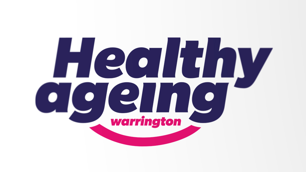
The approach we took was to use a heavy and highly legible font, and team it with the hint of a smiley face, to develop a unique logo mark which had a confident and at the same time supportive and reassuring feel to it.
In addition to the central logo design, Warrington Primary Care Trust also asked us to design a suite of icons which could be used to represent the 11 main areas of concern they wanted to address and raise awareness of.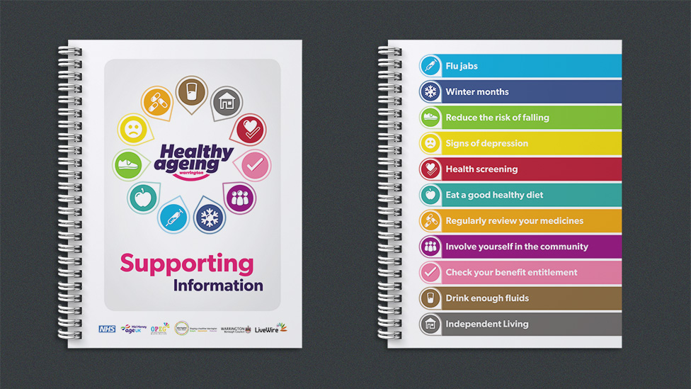
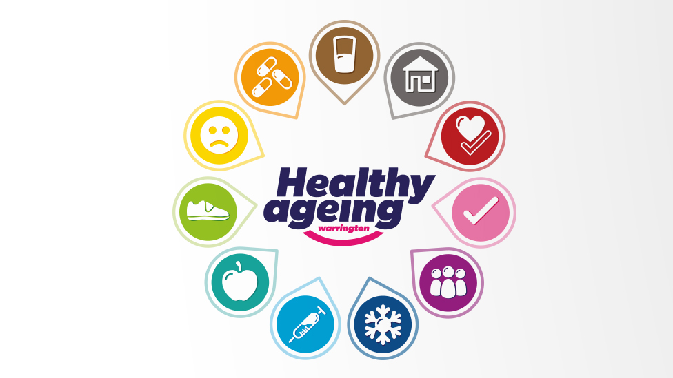
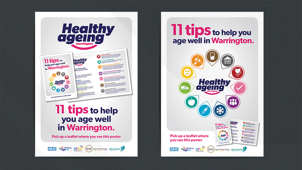
Upbeat, simple and clear, the colour palette and style of these icons give the overall health campaign brand a very positive and energising feel that contributed to its high rates of success.
Looking for help with your project?
Feel free to give us a call to start a conversation,
our doors are always open.
Related projects

AstraZeneca
Global employee referral campaign

H&T Presspart
Branding strategy & development

Scouts
Volunteer recruitment campaign
