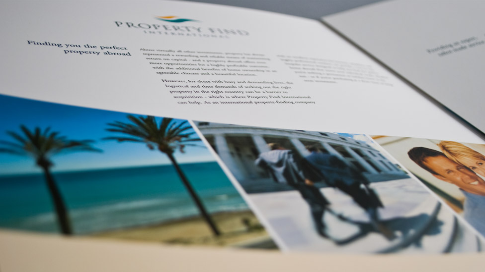
This international property brochure delivers a look which inspires trust, reassurance and credibility.
Background
As a start-up company, Property Find International needed to get themselves noticed and transmit a sense of being a much bigger operation than they were.
Challenge
The first requirement was to create a new brand for the company, which would help them give the impression of a much larger operation. It was also vital for a business dealing with significant customer investment that the brochure delivered a look which inspired trust, reassurance and credibility.
Solution
We designed a new sophisticated logo, comprising of a classical serif typeface and elegant graphic evocative of a stylised waving flag. The new logo then inspired the shape of the graphic running through the international property brochure design, with a strong sweeping band housing carefully selected photography, aimed at both business and leisure property investors.
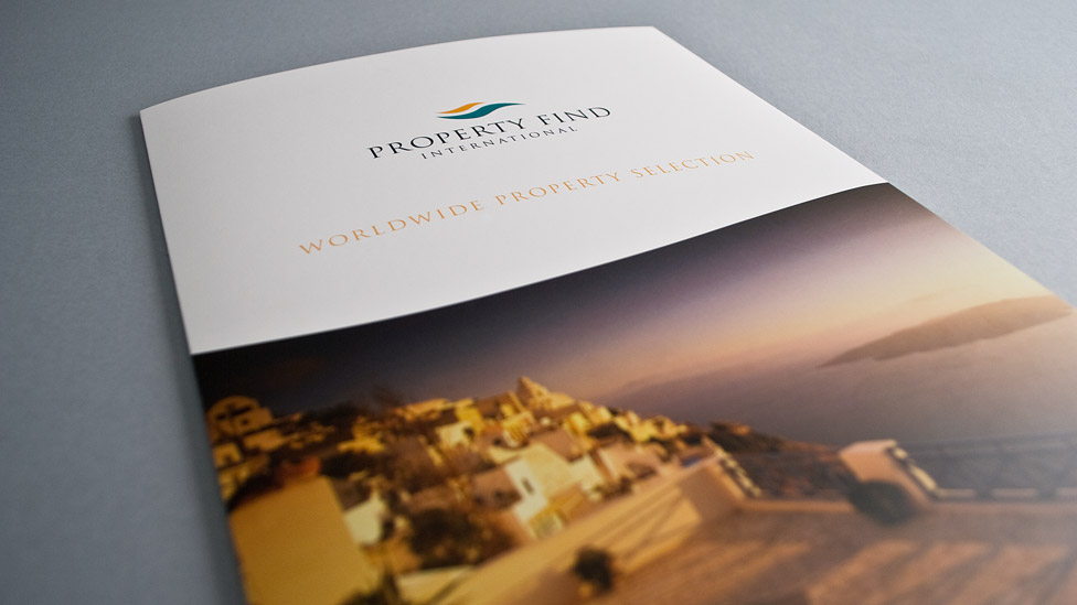
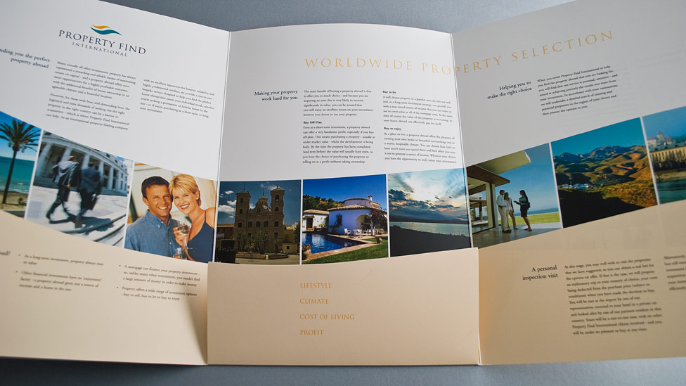
Picking up on the corporate colours from the new logo, we then designed the brochure with a clean professional, and yet warm and approachable look. Crisp, well laid out typography completed the look. To allow the international property brochure to be as flexible as possible, we kept copy fairly generic.
We also designed a fold-out pocket where more specific property detail sheets, itineraries or contracts could be inserted. The brochure was printed onto a crisp white silk stock and finished with a matt laminate, giving it a premium feel.
A phone call to our client from a competitor company with over 100 staff proved the success the brochure helped achieve: having received one of Property Find International’s brochures, the competitor expressed a strong desire to do business with them, but feared that Property Find International were probably too big for them and wouldn’t be interested.
Looking for help with your project?
Feel free to give us a call to start a conversation,
our doors are always open.
Related projects
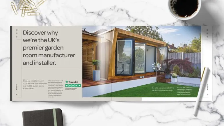
Green Retreats Group
Sales and marketing brochure design
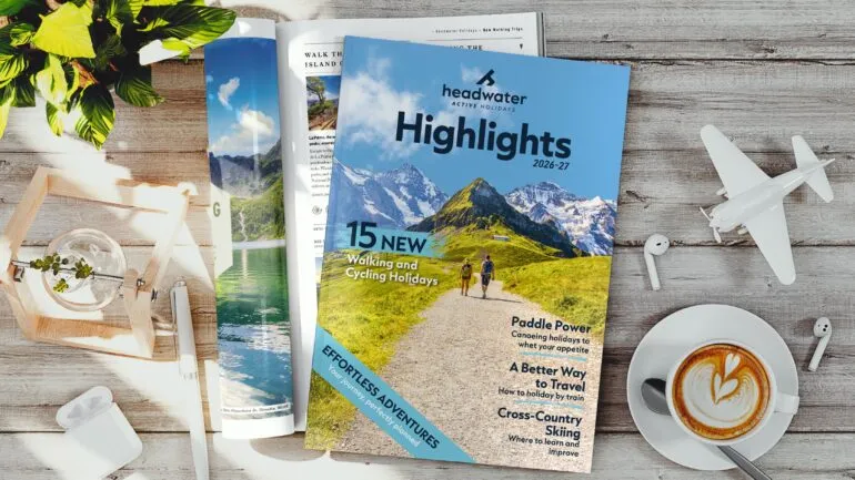
Headwater Holidays
Travel brochure production
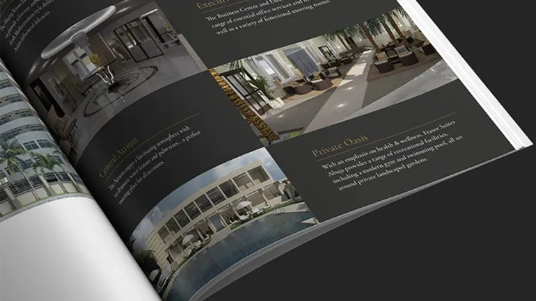
Royal Pacific Group
Property brochure
