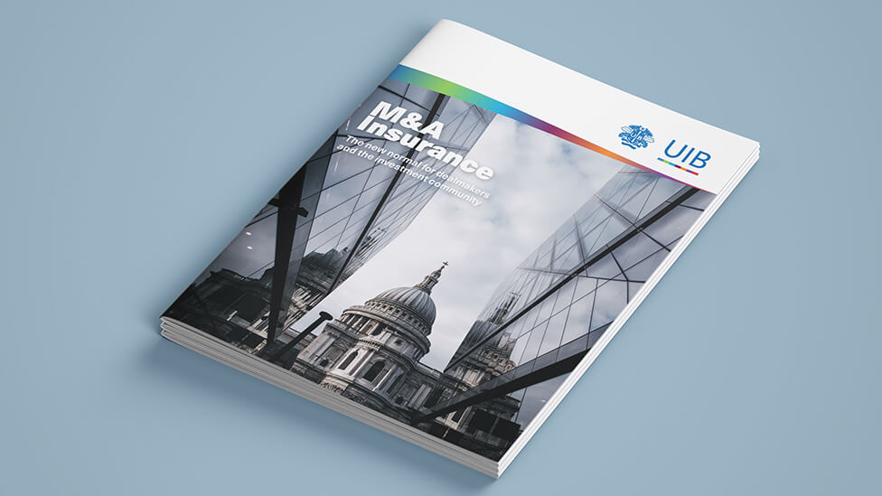
This marketing brochure and translation project presents a traditional brokerage firm as a company that very much looks forward.
Background
A leading Lloyd’s broker established in 1987, United Insurance Brokers (UIB) is the largest operating company by revenue in the UIB Group, the world’s 7th largest reinsurance broker. Working with insurance markets across the world, the company’s team of specialists provide a culturally sensitive, personal service to customers distributed across 14 countries.
Challenge
With pressure mounting in the increasingly competitive Mergers and Acquisitions (M&A) market and with transactions often impacted by cross-border complexities, our brief for this marketing brochure and translation project was to present a traditional brokerage firm as a company that very much looks forward, while being proud of its history and experience. Always following the existing brand guidelines provided by our client, the marketing brochure needed to act as an effective and engaging information piece that felt new, fresh and dynamic, and that would allow prospective clients to absorb the information quickly.
Solution
With the nature of Mergers and Acquisitions transactions front of mind, our brochure design maximises the concepts of scale and impact in headings and photography.
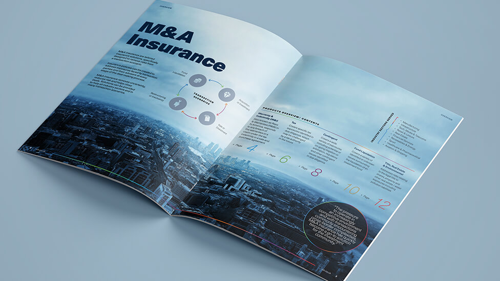
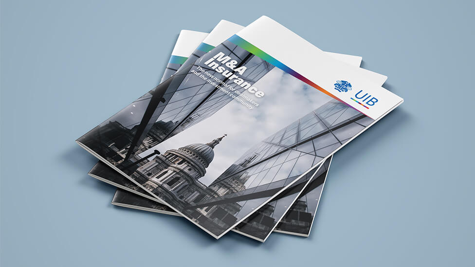
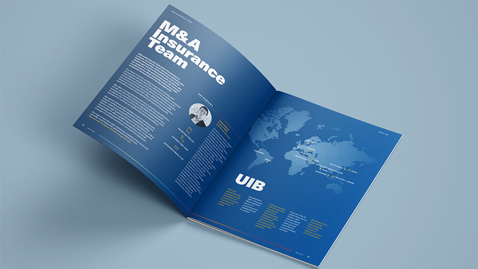
The simple yet effective structure and a colour coding approach for the different sections help the busy target audience take in the information quickly. A diagonal that slashes through images and text adds a sense of pace to the narrative and inspires the audience to not lose momentum, while also presenting our client as a dynamic organisation.
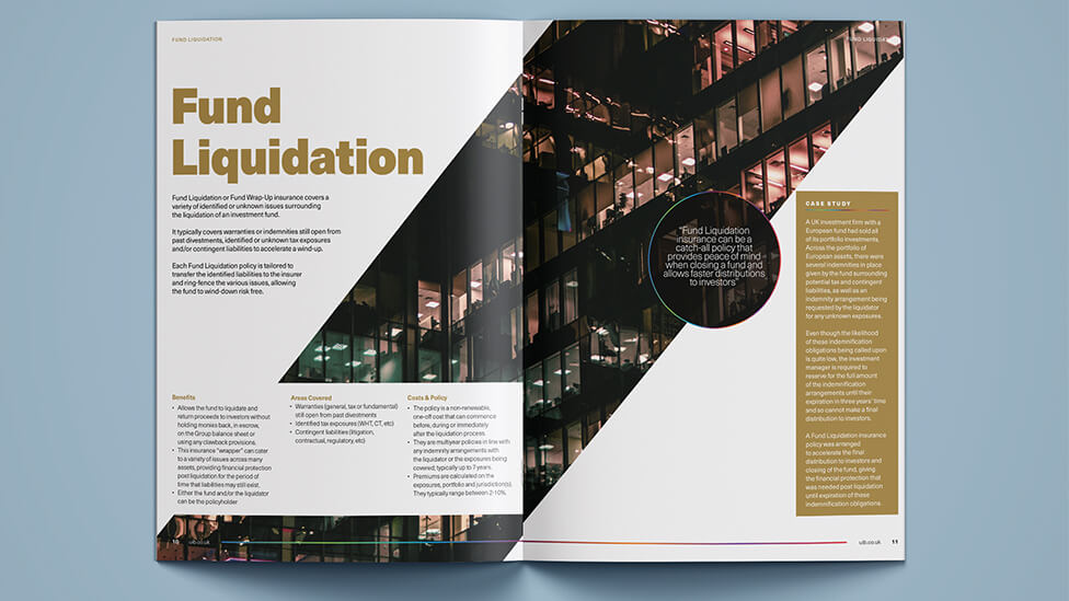
Roundels dotted around the pages help highlight snippets of information or testimonials that speak directly to the audience. People photography plays an important role in the marketing brochure, helping humanise the M&A process, although we were careful to use silhouettes so that the reader’s focus remains on our client’s story and expertise.
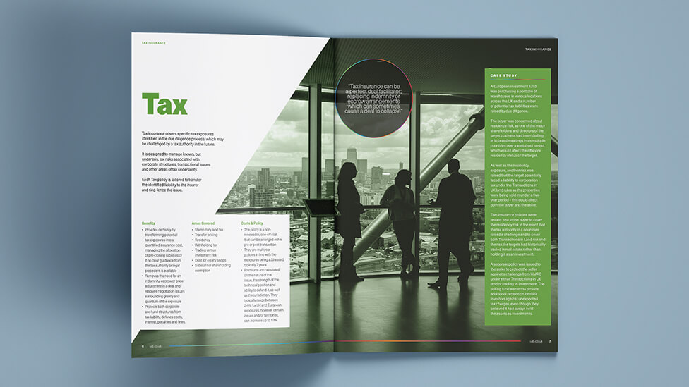
Inspired by elements of UIB’s corporate identity, we created a gradient colour bar that sits at the bottom of every double page spread, subtly transmitting the idea of progress.
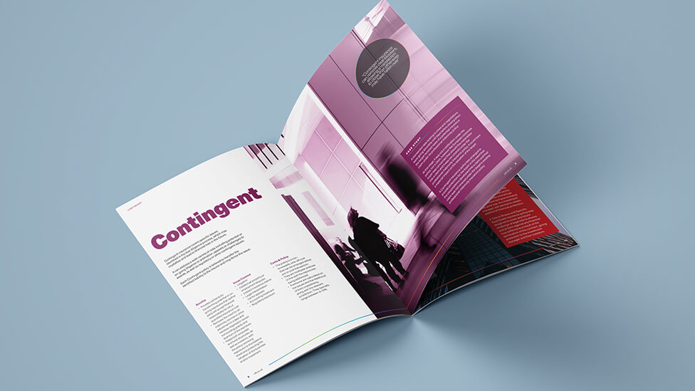
As well as the UK English version of the brochure, we also produced a localised version for the Japanese market.
Looking for help with your project?
Feel free to give us a call to start a conversation,
our doors are always open.
Related projects
Green Retreats Group
Sales and marketing brochure design
Headwater Holidays
Travel brochure production
DAI
Brochure design and translation
