We developed an engaging medical brochure design that visually expands Alere’s new brand, presenting its products and services in a clear and streamlined format.
Background
As a leader in medical diagnostics equipment, but with a new name, our client needed a medical brochure design with a fresh, modern look. It had to showcase their expertise and innovation while strengthening their brand identity. The design also needed to appeal to both existing and potential customers.
Challenge
After rebranding and introducing their new name and logo, Alere UK approached us to create a medical communications piece that fully captured their new brand.
Solution
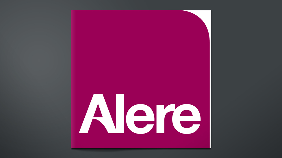
We drew our inspiration for the cover design directly from Alere’s new logo, ensuring a strong visual connection to the refreshed brand identity. This approach not only reinforced brand recognition but also allowed us to explore a distinctive square format for the medical brochure design. The unique shape made the brochure stand out from traditional materials. It was instantly recognisable, visually appealing, and aligned with Alere’s evolving brand image.
We took this approach further by including an innovative die-cut feature on the cover, carefully following the curve of the Alere logo. This design choice added a layer of depth and sophistication, creating a tactile experience that made the brochure feel more premium and memorable.
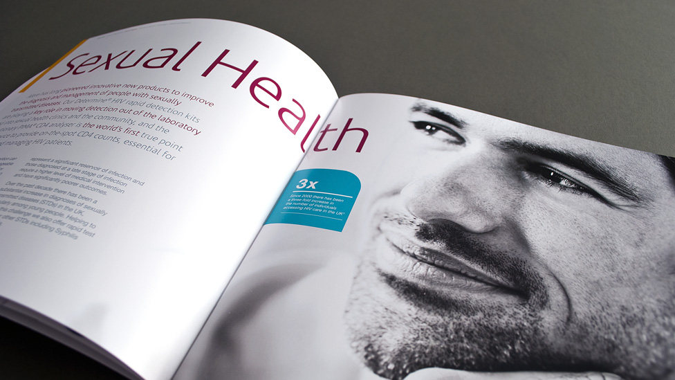
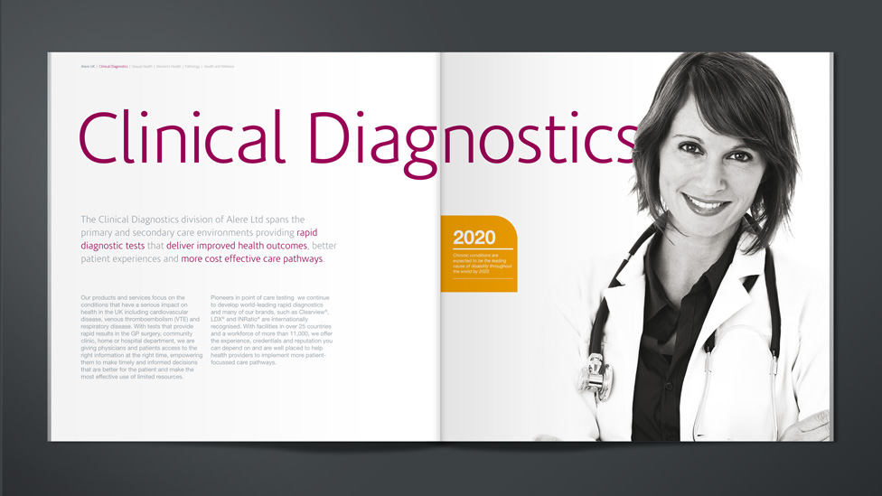
The inside brochure spreads present a carefully curated blend of black and white photography paired with subtle colour panels derived from the Alere brand palette. The contrast between the bold imagery and the soft colour accents creates a visually engaging layout that balances impact and clarity. The monochrome photography adds a sense of sophistication and professionalism, while the carefully placed colour panels provide a cohesive brand presence without overpowering the content.
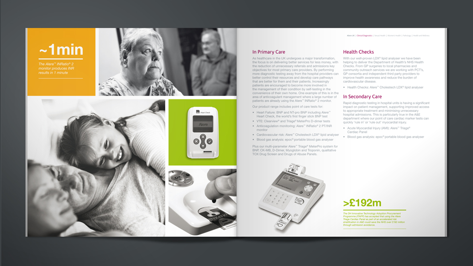
The layouts maintain a strong clinical feel, ensuring they resonate with the target audience while still retaining an approachable editorial style, reflecting both the market sector Alere work in and the culture of the company.
The design strikes a careful balance, incorporating clean lines, structured content and precise typography to reflect the scientific and medical expertise behind Alere’s work.
“We find it tremendously efficient working with the team at Parker Design. Having direct access to their friendly team of designers means that we can maximise our marketing spend. Not only that, they excel in the creative stakes and consistently deliver a first class service that we’ve come to rely on, sometimes against very tight deadlines”.
Looking for help with your project?
Feel free to give us a call to start a conversation,
our doors are always open.
Related projects

Coveris
Product brochure design

AstraZeneca
Science brochure design

Global Finance Function
Change management animation
