LEO Pharma
Pharmaceutical stand design
With limited space to play with, both in terms of plot size and access to it, we based this pharmaceutical stand design around layout and structure, and created a space that felt light and airy with a journey that delegates could easily follow.
SPIN (Skin Inflammation & Psoriasis International Network) was launched back in 2004 as PIN (Psoriasis International Network) by the Fondation René Touraine, a non-governmental, non-profit organisation that fosters international collaborations to support therapeutic progress in dermatology. Every year, the Network celebrates its congress in Paris.
“Thank you again Parker Design for turning a challenging space into a magnet for delegates at the congress. You have successfully combined the strictest pharma regulations with engaging design that really showcases our brands and what we strive to do every day for patients.”
Translating the new brand
While working with our client on another pharmaceutical stand design for the World Congress of Dermatology (WCD) in Milan, LEO asked us to also collaborate with them as they were planning to attend the SPIN Congress in Paris. Our brief was to visually translate, in synergy with what we were producing for WCD, the new LEO brand into an exhibition stand that would attract visitors to find out more about a medication to treat severe psoriasis.
We were faced with a number of issues:
- A small plot.
- A low ceiling, with a maximum height of 2 metres allowed for the stand.
- The basement location of the exhibition hall, secondary in importance to the various symposia taking place as part of the congress, and therefore only visited by delegates during breaks between keynotes.
- Very restricted access for the installation crew, via a small goods lift.
- 1-day build, with no option for construction or any finishing touches on day 1 of the show.
Design based around layout and structure
With limited space to play with, both in terms of size of the plot and access to it, we based the pharmaceutical stand design around layout and structure, and created a space that felt light and airy with a journey that delegates could easily follow.
Although this was a totally bespoke design, some of the elements were built in modules to facilitate access to the basement floor and also assembly in the small space allocated, including the interlocking jigsaw flooring, which was slotted together on site.
One plot, five distinct areas
Divide and conquer
We split the plot into 5 distinct areas:
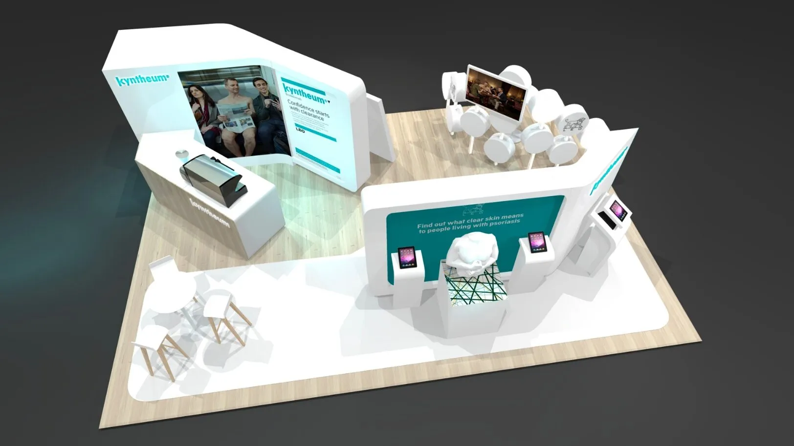
- Coffee area positioned by the main entrance aisle, including a store room for coffee supplies and sales collateral.
- Scientific area featuring interactivity elements visible from the coffee bar; contrasting floor coverings contribute to the delegate flow. Behind this area, we included wall-affixed pockets to hold printed collateral.
- Two areas dedicated to showcase the science behind the product, its MoA (Mode of Action).
- Medical information area, private and independent from the rest of the stand to comply with regulations.
A magnet for delegates
We built the coffee area by the main entrance aisle to be the main draw at the front of stand. With the brand being featured prominently on the coffee bar, the inviting aromas of freshly-brewed coffee and the clean and uncomplicated Scandinavian design style pulled delegates in straight away.
Interactivity, immersion, emotional connection
One of the main attractions of the pharmaceutical stand design was an interactive piece in the scientific area. In the shape of a torso flanked by two iPads, the sculpture had been programmed with Augmented Reality software. Using the iPads, delegates could superimpose images onto the torso, bringing it to life and immersing themselves in the experience of a psoriasis-suffering swimmer, which added an immediate emotional connection.
To counteract the poor lighting conditions of the basement location, we included a series of lightboxes in the stand design.
Next to the area featuring the torso, we placed another plinth and another iPad, also pre-programmed with AR software to add another layer of interactivity to the stand. This feature allowed delegates to scan their own hand and project a live 3D model of it affected by psoriasis, even allowing them to alter the severity of the condition via a scale on the iPad’s touchscreen.
Despite delegates having to step off and back on to access this independent area, the structure feels open and welcoming, thanks to a fluid wall of circular structures that generates curiosity and entices delegates to approach. Curved shapes that echo the LEO brand, soft edges and warm lighting help make the stand rise above others in the hall.
A perfect finish
Each individual element of the pharmaceutical stand design was spray-finished in the workshop to the highest standards, to then be reassembled in the exhibition hall ready for the start of the show.
30 years of expertise in
pharmaceutical stand design
We’re confident we can help, so why not drop us a message? We’d love to hear from you.
Take a look at other exhibition design projects

Sage
Exhibition stand design and build
H&T Presspart
Bespoke exhibition stand
LEO Pharma
Pharma trade show stand
