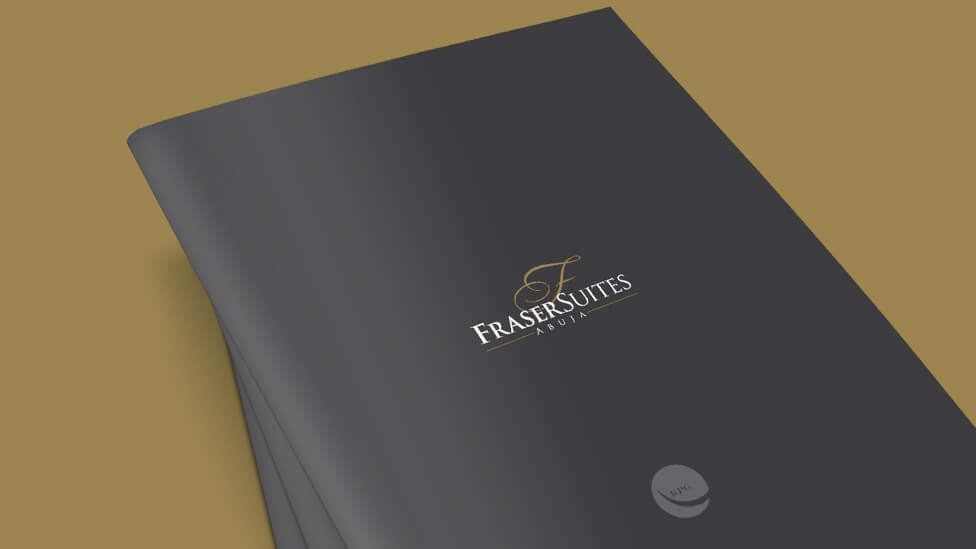
A property brochure design that conveys the idea of exclusivity and craftsmanship, immediately creating a connection with investors.
Background
Royal Pacific Group is an investment and development company focused mainly on the high-growth property market of Nigeria. Our client, in partnership with Frasers Hospitality – global leader in prestige serviced residences and boutique lifestyle hotels – asked us to produce a brochure design that would help them attract investment to Fraser Suites Abuja, the first venture in Africa for Fraser Suites.
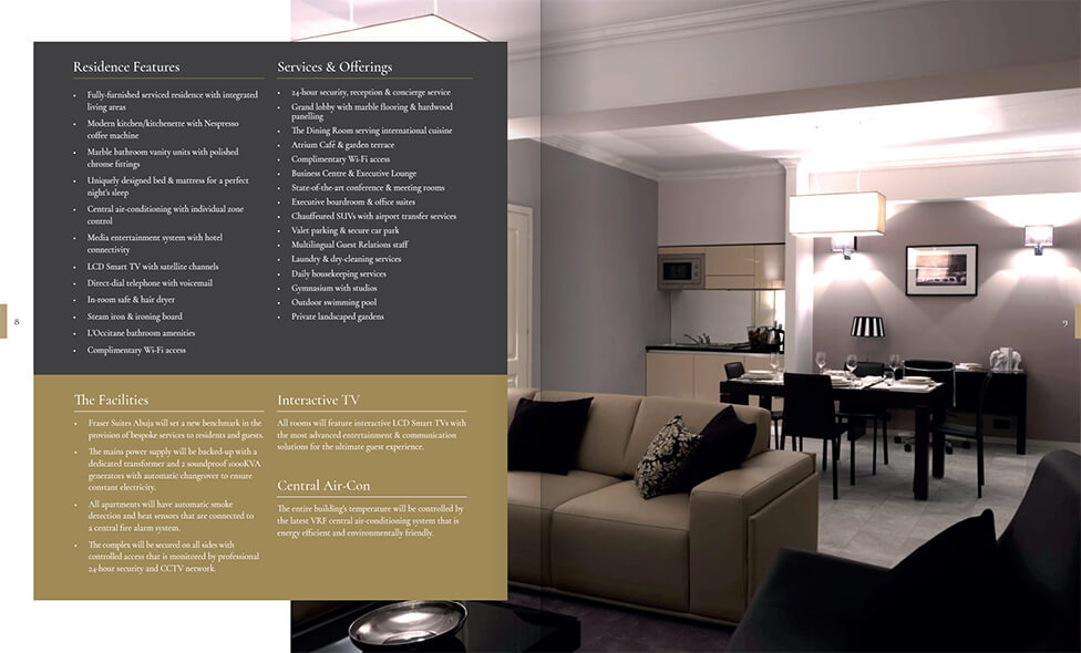
The development, located in the heart of the modern Federal Capital of Nigeria, features 126 Gold-Standard residences that seamlessly combine style and technology with state-of-the-art facilities and exclusive in-house services.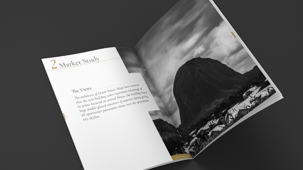
Challenge
The brochure needed to serve as a tool to help our client attract investors and a savvy target audience of – amongst others – international businesspeople, embassy diplomats and wealthy individuals.
Solution
The property brochure design we created immediately establishes a connection with the target audience by conveying the idea of exclusivity and craftsmanship.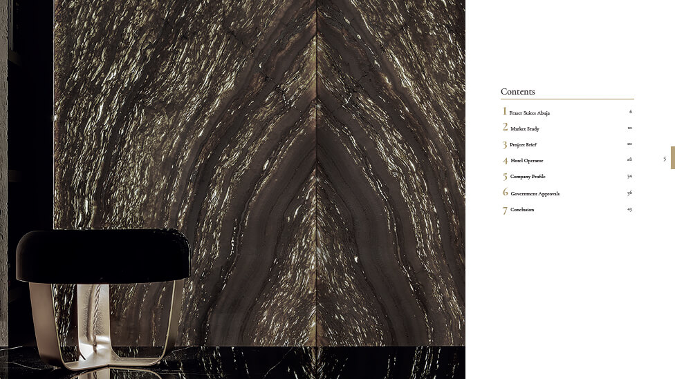
We applied the same attention to detail as our client does to their luxury properties, and we matched font colours to the colour scheme of the residences. 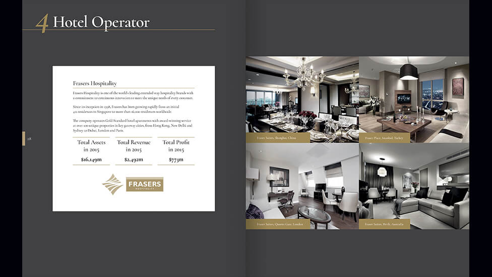
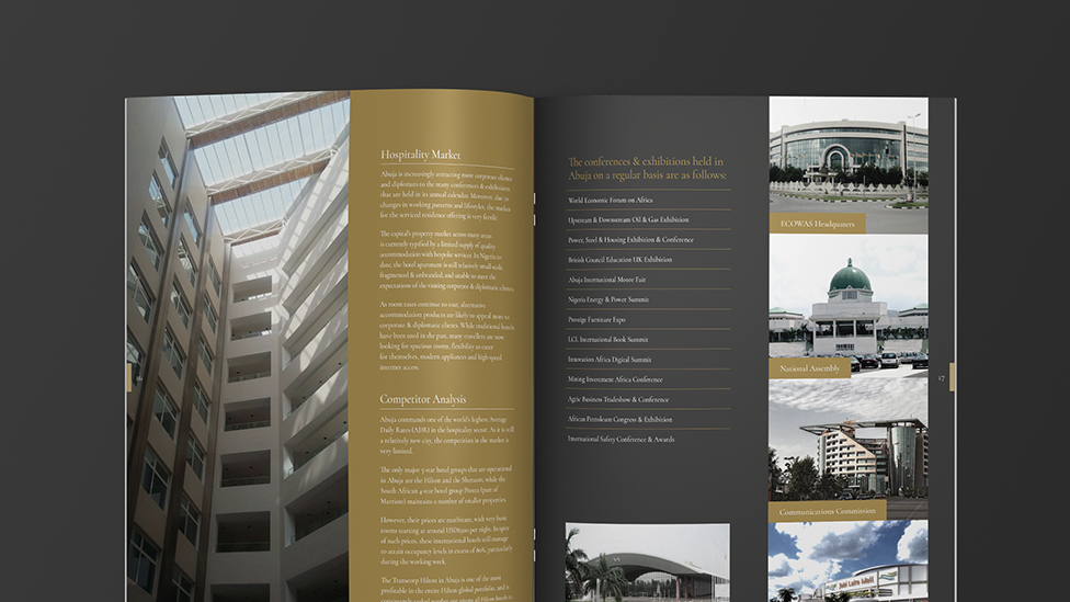
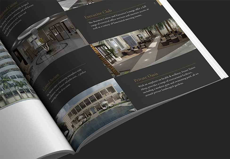
The brochure design is full of detailed and striking imagery, which came from a variety of sources, including some suggested by our creative team. Applying the same colour treatment to all the images gives the brochure consistency and adds elegance.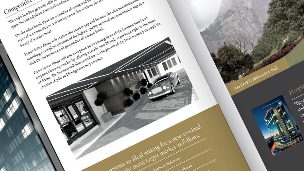
We distilled 60 pages of information – supplied by our client in PowerPoint – and worked closely with them to determine the most effective way to present the content. We also suggested some changes to the copy to maximise impact and return.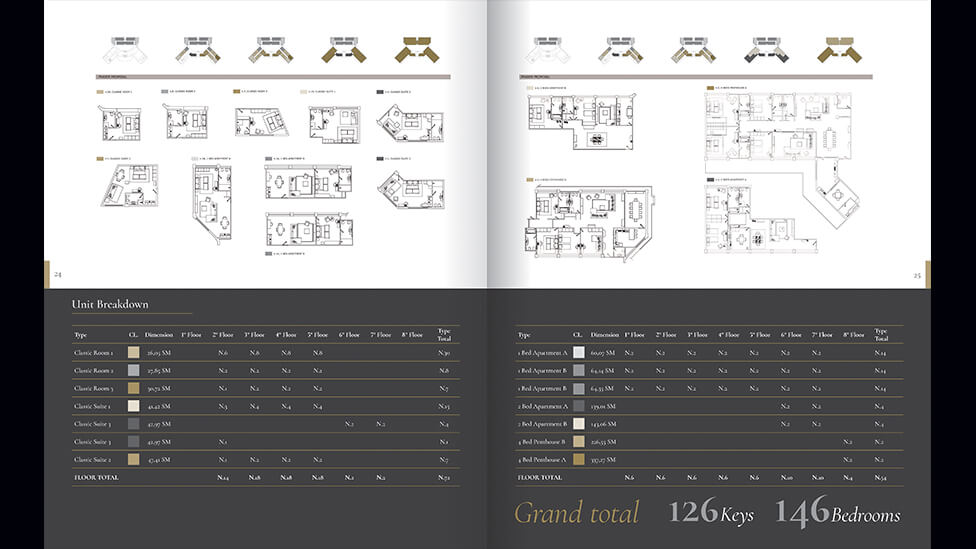
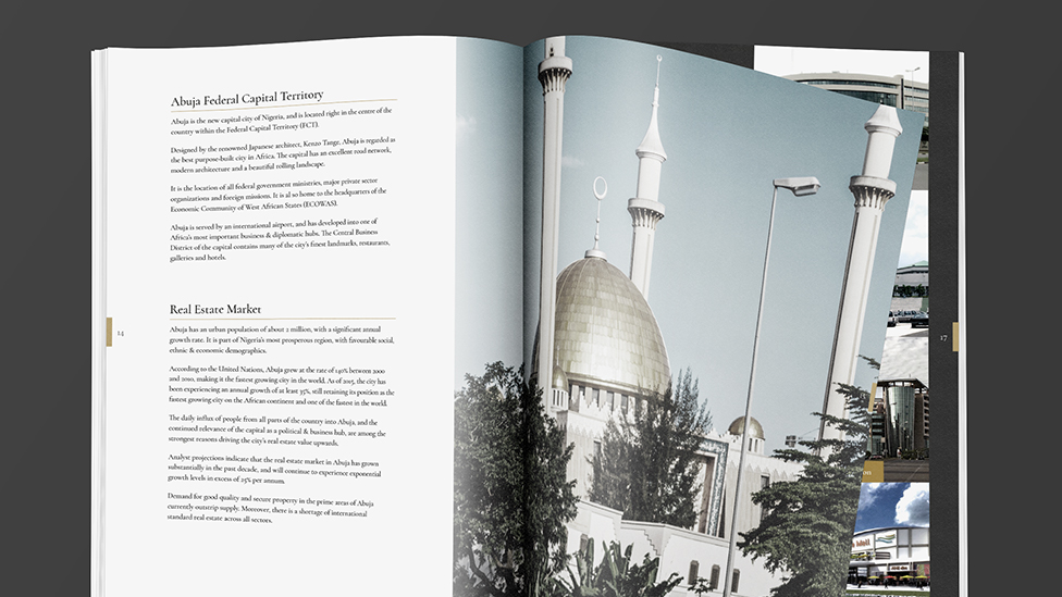
The finish of the brochure mirrors the premium feel of the property’s exquisite furnishings. We used matt laminate, two foils and spot varnish on the cover to give the design a premium look and feel, whetting the audience’s appetite and inviting them to find out more.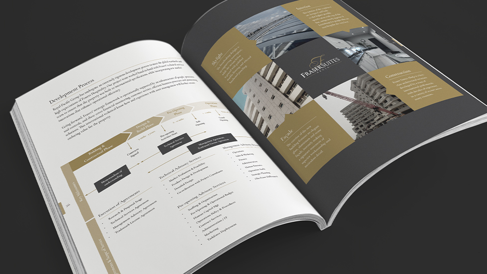
We edited floor plans to make them gel with the rest of the brochure.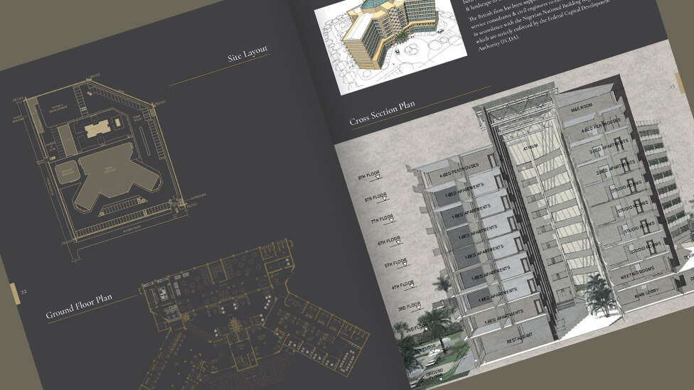
Applying an infographic style to key stats helps present the information in an engaging way, as well contributing to the contemporary look and feel of the marketing brochure.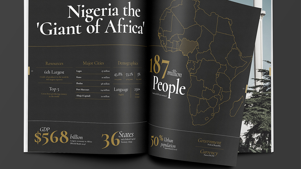
Looking for help with your project?
Feel free to give us a call to start a conversation,
our doors are always open.
Related projects
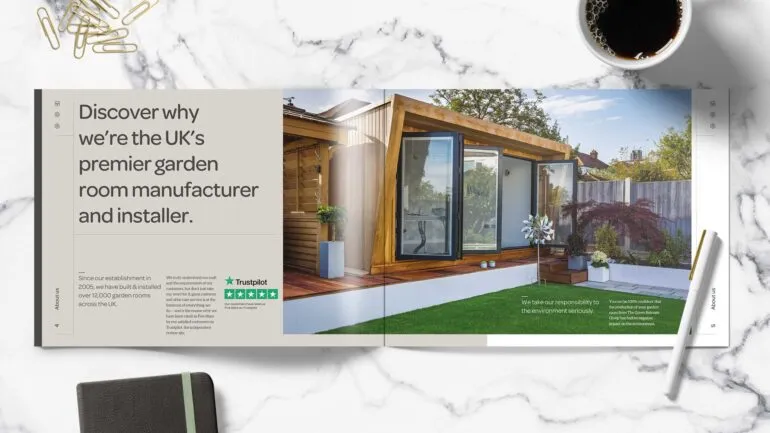
Green Retreats Group
Sales and marketing brochure design
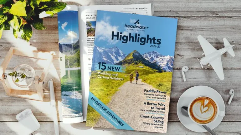
Headwater Holidays
Travel brochure production
Meller Braggins
Property sales brochure
