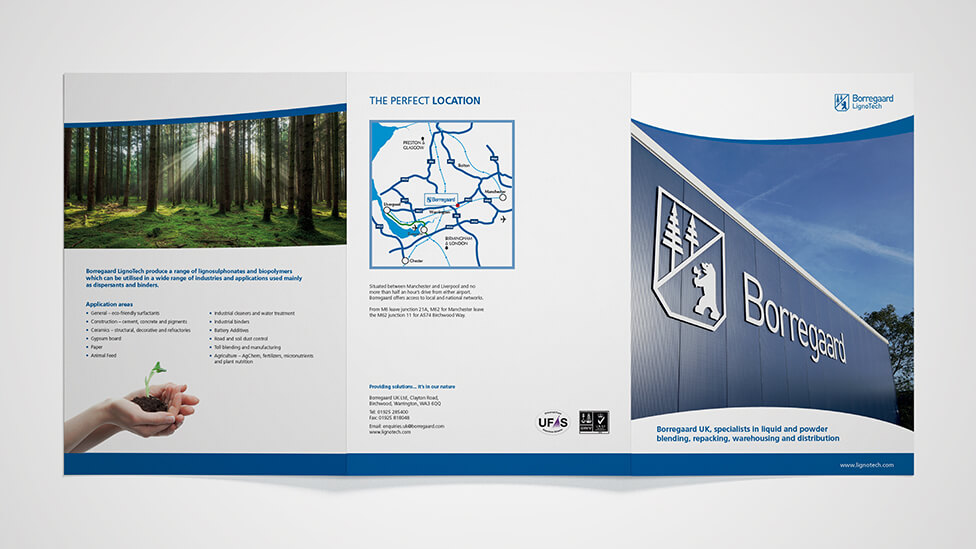
Thanks to a combination of powerful photography and clean and contemporary design we brought Borregaard’s sales collateral up to date, helping them increase brand awareness at a major industry exhibition.
Background
Borregaard is an award-winning biorefinery committed to providing sustainable solutions to a wide range of industries. With offices and research centres in 16 countries throughout Europe, Americas, Asia and Africa, and strong links with universities and research institutions worldwide, the company aims to demonstrate their commitment to social responsibility in everything they do.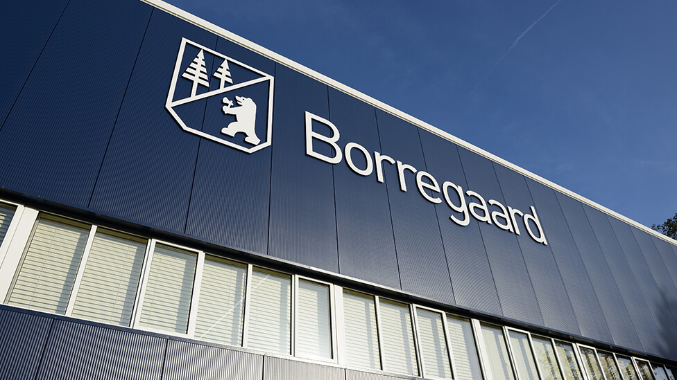
Challenge
In preparation for an upcoming industry exhibition, the client needed a fresh sales collateral design that would help them promote their services and what they stand for as a responsible business. Borregaard’s existing collateral lacked consistency in style, so the client asked us to create a new design that would work effectively across all formats. The new materials would help present the client as an industry leader committed to sustainability and innovation, aiming to attract visitors to the exhibition stand and sales enquiries.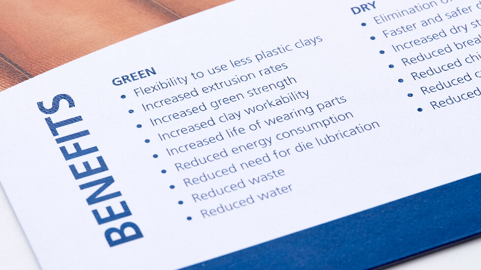
Solution
We approached the design in a way that would showcase Borregaard’s operations – and the people behind them – through the use of powerful images, contemporary design, stylish typography and a clean layout that allows the information to flow.
Instead of using stock photography, we recommended, organised and directed a photoshoot for the client. This helped Borregaard maximise their investment by providing a fully-owned image library they would be able to take advantage of for years to come. It also helped the client communicate its ethos more directly and effectively to the audience.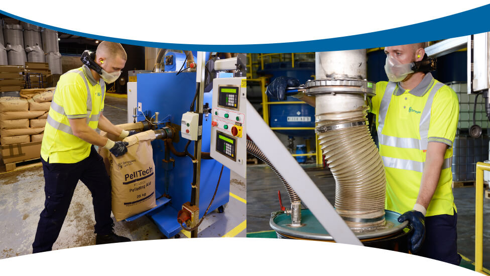
Powerful shots of company vehicles against a clear blue sky background, and photos of staff at work handling equipment all help present the client as a company committed to a sustainable future thanks to their innovation and research efforts.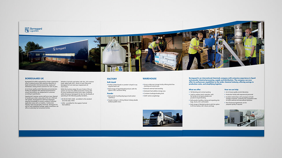
The design was applied to a variety of collateral, including sales folders and pull-up banners. The sales folder includes a convenient pocket for different inserts, such as data sheets, maximising the client’s investment as it allows sales teams to tailor content in line with business requirements. Pull-up banners also helped the client realise significant cost savings as they’re easily portable and simple to put up and take down, allowing our client to repurpose them for a variety of exhibitions.
Highlights
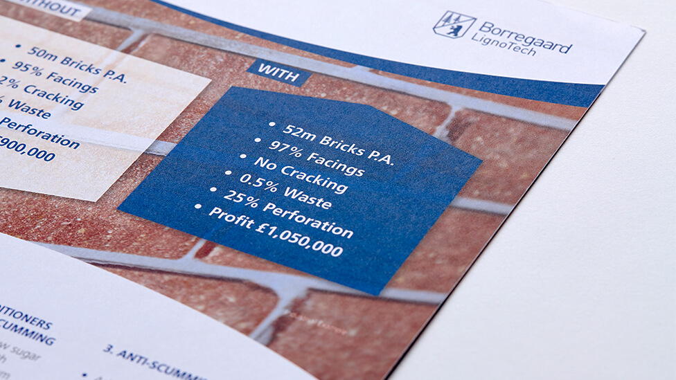
- Graphical elements add interest to the way detailed product specifications are presented.
- We chose highly durable stock to increase the lifespan and quality of the sales folder.
Looking for help with your project?
Feel free to give us a call to start a conversation,
our doors are always open.
Related projects
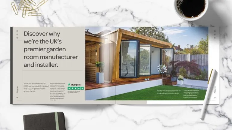
Green Retreats Group
Sales and marketing brochure design
Eurocentres
Course prospectus design
Imperial College London
Programme prospectus design
