A striking school prospectus design that successfully communicates the institution’s mission and aspirational values.
Background
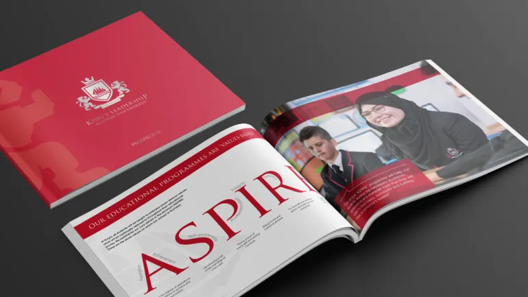
Following on from the branding we had developed for King’s Leadership Academy, the free independent school needed a prospectus design to communicate its values and what it stands for.
Challenge
As well as initiating and responding to interest in the academy, the prospectus needed to provide an overview of the school’s values and mission, and answer the many questions parents and children may have. Ultimately, the purpose of the prospectus was to generate an incremental number of enrolment applications.
Solution
The school prospectus design provided the perfect opportunity to develop and build a strong brand for the school, inspired by the new logo.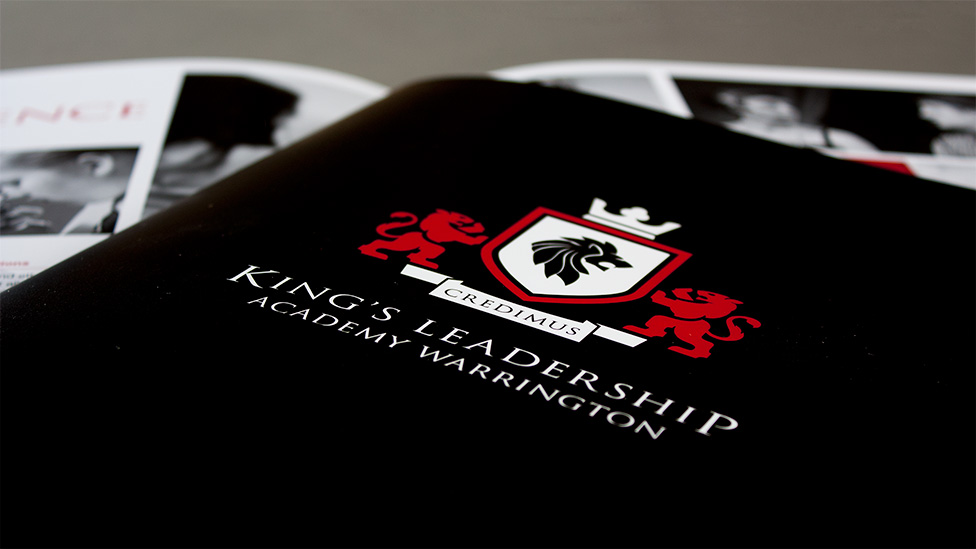
King’s Leadership Academy focuses daily operations and educational approach on values born from the word ‘aspire’. These values – Aspiration and Achievement, Self-awareness, Professionalism, Integrity, Respect and Endeavour – are reflected in everything the academy does, and so it was our job to portray this culture through design.
To begin the process we organised a session to discuss what each of the values meant, and came up with design ideas that would help get them across to the audience: red blocks help convey the aspiration and endeavour values, whereas black and white imagery communicates the concepts of professionalism, integrity and respect.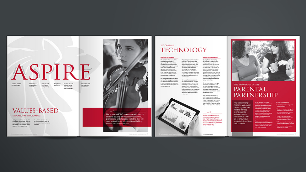
The prospectus had to be completed before the academy took its first intake of students, so we weren’t able to photograph real students. To get around this, we selected a range of royalty-free stock images to communicate the school’s personality, enhancing them by retouching in the school crest.
Parker Design is the “Challenge Anneka” agency –
ask for the impossible and they turn it into reality.
To add gravitas and integrity, we commissioned a professional photography shoot of the school’s founder and principal. The portraits add a personal touch alongside the introductory messages and immediately establish a connection with the reader.
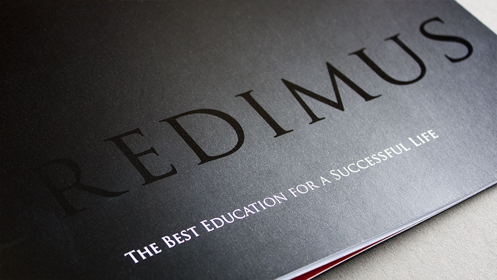
As well as creating the school prospectus design we also managed the print production. The management team wanted a high-impact finish for optimal first impressions, so we suggested an anti-scuff matt laminate on a jet black cover. This was enhanced by a spot-uv lamination of the word ‘Credimus’ (‘We believe’ in Latin) which is the school motto and is echoed in the logo itself. Using a high quality digital print process, we were able to supply quality and cost-effectiveness within very tight timescales.
Looking for help with your project?
Feel free to give us a call to start a conversation,
our doors are always open.
Related projects

University of Manchester
University prospectus design
King’s Leadership Academy
School prospectus

Eurocentres
Course prospectus design
