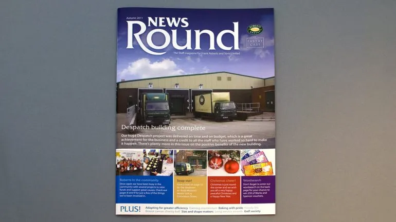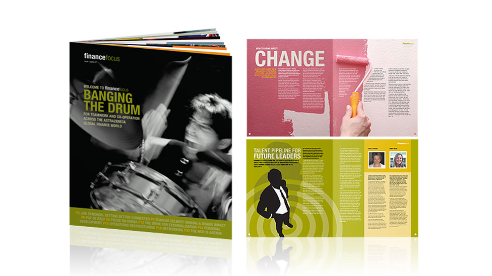
“What do we want it to feel like?” – A question that helped us answer this brief with a strong staff newsletter that changes perceptions.
Background
Striking and memorable design is often a key factor when trying to change perceptions. And that’s what this internal newsletter design helped achieve by turning the efforts of a team into cover headlines.
Challenge
To deliver a finance newsletter that would feel and look different, and challenge people’s expectations of a traditional newsletter design for this sector.
Solution
We asked ourselves one question – “What do we want it to feel like?”, instead of a more traditional approach of diving straight into designing the page layouts.
Focusing our thinking on less is more, we opted for a bespoke size smaller than A4, giving the newsletter a unique and very distinctive appearance.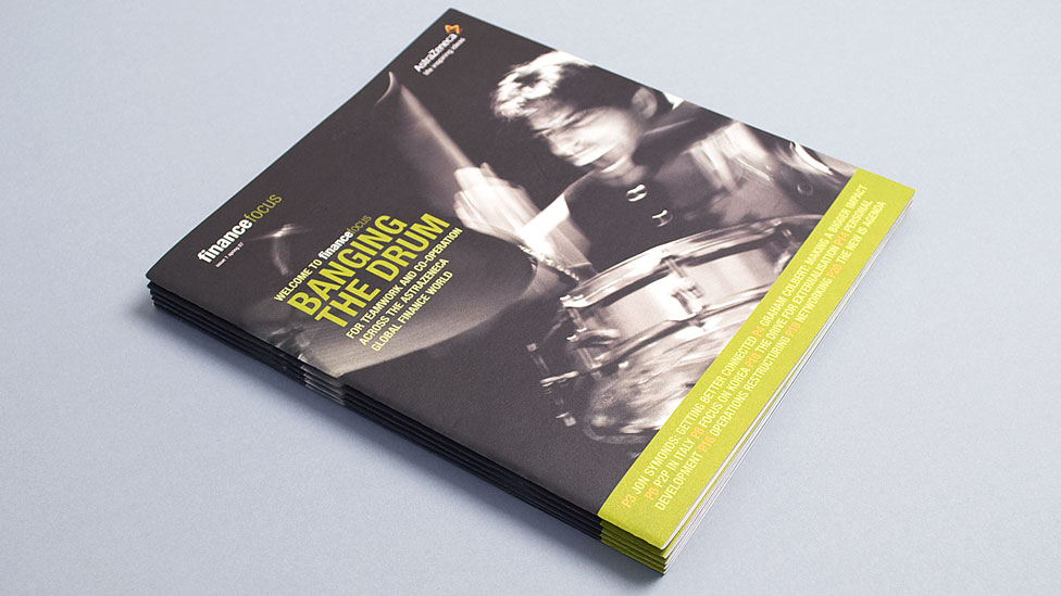
Inside, we treated most articles as feature spreads and designed them with bold, contemporary typography, strong use of colour and evocative imagery that bring the content to life.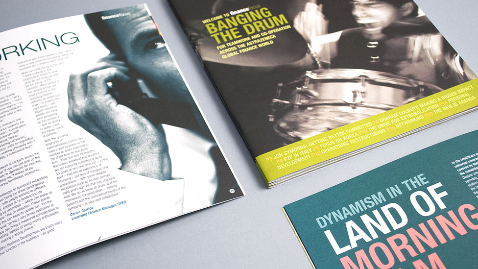
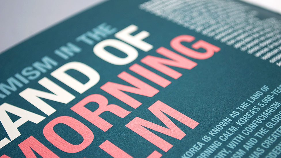
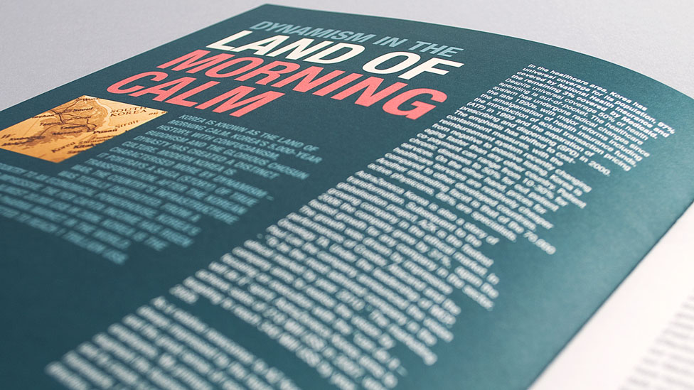
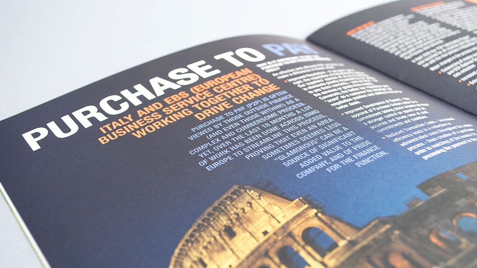
Using a mixture of photography and illustration throughout the staff newsletter, we created a truly appealing piece of internal communications that maximised engagement.
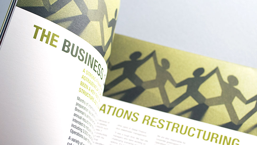
An uncoated cartridge-style paper helped us achieve a strongly tactile feel, making the staff newsletter even more memorable by appealing to the senses.
“Working with Parker Design is a real pleasure. Nothing’s too much trouble and ‘going the extra mile’ is part of the service.
They’re pro-active, provide creative solutions, and do whatever’s needed to meet tight deadlines and work within the agreed budget, to produce a quality product.
I’d recommend Parker Design to anyone.”
Looking for help with your project?
Feel free to give us a call to start a conversation,
our doors are always open.
Related projects
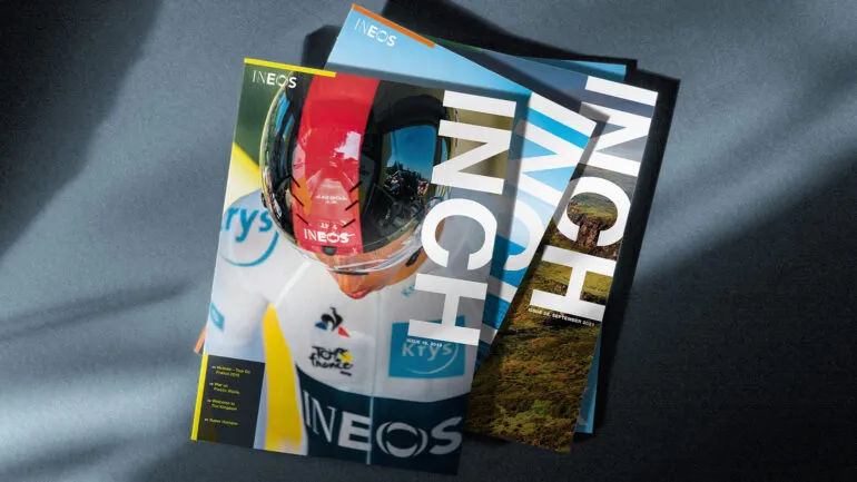
INEOS
Company magazine design
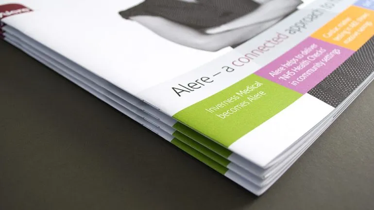
Alere
Newsletter design
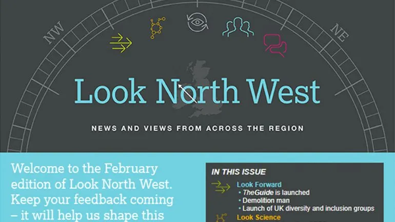
AstraZeneca
Email newsletter design
