A self-catering holiday brochure design that speaks directly to audiences, through fresh and vibrant colour tones, relaxed font styles and stunning photography.
Background
Keycamp, one of the leading self-catering holiday providers in the country, offers the biggest choice of outdoor holiday options across Europe.
Challenge
Despite a successful online presence, our client wanted to offer a printed self-catering holiday brochure design that would provide their customers with a tangible piece of literature they could relax with, read and note their ideas on as they explore the possibilities of their next holiday.
Solution
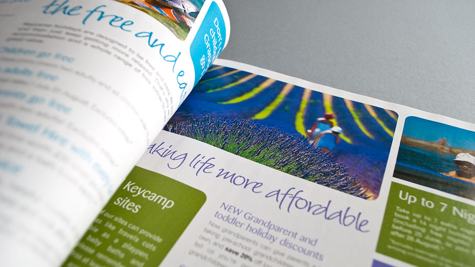
A script-like font for the headings speaks directly to the audience and nods at the personal, customised, informal and fun nature of a self-catering holiday. Prominent text boxes help structure content, making it easier for the reader to zoom in on important details of the activities on offer. Colour tones not only also help with structure, but they reflect the beautiful and aspirational destination photography. Specific information on each holiday park is clearly laid out in well-designed tables, allowing readers to easily process the amount of information provided.
Over the years, we have created highly effective brochure design for a wide range of clients in the Travel industry and other sectors. Have a look here to find out more.
Looking for help with your project?
Feel free to give us a call to start a conversation,
our doors are always open.
Related projects

TruTravels
Travel brochure design

Travelopia
Holiday brochures

Exodus
Travel brochures
