University of Manchester
University prospectus design
We moved beyond traditional university prospectus design to create a highly engaging magazine-style experience aimed at ambitious students.
Competing on a national stage
The Faculty of Humanities at the University of Manchester is home to four schools:
- Alliance Manchester Business School
- School of Social Science (a unique combination of eight disciplines: Criminology, Economics, Law, Philosophy, Politics, Sociology, Social Anthropology and Social Statistics)
- School of Environment, Educations and Development (a collaboration between five interrelated specialisms)
- School of Arts, Language and Culture (teaching in nearly 20 languages and also internationally recognised in the fields of human cultures, beliefs and institutions).
With a target audience aged 18-21, and to attract the most ambitious students, our client competes with other Universities all over the country, with UCL, Leeds, Sheffield, Durham, Edinburgh, Liverpool, LSE and King’s College London amongst its competitors, to name a few.
Time to evolve
The team at the Faculty of Humanities attend recruitment fairs globally, and they had decided it was time for a refresh of their university prospectus design to continue to attract the best of the best. There was also a requirement for digital versions to hook students online.
Creating a more engaging experience
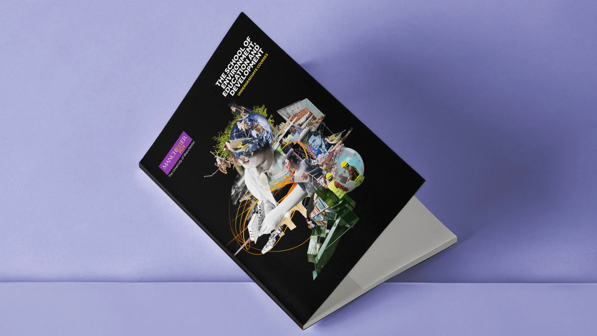
We reimagined the prospectus as a magazine-style experience rather than relying on a conventional format. We replaced predictable student photography on the covers with a distinctive illustration that captures university life from a different angle, and reflects the breadth of subjects and courses available. We commissioned established artist James Dawe to create the artwork, bringing a conceptual, contemporary and forward-looking visual style.
When we briefed James we were careful to ensure that no academic discipline within each school appeared to have more prominence than the other, that way giving the different teams at the Faculty the same level of consideration and respect.
A unique collage for each school, on a striking black background, turns the prospectus and what the University offers into an irresistible piece of communication.
The collages have been repurposed for digital and social media assets, as well as merchandise.
Inside the prospectus, we worked within our client’s brand guidelines to organise substantial course information in clear, engaging ways. Colourful double-page spreads introduce each subject before we move into detailed content through infographics, inspiring photography and Day in the Life features. We also developed sets of navigational icons and distinctive graphic shapes to structure the pages and guide readers smoothly through the content.
Visually exciting, the prospectus easily fits a lot of course information and specific entry requirements, fulfilling its purpose as an information piece.
With a wide range of courses, multiple Faculty stakeholders and a substantial volume of content to shape into an engaging university prospectus, we placed strong emphasis on project management. We scheduled regular meetings with our client and set up a shared Google Drive to organise files, streamline collaboration and maintain clear version control.
Although we didn’t manage the print stage on this occasion, we recommended suitable paper stocks and advised on the most appropriate print process.
Time for a new
university prospectus
design?
If it’s time to rethink your prospectus, we’d love to help.
Other prospectus design projects
Kingspan
CPD prospectus design
Noble Capital Group
Investment prospectus design
Imperial College London
Programme prospectus design
