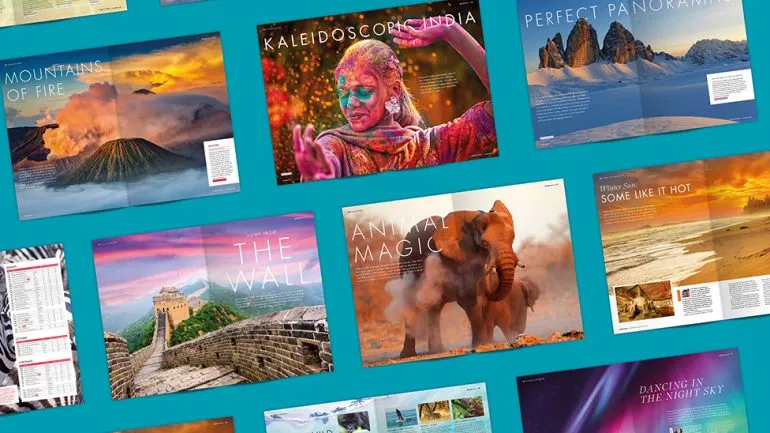
We created a stunning winter magazine design for Exodus with unique content that inspired customers and helped increase seasonal bookings.
Background
Exodus is a UK leader in adventure holiday travel. Their savvy target audience – made up of affluent, time-poor customers in their mid 40s and beyond – like to reward themselves with meaningful and unforgettable holidays. To inspire their customers to book their next holiday, Exodus needed a marketing solution that would help them by share their expertise.
Challenge
With a wide range of winter holiday destinations to choose from, Exodus’ clients liked to research, both in travel magazines and online, to find out more about new travel options. To capitalise on this, our client needed to go beyond a traditional holiday brochure and provide a more aspirational publication that positioned them as in-depth travel experts.
Solution
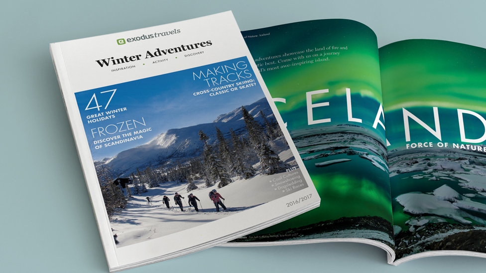
The streamlined, image-focused design presents enticing holiday ideas in an A5 format, which was a total departure from larger holiday brochures that are filled with listings and prices.
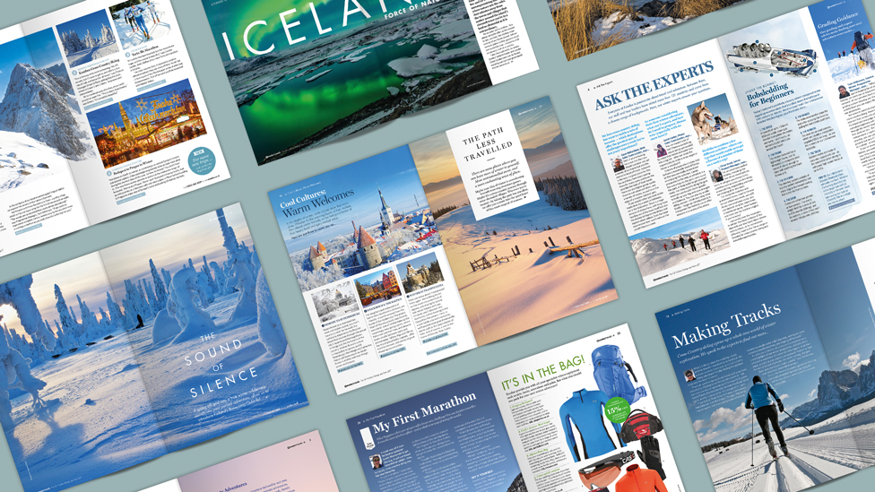
To create the content, we appointed an experienced editor who worked closely with the client’s product and marketing managers, as well as Exodus customers. From page one, it’s clear that the winter magazine design is a departure from what customers received in the past, as it is full of expert advice, unique holiday ideas and stunning photography.
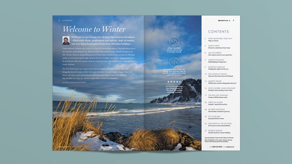
To encourage reader interest, we introduced editorial-style features, providing a more personable and authentic view of an Exodus holiday.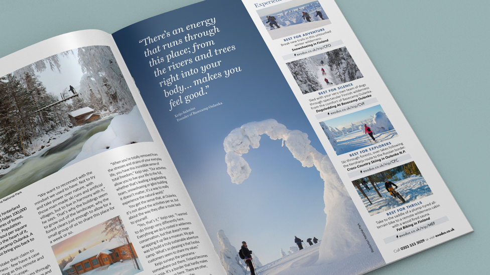
Many features included on-site interviews with professional Exodus tour leaders, and even included insight from customers who had enjoyed a similar holiday with the company in the past.
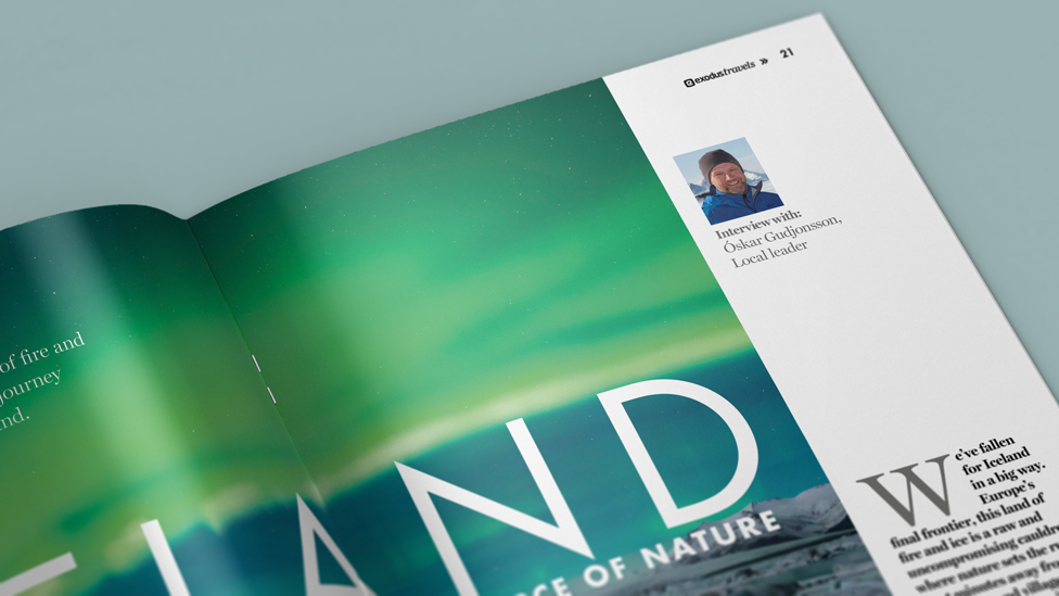
Next to the main travel features, our winter magazine design also included a variety of recommended Exodus adventures to widen out the readers options by their area of interest.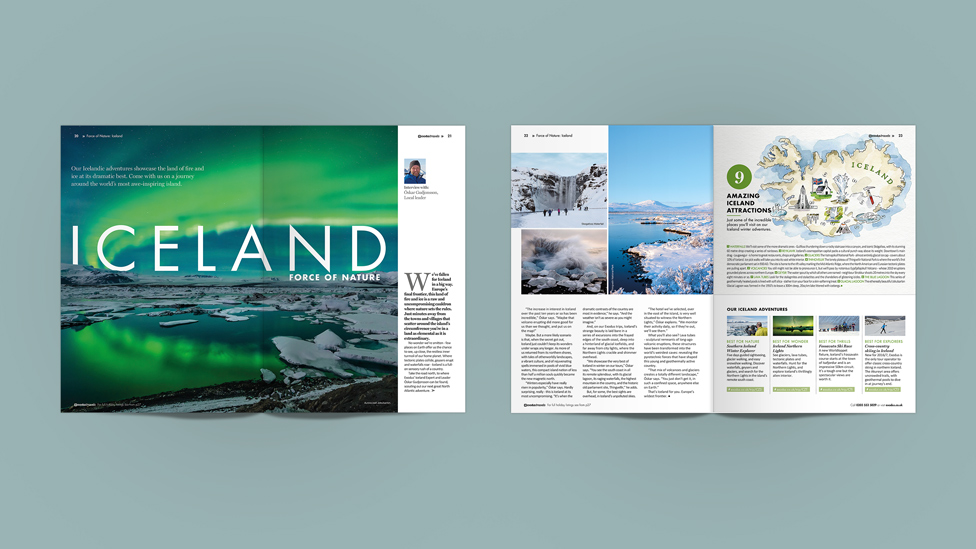
Intriguing headlines and illustrations further contribute to the magazine’s more sophisticated look and feel.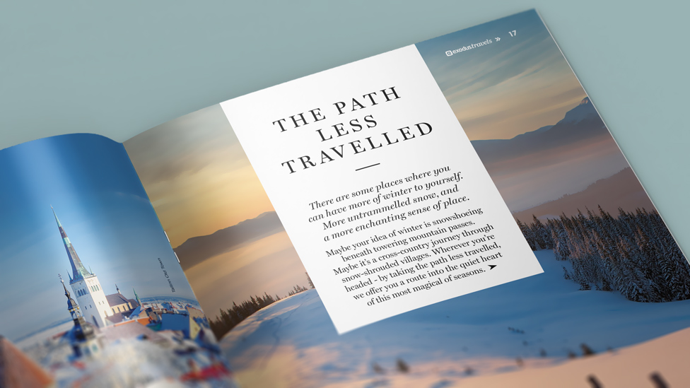
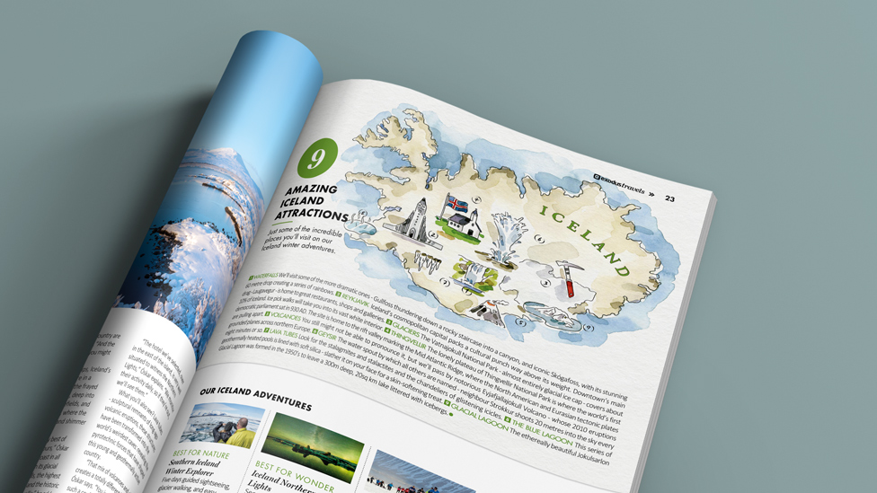
The flow of the magazine was developed by our editor to guarantee the best user experience. He also ensured the magazine had a single, consistent tone of voice: warm and friendly, and with a knowledgeable, but relaxed feel.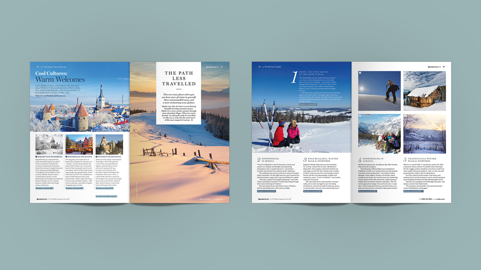
The winter magazine design strikes a balance between a lifestyle magazine and a sales tool: the last few pages include information on prices within a visually pleasing layout, and even recommendations on what to pack for each suggested excursion. Colours and images help the pages integrate seamlessly with the rest of the piece.
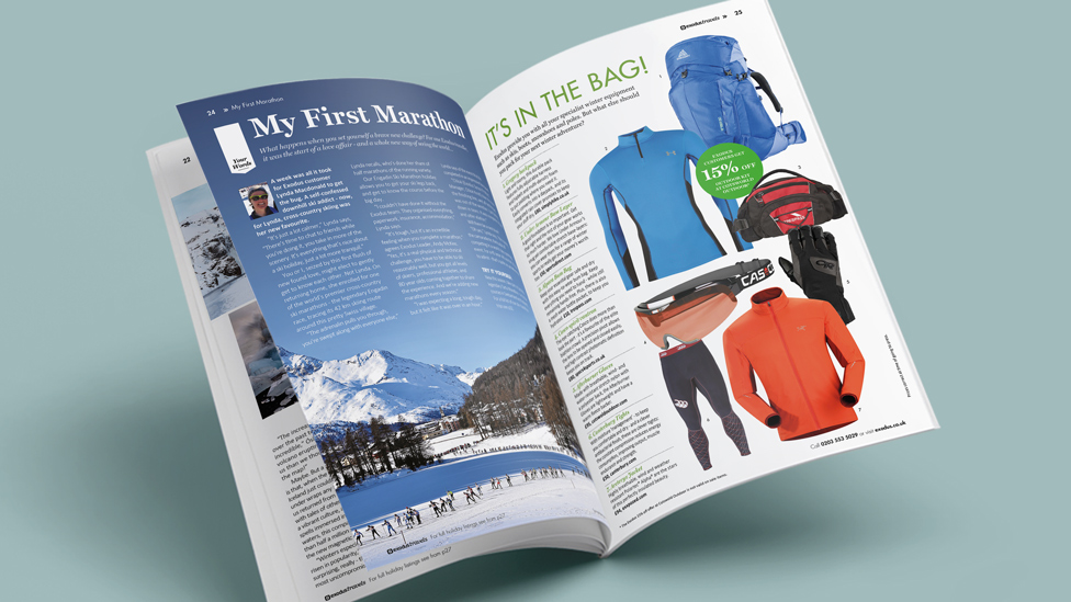
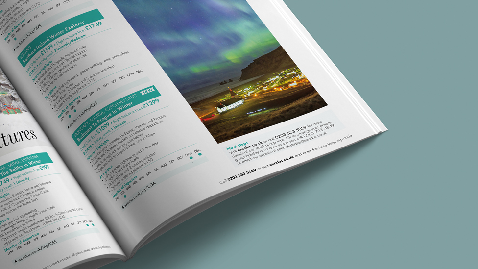
Feedback from the client about the final design was extremely positive – and we’re already working on their next issue!
Take a look at other examples of magazine design.
Looking for help with your project?
Feel free to give us a call to start a conversation,
our doors are always open.
Related projects
INEOS
Company magazine design
AMBS
Online magazine design
AMBS
Business school magazine design
