Estate agency branding

The estate agency branding features an aubergine square symbolising the solid foundations and trustworthy nature of the family-run business.
Challenge
The project first involved aligning various fragmented identity elements used in the past, and developing them to create suite of materials featuring the new logo which would suitably represent the business and its ethos.
Solution
We designed a range of logo concepts and supporting business stationery and, in collaboration with our client’s Management team, a final suite of estate agency branding designs were chosen.
The logo features an aubergine square symbolising the solid foundations and trustworthy nature of the family-run business, which has been established for more than 17 years. By integrating a very traditional and historic colour combination with a stylish and modern sans-serif typeface, we echoed the ethos of the business, which is ‘traditional values, forward-looking approach’.
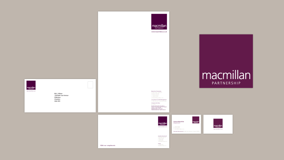
The supporting stationery reiterates these standards using a minimal, classic design style, the focus of which is the unique colour and typography combination of the logo. By providing the logo with ample space within the designs, we laid the foundations for the colour especially to become synonymous with the Macmillan estate agency branding.
For over 25 years we have been helping clients, big and small, reach their audiences in meaningful and effective ways.
Have a look at other examples of brand design that have helped our clients reach their goals.
Looking for help with your project?
Feel free to give us a call to start a conversation, our doors are always open.
