Brand Design – 5 ways good brand design can help your business
Brand Design – 5 ways good brand design can help your business

What do you stand for? What do you want to achieve? What do you want to be known, and remembered, for? And for how long? To answer all those questions, you may need to consider taking a fresh look at your branding design.
Like every individual, each business is unique, so the brand that represents all that you are must also be unique to make a lasting impression. Over the years we have helped many of our clients communicate their personality and bring their stories to life thanks to beautiful and effective branding design ideas that drive business forward. Here are just 5 examples of ways we’ve helped clients achieve a variety of goals.
1 – Change perceptions
How do you communicate the concept of changing perceptions? By changing perceptions.
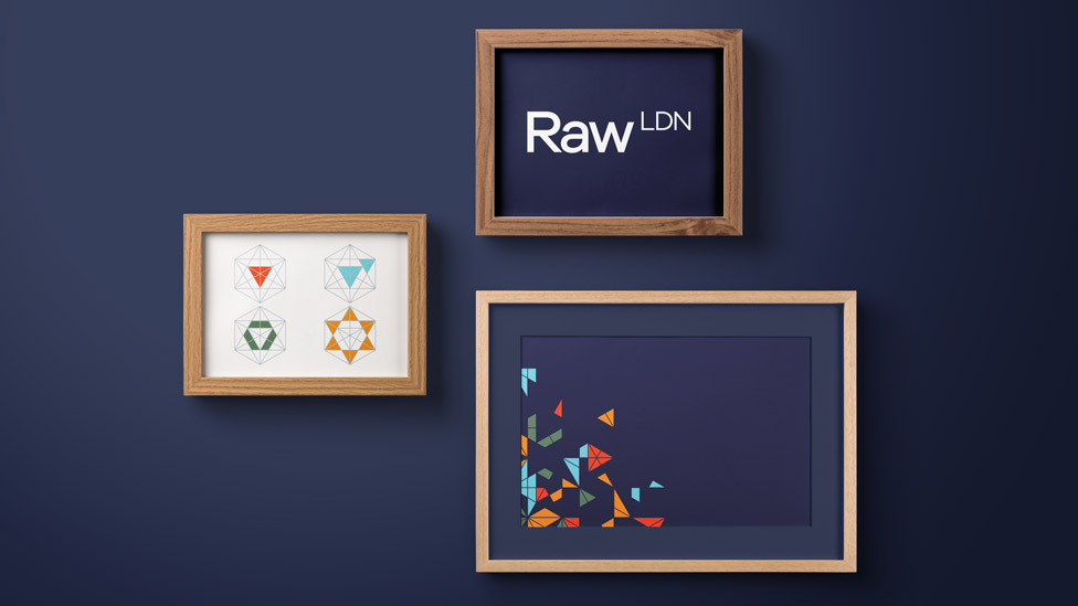
The branding design exercise we carried out for Raw London helped them make the transition from video production house to branded content specialist.
Getting to know our client revealed that above all, they’re as curious, playful and honest as they are strategic, so we started experimenting to find something that encapsulated what they do for their clients – help them change perceptions – how they do it, and which at the same time helped Raw transmit the changes they had gone through themselves.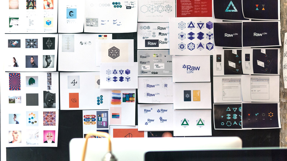
Think of a hexagonal shape – the permutations and possibilities are endless.
Connect the points of a hexagon in different ways, look at the shape from different angles, and what results is a totally different entity – just the perfect visual device to help Raw communicate its message.
![]()
Focus on the lines and triangles, and you’ll notice new 2D and 3D shapes that start to reveal themselves. The hexagon marque has now been transformed into a multi-faceted object. Inspired by the definition of paradigm shift – “a time when the usual and accepted way of doing or thinking about something changes completely” – we named the hexagon marque ‘The Paradigm’.
One shape turns into another thanks to the use of colour – a perfect way to visualise the process Raw goes through to help their clients change perceptions.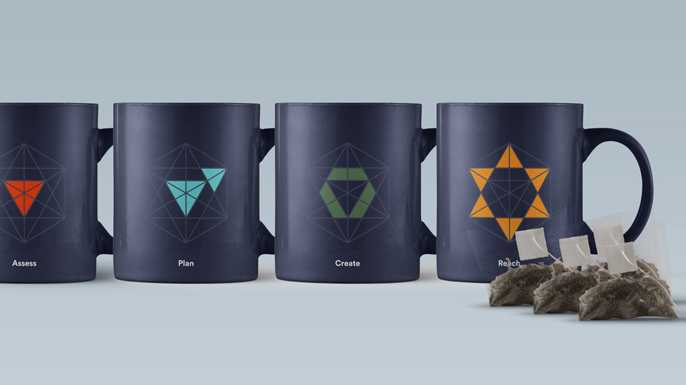
For the logo design we opted for a clean and simple logotype that wouldn’t distract from the hexagon device. At the same time, it’s a confident logo that hints at the possibility of global expansion, or current global presence, of our client. 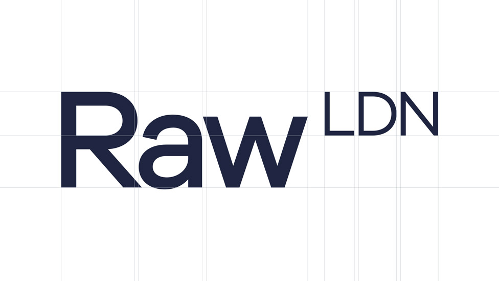
We recommended that where possible, the logotype should be positioned vertically – making another mental reference to the idea of playing with expectations to change perceptions.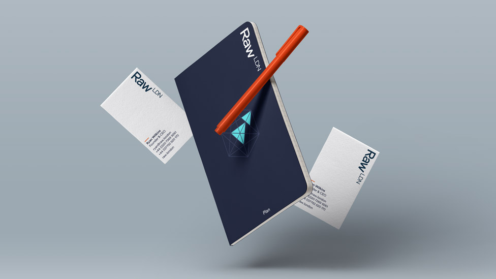
The new brand lends itself to a variety of uses, always transmitting a mixture of energy and dynamism and focused effort, thanks to playful and vivid shapes on a dark blue background that helps transmit a sense of gravitas.
2 – Start a revolution
How do you reinvigorate a company, and energise employees to push forward and challenge the norm? You start by creating a new brand identity that inspires the spirit of revolution in everyone.
Our client aspires to be the global innovator in communications software. Following acquisition and growth, their first step was to change the company name to Invosys. And a new company name needs a new branding design that communicates what the company aspires to in future, without forgetting past achievements.
Inspired by our client’s energy and vision, we developed the brand theme The Revolution is Calling, a powerful internal call to arms that also attracts attention externally in an industry filled with corporate messages that may lack that degree of creativity and energy.
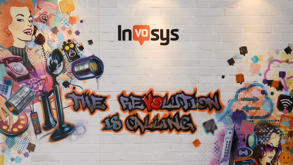
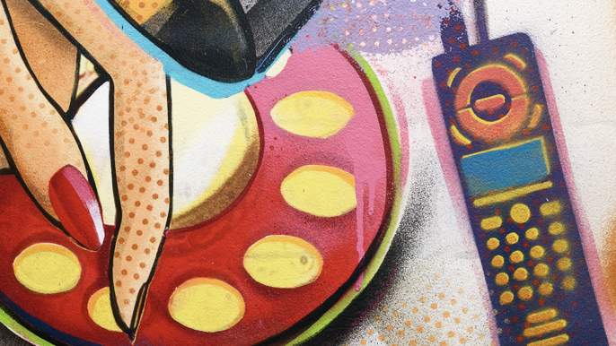
Thinking of ways to disrupt the disruptor, we commissioned a bespoke graffiti wall from artist James Blinkhorn, an idea that filled the internal brand launch with energy and paved the way for the new things to come.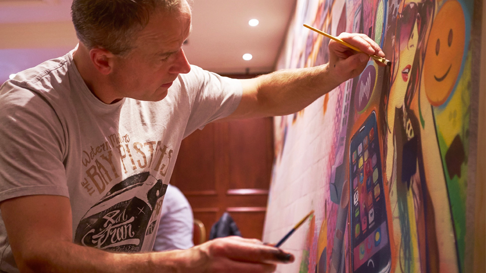
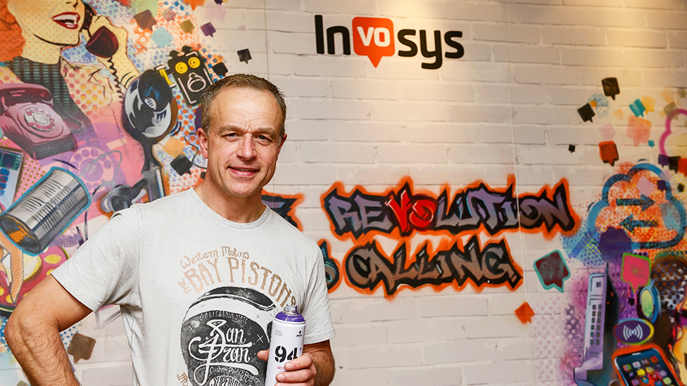
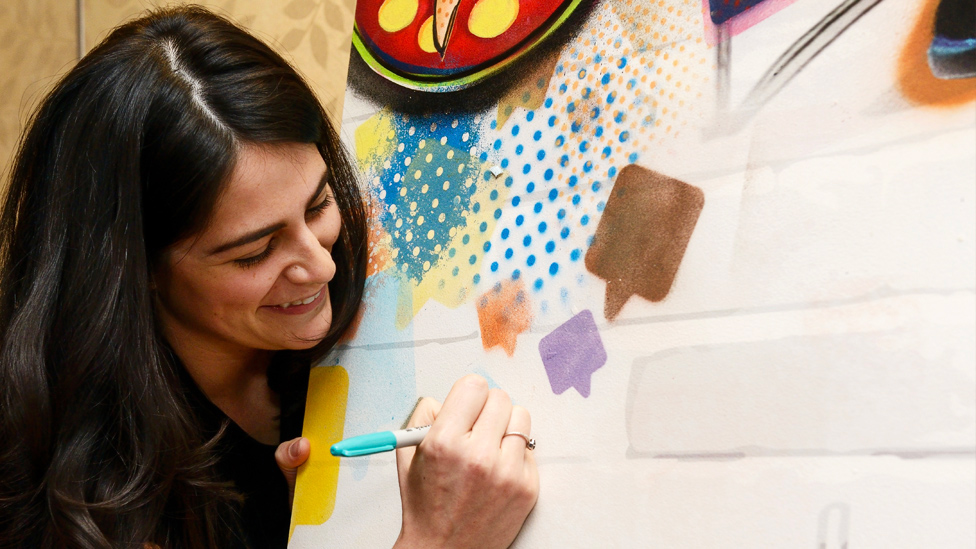
The piece transmits the confidence of a leader who’s not afraid to do things differently, and provided a great opportunity for employees to immediately make their own mark on the new brand.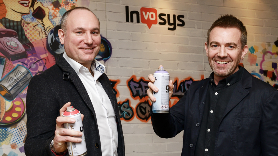
Evolving the company’s existing logo, we created a unique and confident identity. To inject personality and movement, we brought out the “vo” in Invosys and Revolution within a speech bubble shape. Giving this visual device a memorable name – the Voyo – fills the brand with even more personality and inspires a sense of ownership amongst staff. The speech bubble shape can then be adapted to communicate a variety of inspiring messages.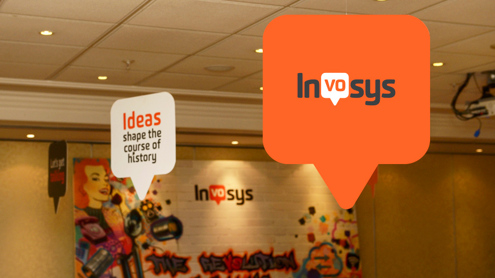
— Invosys Ltd (@InvosysLtd) July 13, 2017
3 – Break with tradition
How does a young business compete in an industry steeped in tradition?
First you need to inspire trust; you also need to create differentiation to give your target audience a reason to choose your business over long-established competitors. Be bold. Disrupt, always remain professional. Demonstrate credible innovation. Appear fresh and reliable at the same time. And be friendly and confident in presenting a product of the highest quality.
Dealoil is a derivatives brokerage company new to the industry. Their approach is to get customers the best deals by establishing strong relationships – based on mutual trust – with oil suppliers.
Our branding design solution expresses the concepts of connectivity and collaboration through interconnecting circles that evoke flexibility and also hint at the shape of a drop of oil. The circular shapes also help establish Dealoil as a dynamic and forward-looking company.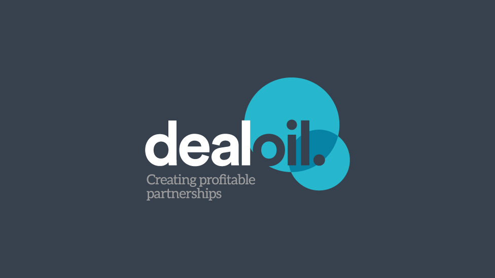
The contemporary colour palette and strong strapline – Creating profitable partnerships – reinforce the message of a young company confident in their ability to build a profitable future for their clients.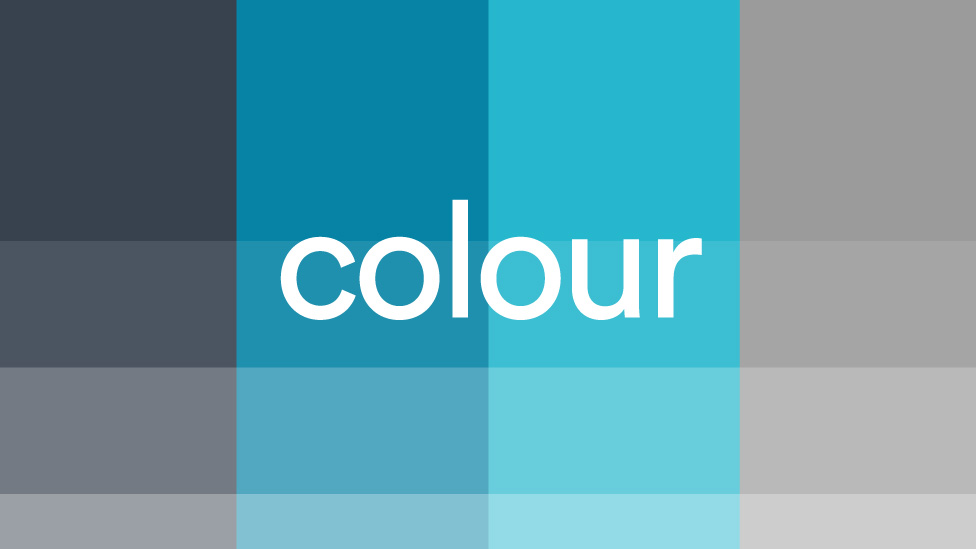

The word “partnerships” helps indicate that Dealoil are experts in so much more than just business transactions – a flow of fresh ideas in the traditional oil industry.
4 – Reinvent yourself
Reinvention could make or break a business. If not done well, a long-established organisation runs the risk of alienating faithful existing audiences while failing to reach new ones. The opposite was true for BrightHR and the new brand strategy we developed for them, focused on innovative thinking and individuality.
A specialist in people management software, BrightHR like to do things differently for their internal teams and customers: their cloud-based product is simple and engaging, and allows users to easily customise the interface for themselves. Inspired by BrightHR’s belief in the power of having fun and being yourself at work, we developed a new and brilliant branding strategy.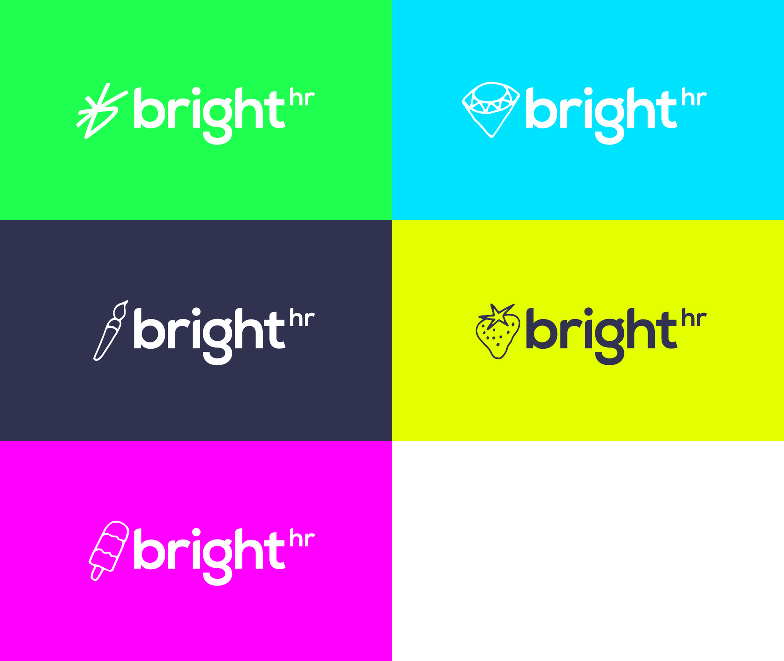
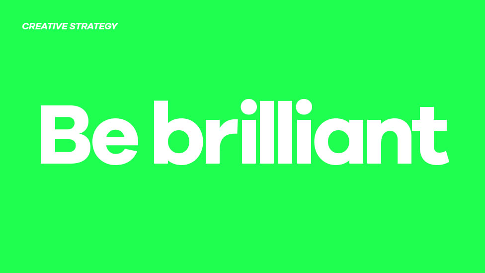
Fun and collaborative brand immersion sessions led us to the concept of brilliance, something we all aspire to, at home and at work. Helping establish the company’s five guiding principles: Fun, Simplicity, Courage, Zest and Love, we combined these elements to create a new brand position and visual identity where simplicity becomes power. Playful and dynamic, the new brand wouldn’t be out of place in a B2C environment. It exudes confidence and liveliness, and represents our client perfectly.
Simplicity also rules when representing the 5 guiding principles. We created a brand identifier, the Xing, which is more than a symbol. As well as representing the 5 guiding principles, it also represents the “b” in bright. A fast stroke effect reflects our client’s energy and reminds us of an enthusiastic seal of approval after a moment of brilliance.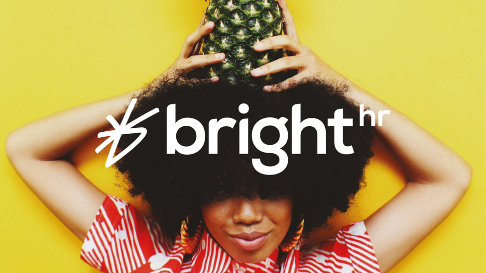
Our branding strategy also included the unique concept of “moodles” – a flexible set of doodles that anyone in the team could use to express their mood and personality, taking ownership of the brand.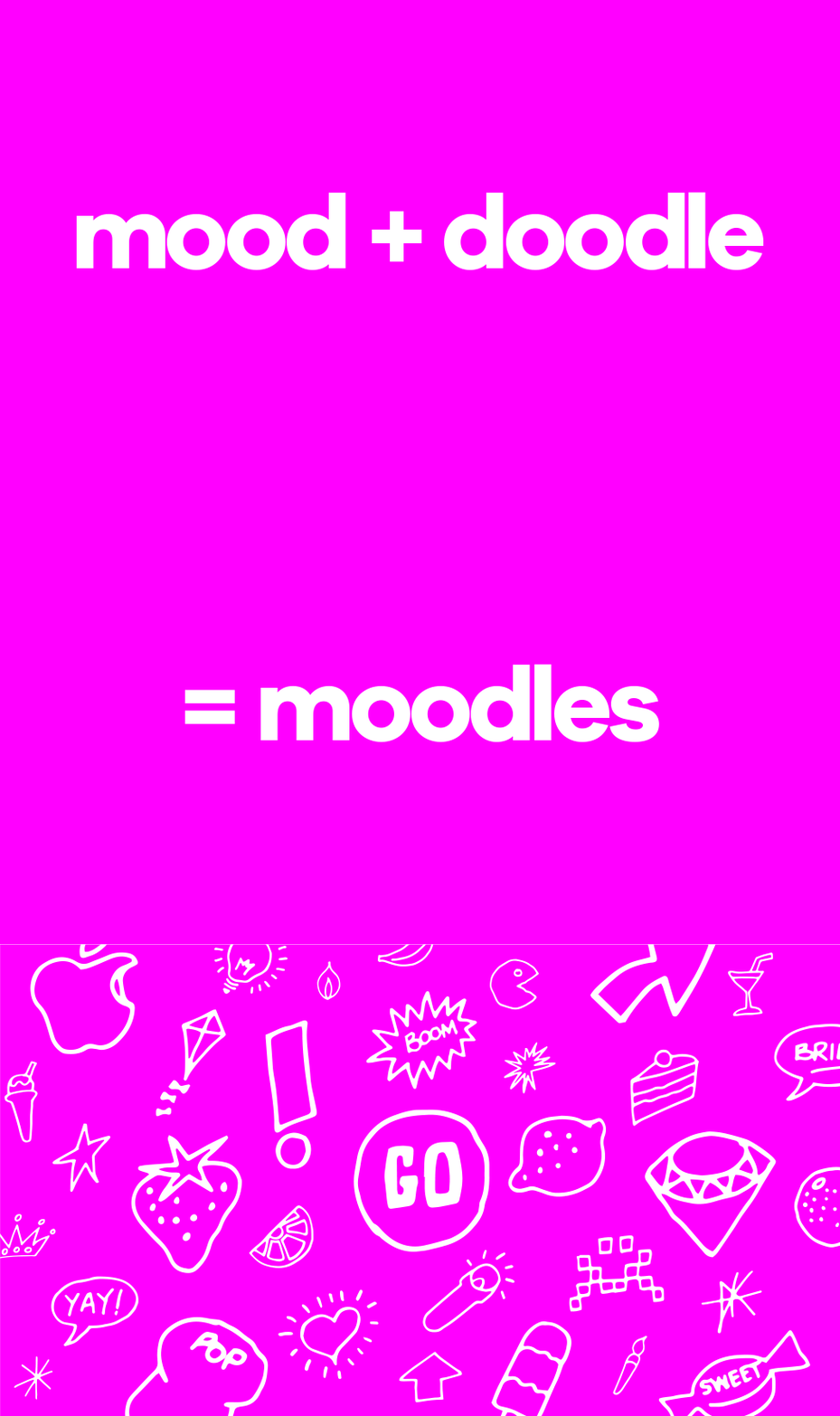
5 – Maximise opportunity
When The Cambridge Club identified a gap in the local cultural landscape – a festival that mixes music, food and drink, we helped them launch the new must-go event in the season’s calendar with a brand design that mixes exclusivity with the allure of a British summer’s day.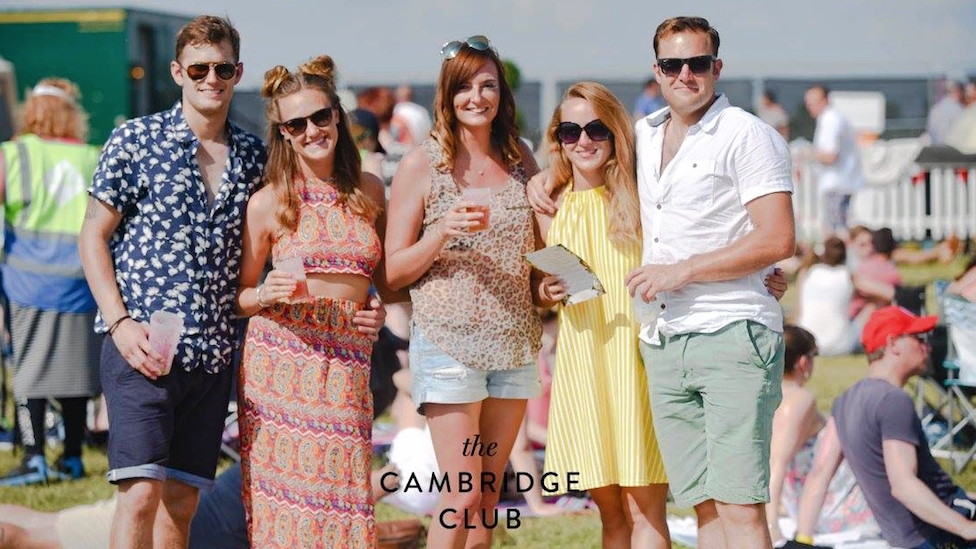
The new iconic identity appeals to the local sophisticated audience, and creates enough differentiation with another festival that was planned for the day before and at the same site.
To attract attention and ticket sales in the run-up to the event, we developed a strong identity that evokes the shape of a crest, immediately getting across that this is not just another festival.
For the promotional launch and on-site materials, we were inspired by the natural ingredients that are needed to create the range of drinks on offer at the festival.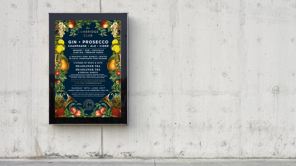
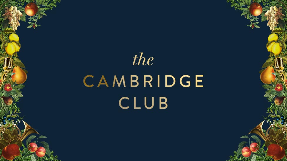
Just like a Caravaggio still life, earthy colours and textures of summer fruits – lemons, grapes, peaches – and flowers evoke a sense of plenty and opulence and give the design a classic and historic feel, so at home in Cambridge. To complete the picture, we added a layer of sheen that transmits the vibrancy and freshness of a summer music festival.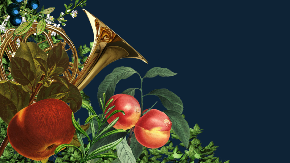
Inspired and want to see more ways good branding design can help you? Have a look at more of our brand design ideas…