Logo Design – Adding value by updating your logo
In a highly visual and communication-driven era, external factors such as fashion trends and technological advances can affect how a logo appears to customers and the industry.
Keeping a logo up to date and forward-looking is more important than ever to ensure you don’t get left in the wake of your competitors, but it doesn’t have to be a disruptive business overhaul.
So… how does yours look? Have you taken a step back and really looked at your logo and branding since you first used it? Is it still relevant and does it look professional and market-leading next to your competitors? Does it look sharp and high-quality on both web and printed materials?
If the answer is ‘no’ to any of these questions then read on….
Most of the largest global brands go through a period of brand evolution every few years to stay ahead of the competition and appear cutting-edge and forward-thinking to their customers, ultimately resulting in a higher market share.
Take Apple for instance – you may remember the multi-coloured striped 2-dimensional apple icon of the late 80s and early 90s. Consider how that logo would look on its ultra-sleek and technologically advanced products in the current global market. Perhaps quite dated, and definitely not as aspirational. The business evolved its logo and brand to represent the products and services it was planning to bring to market, and to appeal to the new target audiences it had identified.
Another iconic example of a logo design update and probably one of the most famous is Shell. In the last 60 years the business has developed its logo 7 times to keep it looking modern, and just as importantly, to make sure it’s suitable for the wide range of media applications it’s needed for. However, Shell have never strayed far from the original logo which was developed in the early 1900s, maintaining the heritage and long-standing trust which has become woven through the company’s identity.
Why should I refresh my brand?
Whether you are a small business with a handful of employees or a large multi-national corporation with offices all around the globe, the importance of keeping your logo and brand looking fresh and enticing to your customers cannot be underestimated.
Customers are very quick to make decisions and often base a large part of the decision on subconscious impressions of brands and products. It’s essential to make the best possible representation of your company instantly.
What are the benefits of a logo design update?
By keeping your brand looking up to date, your business will appear more dynamic and attractive to your audience. It’ll also show your current clients that your business is successfully moving forward. Carrying out a brand refresh may mean you appeal to additional sectors too, and create new opportunities for business.
Don’t forget that well-designed and orchestrated logos and branding schemes can actually become a tangible asset within your business and add to its bottom line value.
Where do I start adding value to my business by refreshing my logo?
Many business owners overlook the importance of this, especially when a logo is something they have worked with right from the start, it can be very hard to move on and accept that the change will be for the better.
But it doesn’t have to be a complete overhaul of your business to keep your brand looking up to date and market-leading. For example Apple’s simple colour change to a black icon performed extremely well for the organisation for nearly a decade. Quite often it can be just subtle changes to a font, colour or shape that makes the difference.
This is where a good design agency comes in. At Parker we’re experts in helping to inject new life into existing branding, and work closely with clients and consider every aspect of how the changes will affect the business, staff, clients and shareholders. A good branding company will listen carefully to its clients’ requirements, plans and business objectives to ensure that they develop a logo that has more longevity and offers more flexibility for use across a range of applications, and which can grow with the business over time.
Shown below are some examples of how we’ve helped our clients achieve a more contemporary, dynamic brand – from simple reshaping and restructuring such as Smart Money or JPCS, to complete overhauls such as Zychem.
Smart Money
We felt the original Smart Money logo had a lot of potential and the logo design update would entail just defining and modernising. This included redrawing the coins to be clearer with more contrast, giving them more presence online. The font was updated to a more even and characterful style, and a shadow added to the coins to give the logo depth online.

Later on the Smart Money logo evolved again.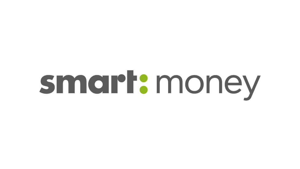
JPCS
JPCS had used their original logo for a significant amount of time and wanted to keep the identity of the business whilst modernising the logo itself. To do this we took the lettering out of the shape making the overall mark easier to use and better suited to digital applications (the depth of the original was becoming restrictive on web applications, social media etc…).

We also made the swirl icon less dominant because it did not have quite as much relevance to the new business direction as it used to, but it was necessary to maintain the connection to the old brand for existing customers.
Zychem
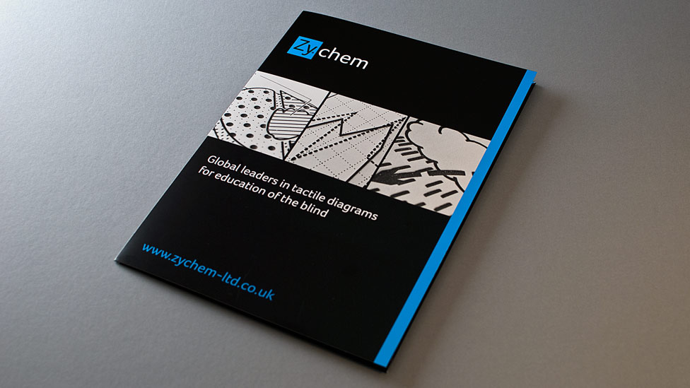
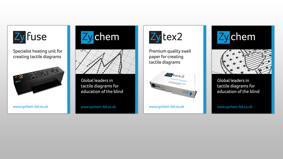
Zychem had been using the original logo for over 15 years, and the business had moved on significantly since then. We produced logo concepts which ranged from developments of the original through to completely new and unique ideas. The refreshed logo created a buzz with staff, and the business subsequently re-branded all sales and marketing materials, as well as the product branding and packaging.

Get in touch if it’s time for a new logo design, we’d love to help.
LET'S COLLABORATE
Feel free to give us a call to start a conversation, our doors are always open.