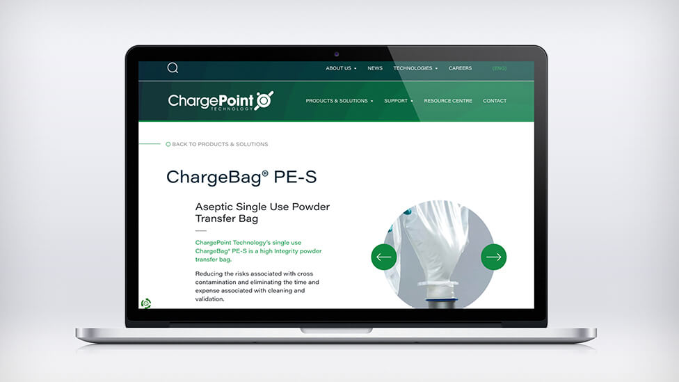
With a highly technical, yet accessible visual style, this animated promotional video helped totally overhaul the way ChargePoint promotes their products through animation.
Background
With a series of patents, ChargePoint Technology is the trusted specialist in pharmaceutical containment and sterile powder transfer systems. Our client’s innovative industry-leading systems enable safe and reliable product transfers, offering three types of solutions: Containment, Single Use and Sterility Assurance.
ChargePoint came to us to help them promote their full range of Single Use technology solutions.
Challenge
Our brief went beyond just creating another animated promotional video for the company’s website: we had to totally overhaul their animation style.
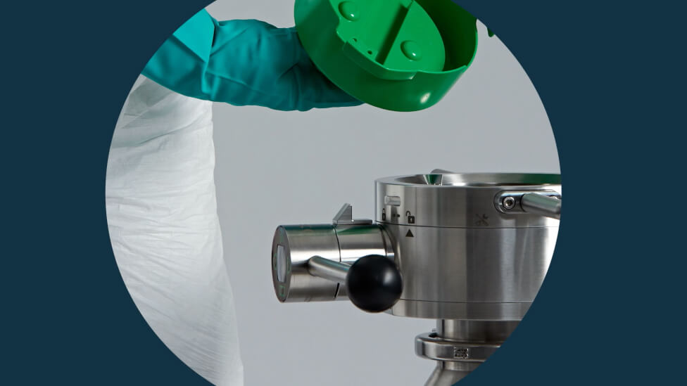
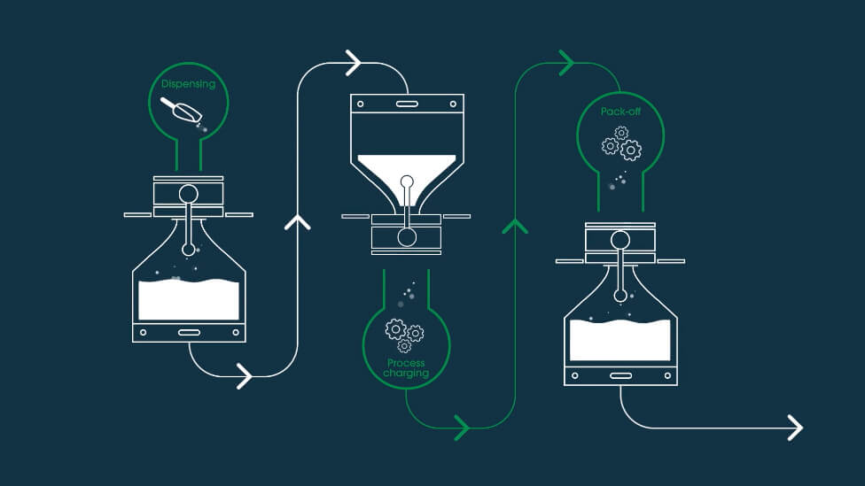
The new style should include photography in a way that felt natural and seamless, combined with uncomplicated animated technical drawings that would help simplify the complexity of processes. The ultimate aim was for the animated promotional video to be a highly technical yet accessible piece of communication.
Solution
Using the refreshed visual style we had recently applied to ChargePoint’s promotional brochures – a clean and contemporary look and feel that also enhanced their brand – we translated it into a completely new graphic style for the promotional video* that extended the ChargePoint brand and also ensured consistency across all sales and marketing collateral.
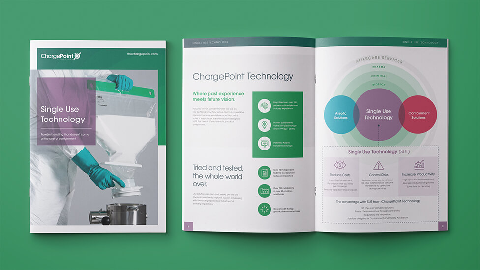

One of the main visual features of the animated promotional video are the circular shapes from the ChargePoint logo and font, which we reimagined into a strong graphic style for the animation. A graduated ripple effect around concentric circles nods at the concepts of process, movement and progress throughout. The circle shapes also help visually simplify the complexity of our client’s technology solutions, and add momentum and a sense of flow to the large amount of content in the animated promotional video.
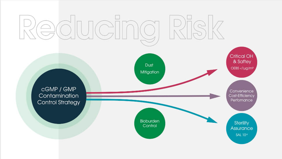
For the colour palette, we balanced the use of the brand’s dark green – a classic tone that adds gravitas to the brand – with new colours and an abundance of white that give the animation, and brand, a fresh and modern look.
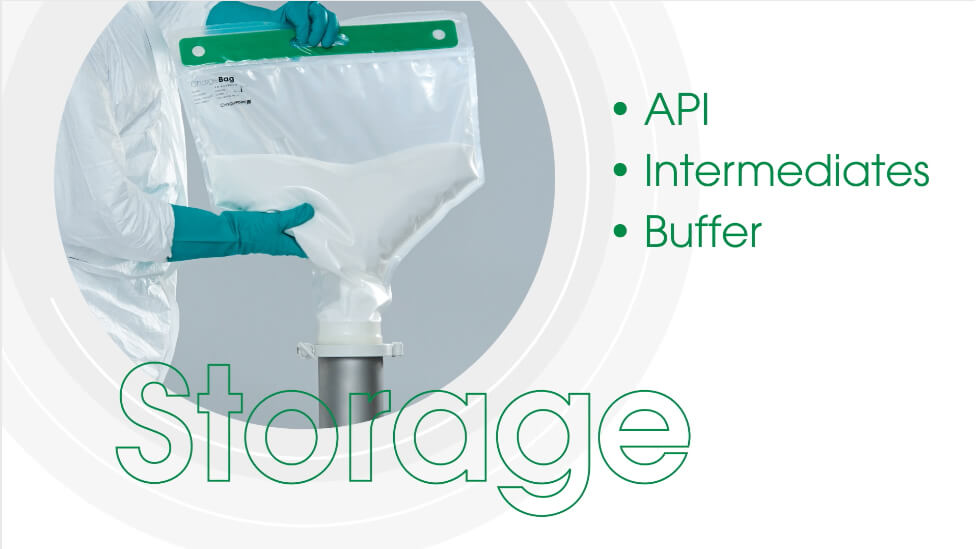
To add visual variety and direct viewers’ focus, we introduced an outline font, framed by the corporate dark green, yet light and dynamic.
We worked closely with our client to adapt the script and visualise the story, compressing it where necessary without losing important information, and also rethinking some of the story order to ensure it worked well in combination with the flow of the animation style.
The tonality of the voice was also a key consideration, so we opted for something that didn’t feel too regional and instead presented a universal, global voice. The pace of the music bed also adds a modern and subtly dynamic feel to the animated promo.
Now that the new style has been set, we will be working with our client to fully refresh their bank of promotional videos.
(*) an edited version of the animated promotional video has been included here for illustrative purposes
Looking for help with your project?
Feel free to give us a call to start a conversation,
our doors are always open.
Related projects
Conduent
Sales explainer animation
Heat Pump Life
Promotional explainer animation

Kheiron Medical
Medical explainer animation
