Raw London
Branding strategy
Experts in changing perceptions, Raw needed a branding strategy to support their transition from a traditional video production house to a specialist branded content agency.
Keen to become a specialist branded content agency known for producing projects that changed perceptions, Raw realised that they needed a new company name and overall branding strategy.
A new brand for a new way of thinking
With a new business strategy in place and a bold ambition to become known for changing the way people think about brands and organisations, Raw needed a brand identity that would reflect this vision. Our brief was to create a distinctive, future-facing identity that captured their evolving offer — one that signalled the move from traditional video production to strategic branded content, while still honouring their creative roots.
Getting to the heart of the brand
We worked closely with Raw to immerse ourselves in their thinking, working style and culture. Through conversations, workshops and careful observation, we uncovered what truly drives them – not just what they do, but how they do it and why it matters. Our findings distilled the essence of the brand into two simple, powerful statements:
Exploring perception through research and form
Work on the company’s new branding strategy began with in-depth research into what it means to shift perception – both in theory and in practice. We looked at examples of ideas, objects and communication that successfully changed how people see and think, and explored the wider meaning of perception itself.
The studio quickly filled with inspiration, sketches and visual experiments. One diagram in particular stood out: a hexagon, with its points connected in various ways, could be transformed into simple three-dimensional shapes. This discovery became a key moment – a visual metaphor for how Raw helps shift perspectives by revealing a new dimension in a familiar form.
A hexagon reimagined
The Paradigm: from structure to transformation
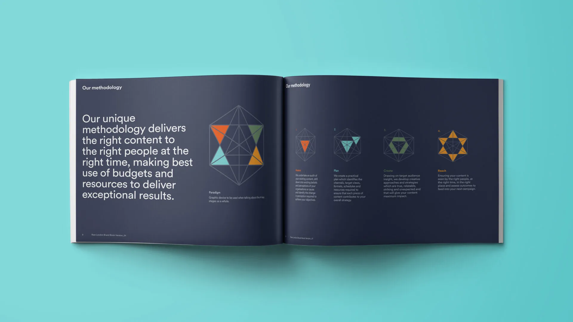
We developed this concept into a new marque named The Paradigm, inspired by the idea of a paradigm shift. At first glance, the shape appears as a hexagon, but as the eye follows the interconnecting lines and coloured triangles, new 2D and 3D forms begin to emerge. It’s a visual metaphor for Raw’s ability to change perception, revealing new meaning through perspective. The result is a multi-faceted identity that reflects the agency’s evolving offer and ambition.
Assess, Plan, Create and Reach
This definition fit really well with the changes that Raw were going through, and also what they set out to achieve with every piece of content they produce.
The Paradigm proved to have legs early on in the new branding strategy process: by colouring different segments within it, we created a set of bespoke icons. Each icon represented a step in Raw’s unique methodology: Assess, Plan, Create and Reach. Alongside the creation of icons, we began to develop a colour palette, heavily influenced by the words curious, playful, can-do and honest.
A refined logotype built for evolution
We created a clean, minimalist logotype and made a deliberate decision not to lock it up with The Paradigm. Keeping them separate allows both elements to breathe, giving each its own space, meaning and impact.
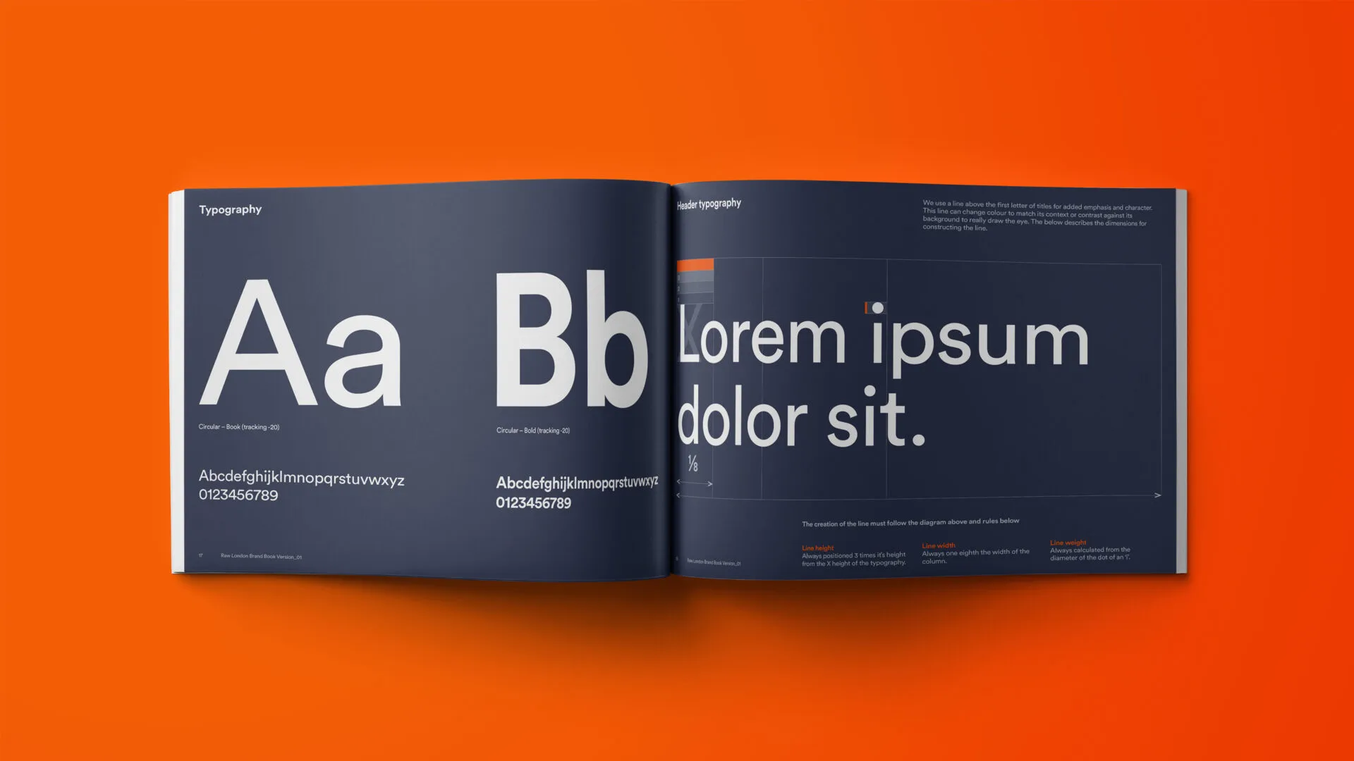
When exploring the company name in different typefaces, we chose to abbreviate ‘London’ to ‘LDN’. This not only improved the visual balance of the logotype but also introduced flexibility, making it easier to adapt if the company expands or evolves in future.
The logotype was designed to appear in a vertical format wherever possible – a subtle nod to the brand’s core idea of shifting perspectives.
The shard: built from the brand’s core
After exploring different ways to apply The Paradigm, we developed the shard – an illustration formed by tiling multiple Paradigm shapes and selectively colouring individual segments.
The shard became the hero element of Raw’s rebrand, appearing across all brand outputs as a vibrant and recognisable symbol of the new identity.
A brand book to guide future thinking
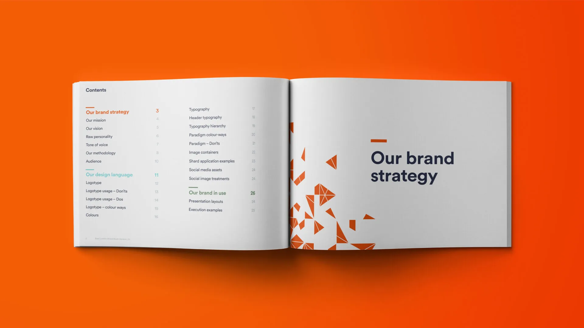
As part of the rebrand, we created a detailed and engaging brand book to serve as a central reference point for Raw.
More than just a set of guidelines, it captures the thinking behind the new identity and explains how to apply it with purpose and consistency. From tone of voice and visual styling to use of The Paradigm and supporting assets, the brand book equips the team with the tools they need to communicate clearly, confidently and in line with the brand’s evolving direction.
The new brand adapts confidently across a range of formats, from internal tools to client-facing materials:
- the presentation template serves as an effective and engaging platform, ensuring Raw and its work are always presented with consistency and professionalism
- proposal documents strike the right balance between energy and gravitas, with the dark blue cover providing a strong foundation for the creative thinking inside
- supporting items like notebooks and business cards bring added personality and confidence, reinforcing the brand in every interaction
A fresh look, online too
As part of the comprehensive rebrand, we also designed and developed a new website built on WordPress, ensuring a seamless digital extension of the refreshed brand identity. The new site not only brought the updated visual language to life, but also focused on improving usability, content hierarchy, and overall user experience. We collaborated closely with the client to understand their audiences, services, and goals, translating those insights into a clean and intuitive website structure that reinforces trust and professionalism.
Built with flexibility in mind, the WordPress platform allows for easy content management and scalability, empowering the client to keep the site current and relevant. The responsive design ensures an optimal browsing experience across all devices, while strategic use of calls to action, visuals, and storytelling helps drive engagement and conversions. The new website acts as both a marketing tool and a brand showcase—strengthening the client’s digital presence and supporting ongoing growth.
Time for a new
branding strategy?
If it’s time to rethink your brand, we’d love to hear from you.
Take a look at other branding projects

AMBS
Identity development and application

ChargePoint Technology
Brand development

H&T Presspart
Branding strategy & development


