H&T Presspart – Branding strategy & development

H&T Presspart

Branding strategy and development

A strategic brand refresh to reposition H&T Presspart in the marketplace, from device manufacturer to solutions provider.

H&T Presspart is a global leader in the design and manufacture of innovative drug delivery devices and pharmaceutical components. With over 50 years of experience, the company has established itself as a trusted partner to leading pharmaceutical organisations worldwide. Specialising in precision-engineered solutions, including metered-dose inhalers (MDIs), dry powder inhalers (DPIs), and other advanced drug delivery technologies, H&T Presspart is committed to improving patient outcomes through innovation and reliability.

H&T Presspart – Branding strategy & development

A new focus

With ambitious growth plans in both existing and adjacent drug delivery markets, H&T Presspart required a refreshed brand to reflect their evolving capabilities and strategic goals. The new brand needed to showcase their expanded expertise, enabling them to engage customers earlier in the product development cycle while maintaining their strong market position.

The branding strategy and development project had to build on the heritage of the existing H&T Presspart logo and identity. It also had to demonstrate the company’s long-standing dedication to existing partnerships, while, at the same time, attracting new customers with drug delivery needs beyond the Respiratory market.

Brand FILM

Setting the wheel in motion

The discovery phase began with stakeholder and customer interviews, enabling us to understand their needs and attitudes to ensure these were fully represented during the creative stage. We also conducted extensive competitor analysis, providing valuable insights into the market landscape and ensuring clear brand differentiation.

These insights were brought into a series of brand strategy workshops with key stakeholders, helping to define and refine H&T Presspart’s identity, positioning, and future direction. Using these findings, we developed a brand wheel to articulate the new identity in a clear and structured way. At the core of the wheel sat the brand essence, ‘The reliable partner’, alongside the proposition line, ‘Our dedicated people drive us forward’.

H&T Presspart – Branding strategy & development

Brand wheel and concept development

Branding strategy and development

Based on the brand essence and proposition, we explored three creative directions, each with a different strapline. The strapline of the chosen concept was inspired by visual representations of the brand essence and proposition themes found within the logo symbol.

The angle in the symbol was repeated horizontally to represent forward movement. This also created a timeline, which sparked a broader line of thinking. A positioning statement was then written to underline how the actions of H&T Presspart’s people today positively impact colleagues, customers, and patients in the future. The inclusion of the word ‘impact’ was key, as it connected the company’s influence with its manufacturing process, which involves creating parts through pressing or stamping.

The final strapline, ‘Impacting Tomorrow. Together.’ encapsulates H&T Presspart’s commitment to shaping a healthier future through innovation and collaboration. ‘Impacting’ highlights the company’s role in driving meaningful change in patient outcomes and sustainability, ‘Tomorrow’ reflects their forward-thinking ethos, and ‘Together’ emphasises the collaborative spirit defining the company’s relationships.

H&T Presspart – Branding strategy & development

Brand strapline

H&T Presspart – Branding strategy & development

Parallelogram sequence

From idea to impact

The timeline concept was translated into the visual identity through the use of distinctive parallelograms, featuring two horizontal sides and two sides set at 54.427° – the angle in the logo symbol. The versatile parallelograms can be coloured, they can overlap and they can be used as containers for images or videos. When combined to create sequences, they not only emphasise forward motion, but also highlight the collaborative and interconnected nature of the company’s work. Parallelogram sequences – and crops of them – became the unifying thread across all brand applications, whether static or animated.

Motion concept

CUSTOM TYPEFACE

The new face of H&T Presspart

A second brand component also derived from the logo symbol. We commissioned Lyon-based Blaze Type to create a custom cut of their neo-grotesque typeface, Slussen. The resulting H&T Stencil is a unique combination of stencilled and regular characters. Stylistically, the separated shapes in the stencilled characters resemble the two-part logo symbol, but they also reflect the theme of partnership and the idea of manufactured components coming together to form a drug delivery device. H&T Stencil is used for major headings and display typography in all brand applications.

H&T Presspart – Branding strategy & development

Primary palette

H&T Presspart – Branding strategy & development

Secondary palette

Expanding the colour palette

We added three vibrant secondary colours to complement and contrast with the more corporate primary colours. Amber, Cyan, and Mauve were chosen to bring energy and increased flexibility to the brand’s visual identity, enabling engaging designs while maintaining a professional aesthetic. Each colour reflected a different facet of H&T Presspart: Amber conveyed positivity, Cyan represented innovation, and Mauve added a human, empathetic touch.

Icon grid

Animated icons

Icons

We created a bespoke library of business-relevant icons for use across all brand applications. Built on a consistent 48×48 pixel grid with a 2-pixel line width, the icons were designed to complement the H&T Stencil typeface, sharing visual characteristics such as common shapes, gaps between lines and 90° line terminals. We also animated key icons to bring an additional layer of engagement and dynamism to digital formats such as videos, presentations and social media.

Icon Library

Website DESIGN AND DEVELOPMENT

Website

H&T Presspart’s previous website served mainly as a brochureware platform, focusing on their product range but offering limited emphasis on their expertise and tailored solutions. The company’s evolution from a device manufacturer to a solutions provider presented an opportunity to redesign the site, setting it apart from competitors and positioning H&T Presspart as a trusted partner for developing bespoke drug delivery solutions. The new website was restructured and its content was rewritten to highlight their experience, innovation and capabilities, aiming to attract new customers and new people.

The website’s design featured the new brand and visual identity in a number of ways. The 54.427° angle was used as a wipe to reveal pages, and overlapping parallelograms animated on scroll in backgrounds behind customer quotes. Parallelogram sequences featured throughout the site, depicting collaboration and providing a snapshot of life at H&T Presspart. We also created a powerful brand film for the home page, to engage visitors immediately and to communicate H&T Presspart’s brand story in a compelling and concise manner.

20%

increase in website visitors since the launch of the new brand.

H&T Presspart – Branding strategy & development

BROCHURE DESIGN

Product brochures

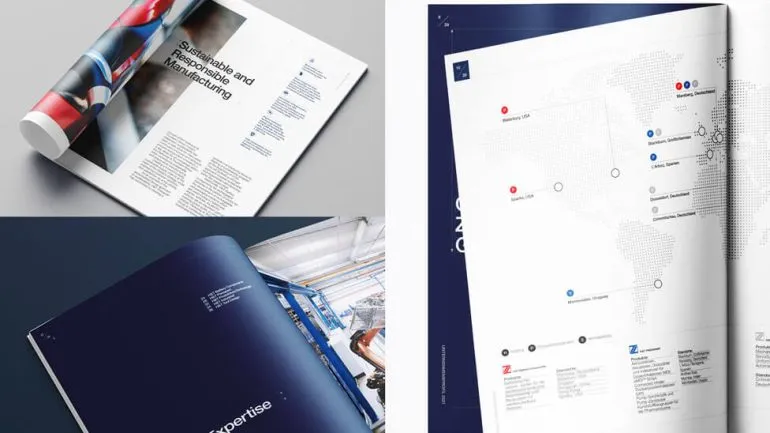
H&T Presspart had previously produced individual data sheets for its products, but as part of the branding strategy and development project, we consolidated these into three comprehensive brochures, each focusing on a specific product category: Inhalation Drug Delivery Solutions, Multi-Component Drug Delivery Devices, and Healthcare Dispensers. The new brochure format allowed us to showcase the company’s expertise and experience in a highly visual way, using the new branding components. High-quality photography or renders, clean layouts and structured designs highlighted key features and benefits, while the refreshed tone of voice ensured clear, engaging communication.

H&T Presspart – Branding strategy & development

Posters

H&T Presspart – Branding strategy & development

Stationery

H&T Presspart – Branding strategy & development

POWERPOINT TEMPLATES

Design templates

As part of the new brand roll-out, we created templates for presentations and social media posts, to ensure consistency and ease of use. These templates featured multiple pre-designed layouts that incorporated the brand colours, the H&T Stencil typeface and the bespoke icons, with many designs utilising the signature angle and parallelogram sequences. The templates simplified the process of creating polished presentations and visually engaging social media content, saving time while maintaining a high standard of brand-aligned communications.

H&T Presspart – Branding strategy & development

Social media post templates

80%

increase in social media followers since the launch of the new brand.

H&T Presspart – Branding strategy & development

Brand guidelines

Brand guidelines

We created a comprehensive brand guidelines document to serve as a blueprint for maintaining consistency and coherence across all brand communications. The document outlined the correct use of key brand components, including the logo, the angle, colours, typography, imagery, iconography and tone of voice, ensuring that every application aligned with the brand’s identity and values. By providing clear rules and examples, the document simplified the creative process, reduced ambiguity and ensured a unified look and feel across different media.

The 'Parallelogrid'

“We devised a grid system for the sizing and positioning of parallelograms. The ‘Parallelogrid’ establishes a set number of angled divisions – from top-left to bottom-right – for any screen, page or container size, helping to achieve a visual consistency across all brand applications.”

PAUL ELLIS, DESIGN DIRECTOR, PARKER

Video bumpers

Name captions

Moving forward

The visual identity was designed to be dynamic and ever-evolving, truly coming to life in animated or video formats. Static images can be replaced with video footage, and parallelograms can be layered to overlap and move at varying speeds, creating a parallax effect that adds depth. The parallax effect was used in video bumpers, transitioning from video footage to the logo using overlapping parallelograms. Other motion-based applications included a social media teaser campaign and a brand film for the website home page. All motion emphasises forward movement, progressing from left to right, to align with the timeline concept and reinforce the brand’s forward-thinking ethos.

SOCIAL MEDIA LAUNCH CAMPAIGN

H&T Presspart – Branding strategy & development

Exhibition stand

New brand, lasting impressions

We designed and built a bespoke exhibition stand for H&T Presspart, showcasing their new brand at CPHI (Convention of Pharmaceutical Ingredients) in Barcelona, as they returned to the event for the first time since before the Covid pandemic. The 4-metre-high stand featured meeting and storage rooms, parallelogram-shaped product display units, and a large LED screen for messaging and video content. It also reflected the company’s commitment to sustainability by incorporating reusable elements for future exhibitions. With its larger footprint, the stand effectively highlighted H&T Presspart’s innovation and leadership in the inhalation and drug delivery space.

H&T Presspart – Branding strategy & development

“Parker’s branding strategy and development work has been absolutely critical to the success of H&T Presspart and in supporting the company as we evolve. I have lost count of how many compliments we have had on the new brand from suppliers, customers, and even competitors.”

CHAD MAYOH, GLOBAL MARKETING MANAGER, H&T Presspart

H&T Presspart – Branding strategy & development

Time for a new
branding strategy?

If it’s time to rethink your brand, we’d love to hear from you.

Take a look at other branding projects

AMBS

Identity development and application
H&T Presspart – Branding strategy & development

AstraZeneca

Global employee referral campaign
branding strategy

Branding strategy

Raw London
H&T Presspart – Branding strategy & development

ChargePoint Technology

Brand development