Following a hugely successful campaign for another area of the business which we had also worked on, the Sage Mid Market Division approached us to create a campaign logo that would be used in an employee communications programme.
Challenge
To create a campaign logo design which was distinctive and memorable, and yet would still comply with the strict Sage corporate brand guidelines. Before developing the campaign logo, we would need to come up with a theme that embodied our client’s employee engagement programme.
Solution
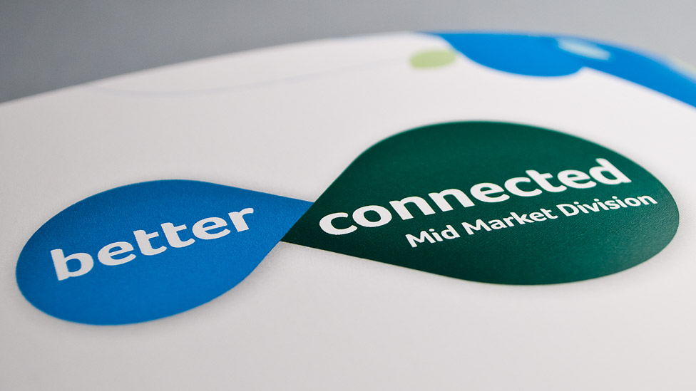
As the corporate initiative was all about promoting collaboration and communication, we developed the theme ‘better connected’. The next stage of the project was the visual element of the campaign logo.
The Sage brand has many elements, including a variety of shapes and graphic devices, so, taking these as our starting point, we settled on the stylised teardrop shape, ultimately combining two of them to create the graphic that symbolises the concept of connection and collaboration amongst teams.
The teardrop graphic was finished in the two primary brand colours used by the Sage Mid Market Division, and we added subtle graduations to the colours to give the logo further depth and presence on the page.
“On working with Parker Design for the first time, I was delighted with the whole experience.
They worked in a very thorough and intuitive manner, delivering the campaign in an extremely short timescale.
Following launch, the board commented very favourably on the campaign, and was delighted with the response. I will be working with them again soon.”
Looking for help with your project?
Feel free to give us a call to start a conversation,
our doors are always open.
Related projects

AstraZeneca
Global employee referral campaign

H&T Presspart
Branding strategy & development

Scouts
Volunteer recruitment campaign
