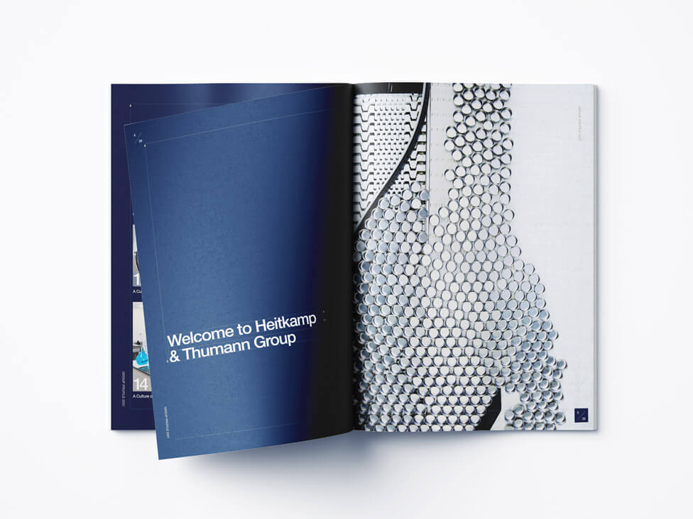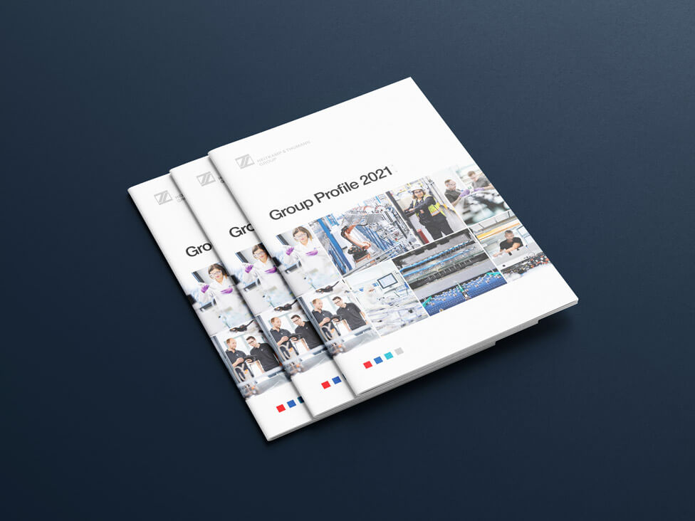
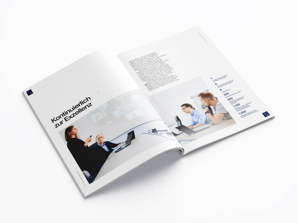
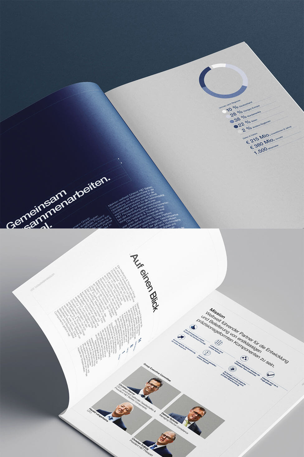
Taking inspiration from precision engineering and the value of a highly skilled, motivated workforce, we designed Heitkamp & Thumann Group’s new company profile brochure with a clear, structured layout, meticulous attention to detail and striking photography.
Background
Founded in 1978, Heitkamp & Thumann Group has grown into a leading global partner in the development and supply of high-precision metal and plastic components. Today, the Group consists of 15 medium-sized companies operating across 9 countries, delivering world-class solutions to a diverse range of industries.
Efficiency and continuous improvement are at the heart of the company’s philosophy. With lean corporate structures and a team of highly skilled, motivated employees, Heitkamp & Thumann Group remains committed to innovation and quality, ensuring excellence in every product and process.
Challenge
Following corporate structure changes at Heitkamp & Thumann Group, our client needed a refreshed company profile brochure with updated content and a new design. The brochure had to serve as a strong corporate business tool, providing key information for customers and external stakeholders while also engaging employees. It needed to be both informative and visually appealing, reinforcing the company’s identity and vision.
Solution
Created exclusively for this company profile brochure, the new design takes inspiration from precision engineering, a core aspect of Heitkamp & Thumann Group. Just as accuracy and expertise shape the company’s products, the brochure reflects these values through a clear layout and refined details, supporting the company’s commitment to quality and innovation.
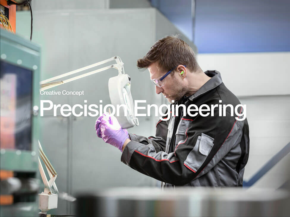
Inspired by the intricacy of technical drawings, the new brochure design highlights the concept of precision by incorporating fine technical details commonly seen in engineering blueprints. Subtle line work, measured grids and precise alignment emphasise the company’s dedication to accuracy and craftsmanship.
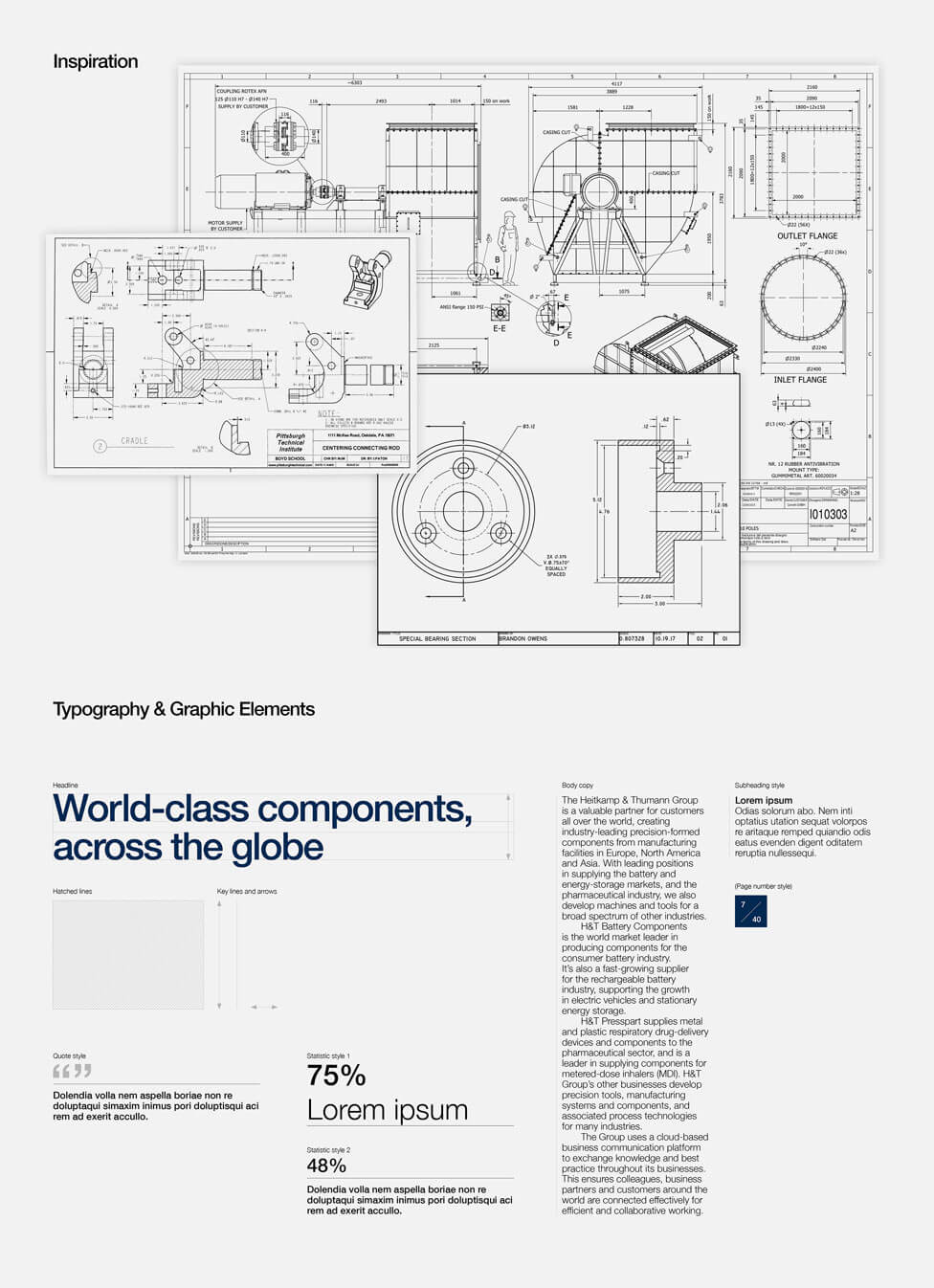
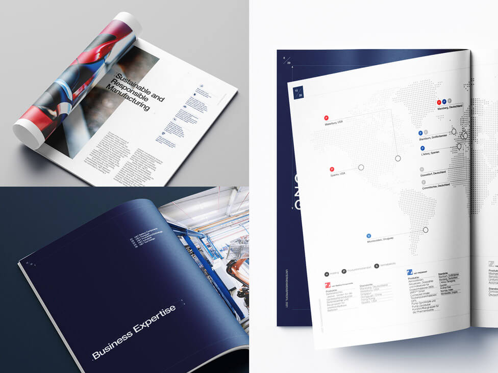
Precision and accuracy shaped the visual treatments applied to headings, ensuring a clean and structured look. A keyline frames each heading, anchoring the text and transmitting a sense of stability and order. To maintain consistency throughout the brochure, we implemented a grid system that organises content with clarity, allowing information to flow across each page.
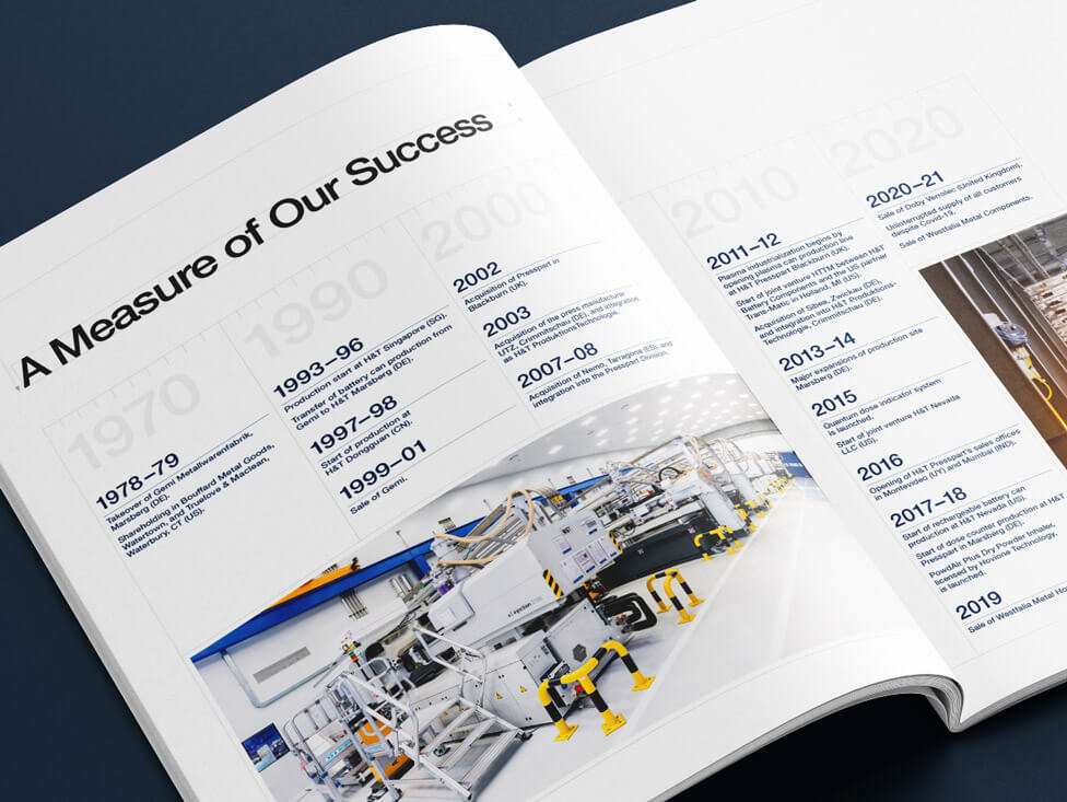
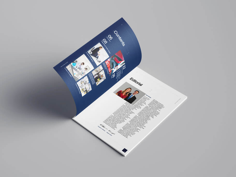
More than 40 years of company history and achievements unfold through a clear and engaging timeline. Designed for simplicity and impact, the timeline presents key milestones in a visually structured format, making it easy for readers to follow the company’s journey.
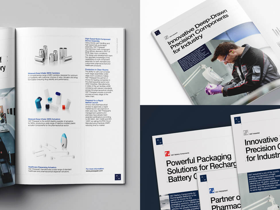
The page numbering style subtly evokes the concept of a numerical fraction – a small but deliberate design choice that further reinforces the company’s focus on engineering accuracy while adding a unique touch to the brochure’s overall aesthetic.
To maintain a clean and sophisticated look, we used colour sparingly, allowing the primary brand colours, blue and white, to dominate the design. These colours create a sense of clarity and professionalism, while grey and red introduce a subtle contrast. Beyond aesthetics, this selective use of colour also serves a functional purpose by helping differentiate the company’s various corporate divisions, ensuring a structured and easy-to-navigate layout.
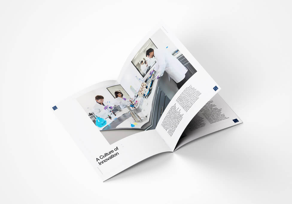
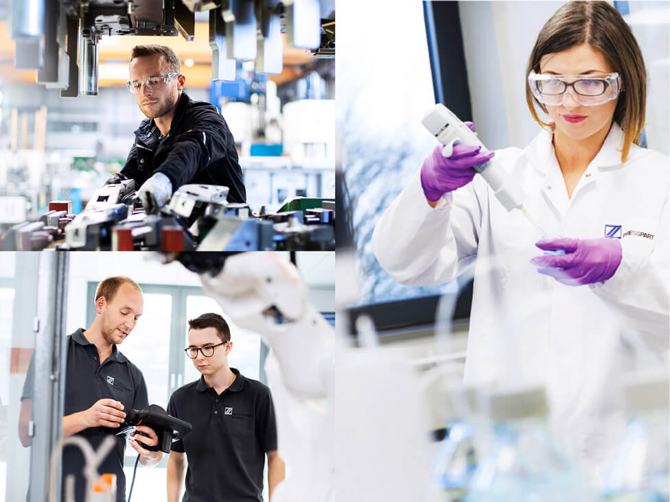
Where possible, professional photography of Heitkamp & Thumann Group employees takes centre stage. We art directed a collection of action shots, focusing on a diverse range of employees in real working environments, highlighting their skills and dedication.
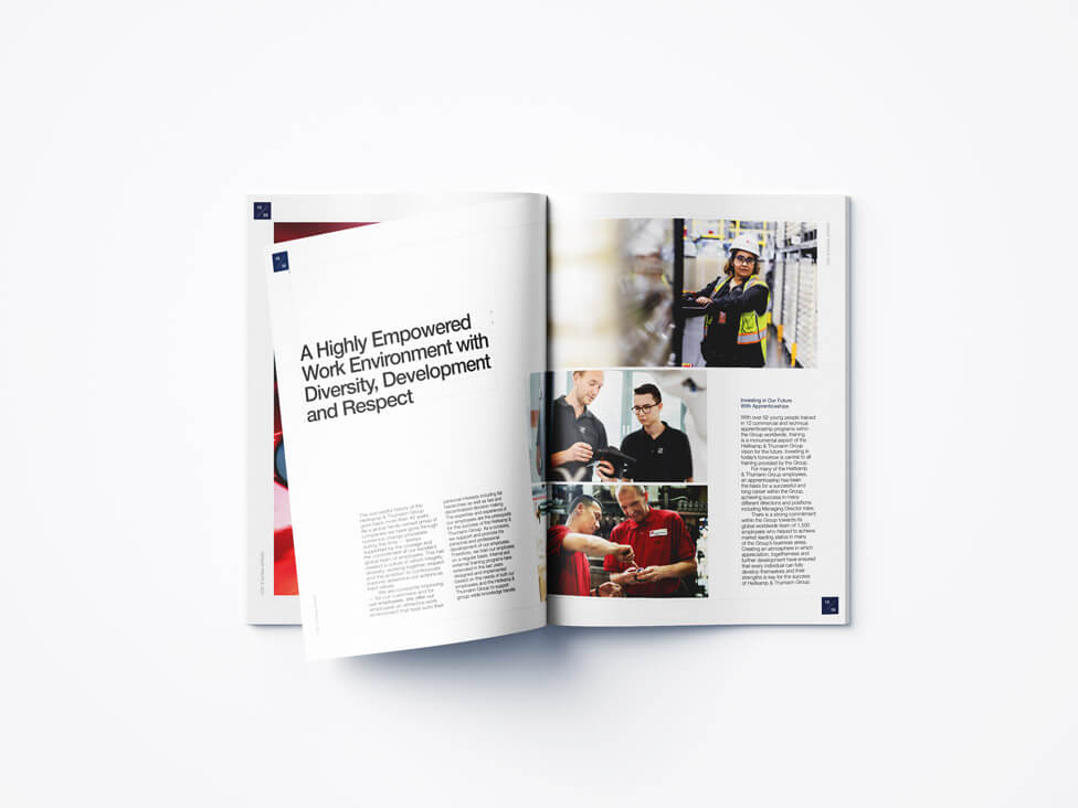
In addition to the English version of the company profile brochure, we created a German-language edition to ensure clear and effective communication with our client’s German-speaking audience. Localising the brochure for this market allowed Heitkamp & Thumann Group to maintain a consistent brand message while making the content more accessible and engaging for a wider audience.
“Everyone’s happy with the brochure. You can be proud of the work you and the team have accomplished!”
CEO, H&T Group
Looking for help with your project?
Feel free to give us a call to start a conversation,
our doors are always open.
Related projects
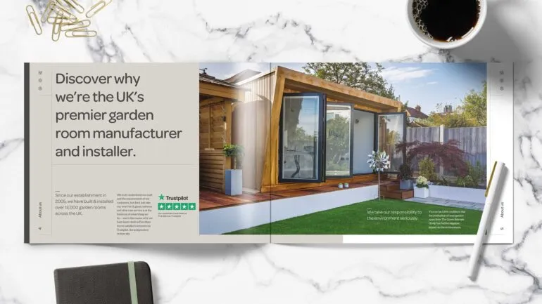
Green Retreats Group
Sales and marketing brochure design

Headwater Holidays
Travel brochure production

Streamline Travel
Company profile brochure design
