
We recommended the use of Prezi to deliver a highly intuitive, dynamic and visually engaging customer journey presentation that acts as a strong marketing tool.
Background
The leading sofa retail specialist in the UK, DFS has been passionate about designing, manufacturing, selling, delivering and installing quality, great looking sofas since back in 1969. Our client is the UK’s largest furniture manufacturer and retailer with over 120 showrooms in the UK, Ireland, The Netherlands and also Spain.
Careful analysis of the customer journey is also key to the longevity and success of DFS.
Challenge
To deliver a visual story, in an easily digestible and highly engaging way, of DFS’s customer journey map, a tool that goes through every step of a retail customer experience when interacting with the DFS brand, both online and in-store, at the point of sale and beyond purchase.
Our client had already mapped the entire customer journey – an extremely complex sequence of events, with multiple layers, levels, strands, and potential outcomes and resolutions, that needed to be translated into a format that would make internal monthly update presentations easy to produce and deliver for our direct contacts at DFS, as well as easy to understand and engage in for their audience of senior stakeholders.

Having discussed different options with design and technology teams internally, our client decided to reach out to us in search of a robust solution that would engage from both design and functionality perspectives, without forgetting the main purpose of the user journey mapping exercise: to share meaningful information on the DFS customer journey and behaviour at every touchpoint, and in turn be able to turn the insights and learnings into process improvements where required.
In total, we would be supplied with over 150 pieces of content to build a customer journey map that had to be easily editable by our client and that had a strict budget to adhere to.
Solution
Faced with the complexity and amount of information at play, we opted for a non-linear approach to map the highly complex customer journey, and suggested Prezi as the tool that would perfectly adapt to DFS’s requirements. We started by introducing Prezi to our client as a strong presentation engine where users can determine their own presenting journey through simple mouse or cursor actions.

With a degree of animation focused on not distracting audiences or presenters, Prezi allows users to zoom in and out and easily go back or forward a few steps, giving total control, almost mimicking an online browsing experience, which we’re all familiar with.
During the initial stages of the project, we were able to source some examples of user journeys that had been mapped using Prezi, sharing them with our client as case studies to support our choice. We also supplied a static design of the entire user journey at our client’s request, illustrating the four different stages the DFS customer goes through, with their corresponding sub-levels, and linear or cyclical actions performed during the customer journey.
At an imposing 3 metres wide, it’s the perfect springboard for our client to justify the need to evolve it into the more dynamic and hands-on format that Prezi offers, helping navigate and solve what at times may feel like an overwhelming puzzle.
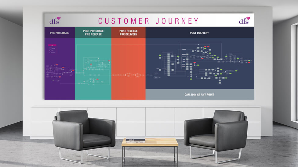
Once the use of Prezi had been agreed on, we approached the project in incremental stages, building an initial framework which allowed our client to then break up their own content to suit the Prezi presentation.
Both from a design and functionality point of view, we kept it deliberately uncomplicated, welcoming users with an initial sequence that mirrors the colour coding of the printed version and helps easily identify the various stages of the customer journey.
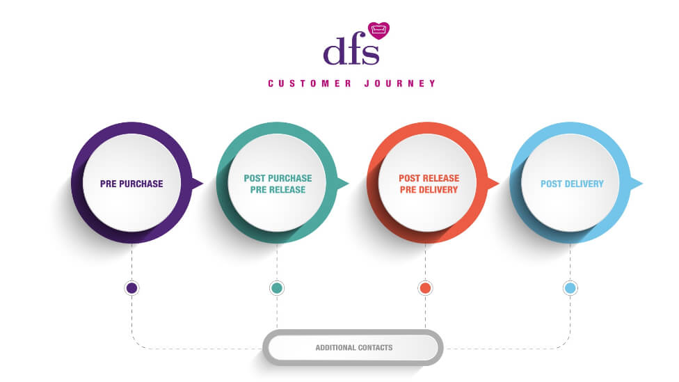
We paid special attention to structure in the customer journey mapping presentation, with easy to locate entry points that allow users to drill down for more information, also making it easy to alter and populate for future editions as required.

Navigation is simple, yet dynamic and energising.

The design: adding a vibrant colour tint to images from DFS’s library adds a strong visual touch, and also helps the icons signalling the potential customer journey stages really stand out against the background – a winning combination that contributes to a seamless flow whilst navigating the presentation.

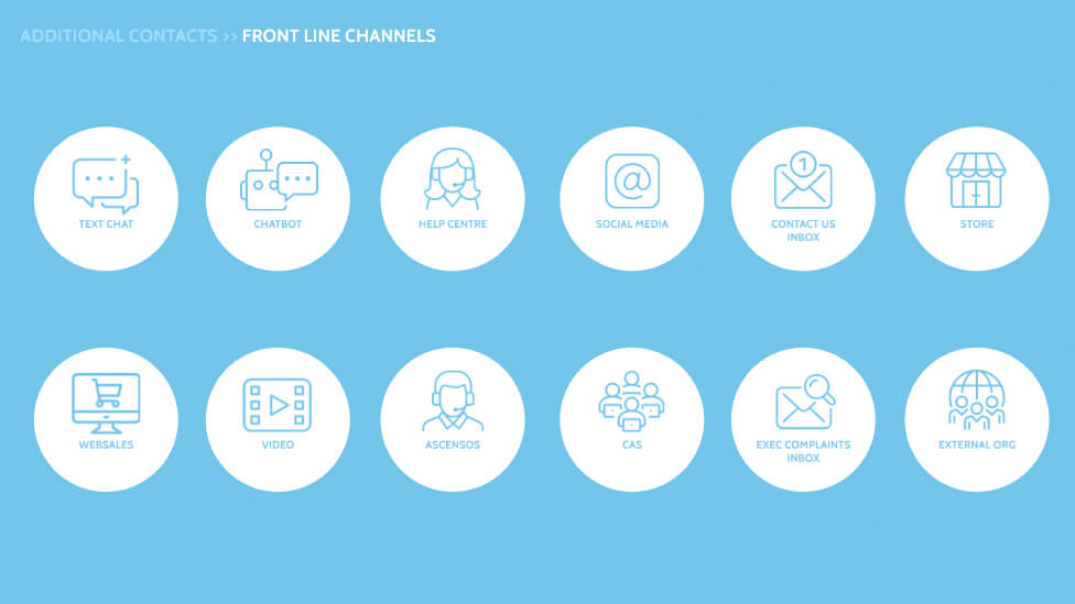
Having fully trained our client on the use of Prezi, as the customer journey evolves, they will be able to quickly and easily update the customer journey mapping presentation themselves.
“After seeing the fantastic presentation designs Parker had created for other clients, we knew they would be perfect to help us bring to life and create our vision for an interactive Customer Journey map.
The imagery and colours fit perfectly with our brand and give a fresh, clear look to the presentation, and gave us our main ask: an editable presentation.
Throughout the process the whole team have been superb. From the initial meetings, listening to our vision, regular catch-ups to ensure both sides were happy with the progress, to handing the project back over to us, Parker handled our project with professionalism and care. The team also made sure we were confident knowing how to update the data, which is beyond what we expected.
Thank you to all the team who have been involved in creating our vision!”
Knowledge and Content Manager, DFS
Looking for help with your project?
Feel free to give us a call to start a conversation,
our doors are always open.
Related projects

Quandoo
Business presentation design

Kingspan
Presentation design
7i Group
PowerPoint presentation template
