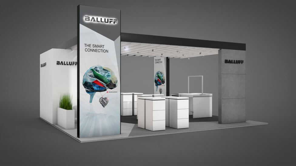
We helped deliver a successful brand experience for Balluff with a dynamic and compelling exhibition design & build that successfully showcases their latest product innovations and promotes interactivity.
Background
Balluff is one of the global leaders in sensor manufacturing, providing practical and innovative solutions for a wide range of industries and applications. The company’s reliable products, and their unique capabilities, are contributing to the increase in production, product quality, and manufacturing improvements in a wide range of industries all over the world.
And our client is, still, a medium-sized organisation, family-run for four generations. With headquarters in Germany, the global player has a leading presence in Europe, Asia, North and South America, and more, and has been offering their automation expertise for over 90 years.
Challenge
Proud of their high standards and personal commitment, our client needed us to collaborate with them on an exhibition design & build that would help them showcase their product innovations, promoting interactivity – all whilst strictly and thoroughly following their brand guidelines.
According to Balluff, “a successful brand experience is marked by a dynamic architecture and a clear, compelling message. The objective of the Balluff appearance is to represent the brand consistently across all exhibitions”, and that is precisely what we had to help deliver.
Solution
Working closely with our client on this exhibition design & build project, we applied their brand guidelines to produce a strong, confident and leading brand experience that turned heads in the exhibition hall. The different elements complement each other perfectly: a strong logo, graphics, colours and illustrations, and the way they all interact with each other, create an exhibition presence that becomes a superior communication channel in a busy environment.
The structure of the overall exhibition space is simple yet striking, transmitting a message of openness, stature and commitment – it provides easy access, and encourages relaxed conversations. 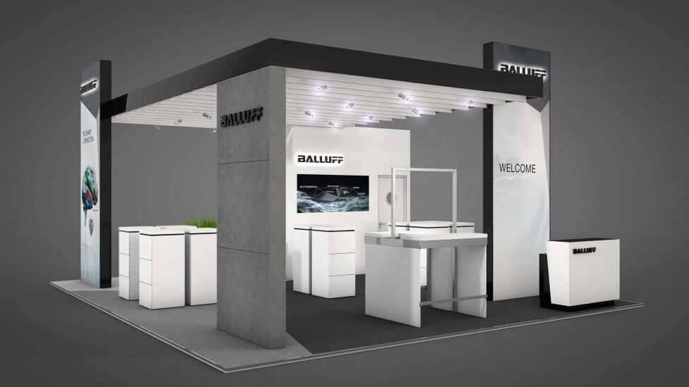
More expressive brand communications are achieved through the use of single exhibits, sometimes even subtle furniture accents and carpet flooring, where a different cut helps define an area and its purpose.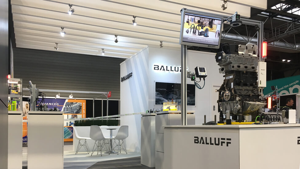
A 1.5 x 1.5m area facilitates product demonstrations – the structure appears light, despite supporting a half-ton sensor and helping conceal cabling.
An imposing pylon with back-lit logo guarantees long distance brand visibility, while wall graphics with simple targeted messages help structure the area. Exhibit cubes, touchscreens and tablets communicate specific content and encourage delegate engagement.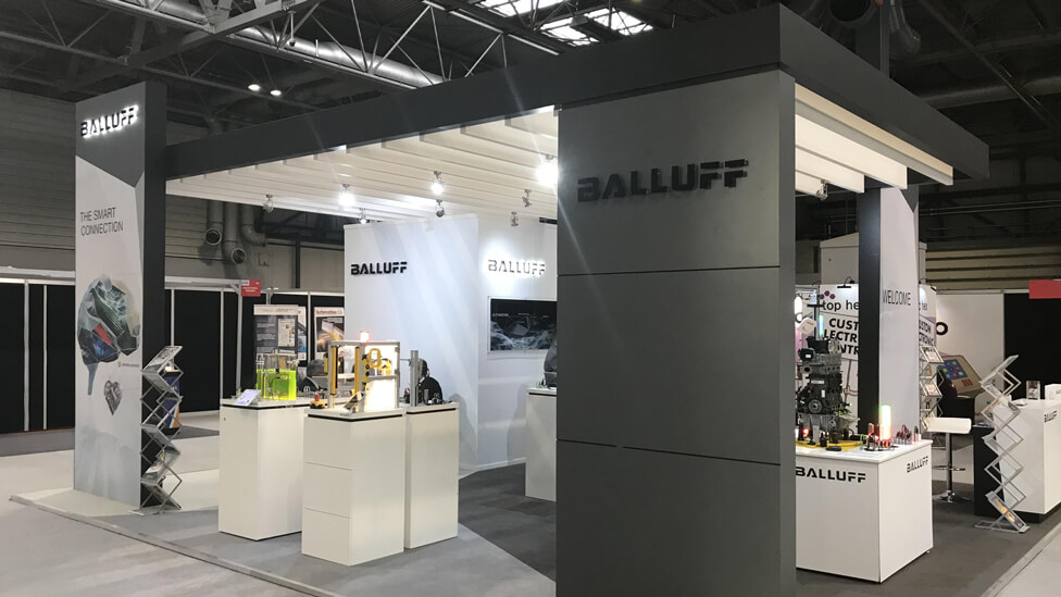
A louvered ceiling is an essential design element in this particular configuration of the exhibition design & build, and provides a seamless, open and fluid connection between the imposing pylon and the top area.
Freshly planted greenery, housed in crisp white planters, adds structure, warmth, and a contrasting element to the heavily technical nature of the materials on show.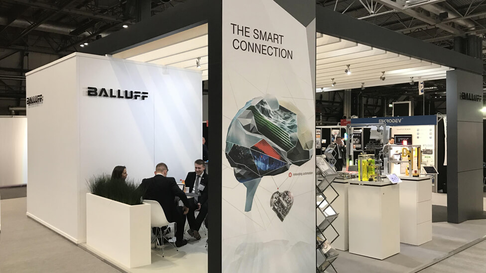
Looking for help with your project?
Feel free to give us a call to start a conversation,
our doors are always open.
Related projects
PTC Therapeutics Inc
Pharmaceutical booth design
Jacobs
Conference booth design
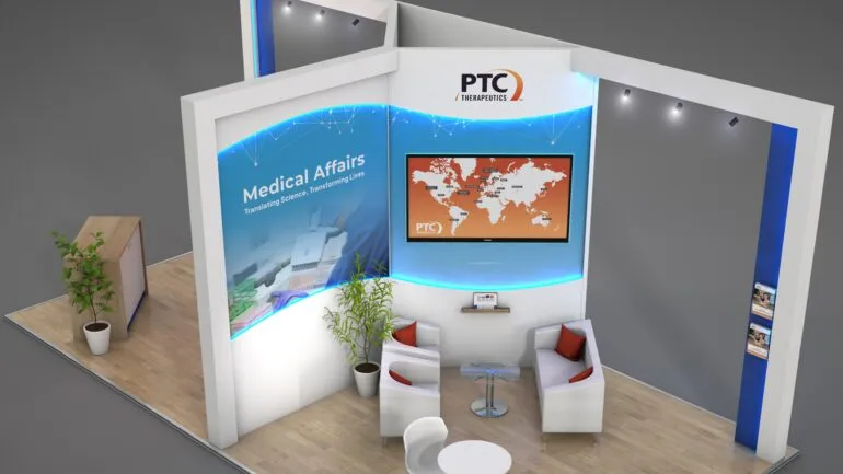
PTC Therapeutics Inc
Congress booth design
