We were recommended by The Design Council when Dynamic-Ceramic Ltd required some new logo designs as part of an overall brand refresh.
Challenge
Dynamic-Ceramic had been trading very successfully for many years when they contacted us, as they felt their brand was in need of a refresh. The original brief was to take the existing logo design and gently move it in a slightly different direction, rather than a total departure from the original logo the company had been using.
Solution
We created a wide variety of logo designs ranging from just a handful of subtle changes through to totally brand new concepts, with our client overwhelmingly deciding on one of the brand new concepts we had developed for them.
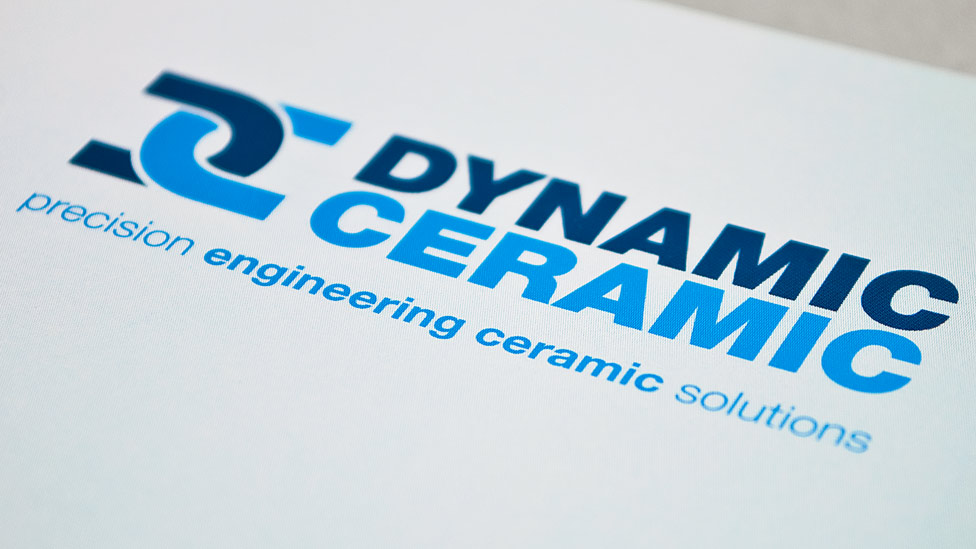
The new logo design features a very simple yet powerful icon of two chain links, created from the company’s initials – representative of the strength inherent to their ceramic products and their partnerships with their customers. The icon is matched with strong, clean typography and complemented with contrasting blues.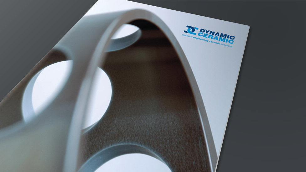
The final addition to the new logo design was the introduction of a strapline summing up what Dynamic-Ceramic stand for.
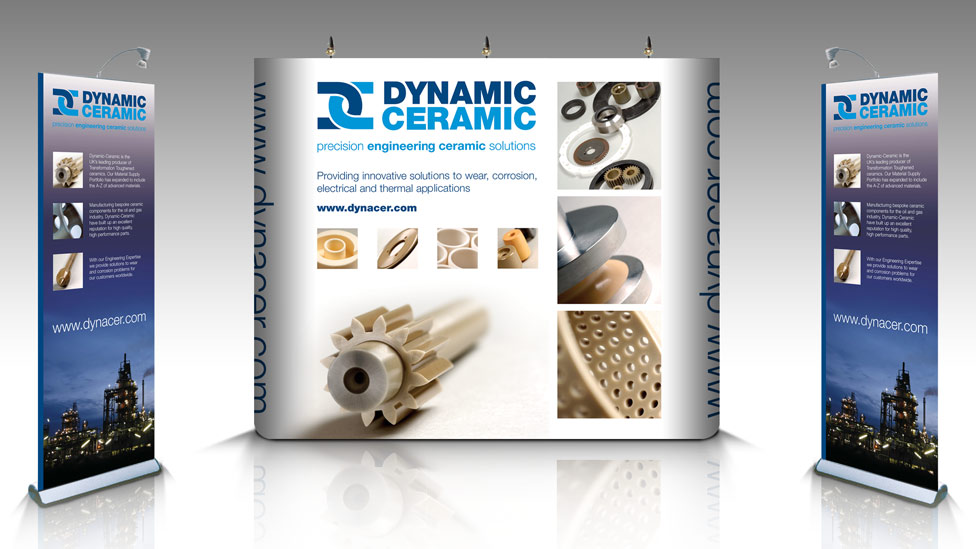
The new logo was then used on a variety of collateral, such as a brochure, stationery and exhibition system.
Looking for help with your project?
Feel free to give us a call to start a conversation,
our doors are always open.
Related projects
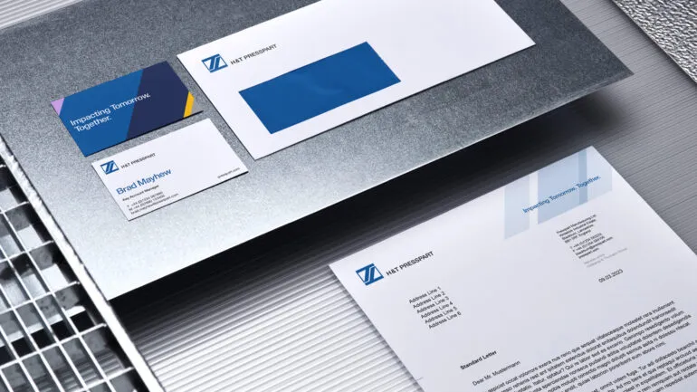
H&T Presspart
Branding strategy & development
Pinpoint Digital
Company logo

AMBS
Identity development and application
