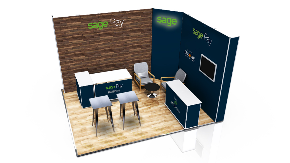
To allow our client to promote their Sage Pay product at an industry-leading show, we created a dual modular stand design that drew visitors in by a transmitting a sense of warmth and one-on-one service.
Background
Sage Pay offers fast and reliable functionality to carry out payment transactions quickly and securely, whether online, face to face or over the phone.
As part of their promotional calendar, Sage was attending Hotelympia. For over 80 years, the show has been at the helm of innovation in the hospitality sector and currently attracts over 750 exhibitors and tens of thousands of visitors distributed across four shows: The Professional Kitchen Show, The Food Service Show, The Interiors and Tableware Show, and The Hospitality Tech Show, where Sage had exhibition space.
Our client was promoting Sage Pay, an integrated payment solution designed for hotel environments. When integrated with the establishment’s Property Management System, Sage Pay makes it easier and faster to process guest payments, improving customer experience and maximising front desk efficiency.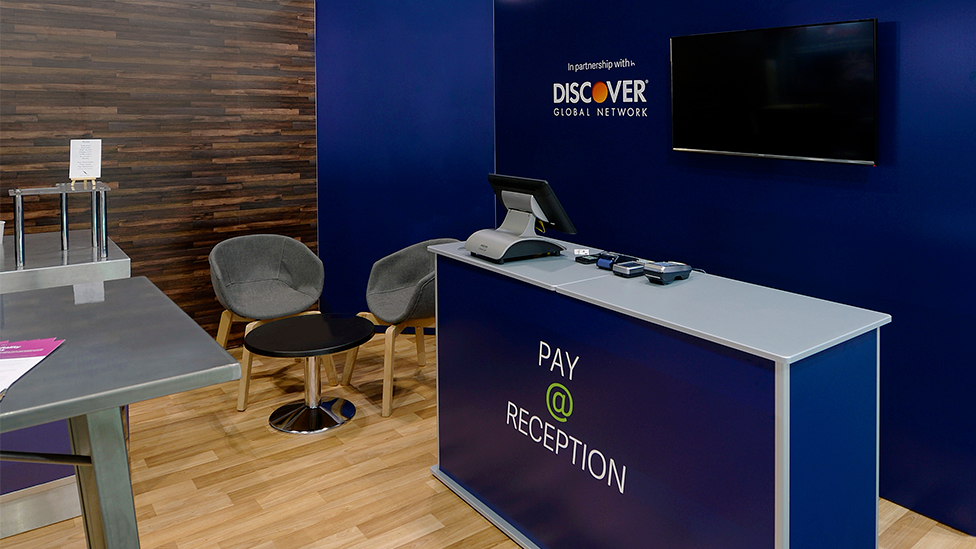
Challenge
This modular stand design had to incorporate two realistic environments which the Sage sales team could use to carry out product demos. Both spaces – representing a hotel reception desk and a coffee bar – had to be created under strict budget limits and in a relatively small 5 x 4 metres plot.
In the past we’ve worked with Sage on much larger stands with an imposing presence in the exhibition hall; this time, and following the company’s latest brand guidelines, there was an appetite for a much smaller, pared down structure that transmitted a sense of a much more personalised, one-on-one service.
Solution
Despite the relatively small space, we delivered a modular stand design that allows for an effortless flow of prospects and salespeople.
The materials used mimic natural, high-quality materials. The earthy colours and gritty textures add a warm, homely feel where visitors feel they are welcome to step in and engage in conversation with the Sage team. The stand feels inviting, almost like a living room.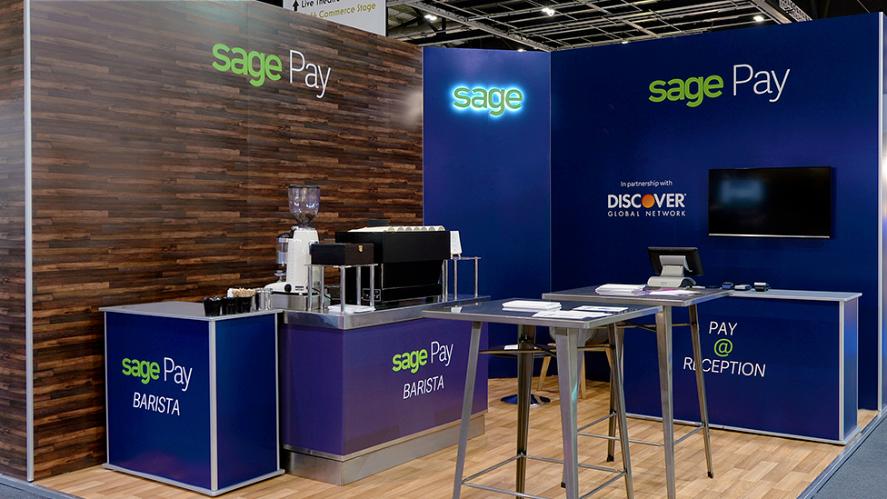
To clearly define the two areas that were required, we used wall graphics on one side, and a wall clad in wood on the other. This not only helped visitors visually differentiate the two areas, it was also a more cost-effective solution to use graphics in one of the areas. Signage was kept simple and integrates well with the stand, and the use of a graphic wall also gives the back-lit Sage logo more prominence.
High stools and tables and soft seating and a combination of metal, wood, and neutral contemporary colours were used to invite conversation in demo and collaboration areas. The barista coffee area served not only to draw visitors in to the stand, but it also allowed the sales team to demonstrate the product’s benefits within a realistic situation.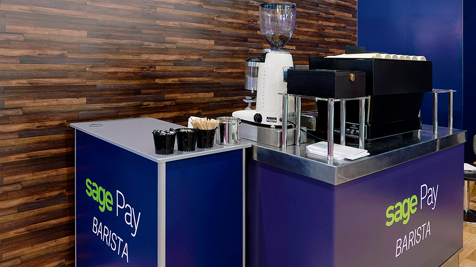
We not only helped Sage with the stand design, we also sourced, managed and installed the Wi-Fi and AV connections, electrics, and professional coffee machine – all within a tight turnaround of just over 3 weeks.
Have a look at other exhibition design projects we’ve delivered over the years.
Looking for help with your project?
Feel free to give us a call to start a conversation,
our doors are always open.
Related projects
PTC Therapeutics Inc
Pharmaceutical booth design
Pascall+Watson
Hybrid stand design
Sage
Modular exhibition stand design
