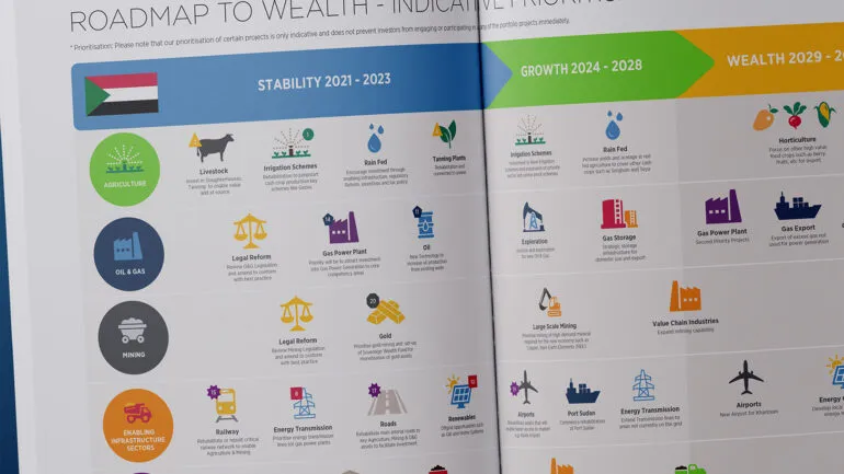
This multilingual infographic design presents the connection between building ventilation, health and productivity in a way that is both uncomplicated yet thought-provoking.
Background
World Ventil8 Day is a global awareness campaign dedicated to advocating for better building ventilation and highlighting its essential role in enhancing health, wellbeing and productivity. The initiative was founded by a coalition of environmental advocates, scientists, engineering organisations and academics, including The University of Sheffield’s Department of Civil and Structural Engineering, in partnership with Sheffield City Council.
As part of the campaign, our client would participate in a series of knowledge-sharing sessions and events, both online and in-person, reaching audiences worldwide to drive awareness and encourage action.
Challenge
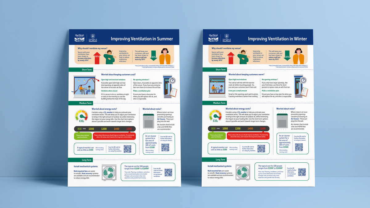
Using two visually simple PowerPoint slides provided by our client – one for summer conditions and another for winter – we were tasked with creating a multilingual infographic design. The goal was to present strong scientific and practical evidence demonstrating how proper ventilation helps reduce exposure to infectious diseases and air pollutants, in an engaging and accessible format.
Beyond the infographic design, the brief required us to make it accessible to a broader audience by providing translations in nine additional languages alongside the original English version.
- Arabic
- Bengali
- Chinese (Simplified)
- Italian
- Kurdish (Kurmanji)
- Polish
- Punjabi (Pakistani)
- Slovak
- Urdu
Since some of the target languages use right-to-left scripts and different alphabets, character sets or symbols, we needed to account for the unique structure and flow of each language. This went beyond just adjusting the text direction – we also had to carefully consider how graphics and text were positioned to maintain clarity and readability across all language versions.
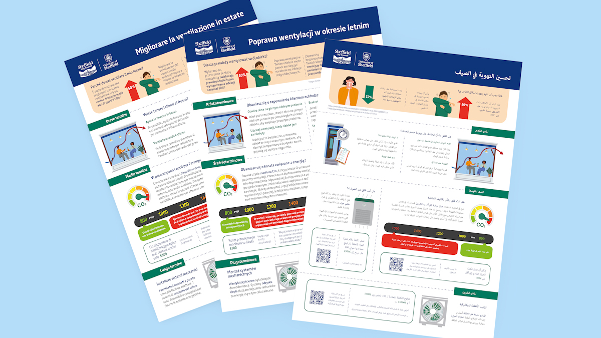
When working with right to left languages, like Arabic, all content has to be positioned as a “mirror image” of the English source version.
In total, there were 20 infographics to design and print: 2 different versions of the infographic – summer and winter conditions – in 10 different languages each.
Solution
With a large amount of information to convey, we opted for a simple design, maintaining clarity and impact while delivering a highly effective final piece. By sourcing stock illustrations, we reinforced the message visually, while our choice of fonts and colour palette aligned with Sheffield City Council’s brand guidelines, ensuring consistency with other communications.
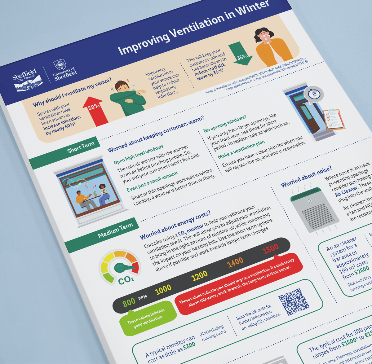
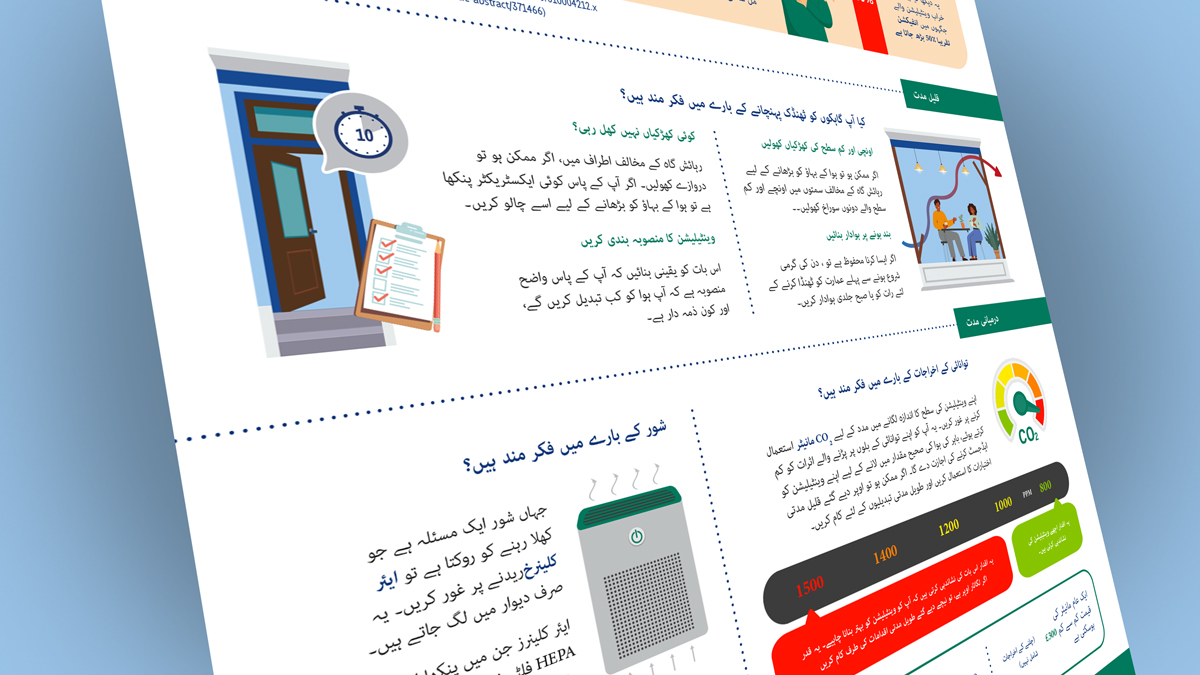
The initial brief requested an A5 leaflet, but after reviewing the content and considering the best way to engage the audience, we recommended an A4 format instead. This larger size provided more visual impact, allowing for better readability and a clearer layout, ultimately making the infographic more effective.
To streamline information delivery and focusing on accessibility, we incorporated QR codes, enabling readers to access additional resources, translations or supporting content.
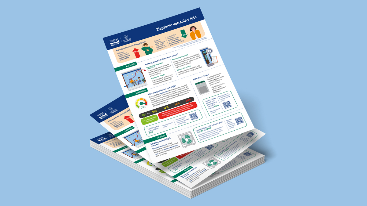
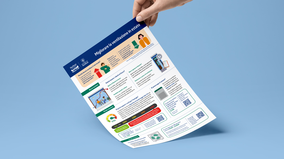
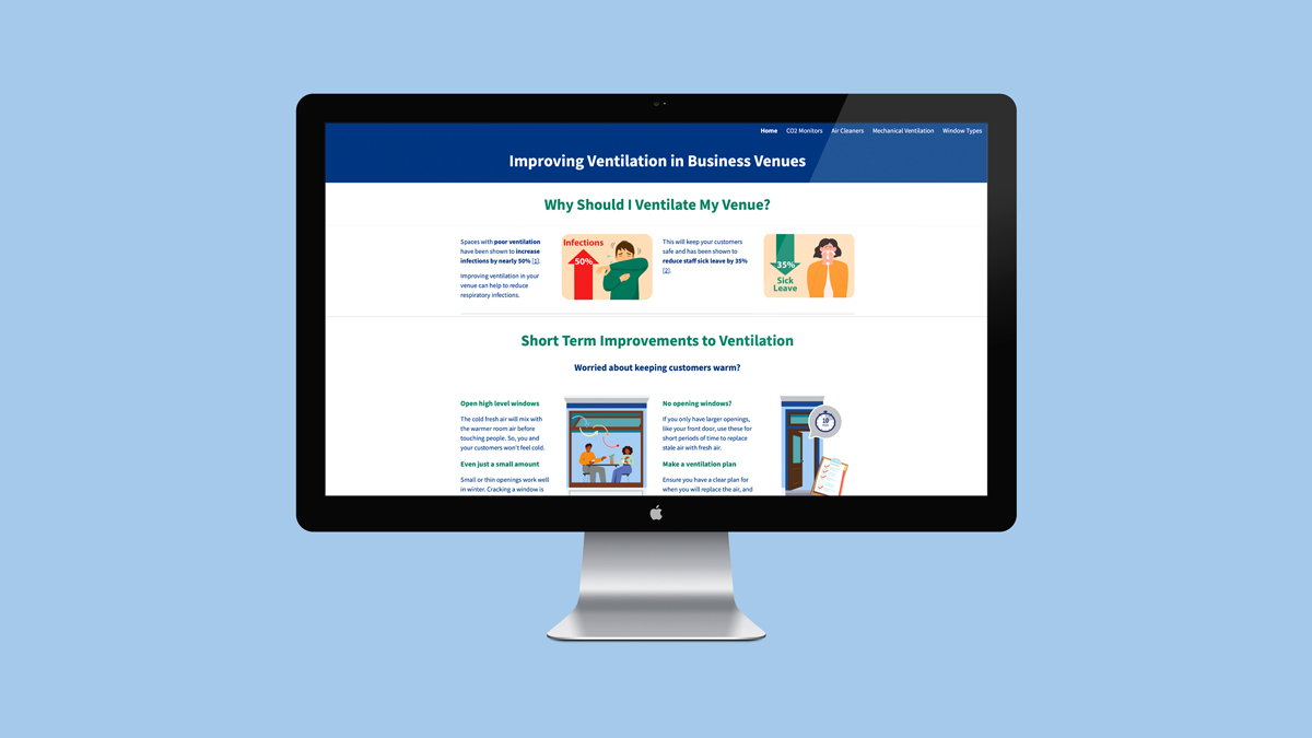
We also designed the infographic to be easily adaptable for digital use, ensuring versatility across various platforms. Whether used in webinars, presentations or virtual meetings, the content could be displayed as a full infographic or split into bite-size sections, making it ideal for engaging different audiences in multiple settings.
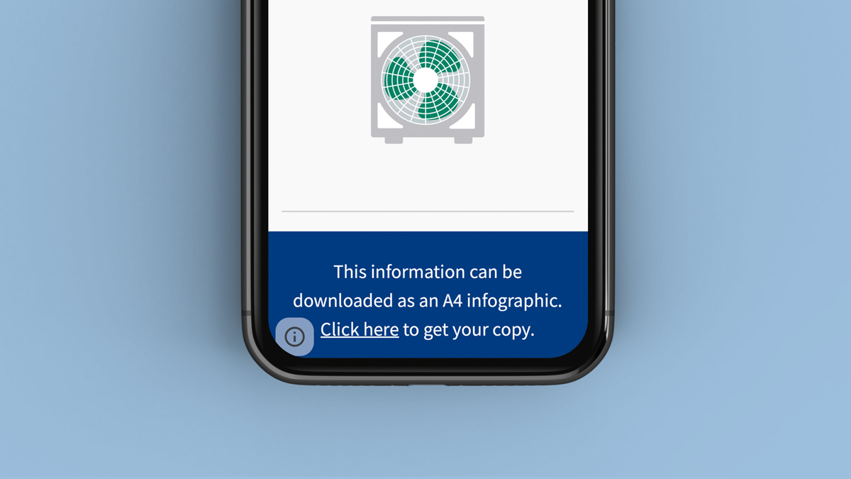
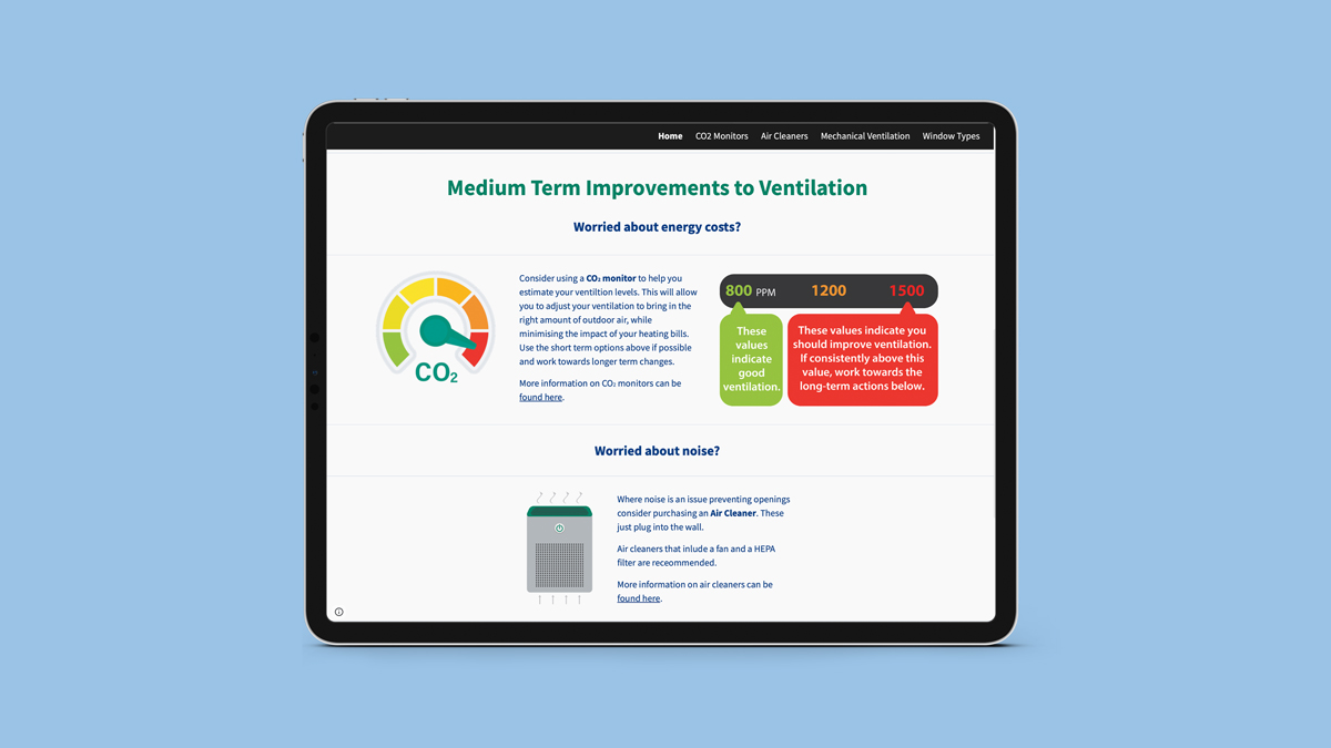
“The first print run of the infographic was spectacularly well received by our project partners and trial participants, who really appreciated being communicated to in their mother tongue. Thanks again Suzie and Bryony for all your hard work on this, you were both a pleasure to work with.” – Research Associate, The University of Sheffield.
Looking for help with your project?
Feel free to give us a call to start a conversation,
our doors are always open.
Related projects
Allmed
Multilingual website design
Andrews Sykes Group
Social media infographic
Deloitte
Internal communications infographic
