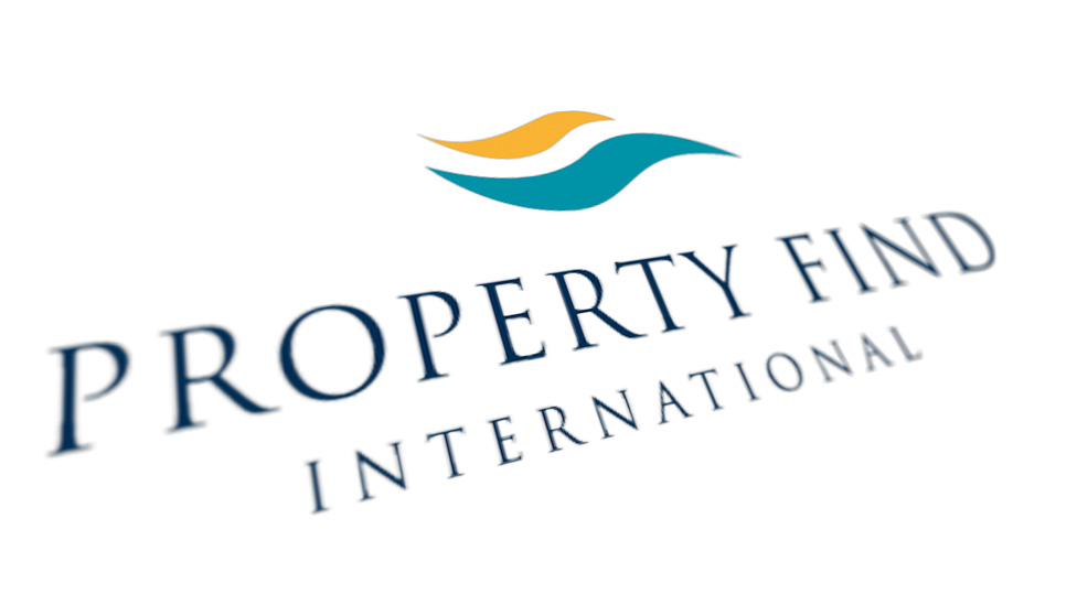
 Mortgage broker Property Find International asked us to create a new business logo design for their exciting venture.
Background
Previously operating as a low key but successful UK mortgage brokerage working from home, the entrepreneurial duo identified a significant business opportunity servicing UK residents looking to invest in property in Europe.
Challenge
Once our client realised that their new start-up company needed a new business logo design which would make them appear to be a much bigger operation than they really were, they enlisted our help.
Solution
We started by designing a range of initial concepts, where we were exploring different typographic styles, colour-ways and graphical elements. The final decision was almost immediate and unanimous – the classic serif typeface set with wide kerning to give the logo a sense of authority and poise, set off with the stylised fluttering flag graphic, helped create a new business logo with the feel of a much larger, established multinational organisation.
Testament to the success of the new logo design came a few months after launch, when an international property agent much larger than our client contacted Property Find International expressing an interest in joining forces with them, but fearing that they would be too small for Property Find International to be interested – evidence of the power of what a great brand design can do for the reputation of a business.
Over the years we have helped clients of all shapes and sizes attract their target audience through striking and effective logo design. Have a look here to find out more.
Looking for help with your project?
Feel free to give us a call to start a conversation,
our doors are always open.
Related projects

H&T Presspart
Branding strategy & development

AMBS
Identity development and application

INEOS
Company magazine design
