We helped Landlink market their premier barn conversion homes with a property logo design that reflects the exclusive character of the Cheshire countryside development.
Background
Property developer Landlink were marketing a select development of exclusive barn conversion style homes, set in the beautiful rural location of Kingsley, in the heart of the Cheshire countryside.
Challenge
The first part of our brief was to come up with a list of names which would effectively reflect the charm, character and exclusive nature of our client’s barn conversion development. Once the name had been agreed on, the next stage of our brief was to create a visual identity that would transmit the essence of the development.
Solution
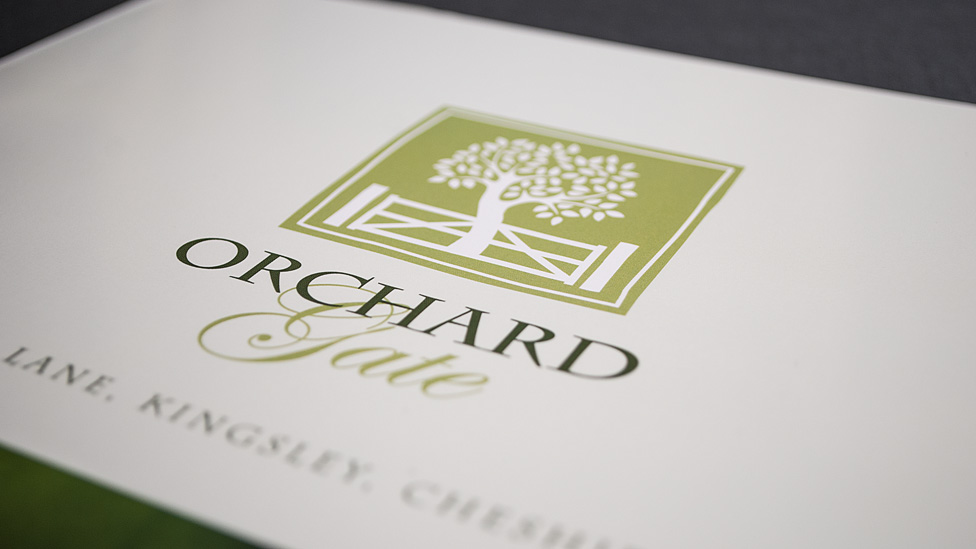
Working in close collaboration with our client’s marketing team, and ensuring the name of the development would match the expectations of their audience, we agreed on the new name: Orchard Gate, which perfectly encapsulates and evokes the sentiment behind the barn conversions. We then set out to develop a sympathetic property logo design which we could roll out across a full suite of promotional marketing materials.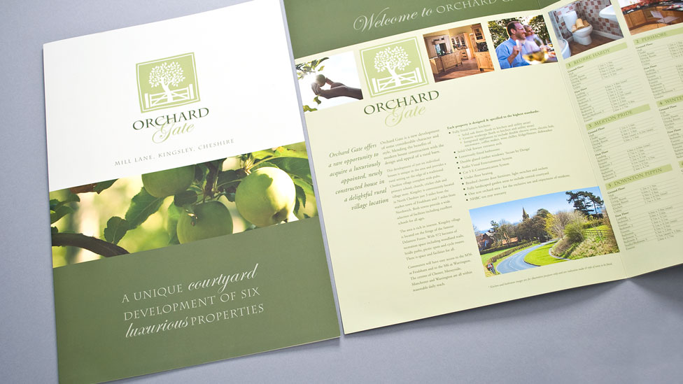
Taking the name and the location as our inspiration, we created a simple yet stylish graphic illustration of an apple tree and gate. We combined a distinctive serif typeface with an ornate script face to give the logo design a natural and rustic, yet elegant and modern look. The colour palette of dark and light olive greens ties in beautifully with the rural location and also helps achieve a suitably sophisticated logo design.
Looking for help with your project?
Feel free to give us a call to start a conversation,
our doors are always open.
Related projects

H&T Presspart
Branding strategy & development
Property Find International
International property brochure
Macmillan Partnership
Property specification brochures
