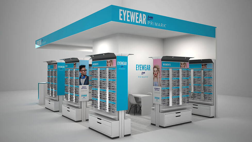
This retail POS design concept helped our client present Primark with a highly professional-looking experience that helps inspire confidence and attract attention to a new in-store initiative.
Background
To be able to compete with the rise in popularity of online retail in the last few years, traditional retailers are increasingly having to think of new ways to keep shoppers flocking to their physical stores. For this project, Primark had decided to explore the possibility of including an opticians space within its stores.
Challenge
Working with our client – a leading specialist in in-store retail and clinical opticians – on a proposal to retail giant Primark, our brief was to come up with not only striking and effective retail experience design ideas, but also with a memorable and strong way for our client to appeal to Primark throughout the pitch proposal stages.
Solution
This retail POS design concept helped our client present Primark with a highly professional-looking experience that helps inspire confidence and attract attention to the new initiative, perhaps unexpected for the loyal Primark customer base.
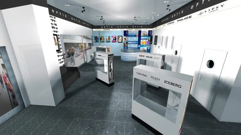
A clearly structured angular layout, clean lines, prominent fonts and minimal use of colour help communicate the purpose of the new space straight away. The POS design stands out in the busy Primark shop floors, where hundreds of product lines and colourful displays compete for the attention of a bustling crowd of shoppers.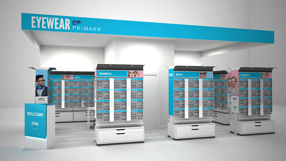
The wide range of styles available is clear from far corners of the store, acting as a magnet for busy shoppers to approach and have a closer look. The column style of the POS design display units helps showcase the large number of options in a logical and structured yet enticing way.
Whilst we maximised every square metre within the plot, we left enough room between the different display units for traffic to flow comfortably, and for shoppers to browse at leisure. The space is calm and welcoming.
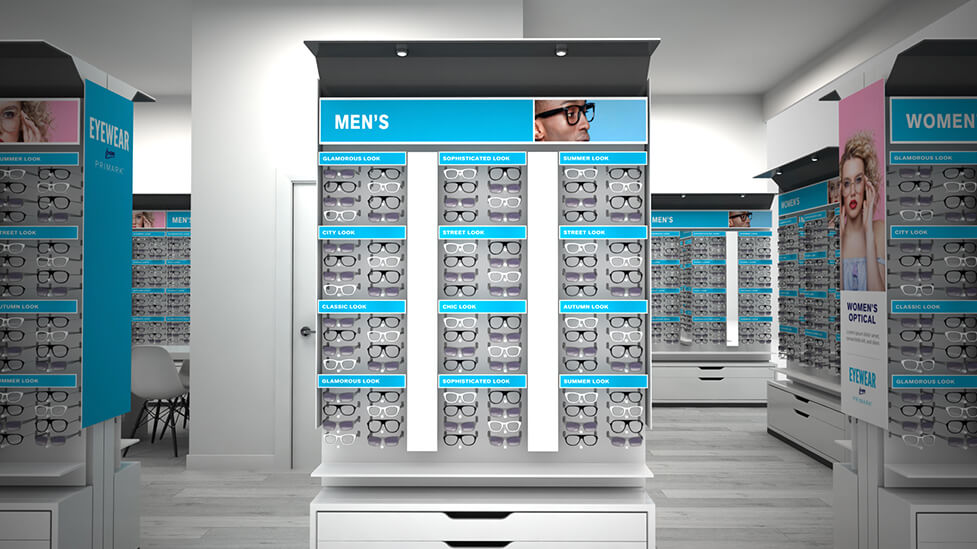
For customers wanting to choose between male and female frame styles, the subtle use of the traditional gender split using blue and pink tones helps plan the customer journey, maximising dwell time.
The space is open whilst still leaving room for private one-on-one consultations in a dedicated desk area we included in the design. While still focusing on privacy, with this POS design we wanted to keep this area visible to make it an essential part of the retail experience on offer. So instead of positioning it at the back of the space, where it may not be so obvious to passers-by, we turned it into a central anchor within the space.
Realistic CGIs strengthened our client’s proposal document, helping Primark visualise the proposed ideas in a realistic way.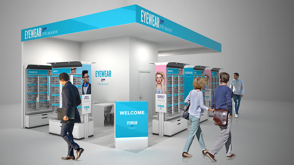
Looking for help with your project?
Feel free to give us a call to start a conversation,
our doors are always open.
Related projects

Aldrich Group
Commercial landlord pack design
Galaxy Optical
Retail point of sale

Air Products
Retail brand design
