A simple yet bold design gives this urban regeneration brochure a strong presence while maintaining an engaging and respectful tone. Created to foster community trust, the brochure presents an ambitious regeneration initiative in a way that is clear, accessible and visually compelling.
Background
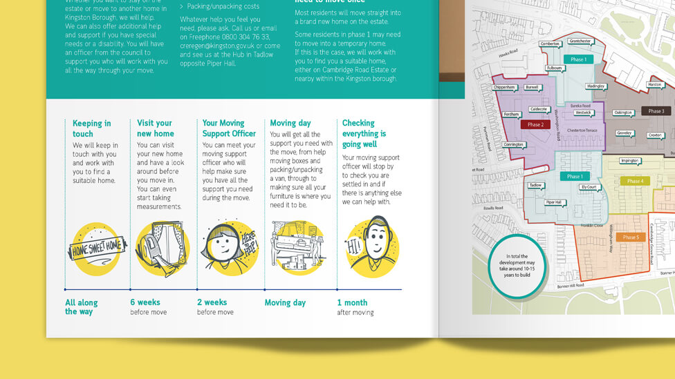
Cambridge Road Estate (CRE) is Kingston’s largest urban regeneration programme, designed to transform the area with 2,000 high-quality new homes over the next 10 to 15 years. The project took shape following months of close collaboration with locals, ensuring that their priorities and concerns were central to the plan.
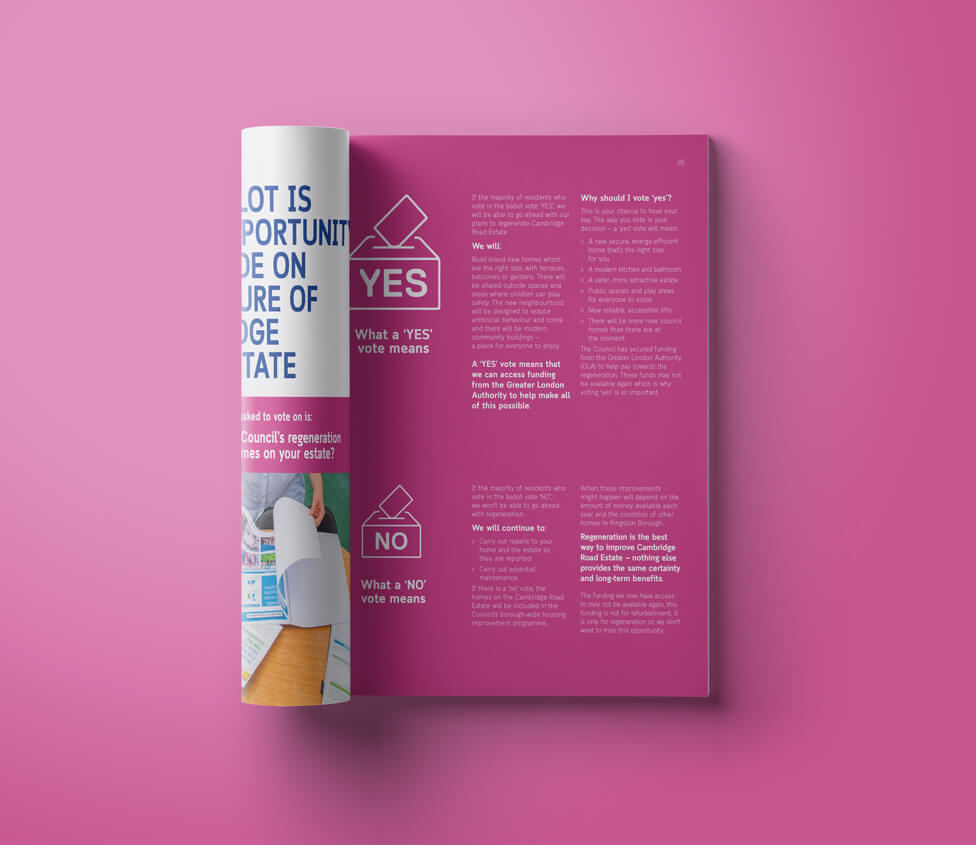
For the regeneration to proceed, a Landlord Offer had to be developed, followed by securing a ‘yes’ vote from CRE residents through a ballot, in line with the Mayor’s estate regeneration guidance. Without approval, the project could not move forward. A ‘yes’ vote would mean more affordable housing, improved community facilities and enhanced outdoor spaces, while also creating a lasting social and economic impact for thousands of residents in this South West London borough.
Challenge
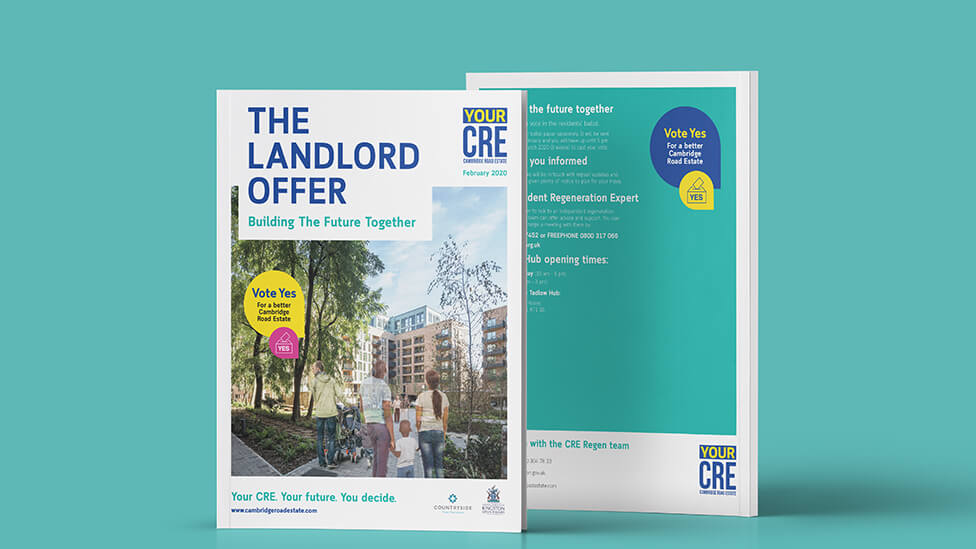
As the ballot approached, our client entered an intensive period of resident engagement and needed our support in creating the Landlord Offer document – an urban regeneration brochure designed to help residents make an informed decision about redevelopment.
A key requirement was to ensure the brochure design reflected a strong local identity and highlighted resident involvement in shaping the new neighbourhood.
Solution
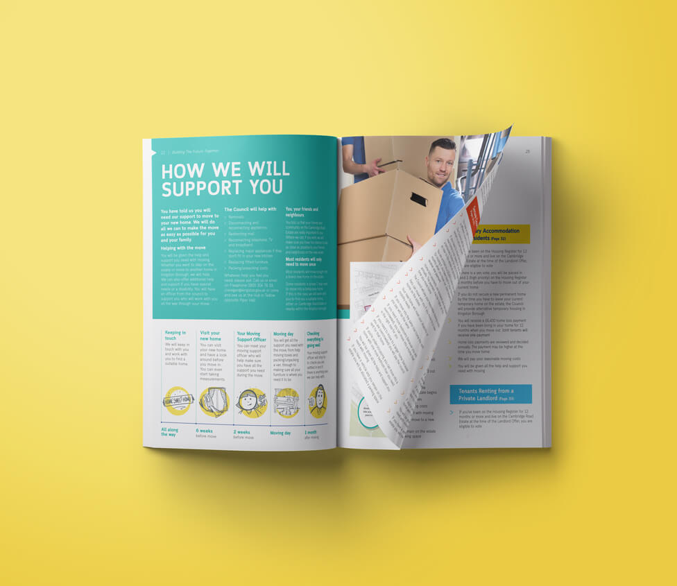
Our design is simple, bold and welcoming, creating a friendly, engaging and respectful tone that helps residents feel informed and reassured. A well-structured layout guides them through a clear overview of key information, with signposts directing them to more detailed explanations in extended sections of the document. This approach ensures the brochure is easy to navigate, allowing residents to find the answers they need without feeling overwhelmed.
Building trust in the initiative was at the heart of the design. The pages are rich with information, delivering a reassuring and transparent message about the voting and regeneration process. The content focuses on what matters most to residents – the continuity of their close-knit community. Instead of feeling like they are being displaced, the message is clear: “You’re not moving away from your neighbours”.
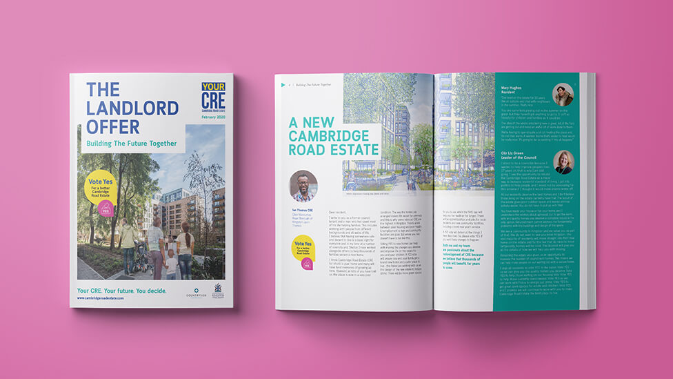
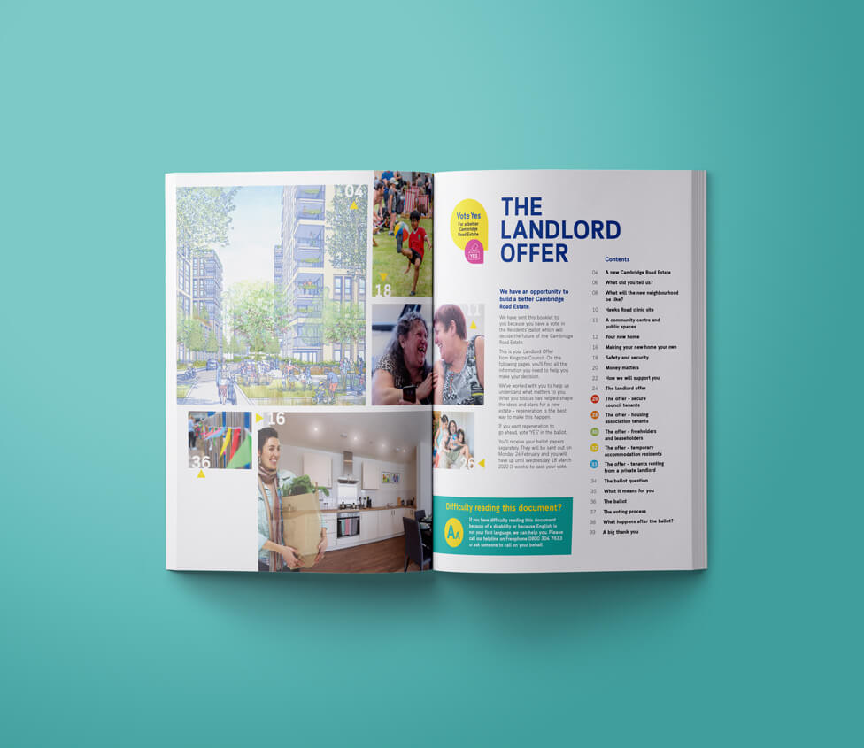
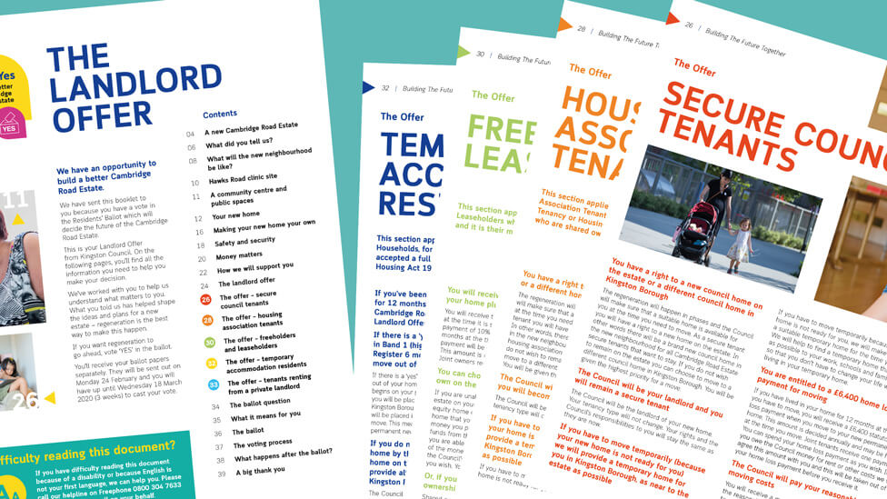
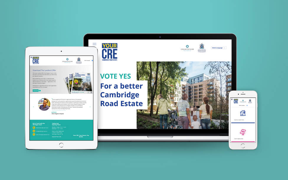
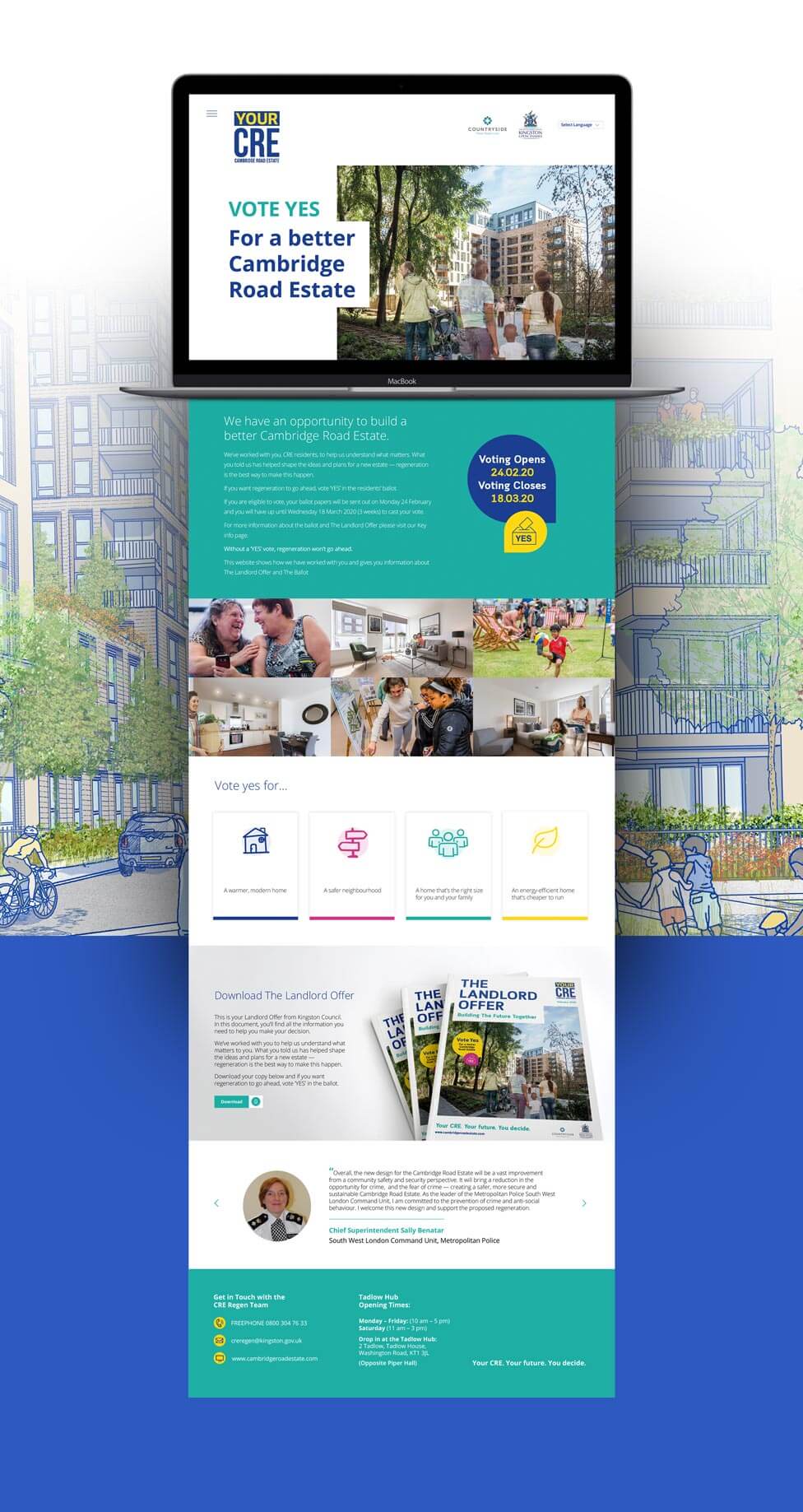
From the very first page, we designed the urban regeneration brochure to speak directly to residents, ensuring clarity and engagement. We structured the contents page as an easy-to-read guide, offering a clear overview of the document while breaking down the key elements of the Offer in a way that is simple to navigate.
This carefully structured introduction is designed to entice readers to turn the page, encouraging them to explore the details of the regeneration plan with confidence.
The brochure prioritises plain English and clear, simple descriptions, ensuring accessibility for all residents. The brand voice is compassionate, fair and understanding, instilling confidence in the proposal and making the information easy to absorb.
The copy immediately engages readers with warm, inclusive and people-focused language, making the content feel approachable and relevant. A thoughtful use of colour, a relaxed illustration style and a clean, well-structured layout further enhance the brochure’s appeal, reinforcing both its message and its accessibility.
We structured the brochure to help residents easily find information that matters most to them, whether it’s financial considerations, the moving process or preserving their community ties.
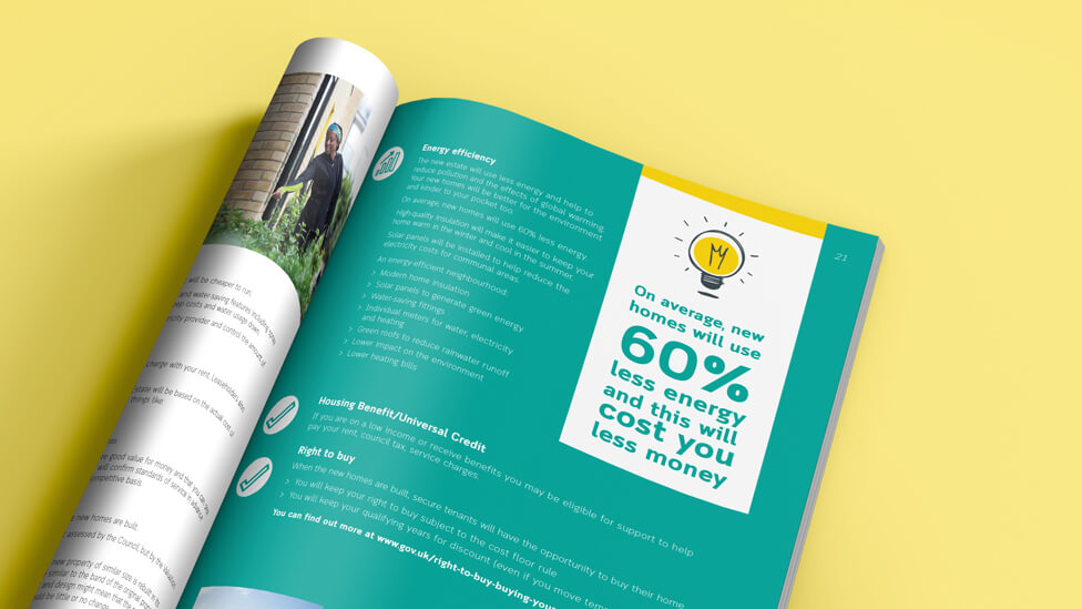
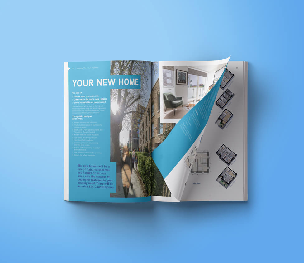
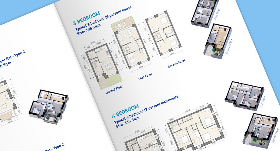
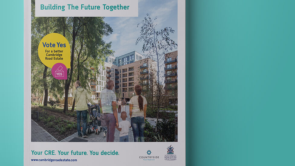
A combination of artist impressions and photography brings the new development to life, showcasing the quality of the new homes and the lifestyle benefits residents can expect. These visuals provide a realistic and engaging glimpse into the future neighbourhood, making the regeneration project feel more tangible.
To make the imagery more persuasive and emotionally compelling, we enhanced the renders by Photoshopping people into the scenes. This subtle yet powerful addition helps residents visualise themselves in these spaces, making the prospect of moving feel less abstract. A once lifeless render of a furnished room instantly transforms into a welcoming home with personality, strengthening the message that this development is meant for them and their community.
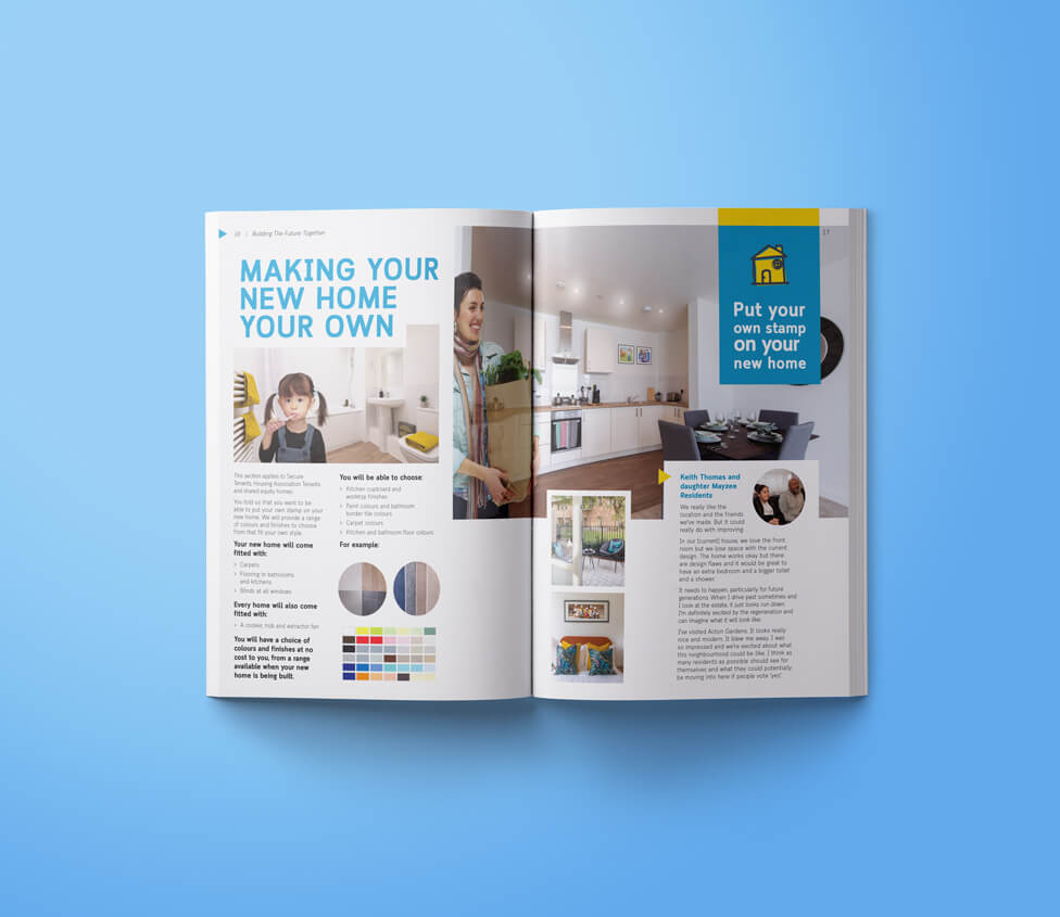
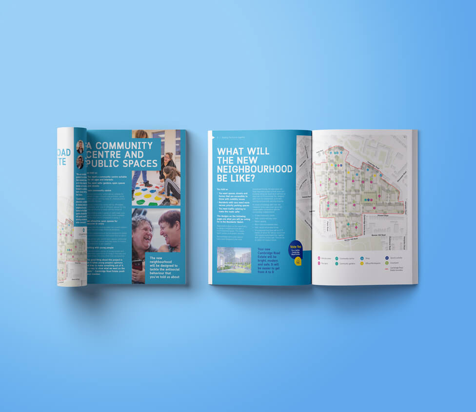
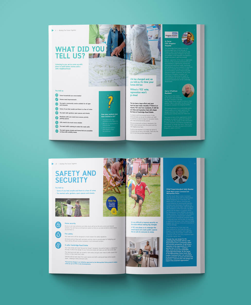
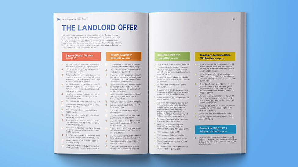
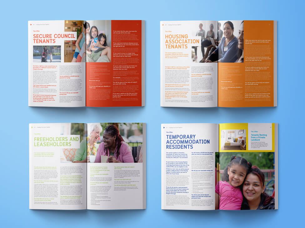
Building on the existing brand, we introduced a new colour system to clearly differentiate the various tenancy options and improve content navigation. We assigned a distinct colour to each tenancy type, allowing residents to quickly identify the sections most relevant to them. The thoughtful use of colour created a structured, intuitive reading experience, guiding residents through the details of their options while maintaining a cohesive connection to the overall brand.
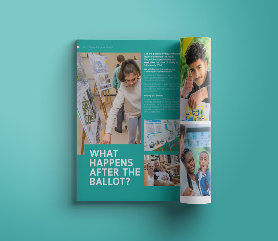
Triangles positioned at the top of each page introduce a subtle yet dynamic design element, creating a sense of movement and progress that reflects the forward-thinking nature of the regeneration project. This visual cue encourages readers to engage with the content while nodding at the idea of positive change and development.
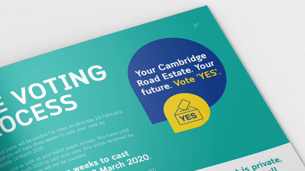
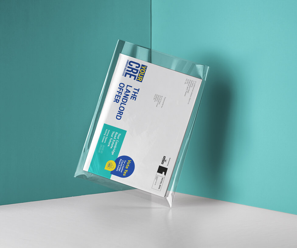
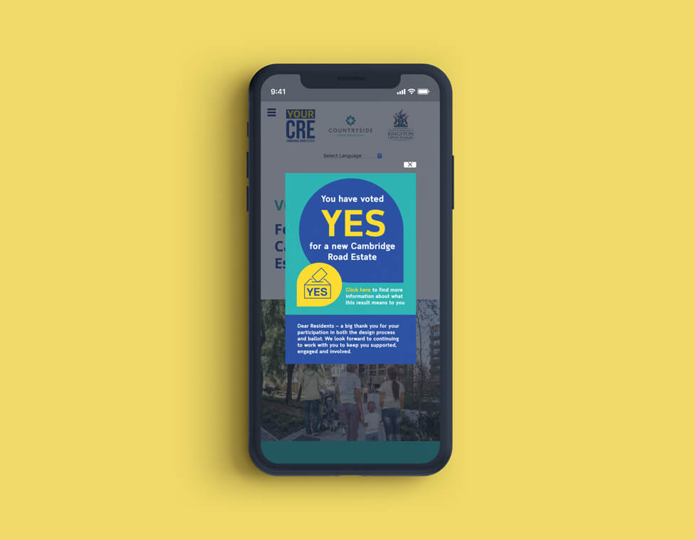
To further embed the client’s key message, a prominent ‘Vote Yes’ icon appears throughout the document. Strategically placed within relevant sections, this recurring visual element serves as a constant reminder of the benefits of the proposal, ensuring that the message remains at the forefront of residents’ minds as they navigate the brochure.
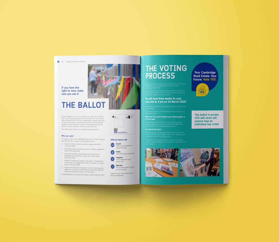
Throughout the brochure, photographs of real residents from the estate take centre stage, creating a genuine sense of community connection. The photography style is fresh and full of optimism, capturing moments of everyday life and positive interactions. This uplifting visual approach makes the initiative more relatable and inspiring, encouraging engagement and trust.
To help the brochure stand out among other materials delivered to residents, we designed it slightly smaller than A4 and placed it in a clear bag to spark curiosity.
We selected light paper stock to make it feel approachable rather than a heavy document that might be discarded. Using recycled paper and avoiding glossy finishes added to this sense of accessibility and personal connection, helping to convey that the initiative is practical, relevant and within reach for residents.
Along with delivering a printed copy of the urban regeneration brochure to every household on the estate, we created a website and a digital version of the brochure for easy download.
The proposal was a success, with residents overwhelmingly backing plans for regeneration in the ballot.
Looking for help with your project?
Feel free to give us a call to start a conversation,
our doors are always open.
Related projects

Papa John's
Franchise brochure design

Green Retreats Group
Sales and marketing brochure design

Headwater Holidays
Travel brochure production
