Nurturing Talent – The next generation answers a real brief
One of our favourite events in the calendar – 6th Form students and the Head of Graphic Design from The Grange School in Hartford, in the heart of Cheshire, are working with us again. The project? To respond to a creative design brief delivered by our Creative Director, Mark Bowers.
It’s the time of year again when we welcome a selection of the most talented A-Level Design students from The Grange School in Cheshire.
With the group at a crucial stage in their potential careers, both our Creative Director Mark Bowers and Managing Director Andi Parker believe in giving young, enthusiastic and talented designers the opportunity to apply those qualities to a real design brief. Mark will then choose a winner, who will join our studio for a week’s work experience in the summer.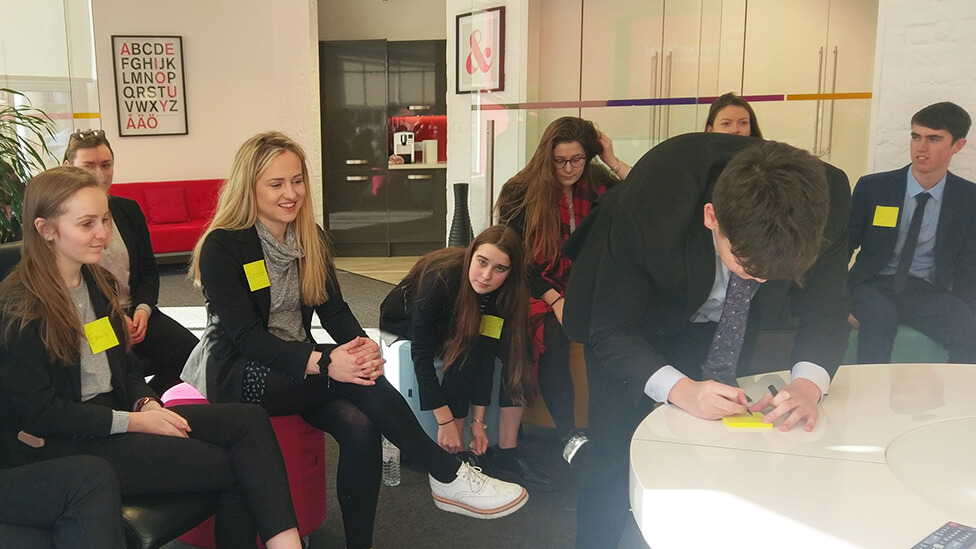
After the success of last year’s competition, Mark was really looking forward to meeting the new students and getting immersed in the project.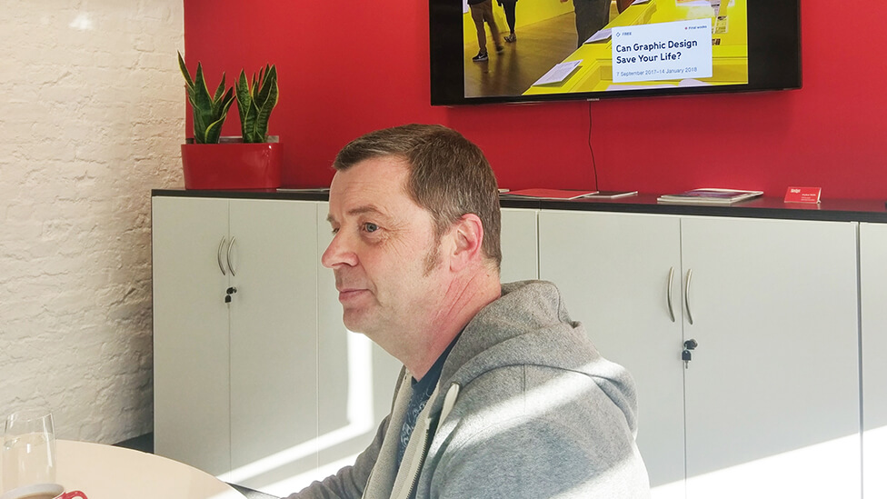
Fresh from attending the “Can Graphic Design Save your Life?” exhibition, and before Mark briefed them on this year’s challenge, the students came armed with their favourite logo designs, and, in every case, a very thorough rationale to back up their choices.
Students’ choice
Here’s a selection of some of the students’ favourite logos, and why they chose them.
Lauren Bond chose this version of the McDonald’s logo, and she commented on the overall positive feeling it exudes: “The introduction of green hints at the healthy ingredients used in producing the food, plus the strapline also transmits a message of positivity.”

Next up was Harriet Hill and the Apple logo: “I like its simplicity and I find the fact that they changed from the original colourful logo to a black & white version quite significant, perhaps it helps transmit the simplicity of their more recent designs”.
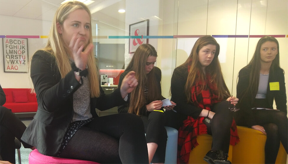
Andi added to Harriet’s presentation by reminding students that when designing, print costs have to be taken into account: “It’s an issue that constantly comes up in the commercial world, clients will always ask about print costs, and of course it’s usually more cost-effective to print in black & white”, he said.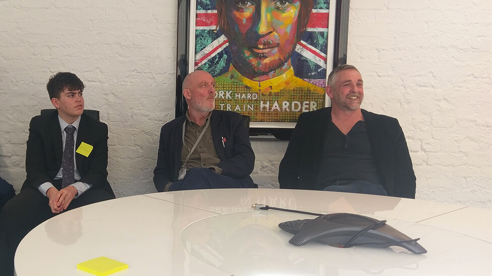
Bryony Webb chose the WWF logo.
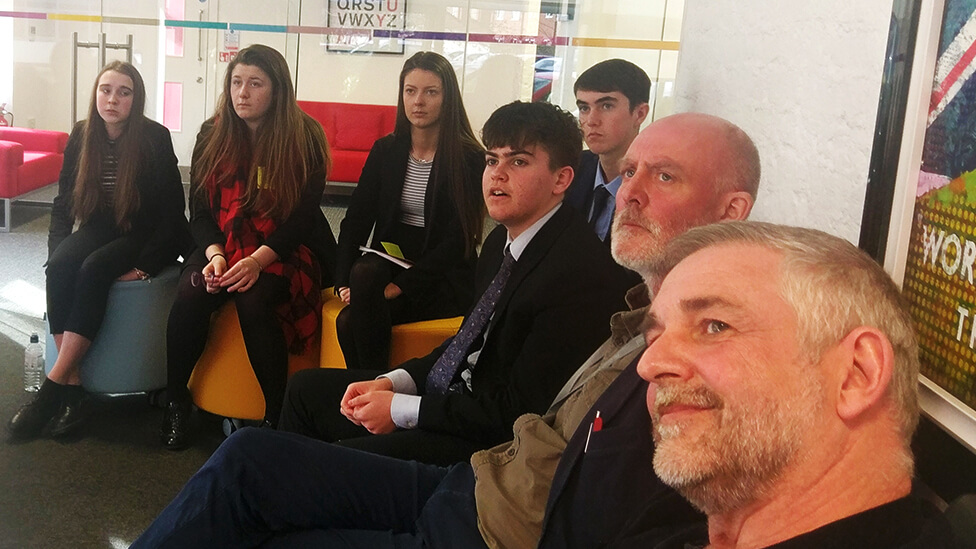
From right: Andi Parker, Parker Design’s Managing Director; Paul McAleny, Head of Graphic Design at The Grange School; and a few of the talented students taking part in this year’s competition.
Bryony felt that “the design of this logo invites you to finish it, encourages engagement and involvement, something so vital for the causes WWF supports.”
The Beats logo was Emily Wilcock‘s choice: “Reminiscent of the shape of head phones, this design appeals to every age”, said Emily, with Andi adding: “It reminds me of vinyls, and I like how it’s very visible and instantly recognisable from the distance. I like how you’ve all really dedicated some thought to your choices.”
The brief
This year Mark asked the students to focus on design for Retail, specifically for the Healthcare industry. The Grange School team will need to come up with a snappy and memorable product name, branding, a strapline and packaging design for a new children’s medicine that relieves pain and fever.
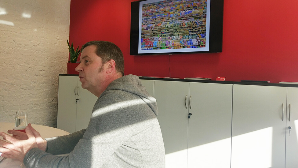
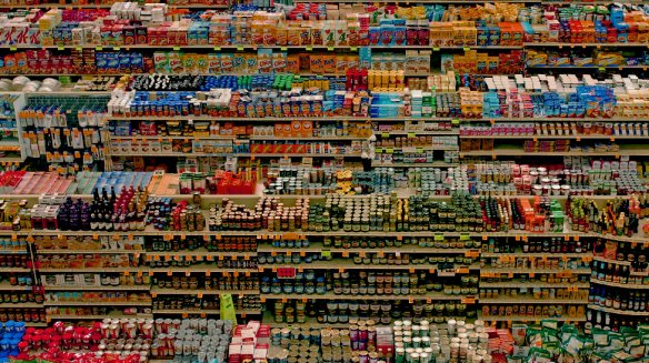
Mark: “It doesn’t matter how well other marketing channels perform, for example TV or print advertising; if you can’t find the product on the shelves, you’re not going to buy it.”
Mark went on to share some examples of branding for well-recognised children’s medicines, explaining how different visual features and product name choices help brands make a connection with their target audience and generate brand loyalty, thanks to combining the rational with the emotional, making a connection between a need and its solution.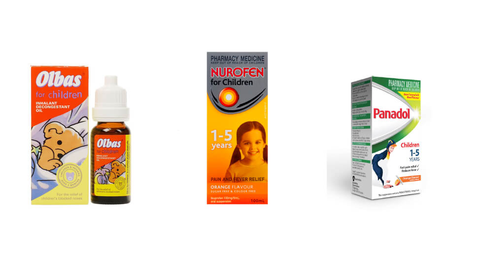
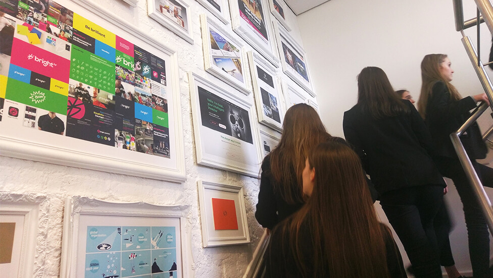
Before going back to school to kick off their designs, Andi took everyone on a tour of our Cheshire office.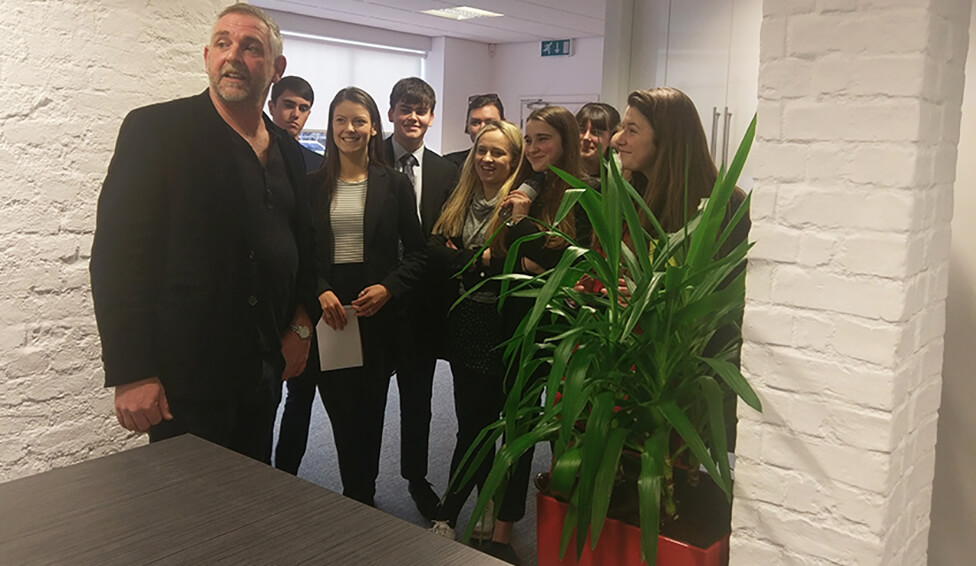
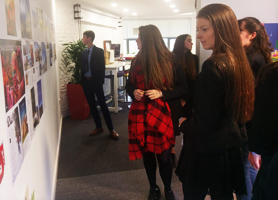 The students review the latest travel magazine designs we produced for our client Exodus.
Good luck everyone, we’re looking forward to seeing your ideas!
LET'S COLLABORATE
Feel free to give us a call to start a conversation, our doors are always open.