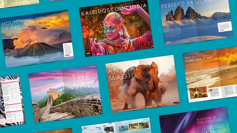
Exodus first took a group of travellers to the Himalaya back in the 1970s. Since then, the company has expanded to offer over 500 unique itineraries worldwide, with a mixture of adventure and family holidays, winter seasonal getaways, and walking and cycling tours, all promising savvy travellers the holiday of a lifetime.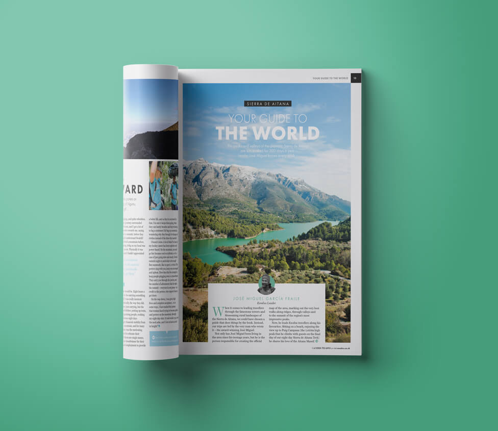
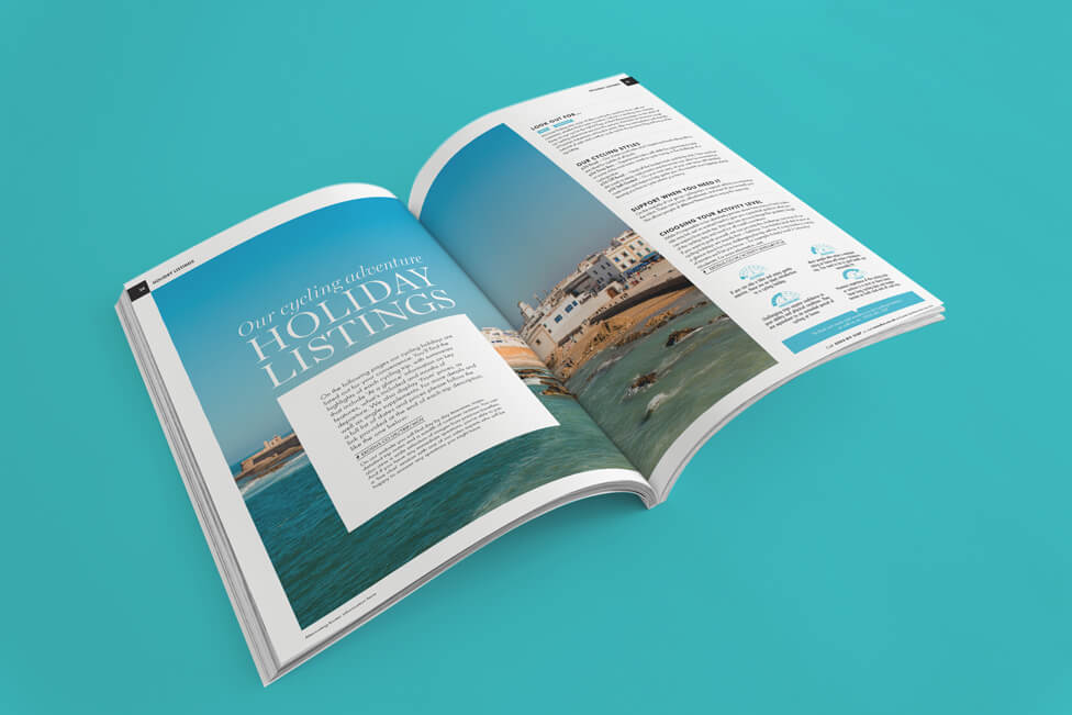
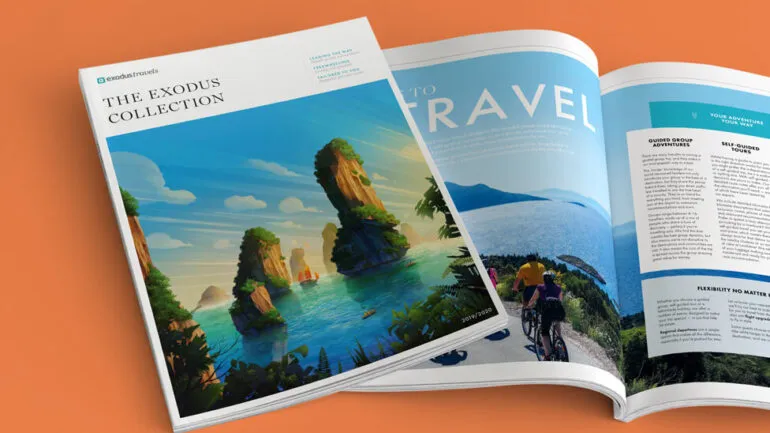
Despite each page needing to accommodate a lot of visual and written content, this adventure holiday brochure design is always crisp and clean, engaging and easy to follow.
Background
Challenge
Research done by Exodus had revealed that when readers receive the brochures, there was an uptake on holiday bookings, however, those bookings didn’t necessarily correspond to the trips the brochures were promoting.
To minimise this, and also to offer Exodus audiences a new kind of experience when browsing through the brochures, our client had decided to reduce their number by combining different brochures together. As a result, our designers had fewer pages to work with for a similar amount of content to previous editions, also designed by Parker.
Solution
To keep the design fresh, we arranged for a different design team to work on this edition. Whilst not a total departure from the previous adventure holiday brochure design, the renewed look and feel stands out on its own, with the aim of keeping existing audiences engaged, and inspiring new ones.
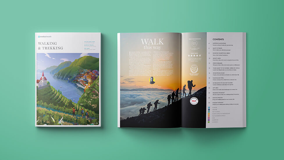
Content which may have traditionally been split across two different brochures (for example, Walking & Trekking and Winter) has now been combined into one brochure. This not only helped Exodus realise significant cost savings, but it also gave them the opportunity to present a fresh perspective on some of their experiences.
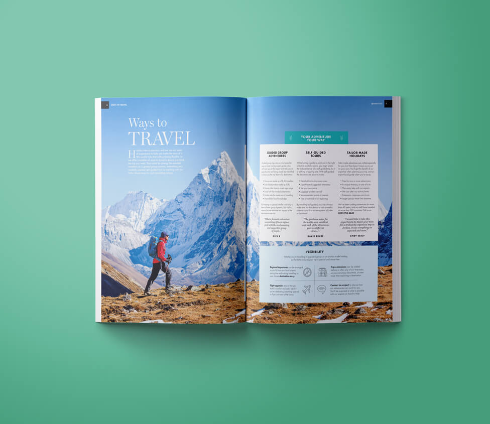
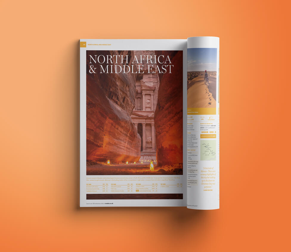
With a new design team came a new approach – one of its manifestations is how editorial pieces are treated differently to more brand-orientated pages, with different fonts and page layouts for each type of content.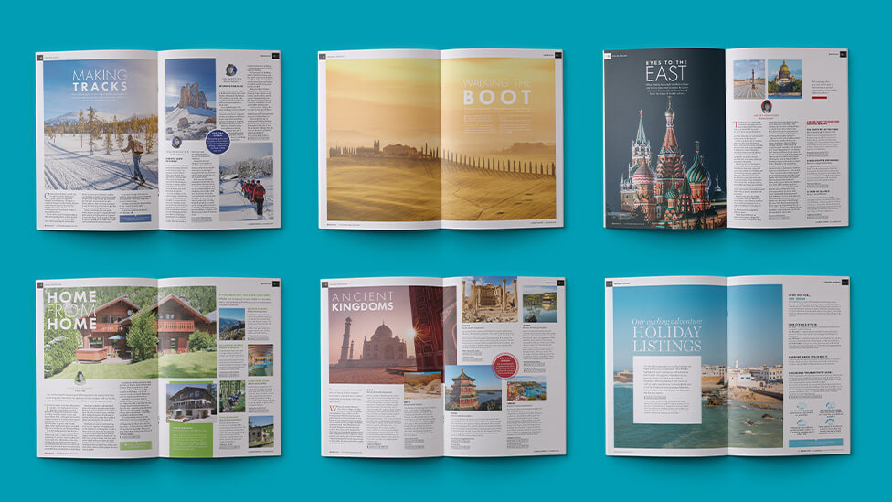
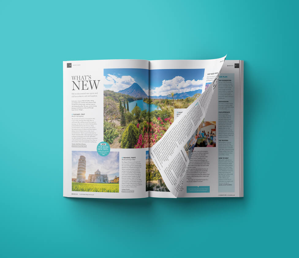
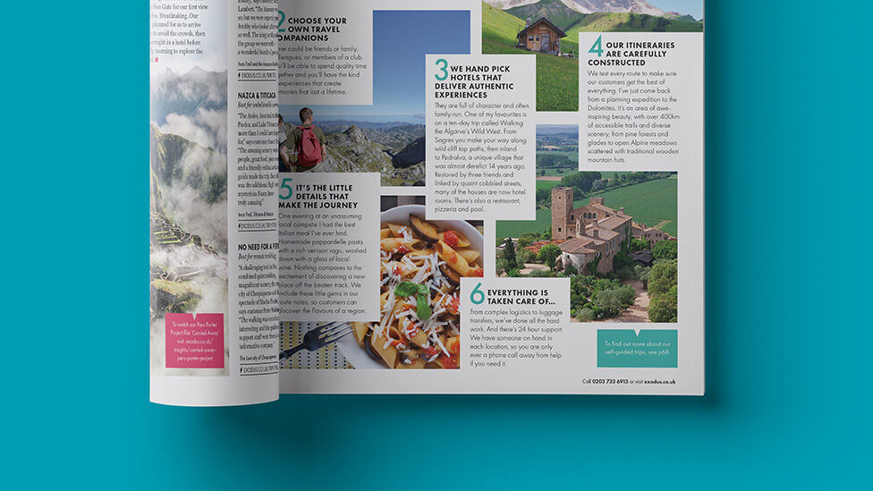
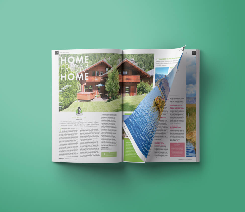
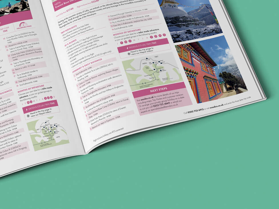
The adventure holiday brochure design pays special attention to the photography – the images act as strong independent hooks, enticing audiences to move on to the written content.
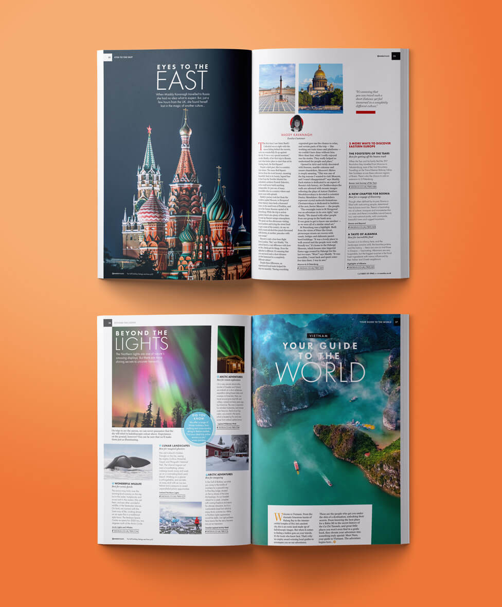
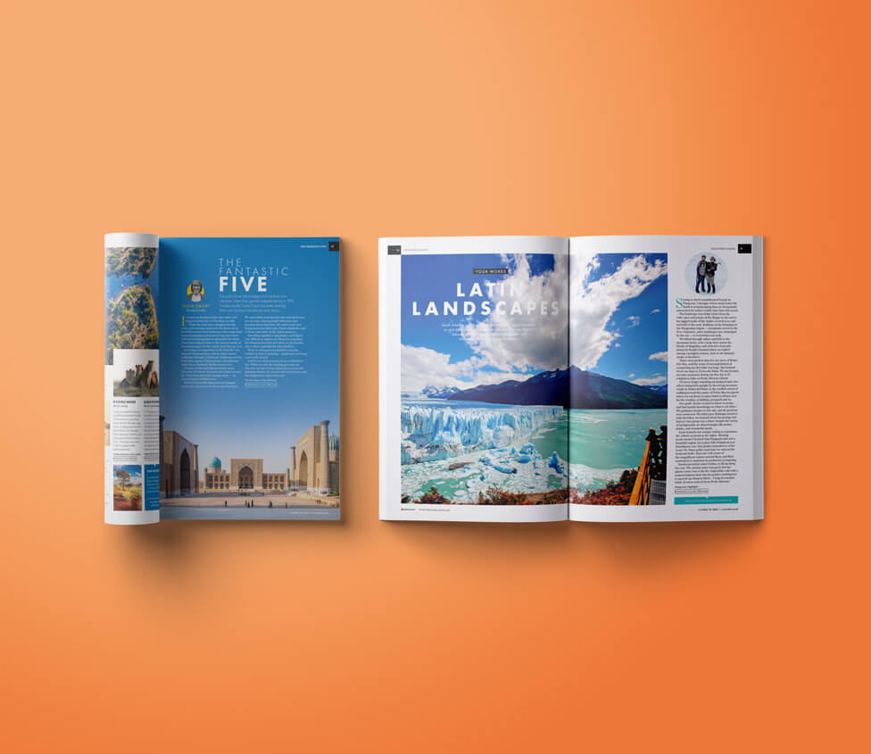
Despite each page needing to accommodate a lot of visual and written content, the adventure holiday brochure design is always crisp and clean, engaging and easy to follow.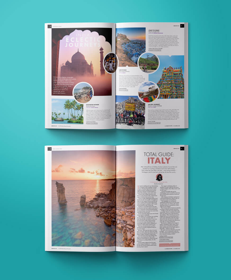
One of Exodus’ main selling points is the local expertise the company offers for each destination. To get this across in a powerful way, we commissioned a team of expert writers, an editor, and organised interviews with Exodus’ local experts. The brochures also include editorial pieces where existing Exodus customers share the unforgettable stories they returned home with.
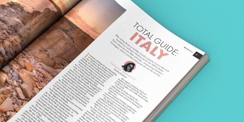
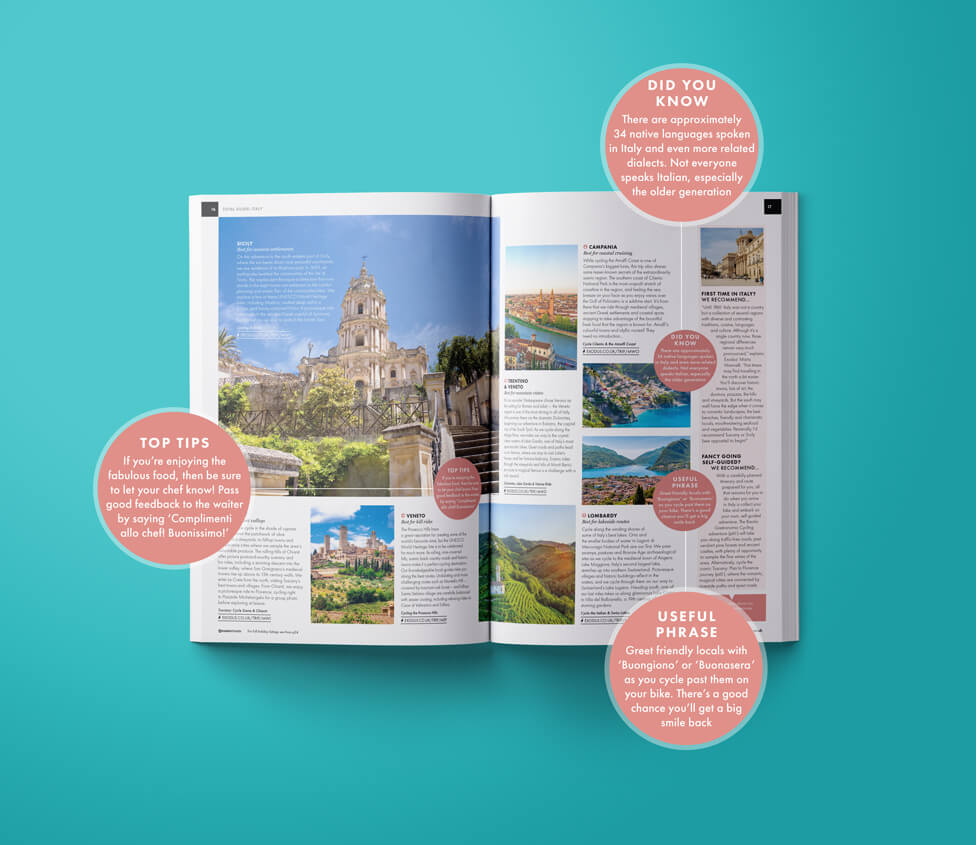
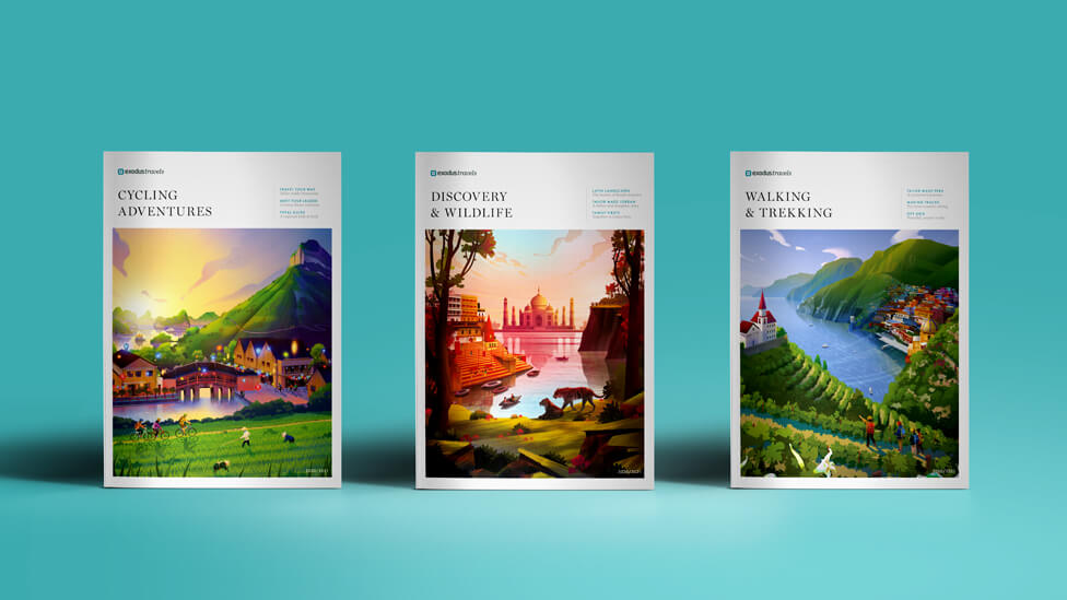
Illustration plays a major part in helping the Exodus brochures rise above competitors, and really engage target audiences with a whimsical style that immediately transports them to distant lands.
Used on the front covers for the last three editions, the strong storytelling continues on the back covers, appealing to the audience’s feelings with a powerful story of passion for travel, and compassion.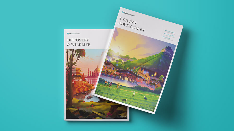
Serbian illustrator Martina Crepulja, who’s driven by encouraging and supporting children through art, chose to donate a portion of her fee to Exodus’ Inspiration Project, an initiative that so far has given thousands of disadvantaged children the chance to explore the world and learn more about their own cultural heritage.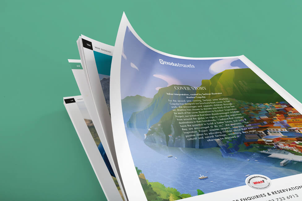
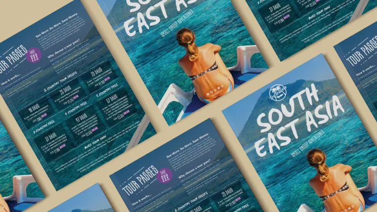
Appealing ways of organising content continue into the sales-focused listing pages of the adventure holiday brochure design, which we redesigned to give more space and allow the information to breathe on the page.
Take a look at other examples of brochure design.
Looking for help with your project?
Feel free to give us a call to start a conversation,
our doors are always open.
Related projects
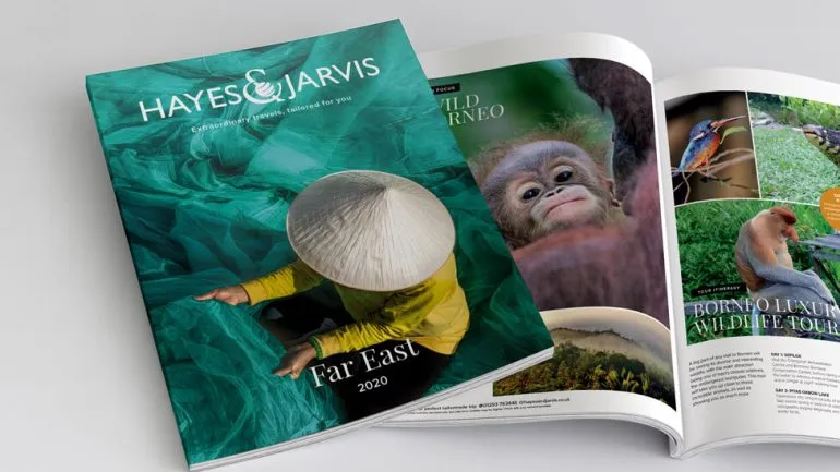
Travelopia
Holiday brochures
Exodus
Travel brochures
TruTravels
Travel brochure design
