Nods to both tradition and innovation are the perfect ingredients to make a solid success of this bakery packaging design.
Background
With 160 staff, one bakery and six distribution centres, family-owned Coultons Bread is a baking and distribution business that supplies over 2,000 customers per day with a range of own label and 3rd party market-leading brands.
Challenge
To continue to meet the demands of the company’s growing market, Coultons asked us to consolidate two of their brands under one new refreshed strong identity and packaging. The new bakery packaging design would also need to incorporate a subtle dose of nostalgic Britishness as the new product range was also targeted for distribution to the ex-pat community in European markets.
Solution
The new design exudes a balanced blend of fresh, modern elements and traditional touches that evoke a strong sense of heritage, deeply rooted values of identity, family, and home. This thoughtful combination creates a visual identity that is both contemporary and reassuringly familiar, appealing to both long-time customers and those discovering the brand for the first time.
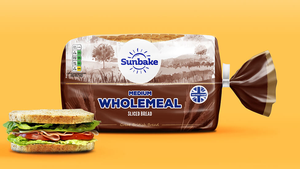
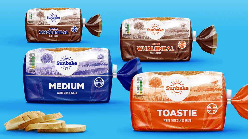
A beautifully illustrated watercolour-style image of rolling hills stretches across the packaging, depicting a timeless rural landscape that could be found anywhere in Britain. This serene backdrop provides a natural setting for the new style logo, which stands out with a refined yet approachable look. Wholesome, carefully chosen fonts complement this aesthetic, creating an inviting and trustworthy feel as they introduce the various product ranges, reinforcing the connection between quality ingredients and a comforting, homely experience.
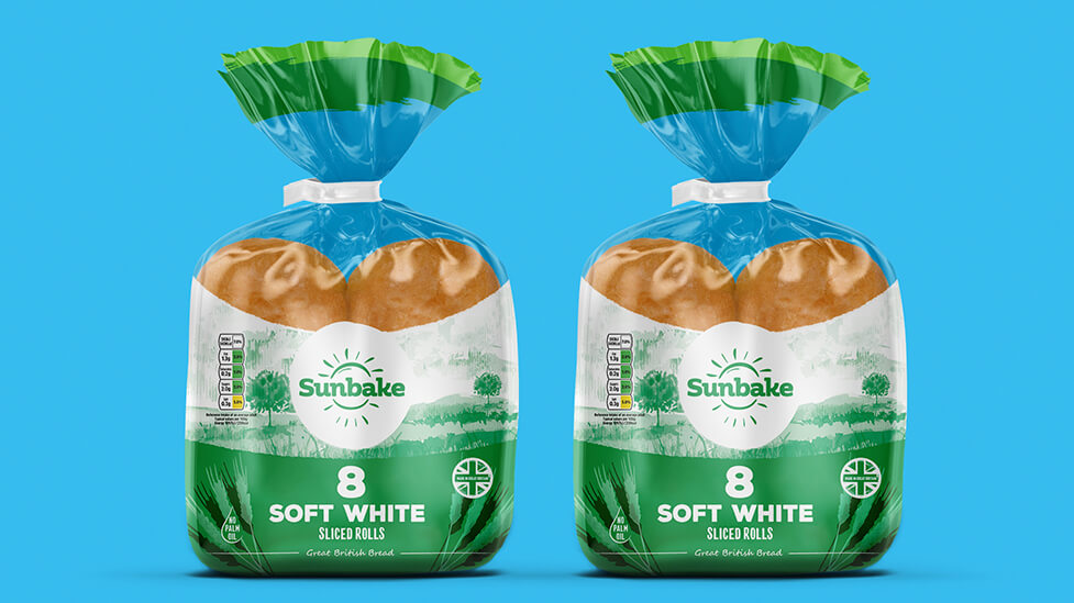
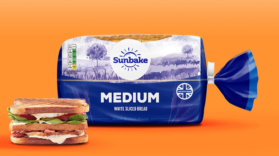
We carefully selected the design and materials used for the bakery packaging to ensure the best possible presentation and preservation of the products. Not only does the packaging maintain product freshness, but a strategically placed top panel also offers a clear glimpse of the product inside – fresh, golden, and irresistibly tempting – enticing customers to pick it straight off the shelf. This clever design choice provides reassurance of quality while reinforcing the sensory appeal of freshly baked goods.
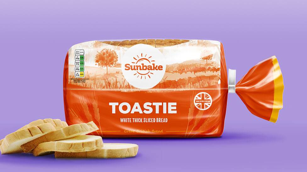
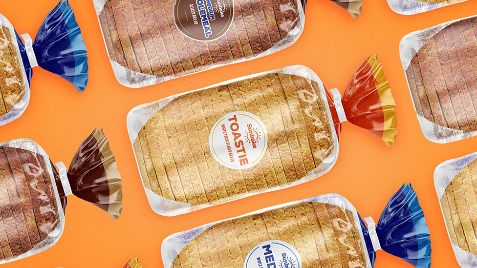
Colours assigned to each product variety adhere to well-established industry standards, ensuring immediate recognition and a seamless shopping experience for consumers. Whether it’s wholemeal, thick, white, or another variety, each pack follows a logical and familiar colour scheme, making the purchasing decision effortless. Additionally, subtle accents of colour from one pack to another create a consistent visual thread across the entire range, strengthening brand recognition and making the selection process feel intuitive and reassuringly familiar.
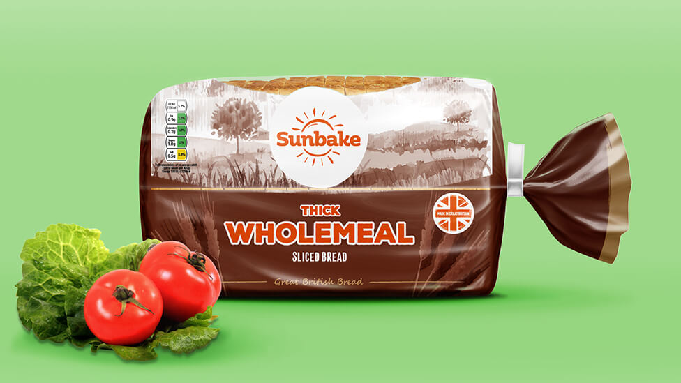
Each bread bag is designed with international consumers in mind, including translated versions of ingredients and nutritional information to meet European market standards. This attention to detail ensures transparency and accessibility for a diverse audience, reinforcing trust in the brand and its commitment to quality.
Beyond functionality, the new bakery packaging effectively conveys the premium quality and outstanding value offered by a market leader. Every aspect of the design – from the thoughtful material selection to the refined aesthetic and practical features – works together to communicate freshness, authenticity, and a deep appreciation for traditional baking craftsmanship.
Looking for help with your project?
Feel free to give us a call to start a conversation,
our doors are always open.
Related projects

Tru
Food packaging design

Roberts Bakery
Bakery packaging design

Robert Andrew
Brand launch and marketing strategy
