Brand architecture that elegantly communicates different product identities without overshadowing the company’s flagship software product.
Background
SolutionsPT are experts in industrial IT solutions, and the sole UK & Ireland distributor of Wonderware, a market-leading software for the industrial sector. The solution provides real-time operations management support by allowing people, processes and information systems to communicate with each other more effectively, resulting in increased performance and efficiency.
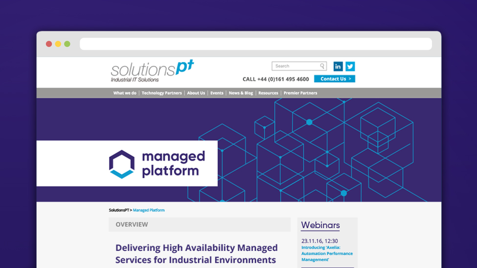
In addition to this flagship product, SolutionsPT also offers Managed Platform, a software that protects system health and security and reduces downtime. As part of the company’s launch event for Wonderware’s next generation of software, SolutionsPT needed a new brand architecture to clarify their offering to consumers.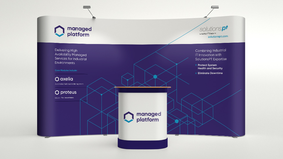
Challenge
To develop an eye-catching brand architecture for Managed Platform that would sit comfortably alongside the flagship product without stealing the spotlight. The launch event would play an essential role in introducing Wonderware’s new range of features to the industrial IT market, and therefore Managed Platform would need to play a supporting role without outshining the true “star of the show”.
Solution
To communicate the brand architecture effectively, we first addressed how the flagship product and its supporting modules were named. We retained “Managed Platform” at our client’s request and developed an initial series of unique module name options for them to choose from.
Through a process of elimination and refinement, we created a name for the core module: Axelia (protector of mankind in Greek mythology). A second name – Proteus – was provided by the client, based on the mythological theme we established.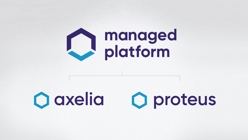
Security, stability and storage were key aspects of the product that our client wanted to communicate, so borrowing from the existing SolutionsPT brand colour palette, we created a visual style that fit seamlessly with their existing materials, yet retained a distinct look and feel.
The hexagon shape has been broken to suggest the secure flow of information in and out of the system, as well as creating an arrow device that references the product’s identity as software that sends data down from the Cloud.
The design also makes use of cubes, both in the logos and marketing collateral, to communicate that this product is one of many modules that a customer can combine and put together to create a solution specific to them.
When multiple cubes are put together into a pattern, it begins to look more like a circuit board and evokes the idea of data transfer within a system.
The clean, contemporary visuals and modern font perfectly suited our client’s requirements and helped differentiate this suite of products without pulling focus from the flagship software solution.
The brand was rolled out across a variety of channels, including printed sales collateral, a product microsite and trade show exhibition stand, making this brand architecture project a success.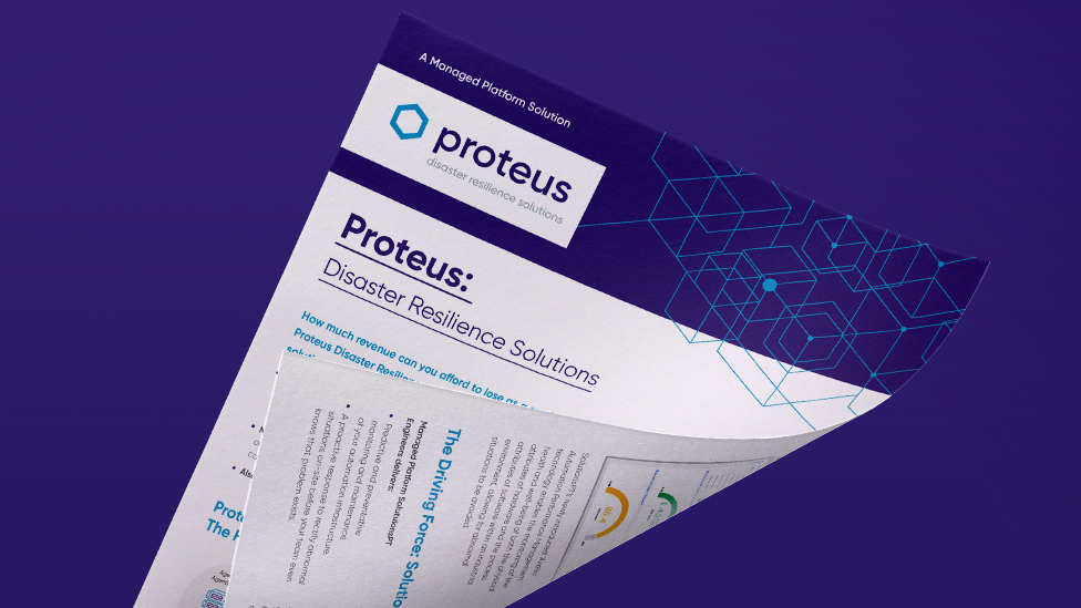
Looking for help with your project?
Feel free to give us a call to start a conversation,
our doors are always open.
Related projects
H&T Presspart
Branding strategy & development
MGN
Architecture brochure design
ChargePoint Technology
Brand development
