We combined direct mail with a mobile game app to create a campaign design that captured the imagination of C-suite executives.
Background
As a global leader in Financial Services software, Thomson Reuters was looking for an eye-catching way to promote their online product, Elektron. Aimed at top-level hedge fund managers, the software helps traders make more informed decisions with real-time market data and analytics.
Challenge
Our client needed to increase awareness of the product and its features in a way that captured the attention of a busy and difficult to impress target audience. It also needed to combine online and offline elements to take traders through an engaging product journey.
Solution
To deliver, our creative and digital teams collaborated to develop a teaser with a twist. Our campaign design featured 150 direct mail pieces, sent out to C-level executives with a clever pop-up and information on how to download an Elektron-themed game app.
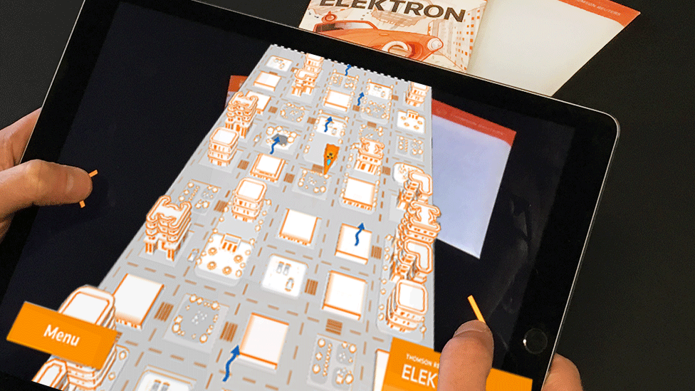
By negotiating obstacles and buildings in an imaginary cityscape, users were exposed to product messages and features in a way that was immediately memorable and engaging.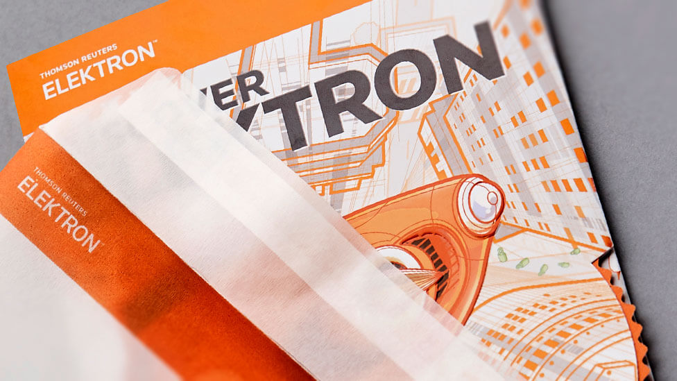
Even before opening the semi-transparent envelope, the receiver can ‘feel’ that there’s something special inside it. A bespoke illustration, created by our design team, is featured on embossed card in brand colours.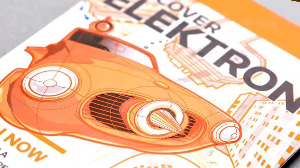
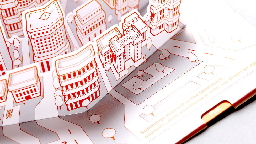
The look and feel is reminiscent of traditional comic books, contributing to the playfulness of the experience. Upon opening the card, the recipient reveals a 3D pop-up cityscape – representing “a new landscape in financial services”– and a free-floating futuristic vehicle.
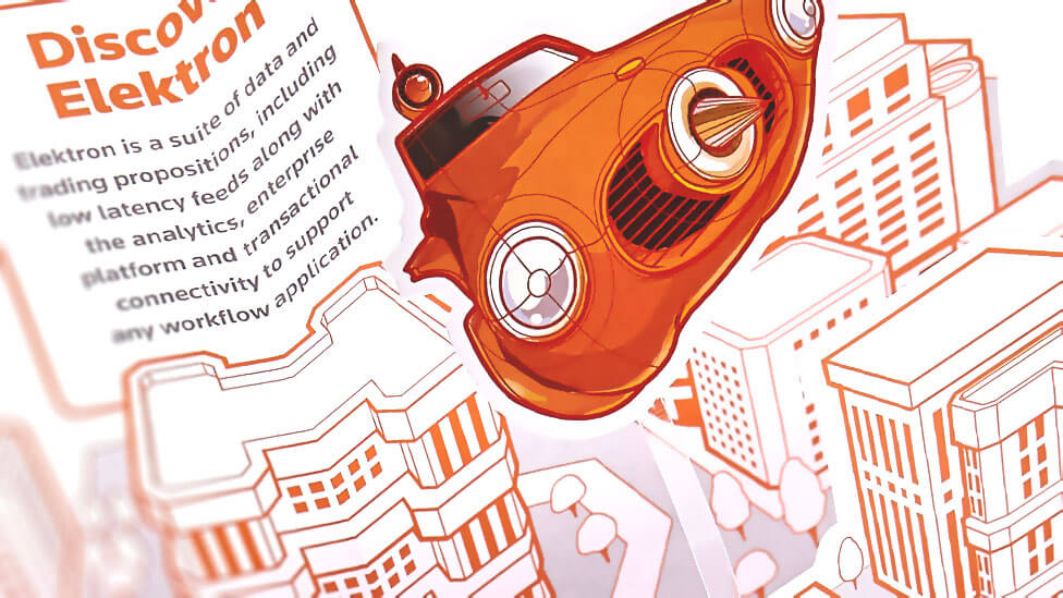
Our aim was to ensure visual continuity by creating a campaign design that flowed seamlessly from the printed piece to the online app.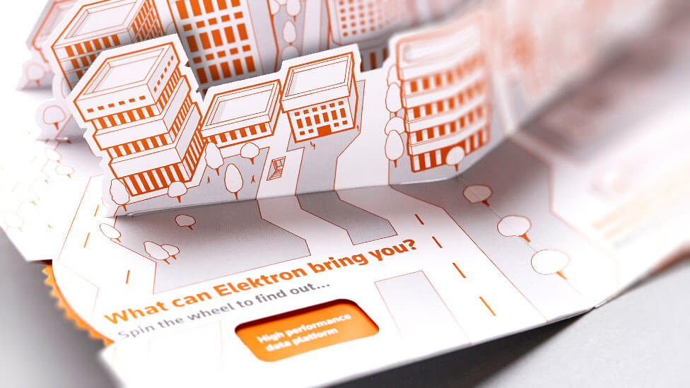
The novelty of the distinctive direct mail piece also increased the likelihood that users would continue online to download the game on their mobile device.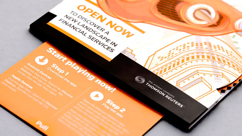
Highlights
- The campaign design pop-up includes interactive elements that communicate the product’s seven key messages, even if users decided not to download the game.
- The printed pop-up includes a spinning product benefit wheel and a pull-out card with instructions on how to download the game.
- Working in close collaboration with the gaming agency, the mobile app was enhanced with additional creative elements developed by our design team.
- Users move seamlessly between offline and online environments, seeing the 2D visuals seen on the printed mailer converted into a 3D cityscape that they can navigate when the game is launched online.
Looking for help with your project?
Feel free to give us a call to start a conversation,
our doors are always open.
Related projects

AstraZeneca
Global employee referral campaign
Thomson Reuters
Email campaign design
Ocean Spray
B2B campaign design
