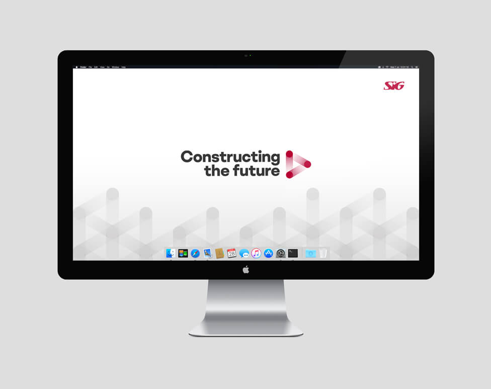
Inspired by the concepts of connection, unity and progression, this company culture rebrand exercise helped align and unify thousands of employees across Europe under a new vision, strategy and core behaviours.
Background
SIG plc is a UK-based international supplier of roofing, insulation, specialist construction products and commercial interiors to trade customers across the UK, Ireland, Germany, France, Poland and Benelux.
Following a period of intense transformation across the Group, it was time for our client to turn its attention to the future growth of the business, and with it came a new vision, strategy and internal culture framework to support it.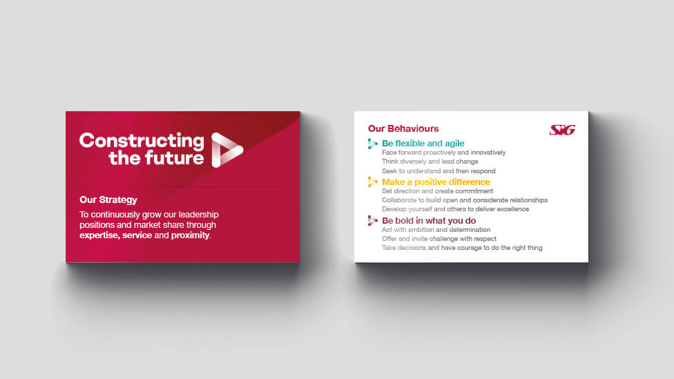
Challenge
Our brief was to develop a new visual identity that would bring together the new vision, strategy and new behaviours and align the new business priorities into a clear and comprehensive system for the 7,000 SIG employees. Whilst ensuring the new visual identity was distinctive enough, we also needed to be mindful of how the company culture rebrand would sit alongside the master SIG brand.
Other key considerations within the brief:
- the new identity should provide an updated, fresh and modern feel to the business
- the new brand would also need breadth and longevity, and be flexible enough to work on a wide range of communication channels, both print and digital
- it would need to help unify a diverse internal audience of employees whose mother tongue is English or French, German, Polish and Dutch, with other secondary languages to consider such as Bulgarian, Hungarian and Romanian
- these employees perform a variety of roles: office-based, in-branch, or in operations, where online access is limited
- external audience: investors
Solution
We created one cohesive look and feel that confidently carries the new ‘Leading the way’ vision across a variety of media to the diverse target audience.
Building on the belief that demonstrating the three core behaviours will allow employees to reconnect with customers and colleagues, the company culture rebrand is inspired by the concepts of connection and unity.
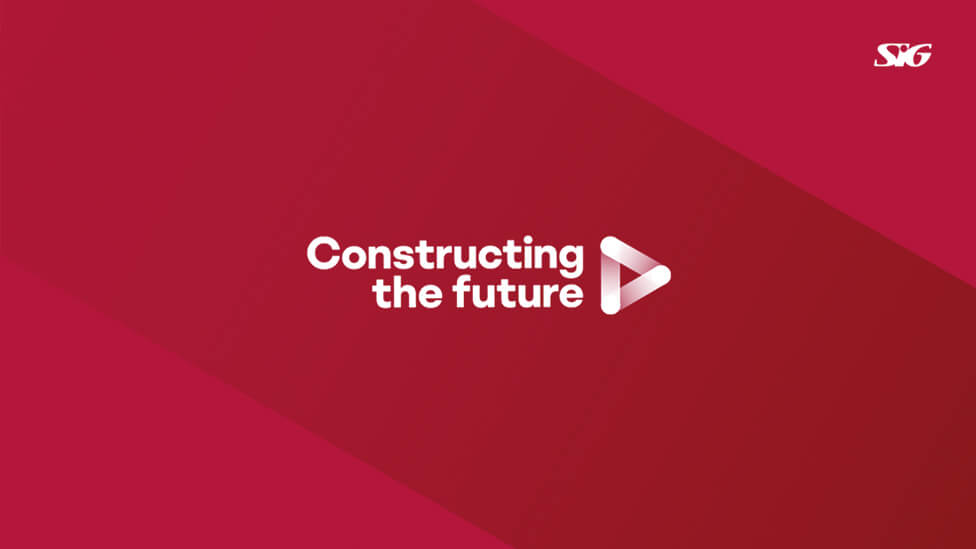
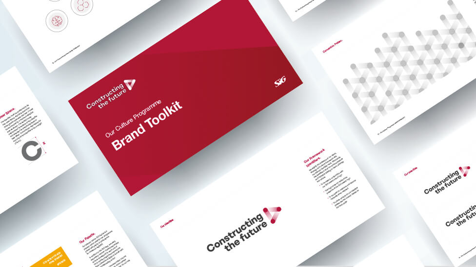
The primary identifier mark is based on those three core behaviours and how they interlink with each other, with a constant flow of forward movement that suggests action and dynamism. For continuity and ease of use, the new culture programme uses the same primary typeface as the main SIG corporate brand – a clear, professional and classic font.
A ‘Connection Pattern’ further reinforces the idea of ongoing connections and growth, representing the links between various strands, layers and disciplines within the SIG business.
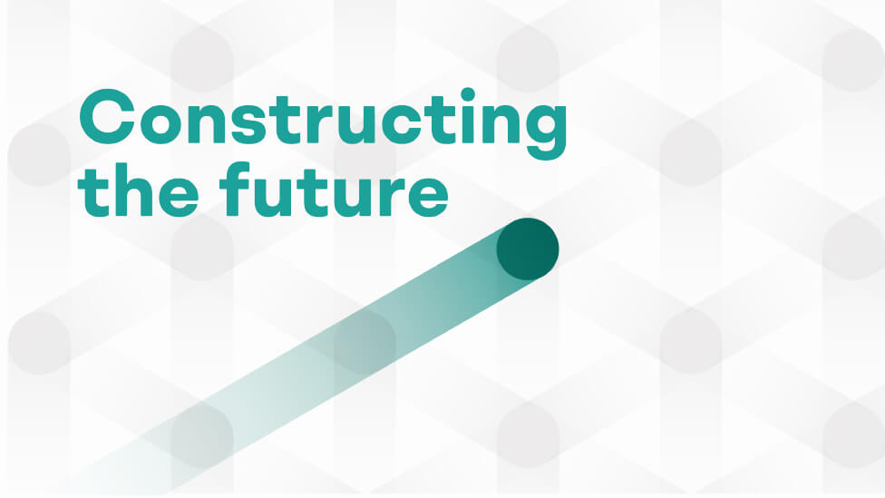
The theme comes alive thanks to connected iconography, inspiring a sense of unity, progression and of looking forward towards the future of the business, regardless of where employees are based.
Keeping the primary colourway of red and grey, we incorporated other contemporary tones that add visual variety to the new colour palette, and which can be used to communicate different behaviours.
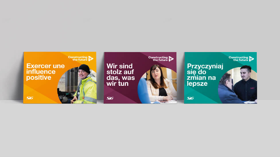
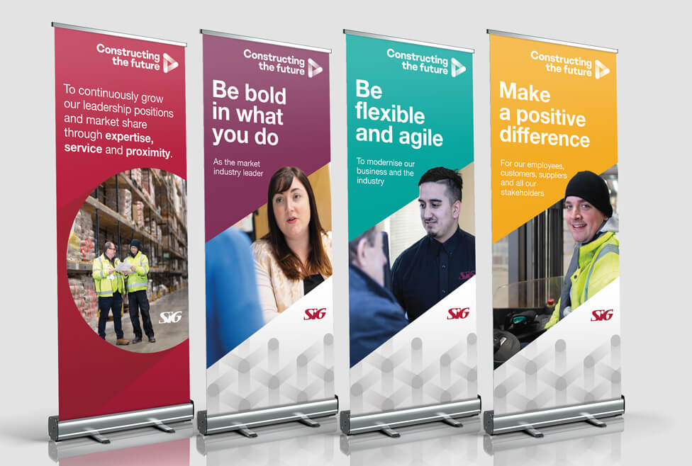
To reflect the inclusive and diverse nature of the SIG culture programme, we paid special attention to employee photography, including a cross section from across the entire business.
A bespoke suite of icons helps represent each of the strategic pillars.
![]()
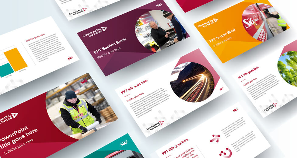
The new brand design was rolled out to a variety of collateral, including an internal brand toolkit.
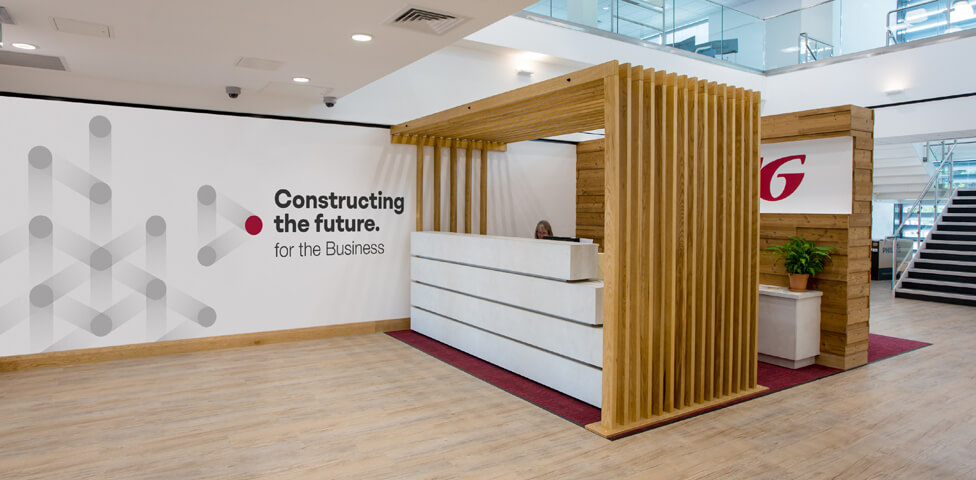
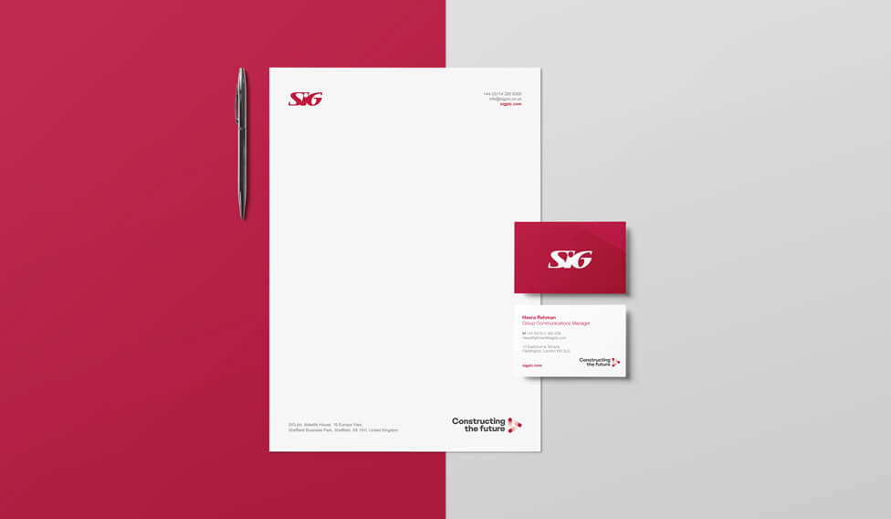
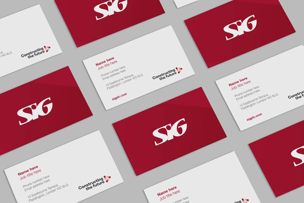
The new identity also adapted well to office interior branding, stationery, pull-up banners, posters, recognition cards, email signatures, Word and PowerPoint presentation templates and desktop background visuals.

Looking for help with your project?
Feel free to give us a call to start a conversation,
our doors are always open.
Related projects

AMBS
Identity development and application
Prism Healthcare
Internal branding design
H&T Presspart
Internal brand design
