This impact infographic enabled Brightlife to present a compelling narrative of their achievements over the past five years in an engaging and visually dynamic way.
Background
Brightlife was established to help older people overcome loneliness and social isolation, enabling them to lead more active, connected and fulfilling lives. Formed in 2015 by a collaboration of public and third-sector organisations, and led by Age UK Cheshire, Brightlife served as the regional delivery partner for the National Lottery Community Fund’s Fulfilling Lives: Ageing Better programme.
Over five years, Brightlife commissioned, delivered and evaluated a wide range of initiatives, providing support to more than 3,000 older people in the community.
Challenge
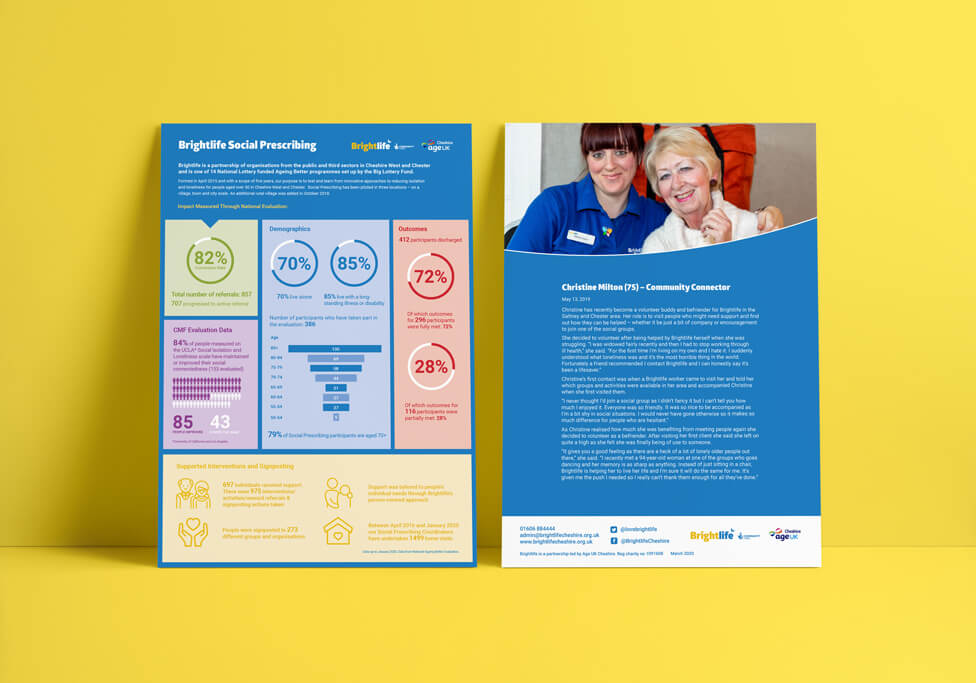
As the project neared its conclusion, Brightlife sought our help in showcasing the positive impact it had on the community. They needed a legacy report and an impact infographic to highlight key achievements. The infographic would be featured in the final project report and also serve as a standalone communication piece, ensuring the project’s success continued to inspire beyond its completion.
Solution
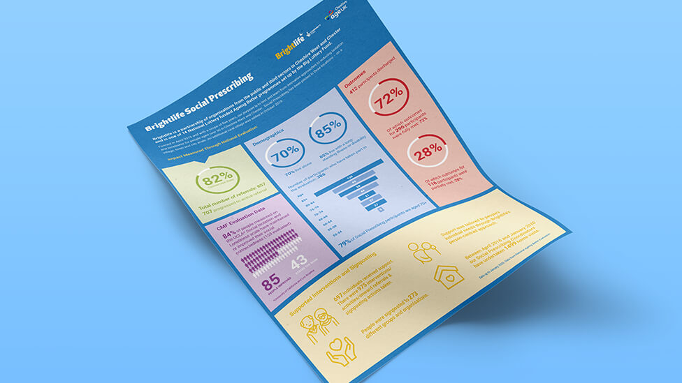
To ensure clarity and readability, we designed the impact infographic with a clean and minimalist approach, allowing readers to focus entirely on the information. By stripping away unnecessary elements, we made sure the data and insights remained the central focus, making the content easy to absorb.
While we kept the use of colour minimal, we applied it strategically to create visual distinction between different sections of the infographic. This helped break up the content, guiding the reader smoothly through the information while maintaining a cohesive and engaging layout.
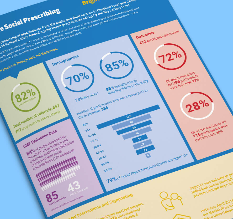
The infographic design presents Brightlife’s story in a clear and engaging format, making it easy for readers to absorb details at a glance. We used structured content blocks and intuitive icons to break down information, ensuring that each section was visually distinct and simple to navigate.
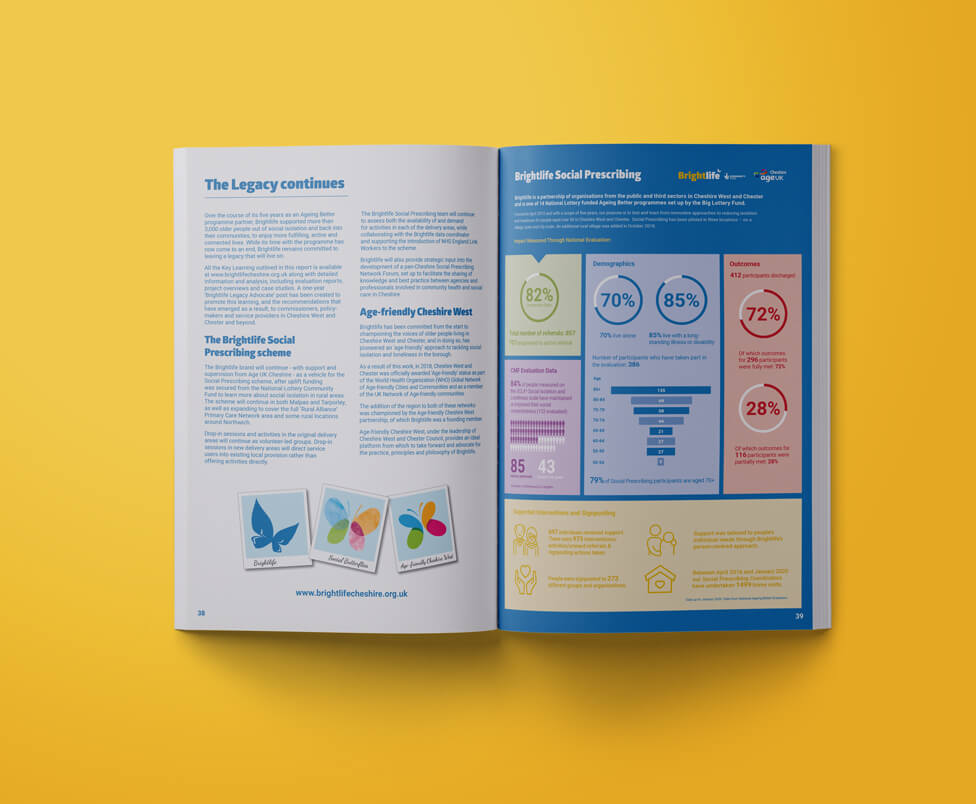
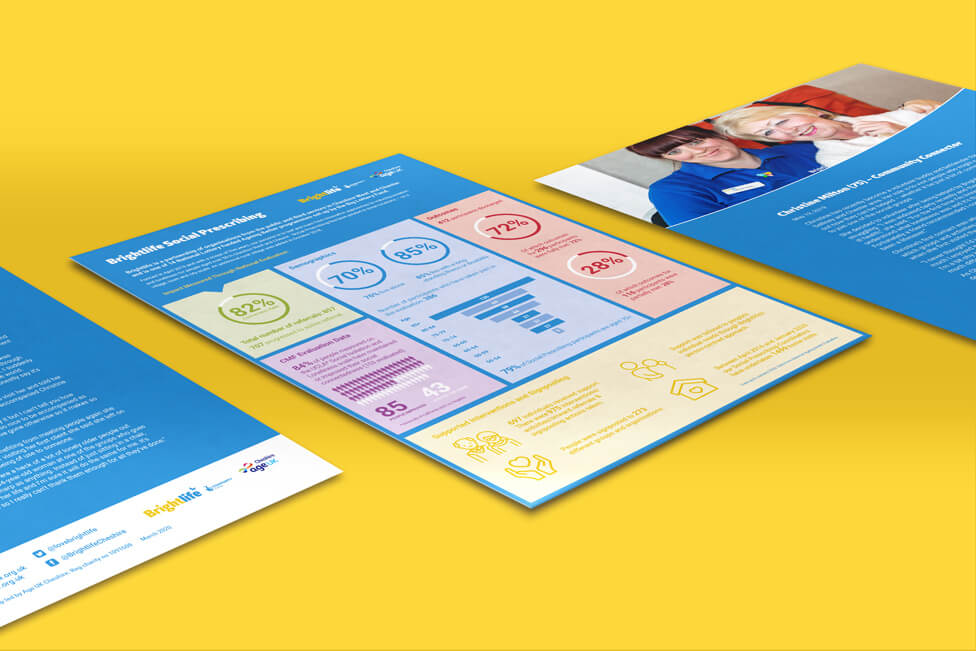
To ensure the impact infographic reached the widest possible audience, we included it as the final page of the legacy report, reinforcing the key messages in a concise and visually compelling way. We also created a double-sided standalone insert, making it a versatile communication piece that could be shared independently. On the front, the infographic presented facts and figures, while the back featured a personal story, adding an emotional connection to the quantitative data. This combination of data-driven insights and real-life experiences helped bring the impact of Brightlife’s work to life, making it more relatable and meaningful for the audience.
Looking for help with your project?
Feel free to give us a call to start a conversation,
our doors are always open.
Related projects

Deloitte
Internal communications infographic

Noble Capital Group
Investment prospectus design

Andrews Sykes Group
Animated infographic design
