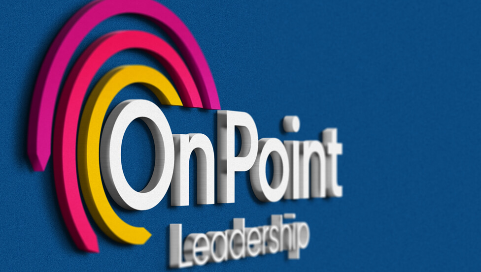
 To support a new company launch, we created a logo design and brand assets that are a perfect fit for the personal brand and reputation our client has worked hard to build over the years.
Background
Our client is a leadership coach, communications professional and strategic project manager with extensive experience of change and transition across a wide range of sectors. A passionate leader, she’s driven by bringing her clients’ dreams and ideas to life.
Challenge
Our client needed our guidance to launch her new business with a new company name, logo design and brand assets, including social media assets and images for the new website. It was key for the new visual identity to transmit the personal brand and reputation our client has worked hard to build over the years. Our client’s strong values would also need to shine through: Honesty, Trust, Integrity, Confidentiality, Loyalty, Reliability, Quality, Striving for success.
Solution
We started by presenting four different concepts to our client, with the final design resulting from a combination of elements from two of the four concepts we had devised.
The company name we chose – On Point Leadership – transmits the concepts of focus, determination, trust. The rationale behind the logo is to express the aim of On Point Leadership by using three semicircles as the main element; these curved lines represent the services our client offers her expertise in: Leadership Coaching, Communications and Project Management.
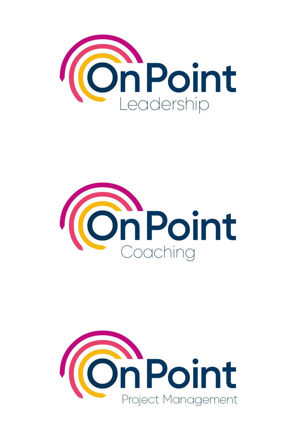
The logo is timeless and commands attention straight away, with spacing around adding an element of impact and depth that alludes to what On Point Leadership can help achieve. The colour semi-circles gradually increase in size and end in an arrow shape, adding a sense of movement and progression, symbolising how On Point Leadership can help clients grow and move forward, staying true to the brand’s core values.
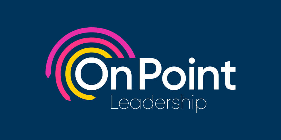
The confident colour palette consists of three main brand colours (purple, pink and yellow) which transmit a friendly and approachable personality. Blue as a secondary colour adds gravitas and reflects our client’s deeply held values of trust, integrity and quality.
The three main colours from the logo are used on the website to distinguish the services offered by our client, helping users to navigate content.
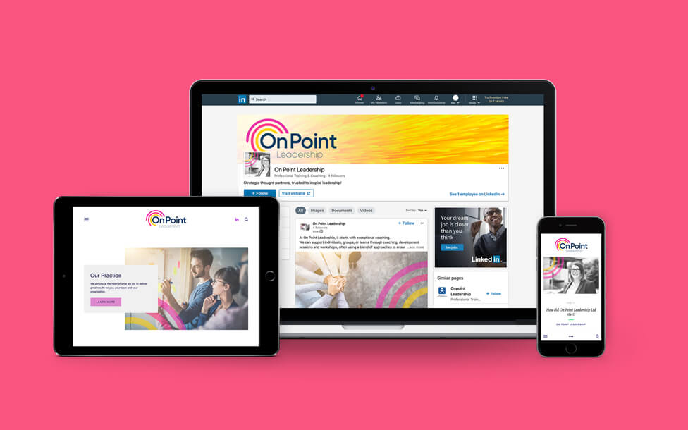
We chose a strong set of stock images to complement the new visual identity. To inject the new brand’s personality, we placed curved lines from the logo over the images, and infused them all with a subtle colour treatment that ensured visual consistency across materials, making them instantly recognisable at different customer touchpoints.


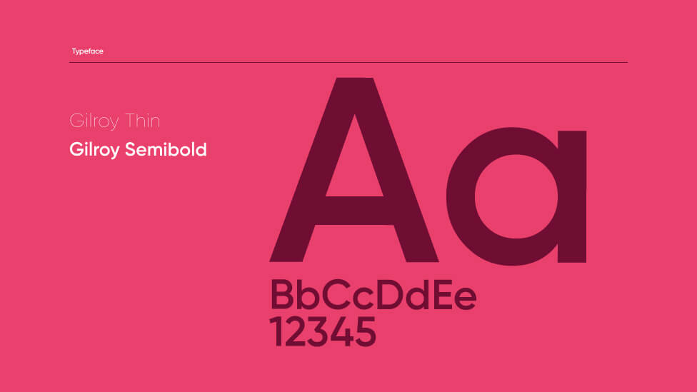
The font and typography choice is not complicated and perfectly complements the logo, reflecting our client’s main qualities of being approachable, friendly and trustworthy. We opted for a simple and rounded sans-serif font that reflects these traits perfectly, and also gives a fresh and contemporary look. In this font, the letter “O” is a perfect circle, allowing us to fit the curved lines of the logo around it.
 Our client gave us this testimonial:
“I’ve worked with Parker Design for about 5 years now on various projects. However, my latest venture has been the most immersive and engaging; who knew I would be starting my own business.
About 2 years ago, I got in touch with Parker’s Creative Director, Mark Bowers, to help organise my thoughts and, if I were to open my own business, decide on a name that encompassed my personal values, which needed to shine through in my business brand. Mark provided just the right amount of creative guidance to get us to the name ‘On Point’, finally ending up with ‘On Point Leadership’.
In preparation for launching, I worked with Mark and designer Bryony Flaherty, briefing them on the vision, values and services offered by On Point Leadership. It was important to them to understand me well, as I represent the brand.
I was blown away by the quality of the four options presented to me. I opted for a combination of two brand logos which were then worked up into the final brand I have today. They even presented photo stock options for me to choose from, that are now branded as On Point Leadership. This means I have all assets that I could possibly need for presentations, email signatures, websites and social media. Fantastic!
They put me at ease, navigating me through a process that I hadn’t been through before – it had to be right, delivered to time and budget, and Mark and Bryony delivered what I didn’t even know I wanted. Thank you both and as always, I would highly recommend Mark, Bryony and the team at Parker Design.”
Looking for help with your project?
Feel free to give us a call to start a conversation,
our doors are always open.
Related projects
Season Cookshop
Shop logo design
H&T Presspart
Branding strategy & development
Prism Healthcare
Internal branding design
