
This office interior branding solution delivers an environment to engage, motivate and congratulate STEM staff for their efforts, and encourages them to focus on the company’s promising future.
Background
STEM Healthcare is a global leader in pharmaceutical benchmarking. Their mission: to help clients accelerate performance, and achieve maximum return. Their vision: to be in every brand plan.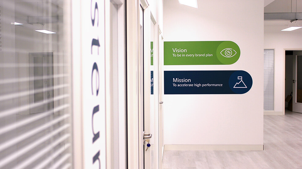
Challenge
Following recent company growth, and a move to bigger premises, STEM needed an office interior branding design solution that would turn a completely blank canvas into a space where every employee – regardless of department, or area they’re in – lives and breathes the six brand values which drive the company’s behaviours.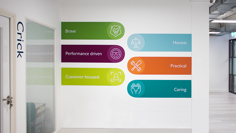
Solution
The result of close collaboration with our client – where we really got to know who STEM are and what their new brand stands for – our approach to the office interior branding design brings their values out onto the surface, inspiring teams to embrace them and apply them to everything they do every day.
Considering more than pure design ideas, we studied the surface materials and lighting conditions, natural or artificial, that our design would interact with, even where air conditioning vents are located – all with the aim of guaranteeing freshness, impact, and durability of the design, maximising our client’s investment.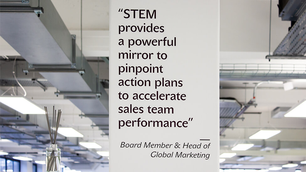
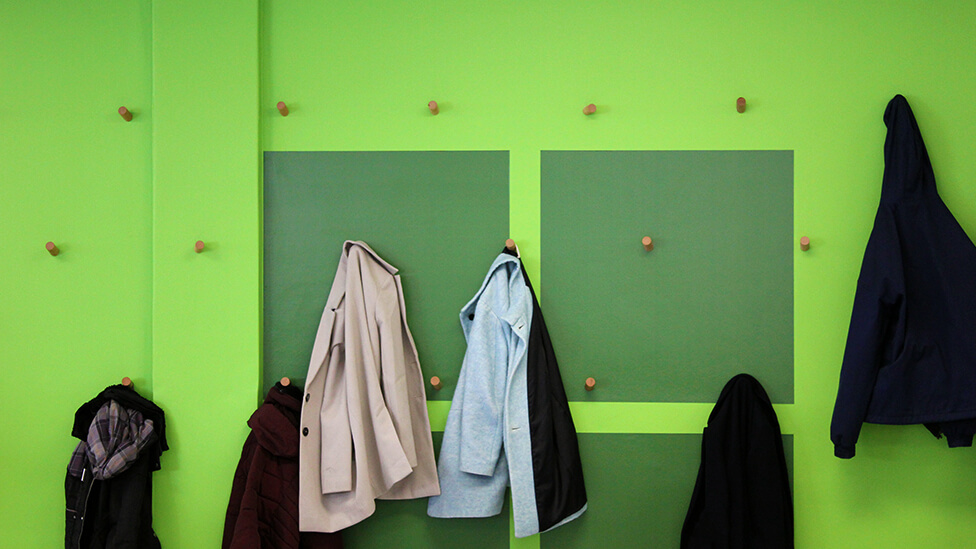
Colour is one of the themes in the design, with green leading and a variety of energising shades that offer the perfect canvas for a wide range of purposes.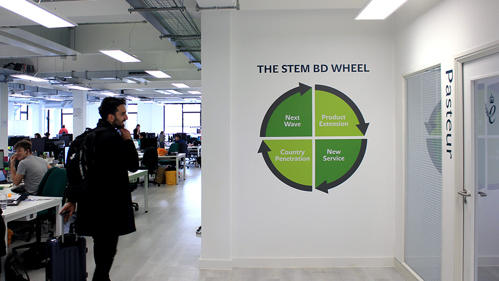
One of the heroes of the office interior branding is a large timeline that takes up one of the main wall spaces, hinting at the magnitude of the company’s evolution and successes over time.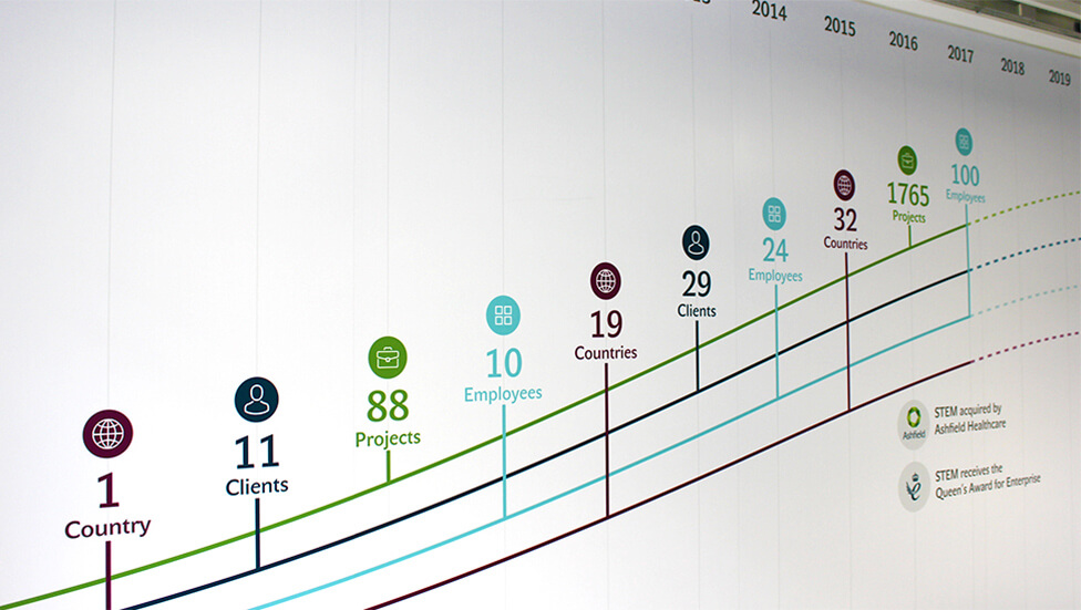
Ascending curved lines break into a dotted pattern, making the timeline not just a celebration of past achievements, but also an inspiring visualisation of what is yet to come for the company and its employees.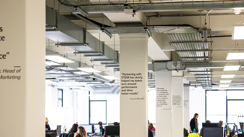
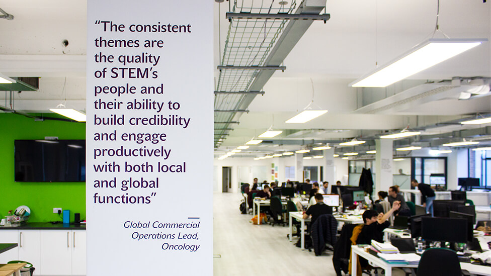
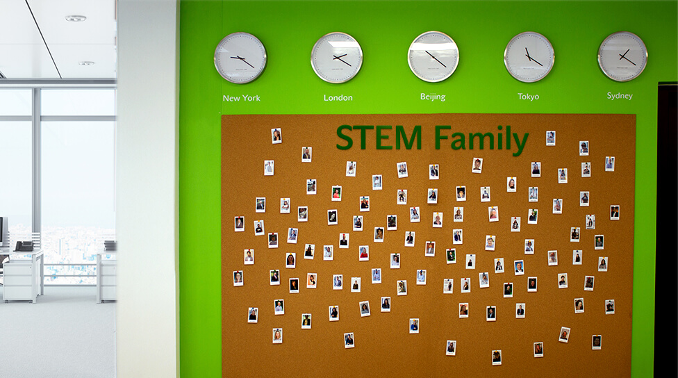
Real client testimonials dotted around the office space are another constant source of inspiration and reaffirmation that every effort pays off. 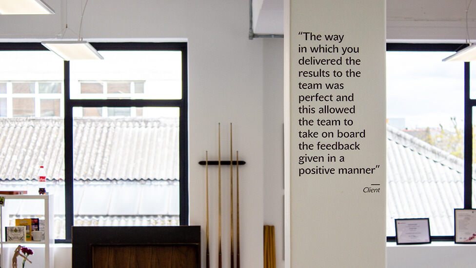
A more subtle yet focused manifestation of the branding is used for private meeting rooms, which we named after leaders in the Science and Healthcare fields, and chose large fonts and a vertical orientation to add impact and contrast to the more understated branding options in this area.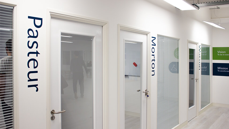
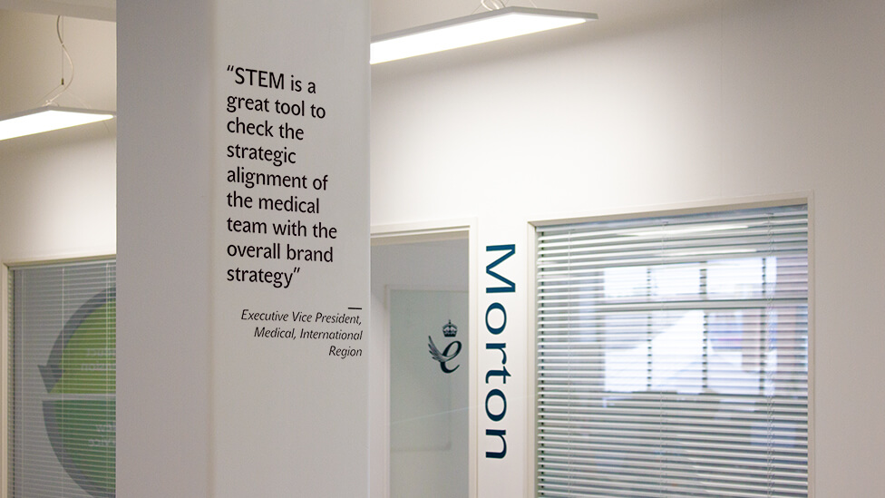
With our client being a recipient of The King’s Award for International Trade, we made sure that its prestigious emblem takes pride of place in the office space.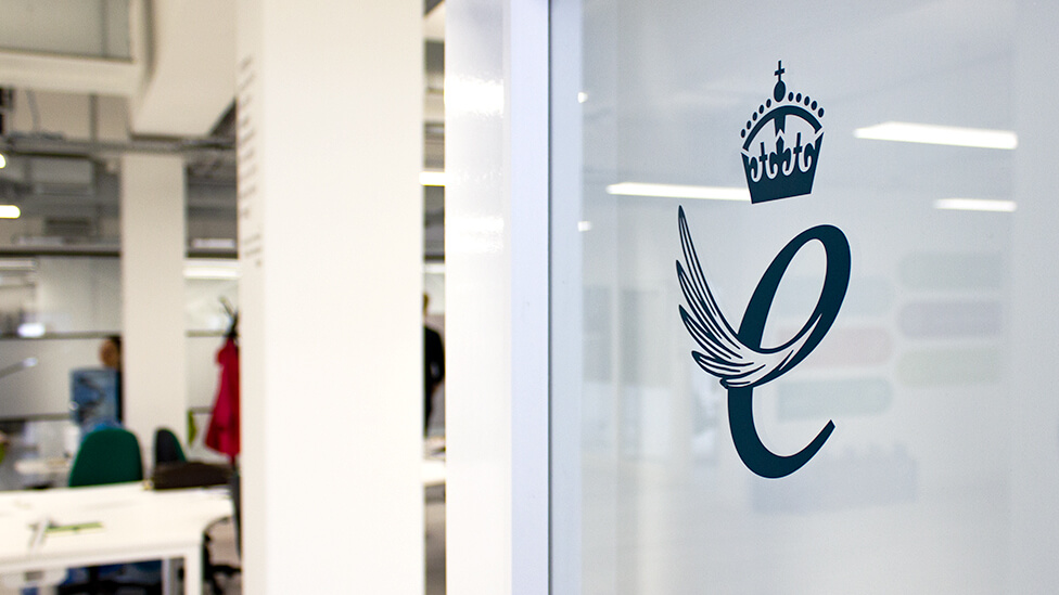
Teams at STEM have shared very positive feedback about the office branding design, feeling they own a space that encourages interaction and a constant flow of ideas. The design has proved to be such a strong employee engagement initiative that we’re currently working on the company’s American office.
“When we moved to a new open plan office space, we asked Parker to help us to design the company visuals to create a positive and motivational work space, using our newly updated branding. Throughout the design process, the Parker team provided great creative input and very timely responses as the designs evolved through internal reviews. We are delighted with the results, and have received very positive feedback from our office teams. We look forward to continuing to work with Parker.”
Global Head of Marketing, STEM Healthcare
Take a look at other office branding projects.
Looking for help with your project?
Feel free to give us a call to start a conversation,
our doors are always open.
Related projects
HRonline
Office interior design
AstraZeneca
Office brand design
HCL Technologies
Office wall graphics
