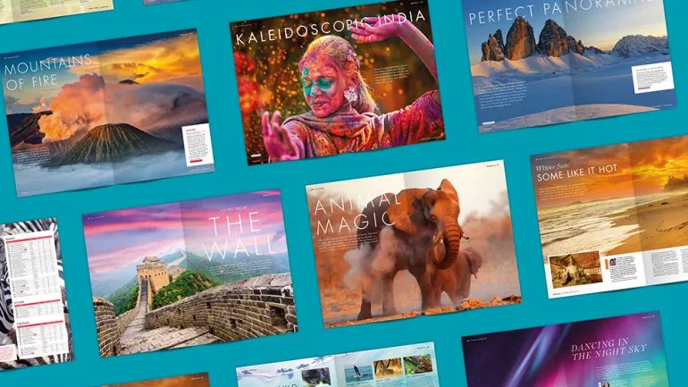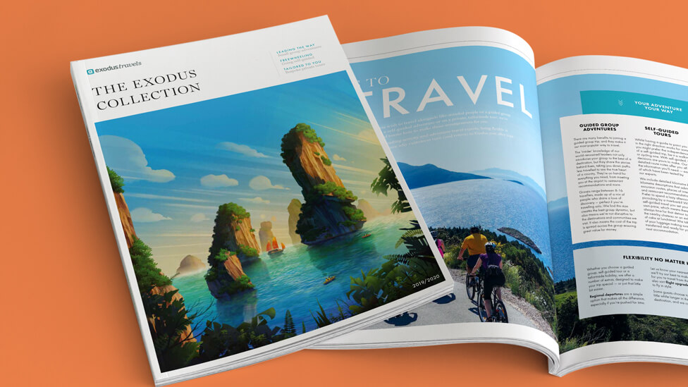
Not relying on the success of previous editions, we subtly evolved the design of this set of travel brochures to encourage audiences to use them in conjunction with our client’s website.
The brochures have proved a success for our client, with Exodus being nominated at the Travel Marketing Awards in the Best Brochure category.
Background
We’ve been working with Exodus for almost 10 years, and in that time, our client and the way people experience travel have evolved, and so has our approach to the design of their brochures, one of their key sales tools.
During our collaboration, we’ve gone from delivering a more traditional take on travel brochure design, primarily focused on destination and price listings, through to a major shift in strategy where we’ve created content-rich travel magazines full of inspirational ideas, and presenting Exodus as experts in providing customers with more than just a holiday – it’s an unforgettable travel experience.
Challenge
This time, our brief was to take a more pared down approach to the design, slightly evolving it from what the previous edition had offered. The latest brochures would need to place more trust in how the printed piece – one of the initial touchpoints in the customer journey – works in conjunction with the Exodus website, and also travel agents.
Solution
Our approach to the new travel brochures does lean on the previous edition – it’s a similar formula, but thanks to some subtle differences in the design and the way we laid out content, audiences are enticed to continue their discovery of what Exodus has to offer via other marketing channels.
To keep the travel brochures design fresh and engaging, we put a new team of designers on it.
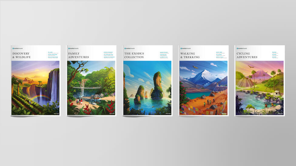
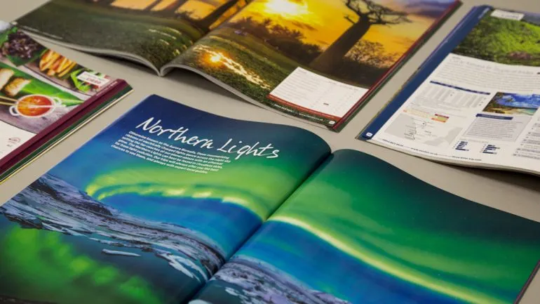
An almost ethereal illustration style that embeds itself in the minds of audiences still plays a key role in the design this time round, although we reduced the number of illustrations in each of the brochures (a set of 5) to create room for large, striking images of the wide range of experiences offered by Exodus.
Having fewer original illustrations didn’t only serve as a subtle departure from the previous year’s look and feel, it also allowed Exodus to realise some cost savings.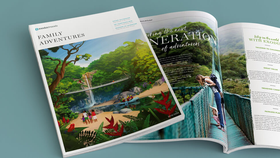
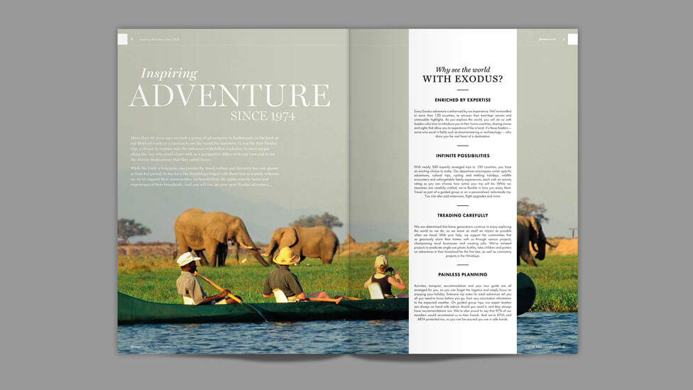
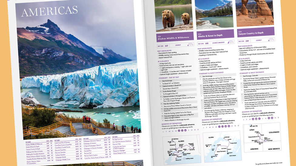
With a redesigned page navigation and fewer elements on each page, the travel brochures feel clean, crisp and focused, whilst there is still plenty of engaging content that positions Exodus as an expert in travel experiences, thanks to the wide range of suggestions from Exodus’ customers and destination experts.
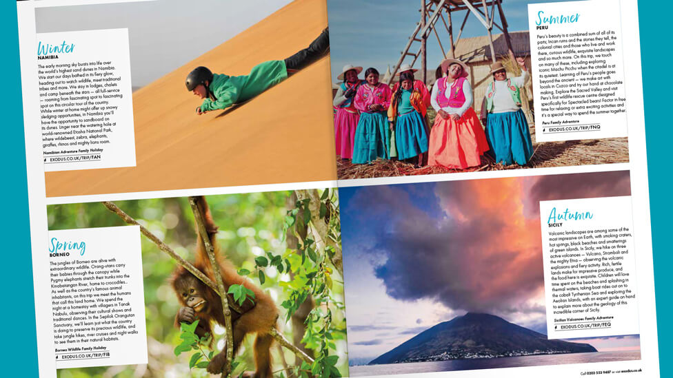
Larger images are one of the new key elements of the brochure redesign.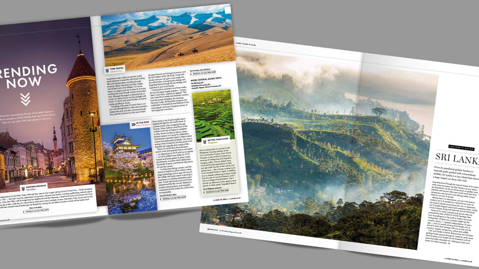
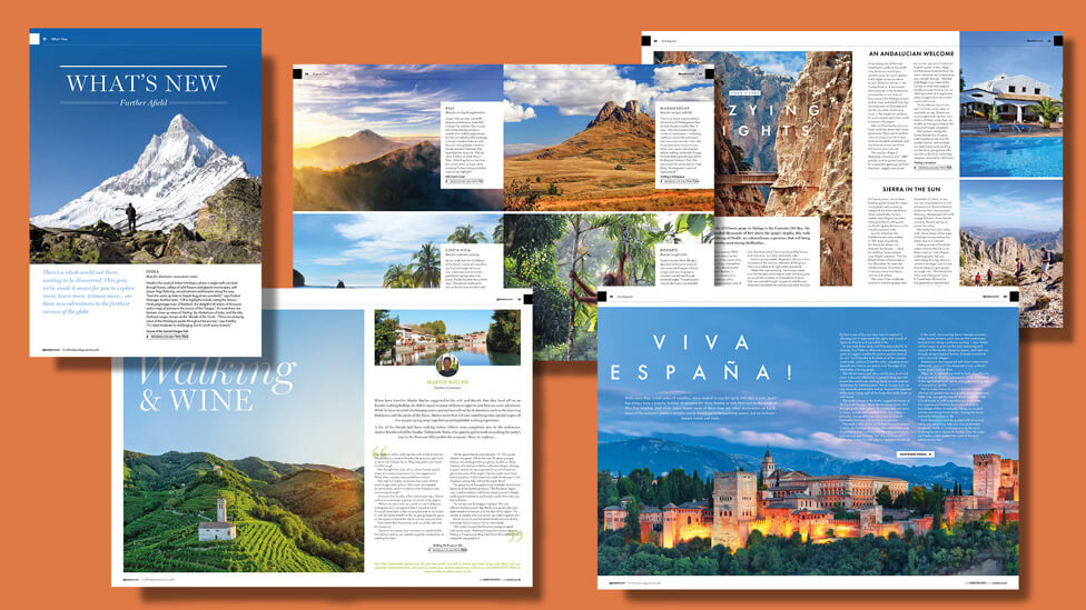
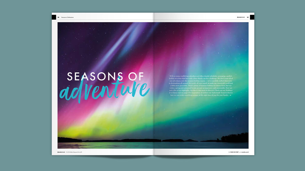
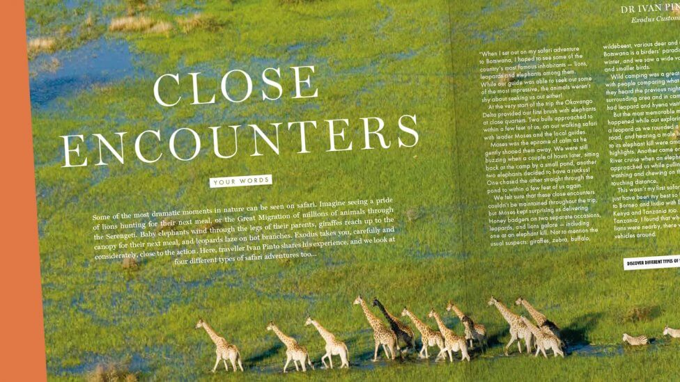
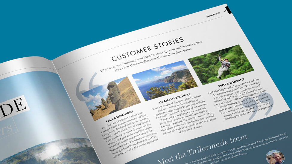
As with previous editions, the travel brochures are brimming with different ways of presenting travel tips and ideas to make the most of an Exodus experience; it’s a highly visual approach that engages audiences straight away.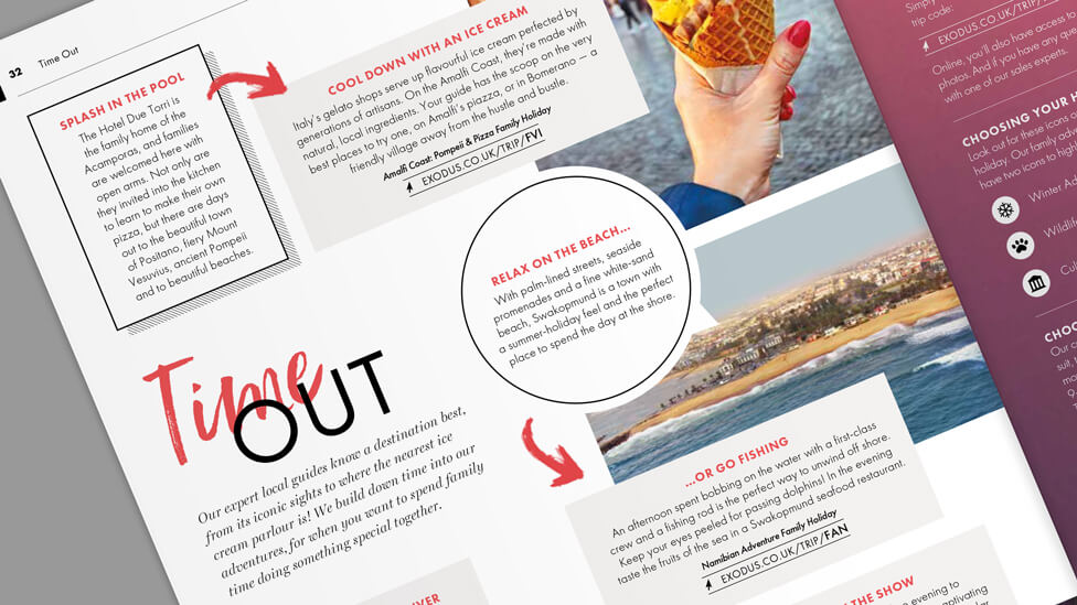
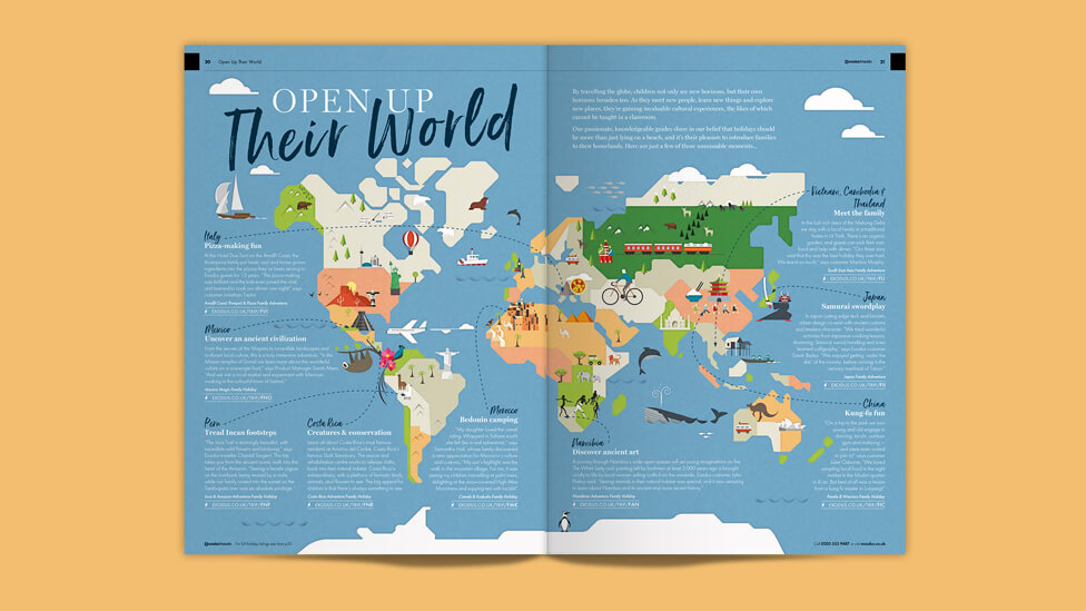
Journalistic-style articles and interesting ways of structuring content – through colour, photography, icons and infographics – capture imaginations, encouraging audiences to see Exodus as much more than just another holiday provider.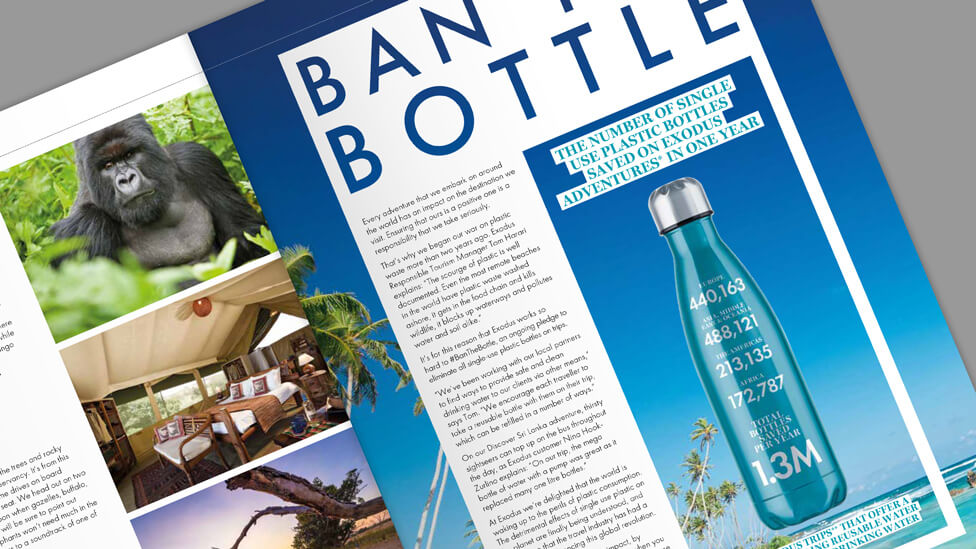
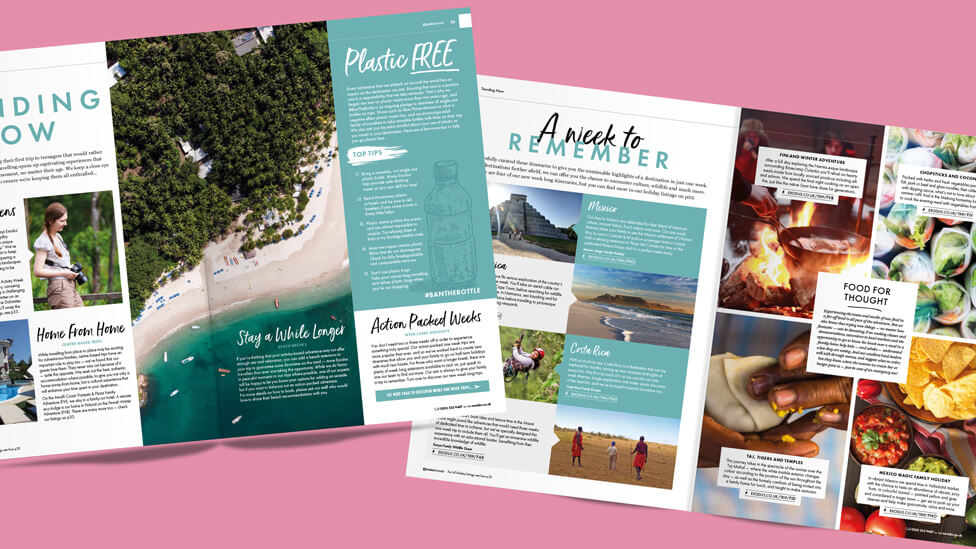
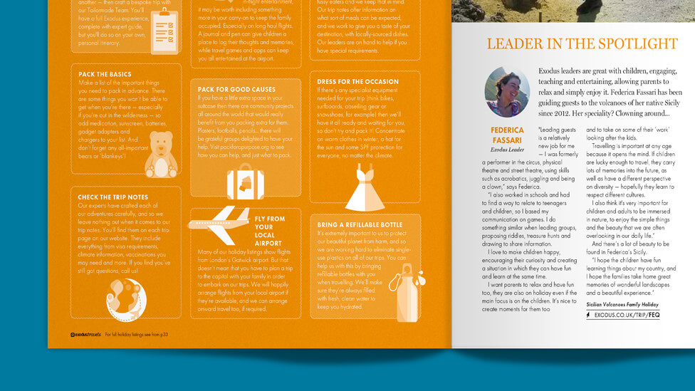
We also applied the pared down approach to the listings pages, with clean and clearly structured layouts that allow information to breathe.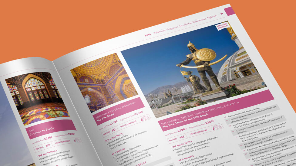
Looking for help with your project?
Feel free to give us a call to start a conversation,
our doors are always open.
Related projects
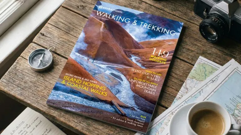
Exodus
Magazine design and content
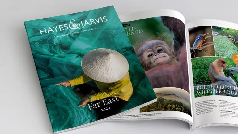
Travelopia
Holiday brochures
Exodus
Travel magazine designs
