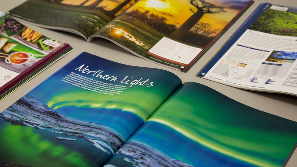
Clean travel magazine designs that highlight high-quality visuals and created a clear, focused and seamless customer experience.
Background
Exodus helps savvy travel enthusiasts reach unique destinations on 500 itineraries across 90 countries all over the world.
Although our client embraced digital platforms early on, research had uncovered that their travel literature still plays a major part in their customer experience. Copies are mailed to existing customers, and our client’s research revealed that the brochures are often revisited and shared amongst friends before making a decision, just like experienced, savvy travellers share insightful tips and recommendations.
The brochures play a major role in demonstrating individualism and expertise. They act as a lifestyle piece in an environment far removed from the more popular, higher volume, packaged holiday.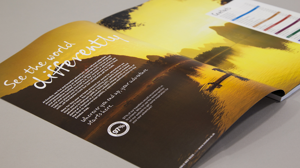
Challenge
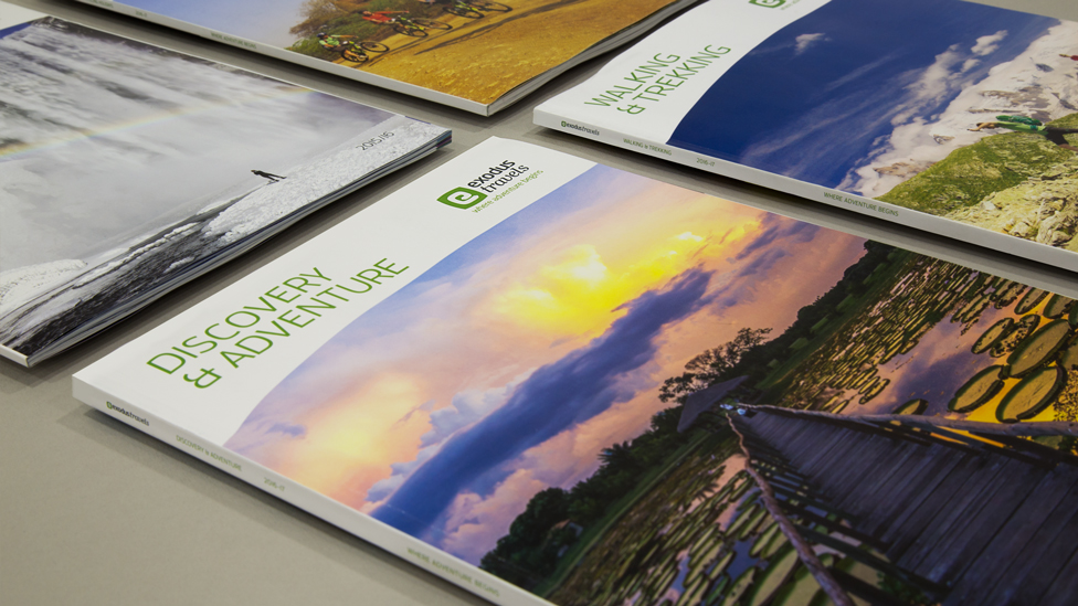
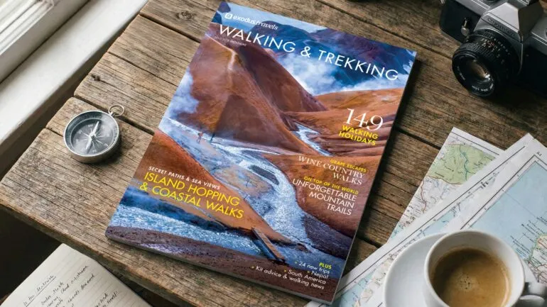
Our client came to us for the second year running to turn the already successful holiday brochure designs into an even stronger series of aspirational travel magazine designs.
The design had to really capture the attention of the sophisticated traveller – as well as their friends and family – to convert interest into tangible sales. It also had to reflect the flexible and individual nature of the holiday experiences our client offers, and be adaptable for the Australasia, South Africa, North America and Europe market versions.
Solution
With the previous year’s clean and striking visuals as a solid base, we took the design a step further. From premium holiday brochures to a series of ambitious travel magazine designs.
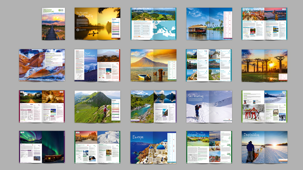
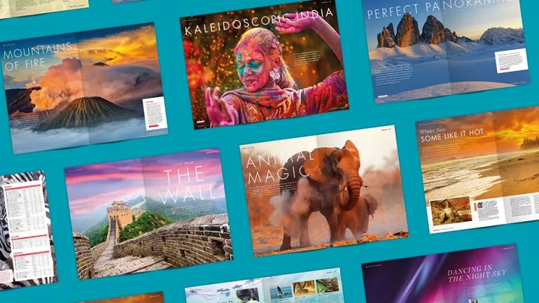
Working closely with Exodus’ destination experts, we translated the vast amount of information from as many as 500 options and 90 countries into easy to read inspirational pages.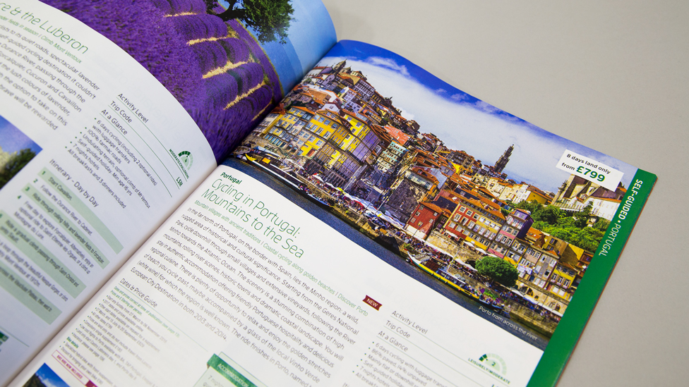
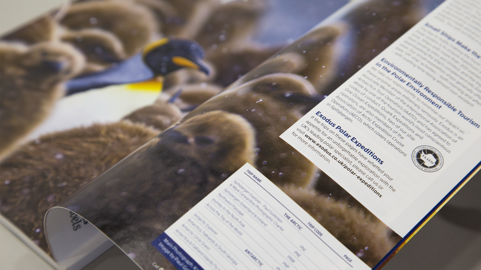
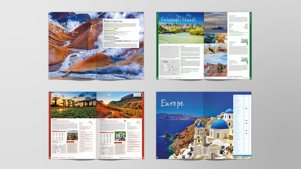
Clean pages, where the images of the destinations are the heroes, allow for the simple iconography we developed to sit comfortably on the page.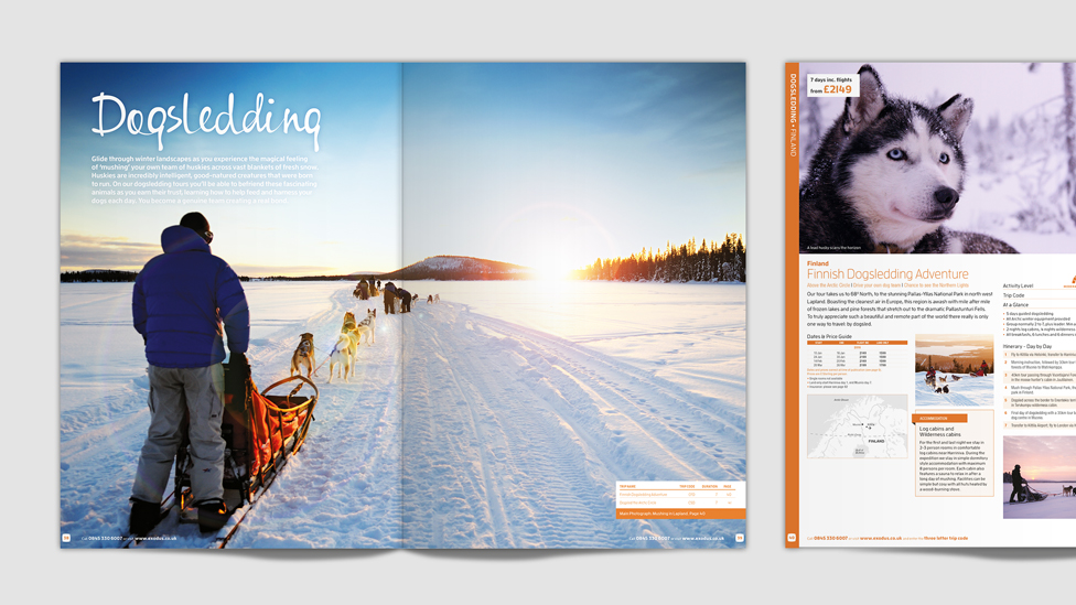
We also selected a secondary font, with a less corporate and more personal and dynamic feel, a true reflection of the experiences the knowledgeable end customer expects from our client.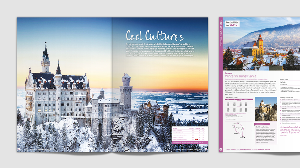
Other small details like putting the prices in bold serve not only as a confident statement for Exodus, but they contribute to the overall idea of being clear and open with the data that ultimately informs a purchasing decision. We also repositioned the pricing information so it gained prominence in the reading flow of the magazine design.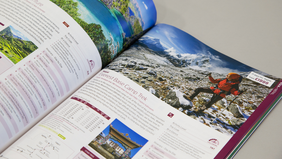
In summary, an inspirational stand-out piece of collateral, designed to cement our client’s reputation as so much more than a travel expert, but as passionate designers of unforgettable travel experiences.
Result
The feedback from our client has been overwhelming – extremely grateful for making it so easy for her to settle into her new role, and taking the design to the next level.
Feedback from Exodus’ customers has also been very positive: “a pleasure to browse through and a great coffee table and conversation piece.”
Looking for help with your project?
Feel free to give us a call to start a conversation,
our doors are always open.
Related projects
INEOS
Corporate magazine design
Exodus
Magazine design and content
Exodus
Travel magazine design and content
