Brand refresh
We created a striking brand refresh to give Smart Money a more sophisticated identity, strengthening the company’s position in a niche sector.
Background
Following a period of strong business growth, Smart Money – a specialist financial broker – asked for our help with a brand refresh. Working within a niche B2B market, the company wanted to project a more sophisticated identity to strengthen their position within a highly competitive market.
Challenge
The brand refresh needed to give Smart Money a more refined and contemporary appeal, without alienating the existing customer base that had contributed to the company’s success.
Solution
Taking the existing brand design as inspiration, we evolved it into a simple yet distinctive new identity that successfully presents the client as an established and trustworthy organisation which is effectively adapting to changing market conditions and the needs of its audience.
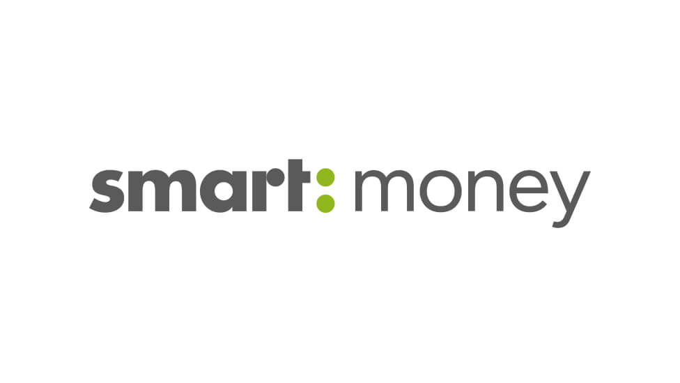
We transformed the client’s logo – which included a three-dimensional illustration of falling coins – into two full circles that split the company name in two. Turning the coins into a colon, and applying different font weights to each word add emphasis and transmit a message of confidence.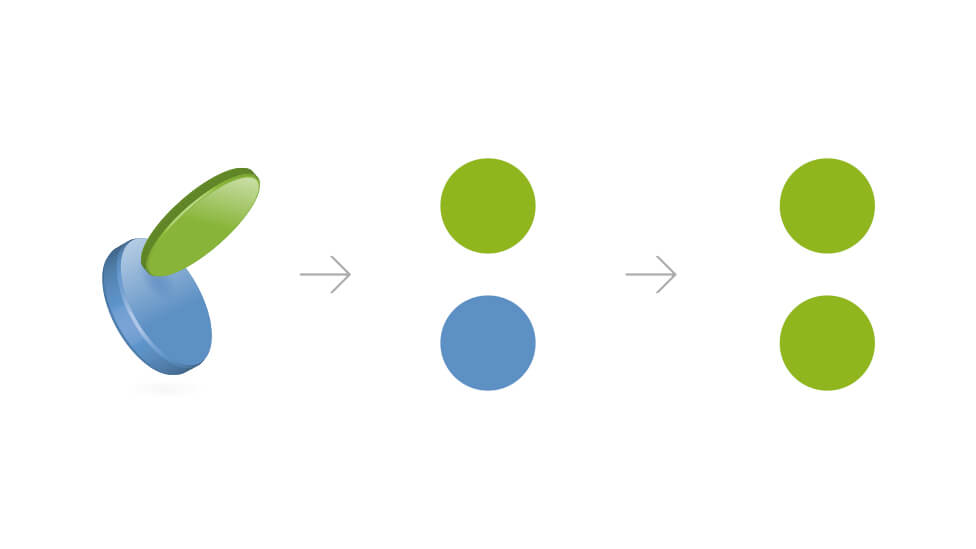
To further evolve the brand, we devised a series of icons with a recurring circular theme that help represent the different products offered by the client.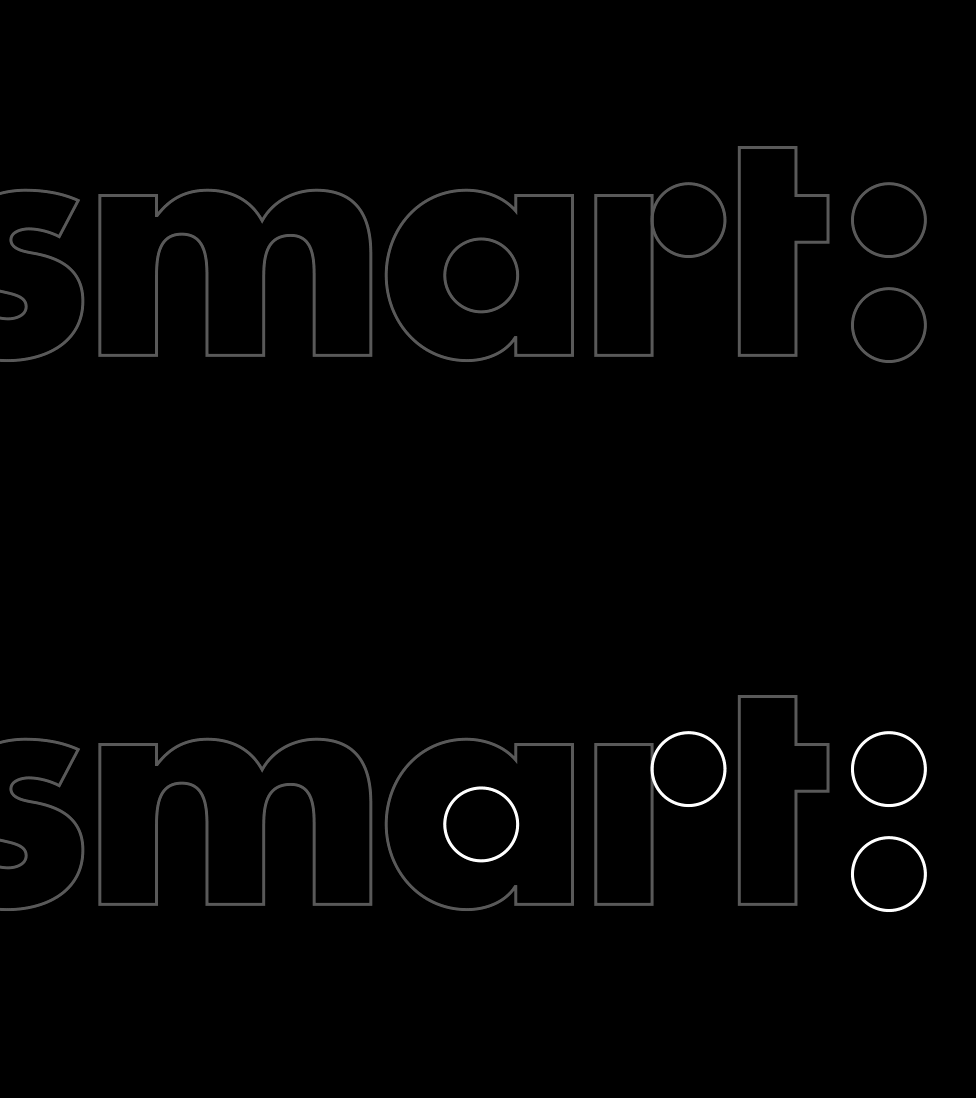
We also introduced a new colour palette to communicate our client’s focus on expertise and innovation. ![]()
The grey tones position Smart Money as a stable, reliable enterprise, while the vibrant green expresses the company’s fresh and energetic personality. The combination of these values is perfectly represented by the duotone effect we applied to lifestyle images.
The brand refresh was adapted to fit to a wide range of media and marketing collateral.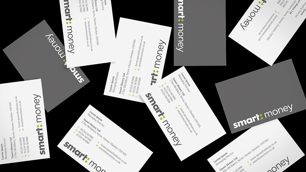
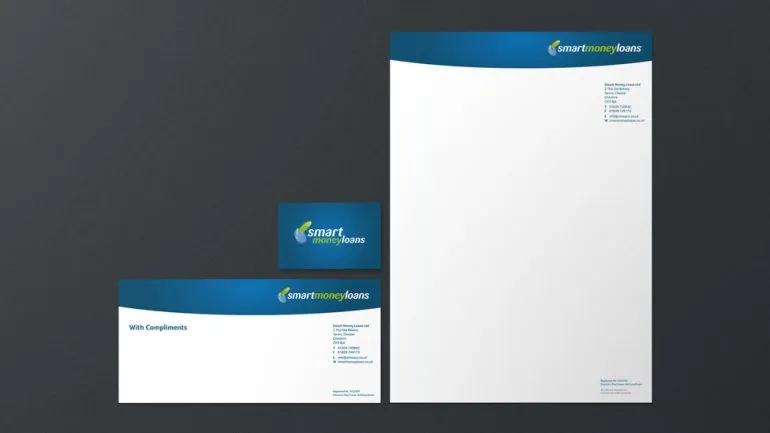
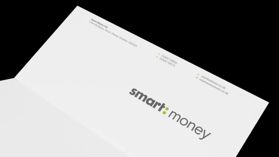
The company stationery was redesigned in a clean minimalist style to emphasise the logo and strengthen brand name recognition.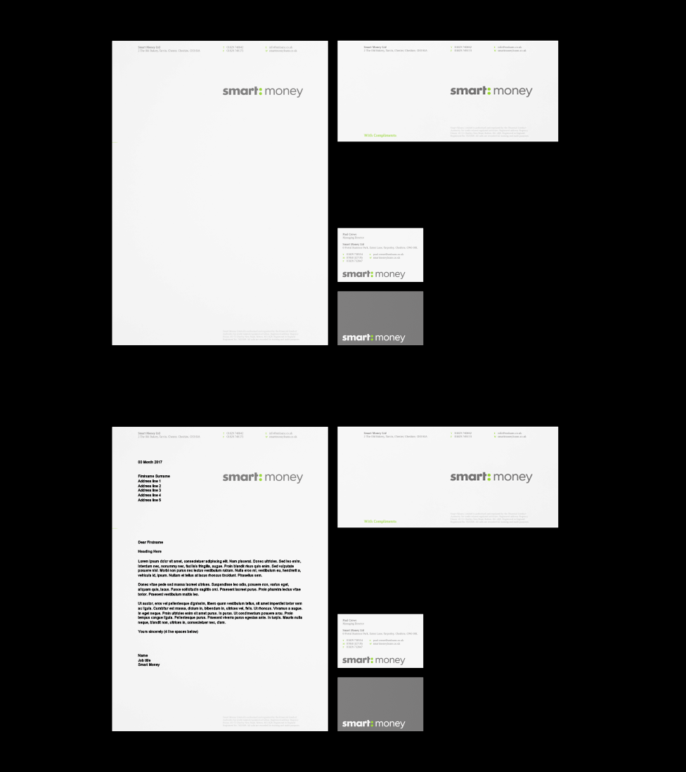
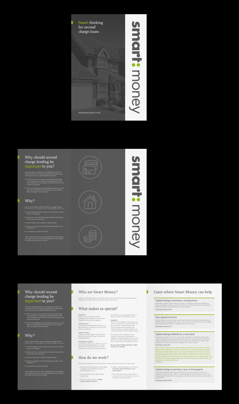
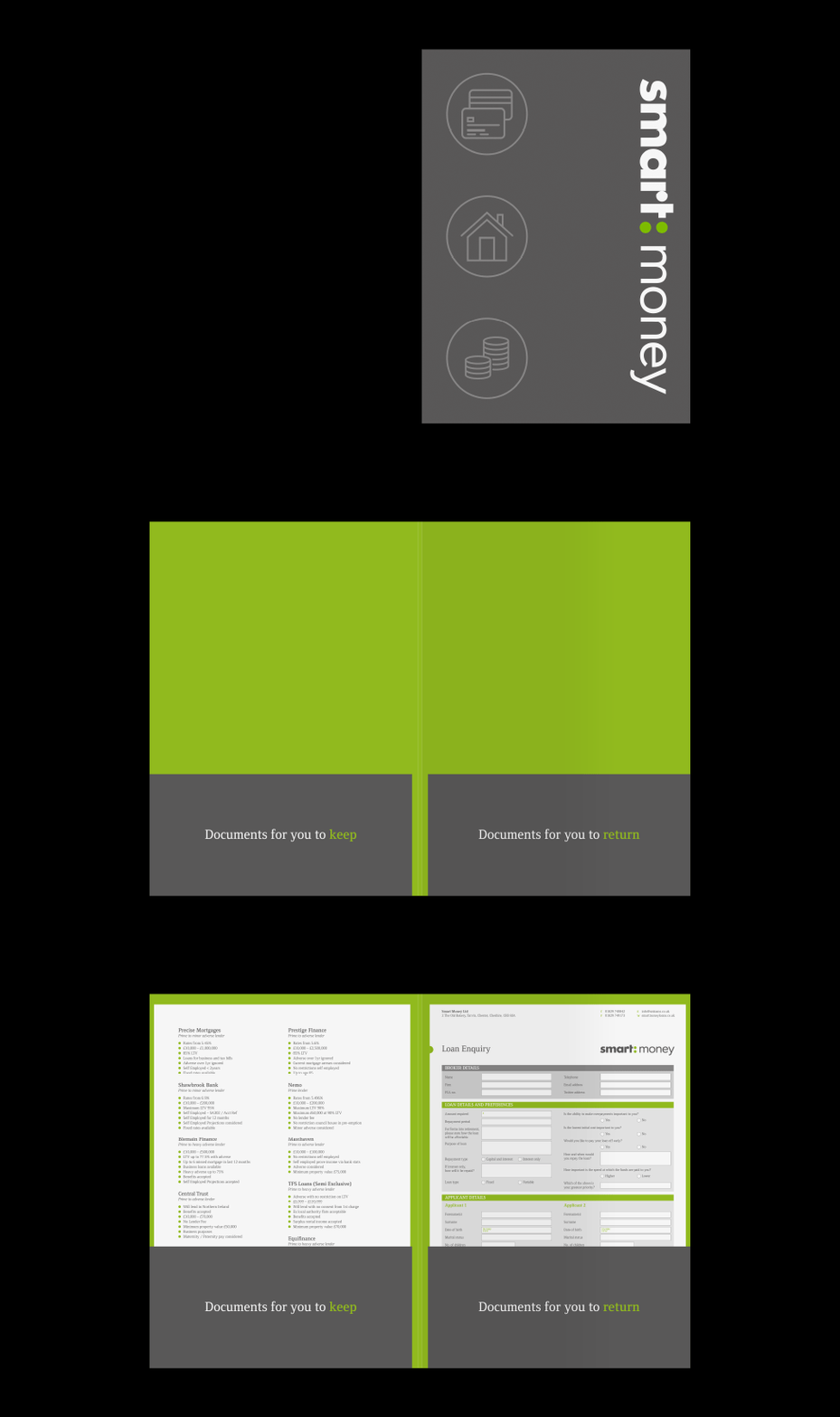
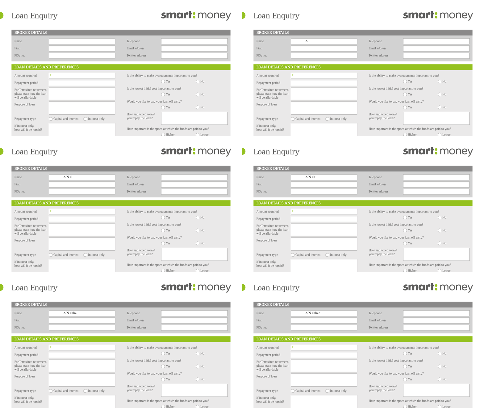
We also produced a simple trifold brochure and a convenient A4 folder with integrated application form that helped increase product awareness and allowed sales teams to capture leads.

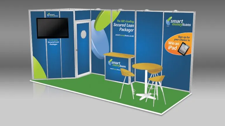
We applied the new brand to a versatile and cost-effective shell scheme exhibition stand that helped increase awareness and support sales efforts at industry trade shows. 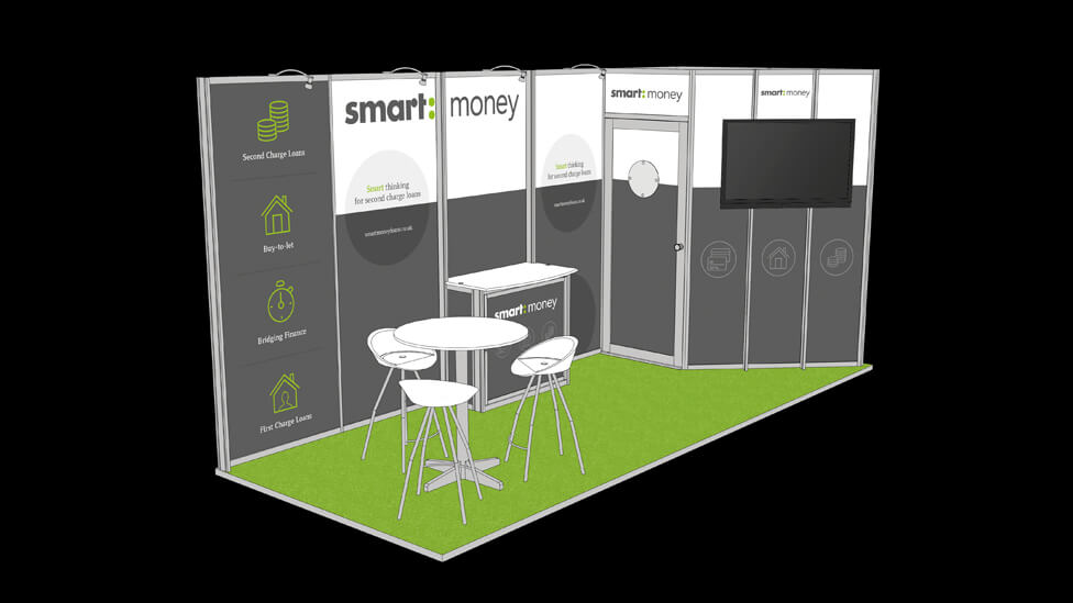
Adding an accent colour on the carpet contributed to a simple yet striking design that attracted high visitor numbers and enquiries.
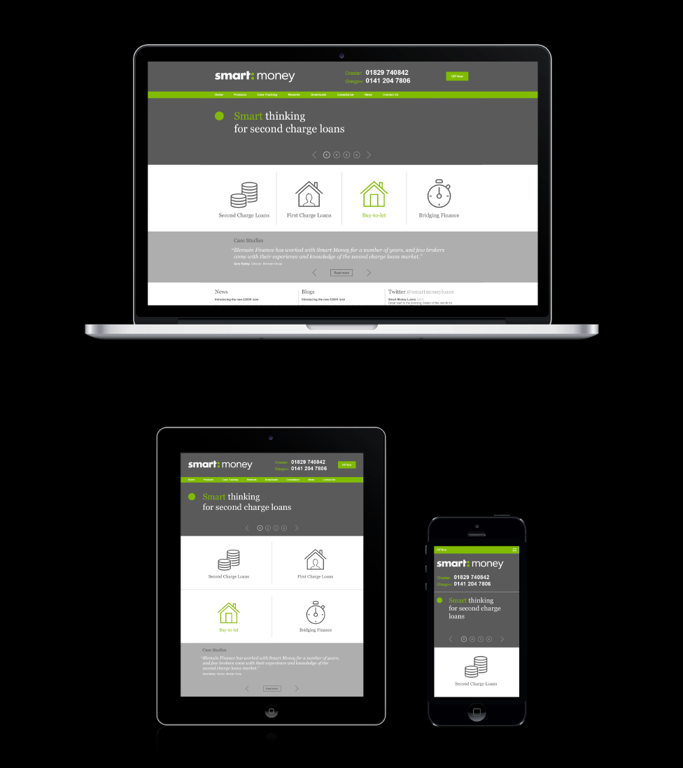
The brand was also rolled out to a fully responsive website and online application form, which also contributed to a spike in applications.
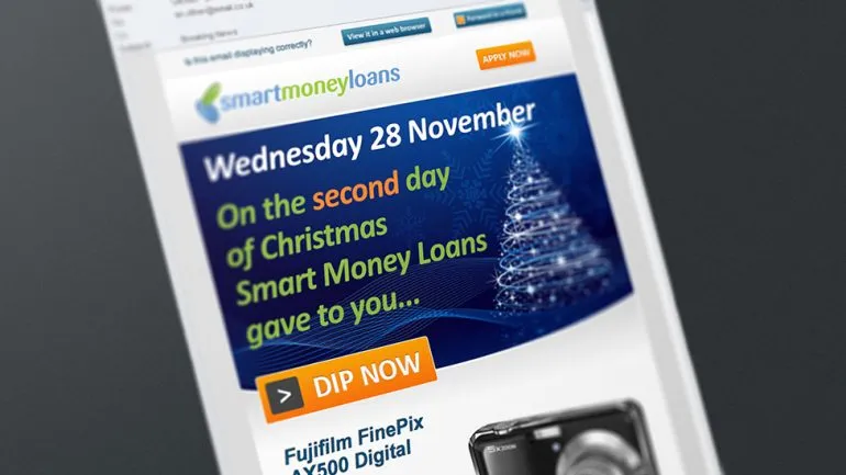
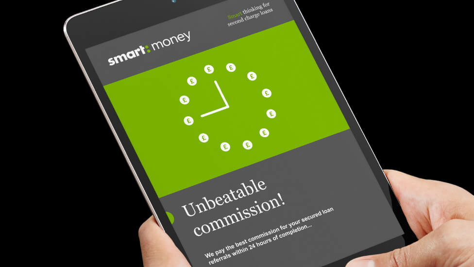
The email template we created could be easily tailored by Smart Money themselves to promote different messages in line with business priorities.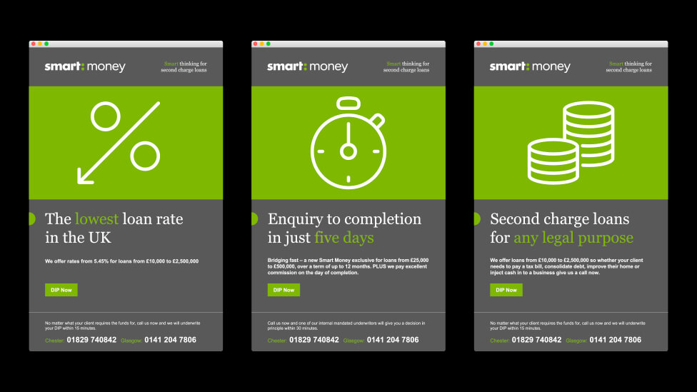
Looking for help with your project?
Feel free to give us a call to start a conversation, our doors are always open.
