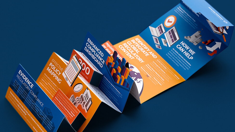
We made regulatory change management simple with a targeted direct marketing design that’s both persuasive and visually engaging.
Background
As a global provider of financial data and software solutions, Thomson Reuters helps companies manage risk by simplifying and automating the process of managing regulatory change. To effectively communicate their offering, our client’s marketing team needed an innovative and versatile way to capture the attention of risk professionals, compliance personnel and general counsel.
Challenge
From the beginning, we knew that our direct marketing solution would need to be durable, flexible and compelling. As well as being used for targeted desk drops and exhibitions, the piece also needed to present complex product features in a clear and persuasive way, while giving readers a reason to hold on to the information.
Solution
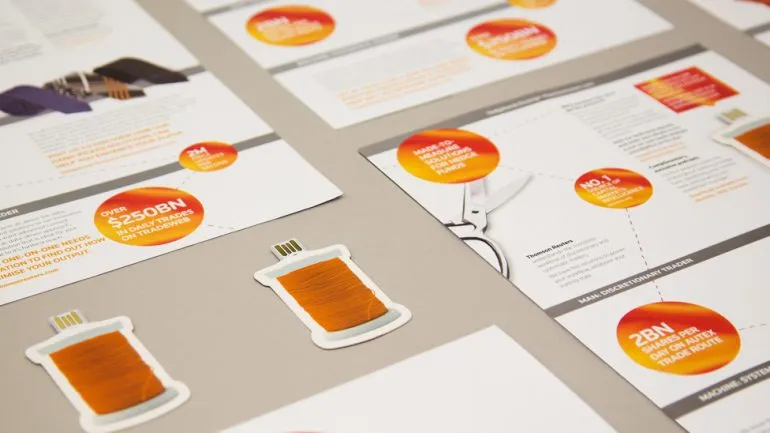
We created a unique direct marketing design that incorporates a double-sided 3D infographic. To balance visual intrigue and versatility, we researched, discussed and tested several layouts and print formats to produce the final piece.
The design cleverly folds out from a compact tabletop piece into a concertina piece that reveals key product features on one side, and helpful tips for successful change management on the other.
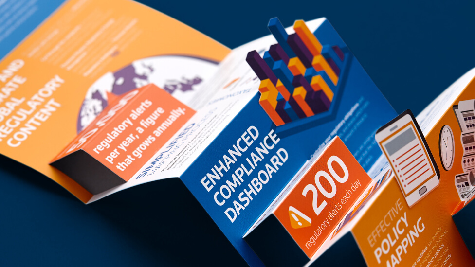

The engaging format showcases our client’s expertise in the challenges faced by their target audience, while also outlining how they can simplify the process of staying on top of the ever-changing regulatory environment.

The infographic layout effectively communicates large amounts of data clearly, while cut folds transform it into a playful 3D piece that draws readers’ eyes from one piece of key information to the next.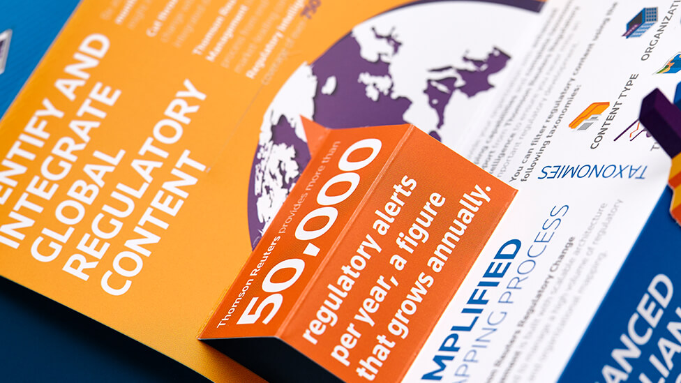
The novel and tactile nature of the direct marketing design also encourages audiences to interact with it again and again, inviting them to hold on to the piece as useful reference material.
Highlights
- The piece ensures continuity with a previous 3D infographic design we had produced for our client, but is distinct enough to generate renewed interest among audiences, and to act as a standalone marketing piece.
- Creative use of our client’s secondary brand palette helps categorise the information on each side, immediately differentiating different types of information.
- The asymmetric illustration style adds movement and helps structure content.
- By selecting matt laminate stock and incorporating a tab mechanism, we were able to increase durability of the direct marketing design – allowing materials to be unfolded and reused in a variety of locations.
Looking for help with your project?
Feel free to give us a call to start a conversation,
our doors are always open.
Related projects

Sage
Exhibition stand design and build
Thomson Reuters
Web key direct mail campaign
INEOS
Company magazine design
