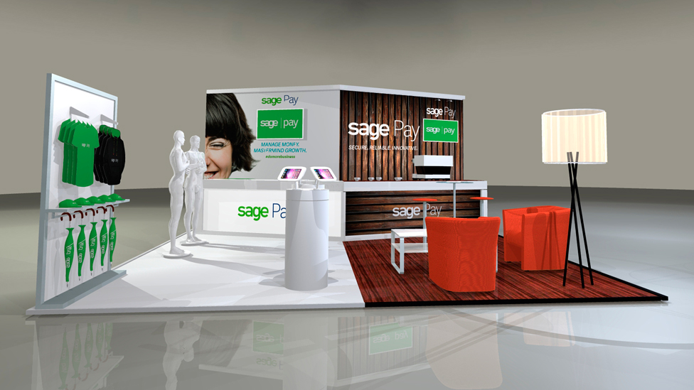
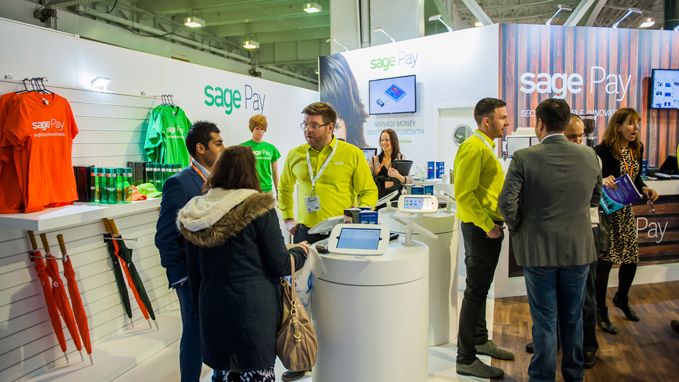
The stand design we created had retailers talking at RBTE, giving our client the opportunity to introduce their range of solutions.
Background
This was the first time our client had exhibited at RBTE, Europe’s biggest and fastest growing annual event for retail and hospitality. In combination with the Retail Design and Retail Digital Signage Expos, all 3 events attracted over 15,000 visitors from all over Europe in just two days.
Challenge
Sage Pay are already well known for their ‘card not present’ technology’. Their aim at RBTE was to showcase their expertise in ‘card present’ technology, and rise above a competition of over 300 exhibitors.
Solution
We set out to create a dual exhibition stand design that delegates would be immediately attracted to and would want to interact with. The stand was designed to enable visitors to interact with Sage Pay technology as they would in a real retail environment.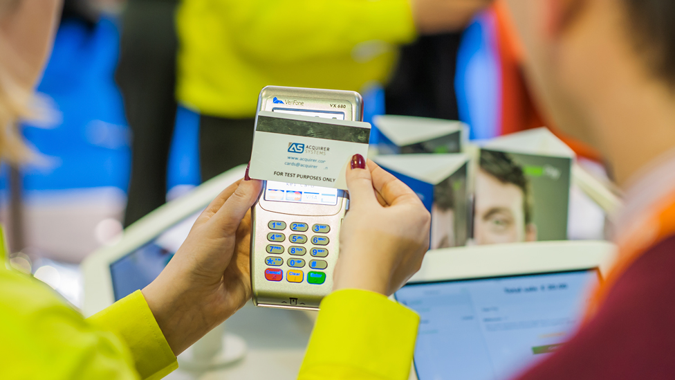
We split the stand into two distinct areas: a retail side with a boutique feel, and a coffee shop area.
The stand was very open and welcoming to attract the maximum number of visitors, whilst both spaces were easily identifiable as two separate areas.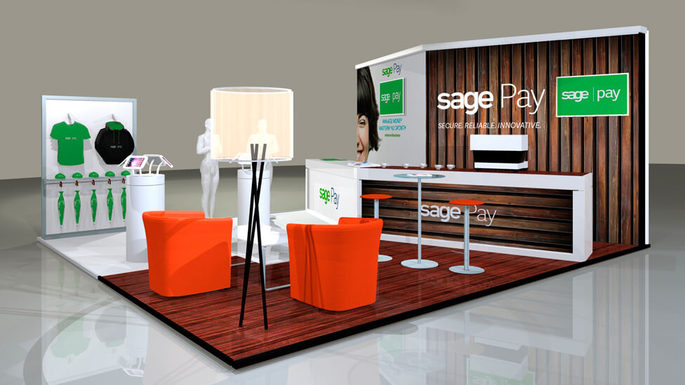
In the coffee shop area, we looked after every detail to ensure the experience was as attractive, fun and close to reality as possible.
The styling, the floor treatment, branded coffee cups and water, together with expert baristas armed with iPads that received drink orders, all contributed to the unique experience offered by the dual stand.
The coffee shop also included a live tweet wall to maximise interaction and engagement.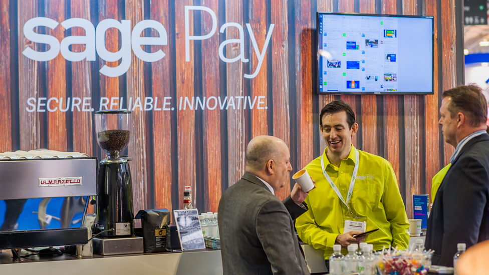
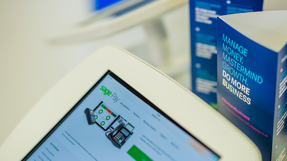
The retail side of the exhibition stand served to bring Sage Pay’s product to life, where 7 iPads allowed “customers” to click and collect their Sage Pay merchandise.
We added another fun and interactive element, by including a competition as part of the overall experience: visitors were encouraged to take a selfie with a mannequin, using a hashtag to tie into a wider campaign.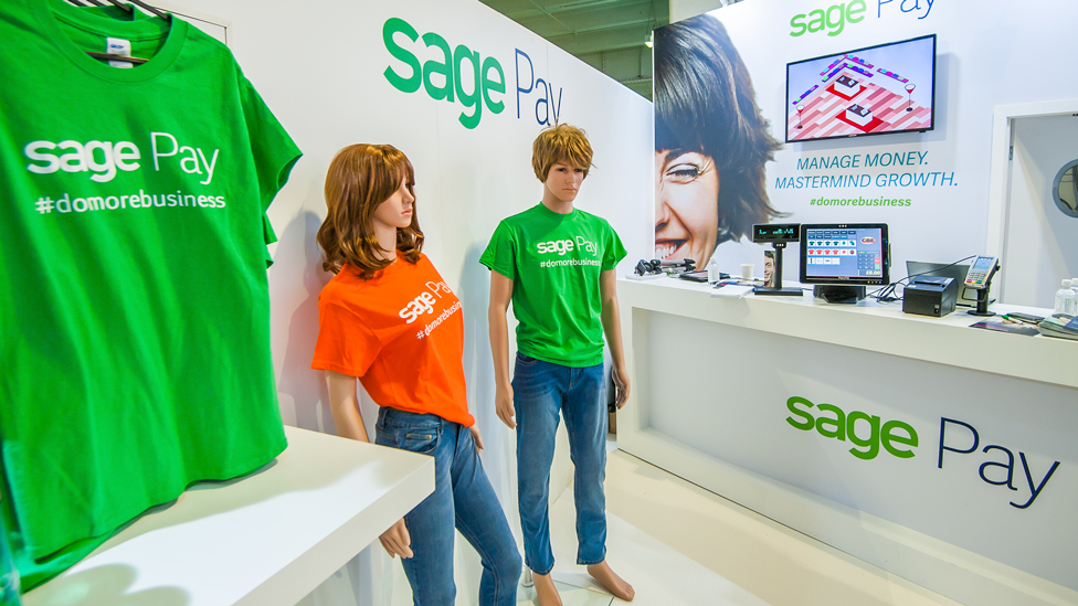
We didn’t just produce the dual exhibition stand design, we also managed the full installation, logistics, AV and connectivity for all the equipment, and we integrated all our client’s kit and Wi-Fi.
We even had custom furniture designed to match our client’s colour palette. The unusual and disruptive exhibition stand soon became a draw in the hall.
“This was our first time exhibiting at the RBTE, and we got great feedback. The retail concept on one side of the stand worked very well as we were showcasing our POS payment solutions, so visitors were able to experience the product in an almost real environment. They understood what we were trying to do without even us having to explain! We were very satisfied with the stand and working with Parker Design, it was a very pleasant process and stress free! One of my colleagues saw our stand, and loved it so much that he asked to re-use it for another event.”
Looking for help with your project?
Feel free to give us a call to start a conversation,
our doors are always open.
Related projects
Jacobs
Custom design stand
H&T Presspart
Bespoke exhibition stand
Sage
Expo stand design
