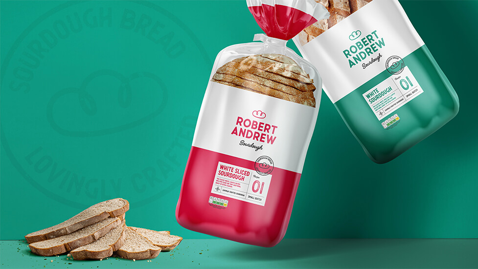
This branding and packaging design project helped our client launch into a new market thanks to an effective mix of relaxed, rustic authenticity and contemporary touches.
Background
Coming from a background of serving the Polish ex-pat community in the UK with a wide range of bakery products traditionally only found in Poland, our client decided it was time to diversify and offer quality bakery products aimed at the British market, specifically sourdough bread.
The popularity of sourdough has risen in the UK in the last few years, becoming a popular choice that feels accessible and premium at the same time. Available in both discount supermarkets and higher-end retailers and eateries, sourdough is an attractive product not just for its flavour, texture and perceived affordable quality, but also because of the connotations it carries with it: the process of making sourdough bread is complex and more time-consuming than other bread products, it’s slower and doesn’t feel mass-produced in a characterless factory, an attractive proposition for today’s demanding consumers.
Challenge
To help our client launch a new product range into the UK, we were tasked with a complete brand creation exercise, from naming through to design of new packaging.
Initially launching with 4 different sourdough varieties, this branding and packaging design project required us to take into consideration plans to expand the product range in the near future, so the new brand would need to be elastic enough to guarantee longevity and cater for additional product launches.
Solution
Focusing first on the naming of the new brand, and having the target audience front of mind, we focused on names that transmitted a sense of traditional Britishness, to make the product feel authentic and appealing to audiences who value tradition.
After considering various concepts and ideas, we decided on a brand name that feels honest, and at the same time creates intrigue and mystique due to its ambiguity: Robert Andrew. Inspired by the names of the founders, the two traditional English names leave consumers wondering whether Robert Andrew is one person, or two, in any case bringing them closer to a personal story that feels authentic.
Combining the names Robert and Andrew also has a certain ring to it, with the alliteration of the letter “R” adding rhythm and making the brand immediately memorable.
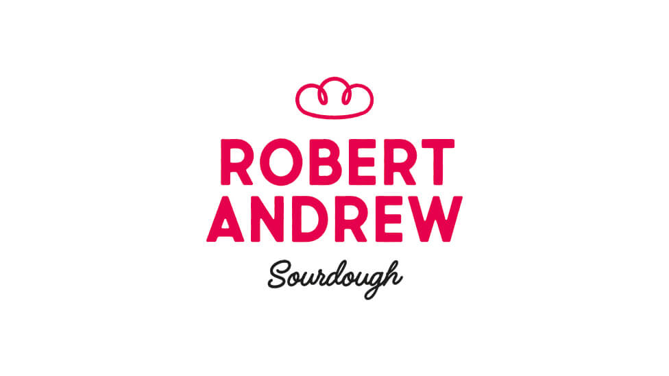
From a visual styling point of view, the brand is clean and honest, bold and friendly at the same time. Echoing this sentiment, the logo is completed with an embellished hand-drawn bread crown above the brand name and a handwritten font for “Sourdough” below, both adding a simple, yet strong and rustic, and deeply personal feel to the brand.
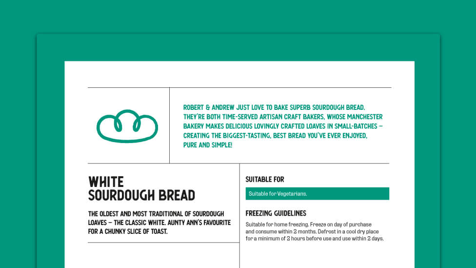
The colourways we chose are both traditional and add a contemporary touch, making it an attractive gimmick-free brand that feels honest, guaranteeing wide audience appeal. Each colour denotes a different product variety, adding elasticity to the visual system as new products get added to the range, and adding real shelf presence to the product.
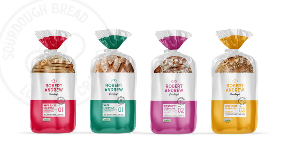
Giving each recipe its own colour also serves to reinforce the idea of a small production line, a strategy that allows audiences to bring their own mental associations to the brand and adds a strong sense of history and traditional craftsmanship.
A visual device in the shape of a stamp transmits the idea of a quality seal of approval, taking the notion of ‘rustic authenticity’ further.
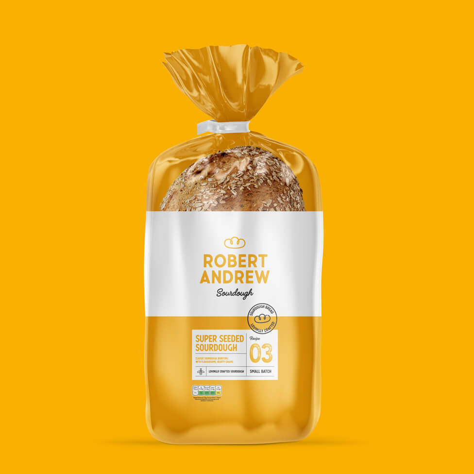
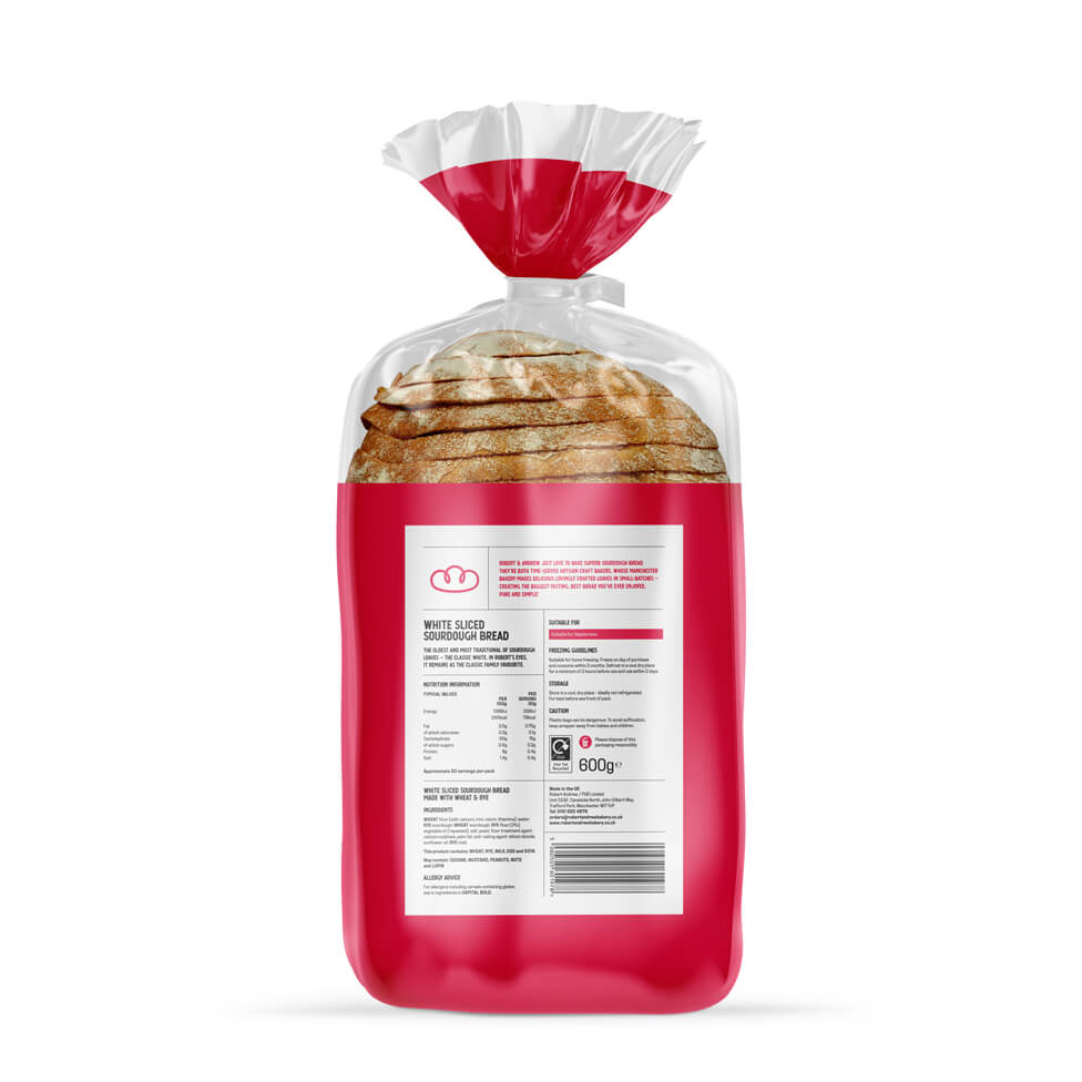
For the packaging design, we explored different routes, and opted for a clear plastic bag which thanks to the use of specialist matting achieves a hand-crafted paper bag look and feel, cementing the idea of authenticity in a way that’s practical and deliverable, as plastic will keep the product fresher for longer.
The use of white helps accentuate the logo, whilst a window at the top of the bag allows customers to see the product and almost feel its freshly-baked texture and aroma, encouraging them to pick it up.
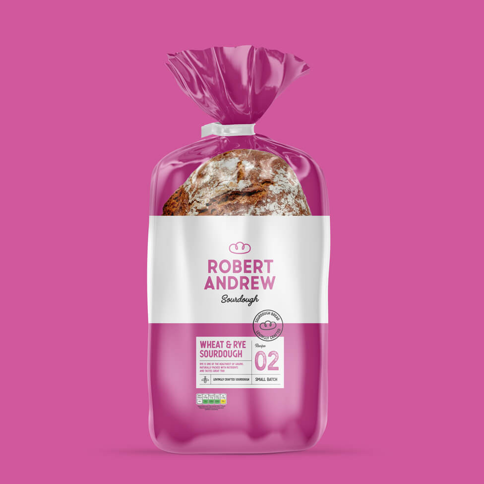
Simple graphic devices and bold use of colour help feature product information without too many distractions, making the packaging look different from the industry norm on retail shelf displays.
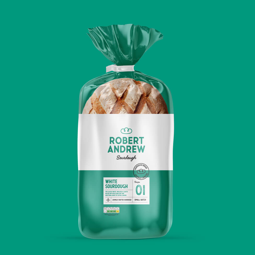
Working closely with our client’s preferred printing house in Poland, we adapted our packaging design ideas to ensure there was no need for changes on the packing line, helping our client avoid a hefty investment for the initial branding and packaging design project.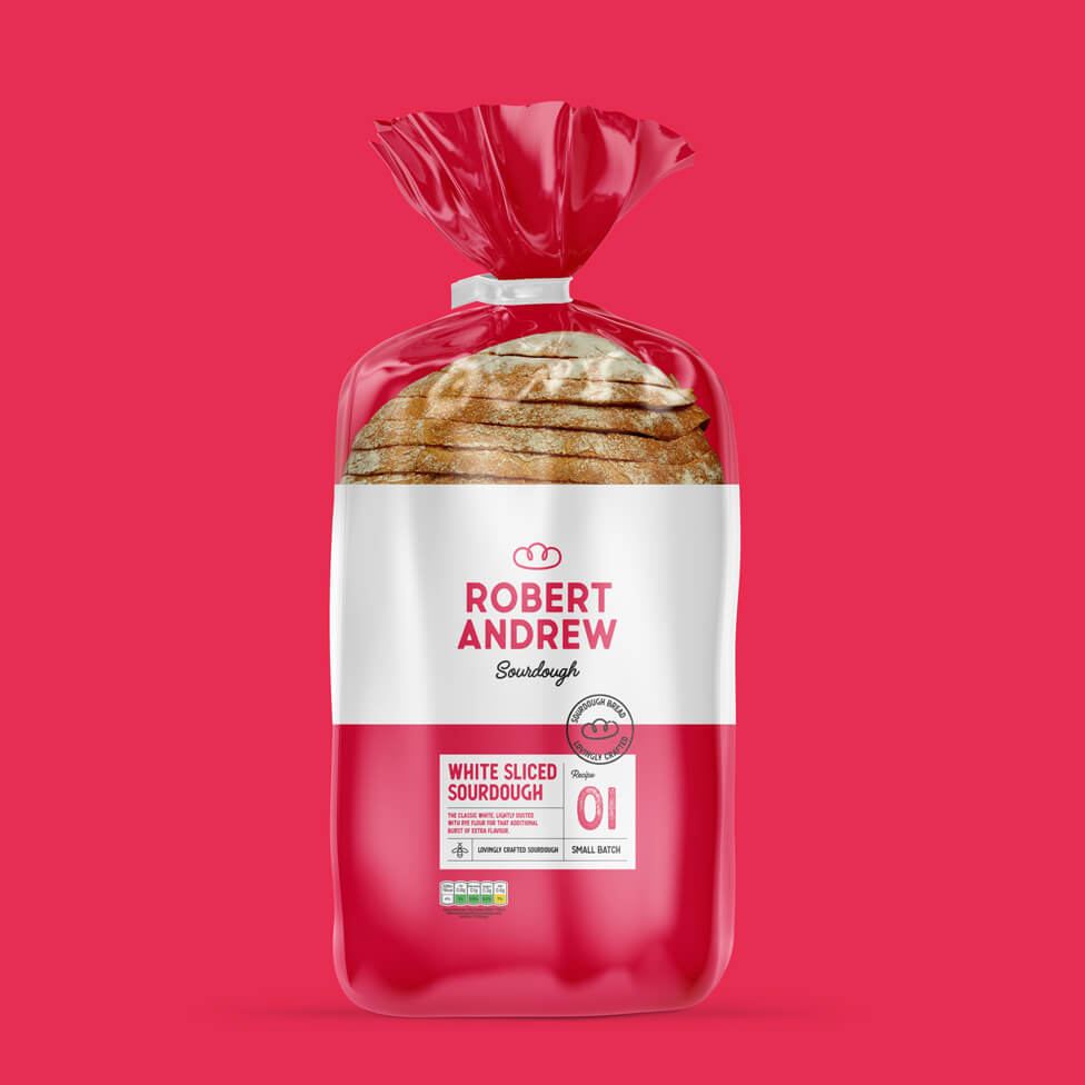
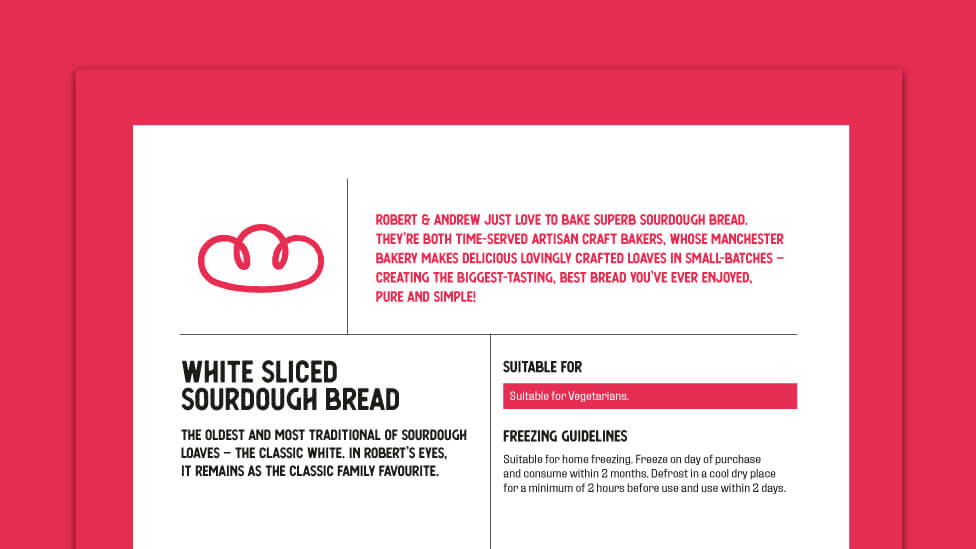
We maximised space on the back of the packaging to take it a bit further than just industry-compliant nutrition information, working with one of our copywriters to craft the Robert Andrew story as well as different personal stories for each recipe, adding a dose of history and heritage to the packaging.
In addition to the branding and packaging design for launch, we have also been working on our client’s new website, as well as more packaging ideas and other promotional materials to help build brand presence.
Take a look at other packaging design projects.
Looking for help with your project?
Feel free to give us a call to start a conversation,
our doors are always open.
Related projects
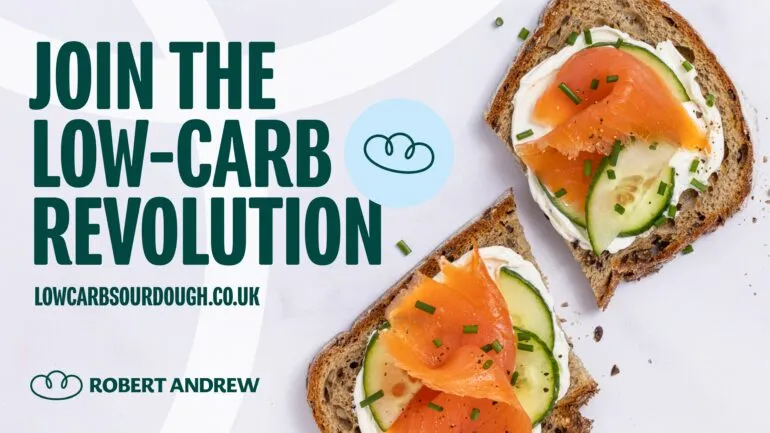
Robert Andrew
Brand launch and marketing strategy

Polecat
Branding development

Raw London
Branding strategy
